
The React Progress Bar indicates the progress of a task with customizable visuals. It includes features to visualize progress in rectangular and circular shapes, determinate and indeterminate states, segments, and customized ranges in different colors. It also supports animation.
Visualize progress in different shapes (rectangle, circle, and semi-circle) to give a unique appearance to your app design.
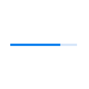

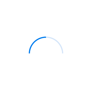
Visualize progress in different modes.
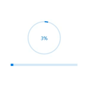
Use the determinate mode progress bar when progress can be estimated.

Use the indeterminate mode progress bar when progress cannot be estimated or calculated. It can be combined with determinate mode to let users know that the app is estimating the progress before the actual progress starts.

Use a secondary progress indicator when the primary task depends on the secondary task. This will allow users to visualize both primary and secondary tasks’ progress simultaneously.
Avoid writing several lines of code to create and position multiple progress bars: just divide a progress bar into multiple segments using a single API to visualize the progress of multiple sequential tasks.


Customize the start and sweep angles of circular progress to give a unique style to the circular progress bar.
Display tooltips during initial load of progress bars and mouse hover with numeric or text values of the progress.

Add any view to the center of a circular progress bar to: indicate the completion of the progress; add start, pause, or cancel buttons to control the progress interactively; add an image that indicates the actual task in progress; add custom text that conveys the progress.

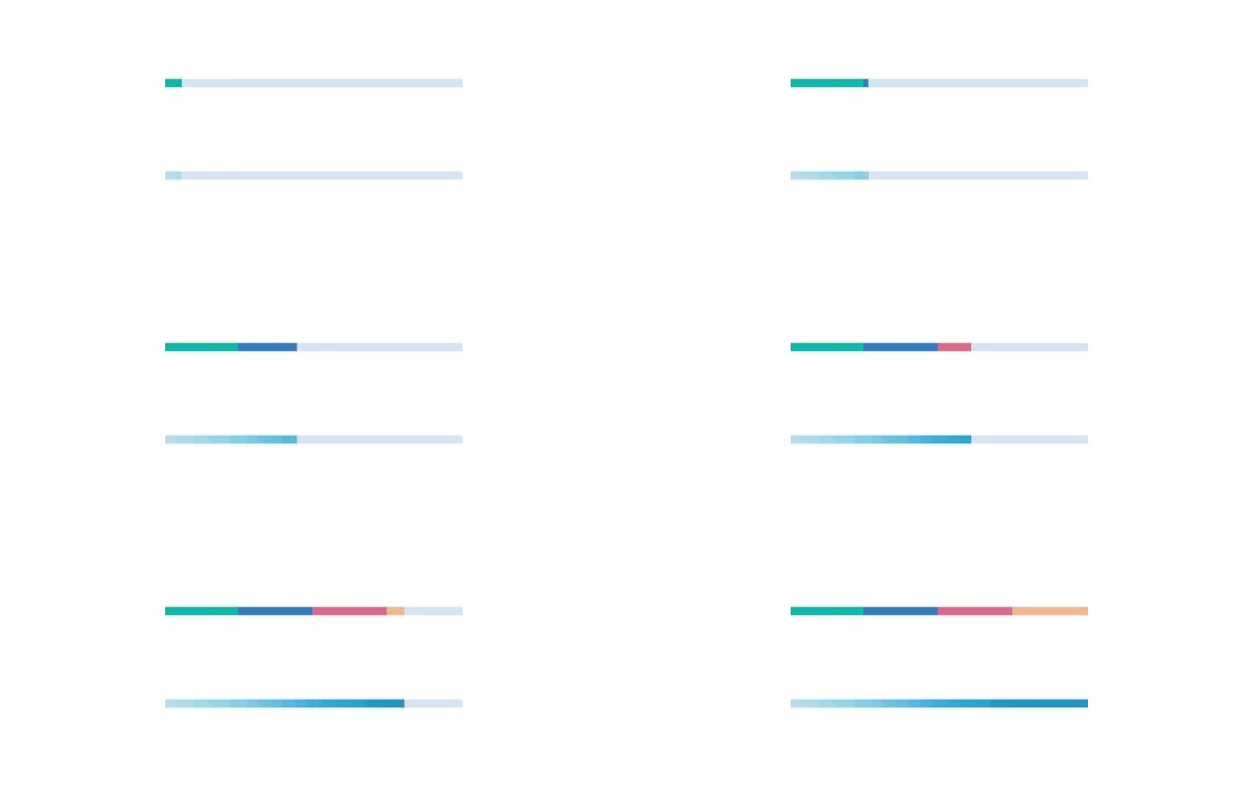
Along with visualizing the progress of a task, users can also visualize multiple ranges with gradient colors or solid colors that are mapped to each range to enhance the readability.
The appearance of a progress bar is highly customizable.

Tweak the thickness of the track and progress indicator to render the progress bar with different appearances.
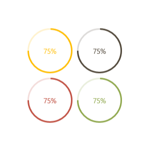
Apply appealing colors to the track and progress indicator to match your app theme.

The corner radius of the progress bar can be customized.
Easily get started with the React Progress Bar using a few simple lines of TSX code example as demonstrated below. Also explore our React Progress Bar Example that shows you how to render and configure a Progress Bar in React.
- import { ProgressBarComponent } from '@syncfusion/ej2-react-progressbar';
- import * as React from "react";
- import * as ReactDOM from "react-dom";
- import { SampleBase } from '../common/sample-base';
- export class Default extends SampleBase<{}, {}> {
- public animation: any = {
- enable: true,
- duration: 2000,
- delay: 0
- };
- render() {
- return (
- <div>
- <ProgressBarComponent id="linear" type='Linear' height='60' value={40}
- animation={this.animation}></ProgressBarComponent>
- </div>
- )
- }
- }
The ProgressBar component is also available in Blazor, Vue, Angular, and JavaScript frameworks. Check out the different ProgressBar platforms from the links below,
We do not sell the React Progress Bar separately. It is only available for purchase as part of the Syncfusion team license. This contains over 1,900 components and frameworks, including the React Progress Bar. The price of the team license starts at $395 per month for 5 developers, and includes support and updates until the subscription expires. In addition, we might offer discounts based on currently active promotions. Please contact our product specialists today to see if you qualify for any additional discounts.
You can find our React Progress Bar demo, which demonstrates how to render and configure the Progress Bar.
No, our 1,900+ components and frameworks for web, mobile, and desktop, including our React Progress Bar, are not sold individually. They are only available as part of a team license. However, we have competitively priced the product, so it only costs a little bit more than what some other vendors charge for their Progress Bar component alone. We have also found that, in our experience, our customers usually start off using one of our products and then expand to several products quickly, so we felt it was best to offer all 1,900+ components and frameworks for a subscription fee that starts at $395 per month for a team of 5 developers. Additionally, we might be able to offer discounts based on currently active promotions. Please contact our product specialists today to see if you qualify for any additional discounts.
No, this is a commercial product and requires a paid license. However, a free community license is also available for companies and individuals whose organizations have less than $1 million USD in annual gross revenue, 5 or fewer developers, and 10 or fewer total employees.
A good place to start would be our comprehensive getting started documentation.
 Documentation
Greatness—it’s one thing to say you have it, but it means more when others recognize it. Syncfusion® is proud to hold the following industry awards.