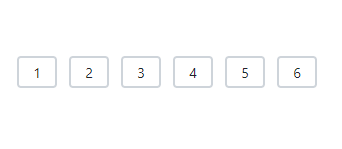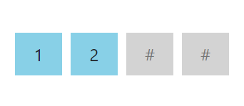
The React OTP Input is a versatile form component designed for entering one-time passwords (OTP) during multi-factor authentication. It accepts a single character per input field, ensuring a focused and straightforward user experience. It offers extensive customization options with several built-in features, including input types, input lengths, styling modes, placeholders, separators, and more.

The React OTP Input component has three input types:
Number: The default input type, allowing digit entries only.Text: Allows alphanumeric and special character entries for complex OTP inputs.Password: Similar to the text type, but masks input characters for privacy.

The built-in styling modes are as follows:
Outlined: The default styling mode, displaying a border around the input fields.Filled: Fills the input fields with a background color and includes an underline.Underlined: Highlights each input field with an underline for a sleek look.Display a hint character in each input field to indicate the expected value. If defined as a single character, it will be shown in all fields; otherwise, each field will display a part of the string based on its length.


Specify a character to be placed between input fields, customized to enhance the visual separation of OTP inputs.
The React OTP Input component allows you to set the validation state, displaying success, warning, or error states based on the input validation.

Customize the length of the OTP Input, styling for each field, the focusing state, and more.

Adjust the length of the input fields, with a default display of four input fields.

Customize the appearance of the OTP Input with rounded fields, enhancing its visual appeal.

Customize the color, background color, and focus color of the input fields to enhance their appearance and make them stand out.
The React OTP Input supports these built-in themes: Tailwind CSS, Bootstrap 5, Bootstrap 4, Bootstrap, Material, Fabric, Fluent, and high contrast. Users can customize one of these built-in themes or create new themes to achieve their desired look and feel by simply overriding SASS variables or using our Theme Studio application.
The React OTP Input component offers APIs for customizing its appearance and behavior, as well as templates for changing its look and feel. With these APIs, developers can create a unique and highly customized OTP Input that fits seamlessly into their applications.
 Documentation
Greatness—it’s one thing to say you have it, but it means more when others recognize it. Syncfusion® is proud to hold the following industry awards.