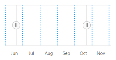
React Range Selector is an interface for selecting a small range from a larger collection. It is commonly used in financial dashboards to filter a date range for data that needs to be visualized.
Plot any type of data in the range selector using different value types like numeric, date-time, and logarithmic.
Plot data in the range selector with different chart types like line, area, and step line.
Skip the chart and show only the range for selecting data. This makes the range selector lightweight in mobile devices.
Major and minor scales display the range with different intervals and are placed at multiple levels of the range selector. A date-time scale can also be configured to be shown in major and minor scales.
Select data using predefined periods in the range selector and use the date picker to select a custom range.
Bind selected data from the range selector to any other data visualization control using built-in events.
Allows you to defer the selected range to be updated until the user stops dragging the scrolling thumbs. This provides a smooth scrolling experience.
The range selector control provides the following three ways to select a range:

All the elements of the range selector are highly customizable with built-in APIs.

Customize the size, color, font family, font attribute, and alignment of the labels using built-in APIs.

Customize the appearance of the left and right thumbs using built-in APIs.

Customize the color, stroke width, dash array, and visibility of the major and minor gridlines using built-in APIs.
Tooltips display the start and end values of a selected range, allowing users to easily select a required range.
The range selector supports right-to-left rendering and allows the series and scale direction to be displayed from the right to left. This improves the user experience and accessibility of RTL languages.
The interactive range selector control also support touch interactions.

All the features in range selector will work on touch devices with zero configuration. Use the touch features such as tooltip and thumb drag without any customization.

You can view the range selector on various devices. It is also possible to hide chart for particular screen sizes by making a very minimal change.

You can render range selector control in all the modern browsers.
Easily get started with the React Range Selector using a few simple lines of TSX code as demonstrated below. Also explore our React Range Selector Example that shows you how to render and configure the Range Selector in React.
- import * as React from 'react';
- import * as ReactDom from 'react-dom';
- import {RangeNavigatorComponent} from '@syncfusion/ej2-react-charts';
-
- class App extends React.Component<{}, {}> {
- public render() {
- return (
- <RangeNavigatorComponent></RangeNavigatorComponent>
- );
- }
- }
- ReactDom.render(<App />, document.getElementById('element'));
The Range Selector component is also available in Blazor, Vue, Angular, and JavaScript frameworks. Check out the different Range Selector platforms from the links below,
Syncfusion React Range Selector provides the following features:
We do not sell the React Range Selector separately. It is only available for purchase as part of the Syncfusion team license. This contains over 1,900 components and frameworks, including the React Range Selector. The price of the team license starts at $395 per month for 5 developers, and includes support and updates until the subscription expires. In addition, we might offer discounts based on currently active promotions. Please contact our product specialists today to see if you qualify for any additional discounts.
You can find our React Range Selector demo here.
No, our 1,900+ components and frameworks for web, mobile, and desktop, including our React Range Selector, are not sold individually. They are only available as part of a team license. However, we have competitively priced the product, so it only costs a little bit more than what some other vendors charge for their Range Selector component alone. We have also found that, in our experience, our customers usually start off using one of our products and then expand to several products quickly, so we felt it was best to offer all 1,900+ components and frameworks for a subscription fee that starts at $395 per month for a team of 5 developers. Additionally, we might be able to offer discounts based on currently active promotions. Please contact our product specialists today to see if you qualify for any additional discounts.
No, this is a commercial product and requires a paid license. However, a free community license is also available for companies and individuals whose organizations have less than $1 million USD in annual gross revenue, 5 or fewer developers, and 10 or fewer total employees.
A good place to start would be our comprehensive getting started documentation.
 Documentation
Greatness—it’s one thing to say you have it, but it means more when others recognize it. Syncfusion® is proud to hold the following industry awards.