The React Dropdown List is a quick replacement of the HTML select tags. It has a rich appearance and allows users to select a single value that is non-editable from a list of predefined values. It has several out-of-the-box features, such as data binding, filtering, grouping, UI customization, accessibility, and preselected values.
![]()
You can bind data from a variety of data sources in an array from primitive data, JSON data collections, or a remote data source using different kinds of adaptors such as OData, OData V4, URL, JSON, and Web API. The component uses the JavaScript data manager to manage data and has customization options for data requests and processing.
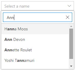
The React Dropdown List Component has built-in filtering support with a rich set of filtering configurations available to match all your application needs. Enable the filtering functionality to show the search input box in the drop-down pop-up list.

The React Dropdown List Component filter queries can be customized. You can also use your own filter libraries to filter data like Fuzzy search.

The React Dropdown List Component has built-in diacritic character sensitivity support. This behavior can be turned on or off.

The filtered search can be customized with case sensitivity, and you can set the number of characters required to make a filtered search.
The appearance (style) of each item displayed in the selection pop-up list, header and footer of the selection pop-up list, and the drop-down input box (select box) can be customized.

Design your own header for the pop-up list using a header template.

Define the custom appearance of each list item using an item template.

Design your own custom footer for the pop-up list using a footer template.

Define a custom appearance for a selected value in the drop-down input box using a value template.

Configure the custom look of a pop-up list when no items are available to display in the filter search functionality.
![]()
Each list item of the pop-up list is configurable with a custom icon to improve readability and visualization.
Create a cascading drop-down list to help the user populate data to the next-level drop-downs based on the selected value of the parent Dropdown List.

Group the pop-up list items with the corresponding category, making it easy to pick an item quickly from the select drop-down and increase the visual experience of the user.
The React Dropdown List is a form component that seamlessly supports HTML forms and obtains values on form submission actions.


The width and height of the pop-up option list is customizable.
You can display items in ascending or descending order in a pop-up select option list.


The React Dropdown List component placeholder can float like a martial design with impressive animation.
The component provides a responsive mode that gives an adaptive, redesigned UI appearance to mobile devices and is at ease with touch actions.
Developers can customize all UI elements and component their behaviors according to the end user’s requirement using the component’s rich set of client-side APIs.
The Dropdown List component is also available in Blazor, Vue, Angular, and JavaScript frameworks. Check out the different Dropdown List platforms from the links below,
We do not sell the React Dropdown List separately. It is only available for purchase as part of the Syncfusion React suite, which contains over 90 React components, including the Dropdown List. A single developer license for the Syncfusion Essential Studio for React suite costs $995.00 USD, including one year of support and updates. On top of this, we might be able to offer additional discounts based on currently active promotions. Please contact our sales team today to see if you qualify for any additional discounts.
You can find our React Dropdown List demo here.
No, our 90+ React components, including Dropdown List, are not sold individually, only as a single package. However, we have competitively priced the product so it only costs a little bit more than what some other vendors charge for their Dropdown List alone. We have also found that, in our experience, our customers usually start off using one of our products and then expand to several products quickly, so we felt it was best to offer all 90+ React components for a flat fee of $995/developer. On top of this, we might be able to offer additional discounts based on currently active promotions. Please contact our sales team today to see if you qualify for any additional discounts.
No, this is a commercial product and requires a paid license. However, a free community license is also available for companies and individuals whose organizations have less than $1 million USD in annual gross revenue, 5 or fewer developers, and 10 or fewer total employees.
A good place to start would be our comprehensive getting started documentation.
 Documentation
Greatness—it’s one thing to say you have it, but it means more when others recognize it. Syncfusion® is proud to hold the following industry awards.