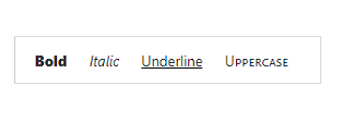


The Blazor Toolbar is a feature-rich component that provides an interface for selecting a command from a collection of commands. Its rich set of features include different orientations, responsive modes (scrollable and pop-up), templating, and button alignment based on priority.
The Blazor Toolbar component allows you to customize the appearance with HTML elements like images, text buttons, toggle buttons, select boxes, text boxes, and autocomplete. This helps you make toolbar search boxes and toolbar menu-like applications.
The Blazor Toolbar component with a rich UI provides data-binding support, rendered based on text, type, and alignment properties.
The Blazor Toolbar component adapts to the available space with scrollable and pop-up display modes, in modern web and mobile applications.

Scrollable display mode displays toolbar commands in a single line with horizontal scrolling enabled when the items overflow the visible space. You can swipe over the toolbar commands to scroll.
The pop-up menu is another type of overflow mode in which the toolbar container holds the items that can be placed within the available space. Items that do not fit the viewing area moves to the overflow pop-up container. You can view the overflow tab headers by clicking the pop-up icon.
You can prioritize the commands to be displayed in the pop-up or toolbar when minimum space is available to view them.
You can set specific items to be displayed in the pop-up always regardless of the available space on the toolbar.
Display the overflow toolbar items as an inline of a Blazor toolbar.

Hide the overflowing toolbar items in the next row and display them when you click the expand icons. If the pop-up content overflows the height of the page, the rest of the elements will be hidden.

The Blazor toolbar commands are aligned to the left, right, or center in the toolbar area.
The Blazor Toolbar component’s default command is a button type, and it can be rendered with the given text input.
You can add icons or images with or without text to the buttons. The icons can be positioned to the left or right.
You can add button text when necessary. You can decide to show text in the pop-up alone, toolbar alone, or in both.
The Blazor Toolbar can be easily integrated with other components such as DataGrid, Scheduler, and Rich Text Editor.
To describe the actions of the command, a tooltip can be added. By default, HTML is supported, but the Blazor Tooltip component can also be used.

The Blazor Toolbar provides customizable commands with styles such as CSS classes and HTML attributes like ID, class, and styles.
Developers can control the appearance and behavior of the Blazor toolbar using a rich set of APIs.
The Blazor Toolbar component is shipped with several built-in themes such as Tailwind CSS, Bootstrap 5, Bootstrap 4, Bootstrap, Material, Fabric, and High Contrast.
Users can customize these built-in themes or create new themes by simply overriding SASS variables or using the Theme Studio application.
Easily get started with the Blazor Toolbar using a few simple lines of C# code example as demonstrated below. Also explore our Blazor Toolbar Example that shows you how to render and configure the Toolbar in Blazor.
@using Syncfusion.Blazor
@using Syncfusion.Blazor.Navigations

<SfToolbar>
    <ToolbarItems>
        <ToolbarItem Text="Cut"></ToolbarItem>
        <ToolbarItem Text="Copy"></ToolbarItem>
        <ToolbarItem Text="Paste"></ToolbarItem>
        //To separate the Toolbar items
        <ToolbarItem></ToolbarItem>
        <ToolbarItem Text="Bold"></ToolbarItem>
        <ToolbarItem Text="Underline"></ToolbarItem>
        <ToolbarItem Text="Italic"></ToolbarItem>
        <ToolbarItem Text="Color-Picker"></ToolbarItem>
    </ToolbarItems>
</SfToolbar>Toolbar is also available in JavaScript, Angular, React and Vue frameworks that are built from their own TypeScript libraries. Check out the different Toolbar platforms from the below links,
We do not sell the Blazor Toolbar separately. It is only available for purchase as part of the Syncfusion team license. This contains over 1,900 components and frameworks, including the Blazor Toolbar. The price of the team license starts at $395 per month for 5 developers, and includes support and updates until the subscription expires. In addition, we might offer discounts based on currently active promotions. Please contact our product specialists today to see if you qualify for any additional discounts.
You can find our Blazor Toolbar demo here.
No, our 1,900+ components and frameworks for web, mobile, and desktop, including our Blazor Toolbar, are not sold individually. They are only available as part of a team license. However, we have competitively priced the product, so it only costs a little bit more than what some other vendors charge for their Toolbar component alone. We have also found that, in our experience, our customers usually start off using one of our products and then expand to several products quickly, so we felt it was best to offer all 1,900+ components and frameworks for a subscription fee that starts at $395 per month for a team of 5 developers. Additionally, we might be able to offer discounts based on currently active promotions. Please contact our product specialists today to see if you qualify for any additional discounts.
No, this is a commercial product and requires a paid license. However, a free community license is also available for companies and individuals whose organizations have less than $1 million USD in annual gross revenue, 5 or fewer developers, and 10 or fewer total employees.
A good place to start would be our comprehensive getting started documentation.


 Documentation
Greatness—it’s one thing to say you have it, but it means more when others recognize it. Syncfusion® is proud to hold the following industry awards.