Overview
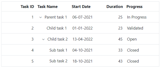
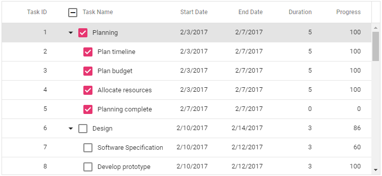
Columns define the schema of data source in Blazor Tree Grid component. It supports formatting, column definitions, freezing columns, column spanning, text wrapping, column chooser, column menu, and other important features.

Define columns
You can define the needed columns explicitly in a Blazor Tree Grid. You can also enhance the appearance of columns by setting the header text, text alignment, cell value format, and width.
Auto size
Users can interactively auto size column width to show its full content by double clicking on column borders. Blazor Tree Grid also supports triggering auto sizing to the required columns programmatically.
Cell styling
Blazor Tree Grid supports customization of cell styles programmatically or by using CSS.
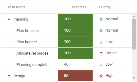

Text wrap
Wraps the Blazor Tree Grid cell text to the next line when it is too large to fit a cell. Users can wrap the header or content cell`s text by setting the available wrap mode options.
Column chooser
The column chooser provides a list of column names paired with check boxes that allows the user to toggle visibility on the fly. This helps the users to control the column visibility through an interactive UI.


Reorder
Reorder Blazor Tree Grid columns either through user interaction or programmatically. Simply dragging a column header to the desired column position will reorder the columns of a Tree Grid.
Resize
Column resize allows changing the column width on the fly by simply dragging the right corner of the column header. A scroll bar appears when the Tree Grid content width exceeds the element width.

Column menu
Allows performing various column-based actions with the help of Blazor Tree Grid column menu. Menu items can also be customized to list only the preferred actions.
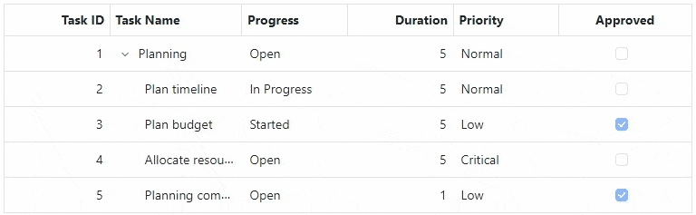
Checkbox Column
Users can select multiple records by using the checkbox column. It is also possible to select the records hierarchically using checkboxes. If a parent’s checkbox is checked, the child checkboxes also are checked.
 Load large amounts of data
55+ interactive demos
519K+ downloads
Load large amounts of data
55+ interactive demos
519K+ downloads

Blazor Components – 145+ UI and DataViz Components