Overview
The Blazor Scheduler component comes with a variety of flexible options to group resources based on different criteria. This includes grouping appointments based on resources, grouping resources based on dates, and timeline scheduling. Also, the data for resources bind with Scheduler either as a local collection or URL retrieving data from remote data services.
Compact layout
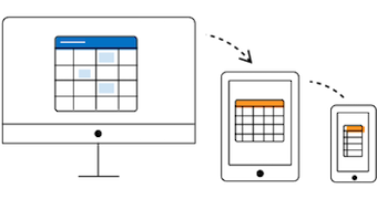
- Our Blazor Scheduler component arrives with a new compact layout for displaying resources and their relevant events on a mobile screen.
- This unique layout brings clear visibility of the resource events by displaying a single resource at a time.

Resource grouping
The Blazor Scheduler component supports four different types of grouping: horizontal, timeline, date-based, and hierarchical (one-to-one).
Horizontal grouping
Group the resources horizontally with a time axis displaying at the left extreme, common for all other resources. Display the appointments of each individual resource in its underlying time slots.
Timeline grouping
Display the resources as rows in a hierarchical tree structure based on the grouping levels. Arrange the appointments of a resource horizontally in its appropriate row, against the horizontal time axis.
Group by date
Group the resources under each date column, whereas each date column will have the underlying sub columns to display those resources.
Hierarchical grouping
This feature maps every end-level child resource to each of its top-level parents, thus allowing the one-to-one grouping model.
Shared events
Multiple resources can share the same appointment, thus allowing the action made on it to reflect on all other shared instances simultaneously.
Different working days for resources
Options exist to set different working days and working hours for each resource.
Resource header customization
Enhance the look and feel of the resource header cells by adding text, images, or CSS styles. In addition, you can display customized tooltips with resource information while hovering over the resource header cells.
Add and remove resources
Built-in scheduler methods are available for adding or removing resources dynamically on a scheduler. You can specify the index position, where the add or remove actions are to take place.

