Trusted by the world’s leading companies

Overview
The Scheduler control for JSP is an event calendar that facilitates almost all the basic Outlook and Google Calendar features, allowing the user to plan and manage appointments and time efficiently.
Orientation
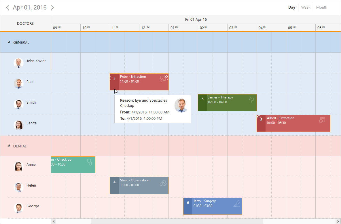
The schedule control is available with two types of orientation: vertical and horizontal. It is rendered in vertical by default. The time cells are rendered horizontally in the horizontal orientation and the same are rendered vertically in vertical orientation.
Data Binding
The scheduler control has integrated support for Knockout and Angular data binding. Angular directives are also supported. Data binds seamlessly with various data sources such as JSON, RESTful and WCF services and so on.
Time Mode
The schedule control supports both 12-hour and 24-hour time formats.

Business Hours
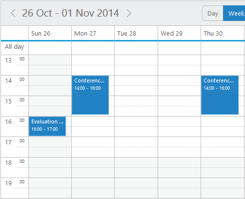
The schedule control’s view can be easily customized to display specific start and end hours.
Quick Appointment Window
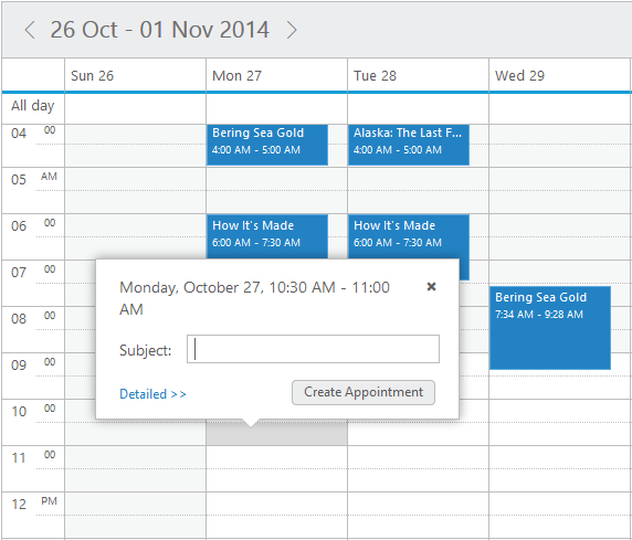
The quick appointment window lets your end users create an appointment with just a single click. Users are prompted for the appointment subject and use the default duration of the selected cell.
Recurrence
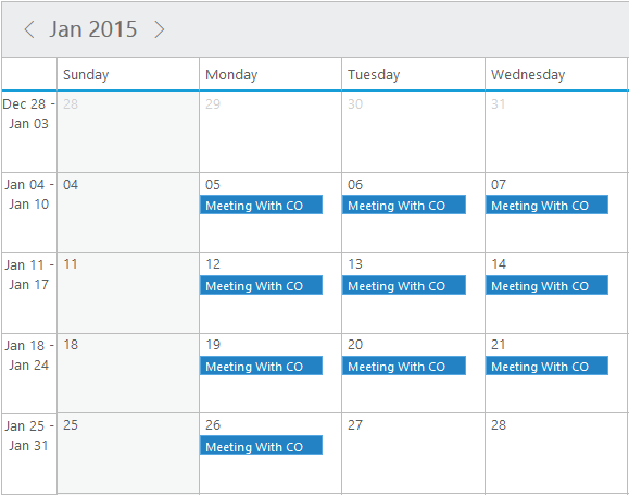
The recurrence option plays a vital role within the schedule control, enabling appointments to be repeated on a daily, weekly, monthly, or yearly basis.
Appointment Template
The appointment template can be customized to add any kind of text, image, or style.

Time Indicator
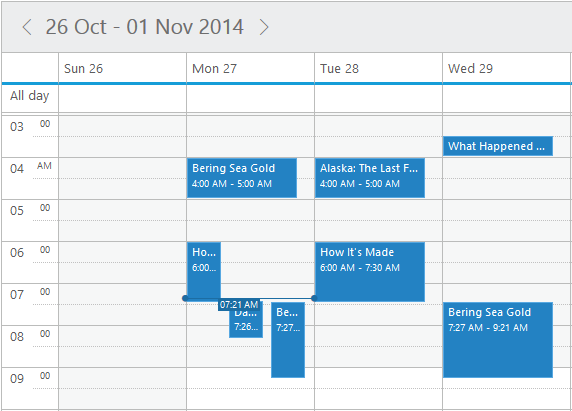
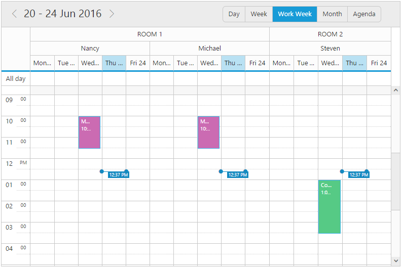
The current time can be indicated on the scheduler UI across the current date column. This allows users to easily identify the current date and time on the schedule. In cases of multiple resources, multiple time indicators will be displayed.
Localization
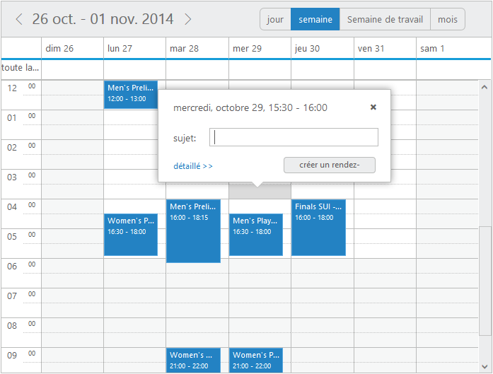
Built-in localization support allows the JSP scheduler to localize all the static text and date content to any desired language.
Multiple Resources with Grouping
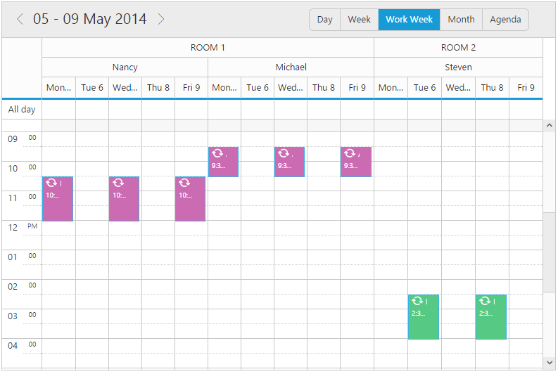
This feature allows users to group various resources at different levels. With this feature enabled, users are able to add the same appointment for multiple resources simultaneously.
Context Menu
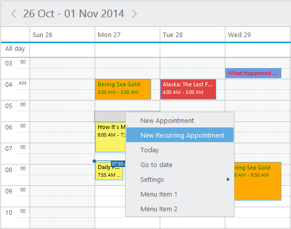
The schedule control has a context menu with default options to manipulate (add/edit/delete) appointments, change other settings like switching between the current views and time mode, and add custom menu options.
Appointment Categorize
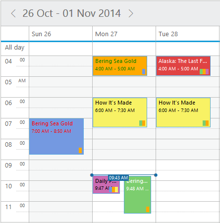
The appointment categorize option allows the user to differentiate each appointment type by its color. It has been provided with complete customization options. Appointments can be categorized either through a context menu option or through the normal appointment window with categorize settings. The option also extends to the level of applying multiple categories to the same appointment.
Appointment Search
Users can search appointments based on subject, description, start date, and end date. The resulting appointments can be obtained and displayed either in a grid or any internal processing.


Print support provides two options: print the complete schedule along with its background color or print specific appointments.
Export Appointments
Schedule appointments can be exported in .ics, .pdf, and .xls format files.

Import Appointments
ICS files generated from any calendar like Outlook, Google, and others can be easily imported into the schedule control.
Custom Date Rendering
A user-specific date collection can be displayed alone on the schedule, which can be a periodic date range or different date collections.

Cell Height and Width
The height and width of the cells within the schedule control can now be customized.
Date Format
The date format can be easily customized and the scheduler is allowed to accept any of the standard date formats.

Minimum and Maximum Date
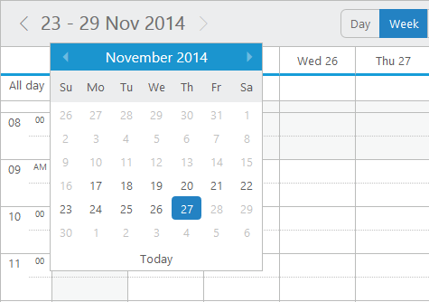
The schedule control supports limiting date ranges. MinDate and MaxDate will define the date range available to the schedule. No navigation will be allowed outside of that range.
Adaptive Rendering
The Scheduler user interface adapts automatically to mobile and desktop devices. This helps the application scale elegantly across all form factors without any additional effort.


Appointment Priority
The priority feature allows users to prioritize appointments by depicting them with individual icons or images. Users can also customize the priority values and icons using a template.
Appointment Inline Delete
Appointments can be deleted inline. When hovering over an appointment, a button will appear, and clicking the “X” button on the appointment will delete it.


Agenda View
The agenda view displays the list of appointments in a grid-like view, categorized based on the dates and resource levels. Edit and delete options have also been included, which show up when the mouse hovers across the events. By default, seven days are displayed in agenda view and the number of days to be displayed in it can also be customized.
Appointments Tooltip Template
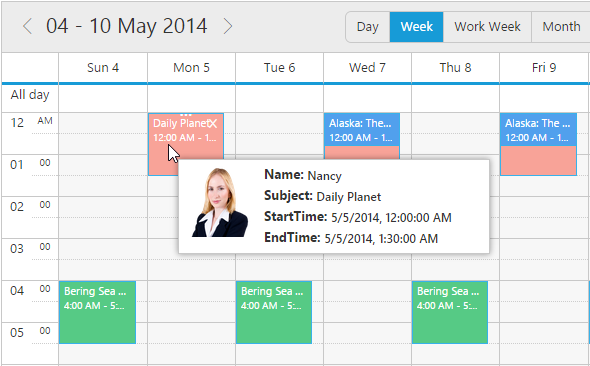
The tooltip feature allows users to display schedule appointment details on mouseover. It can be customized using a template.

First Day of the Week
This feature allows the scheduler to modify the first day of the week and workweek. In the week and workweek view, the next consecutive seven or five days from the specified start day will be displayed on the scheduler.
Workweek Customization
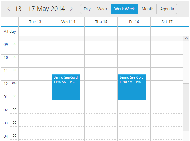
This feature allows users to customize the display of the workweek view with a user-defined days collection. For example, it is possible to display the workweek view starting Tuesday and display up to Saturday.

Blocking Time Intervals
Time slots in schedules can be blocked so that restrictions can be set on those time slots and also on appointments that lie in that blocked range. Blocked appointments will be made read-only and CRUD operations on them will be prevented.
Hide Weekend Days
Weekend days can be hidden from the schedule to display only the working days on all views.

Add and Edit Appointments Inline
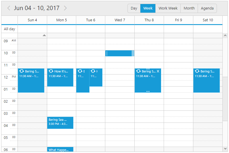
With this feature enabled, users can create and edit appointments inline through a single click on the schedule cells or on the existing appointment’s subject. Pressing Enter after the new subject text is typed in the inline text box will update and save the appointment appropriately.
60+ JSP CONTROLS
Awards
Greatness—it’s one thing to say you have it, but it means more when others recognize it. Syncfusion® is proud to hold the following industry awards.
