Trusted by the world’s leading companies

Overview
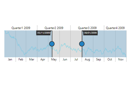
The JSP Range Selector control provides an intuitive interface for selecting a small range from a larger collection. It is commonly used in financial dashboards to filter a date range for data that needs to be visualized.
Data types
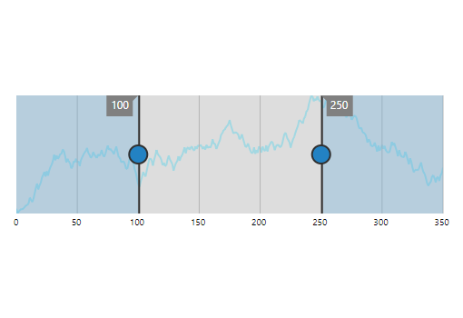
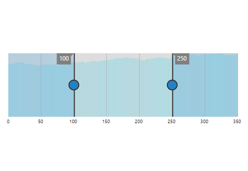
Plot any type of data in the range selector using different value types like numeric and date-time.
Chart types
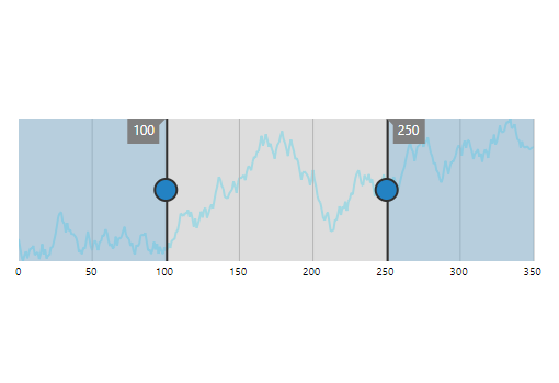
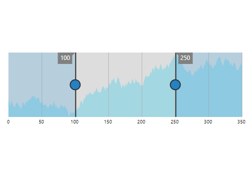
Plot data in the range selector with different chart types like line, area, and step line.
Binding selected data
Bind selected data from the JSP Range Selector control to any other control using built-in events.
Range selection
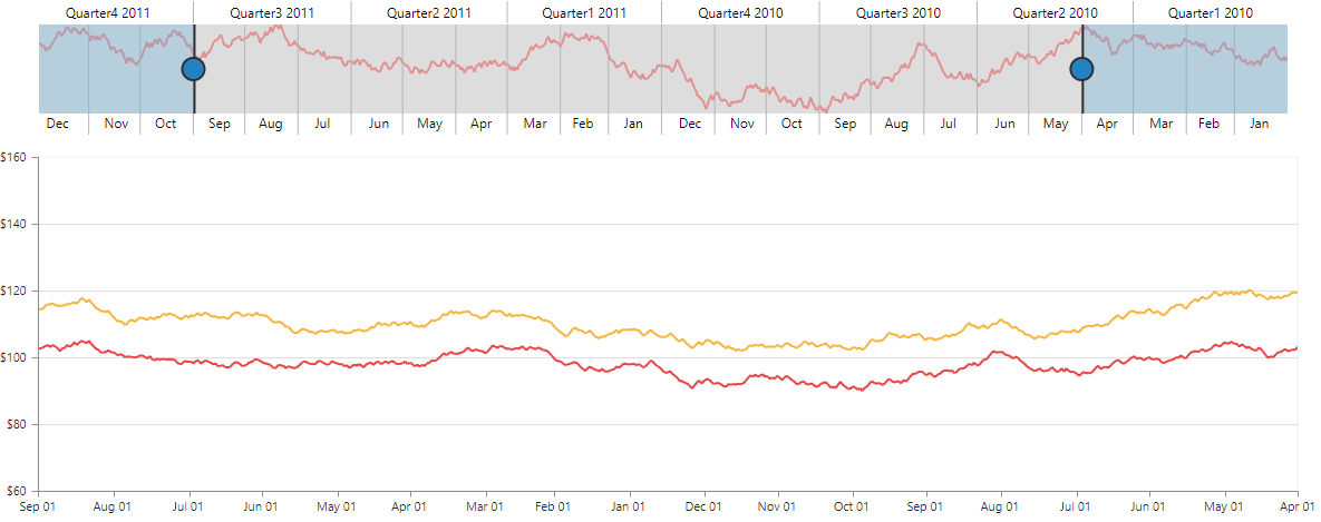
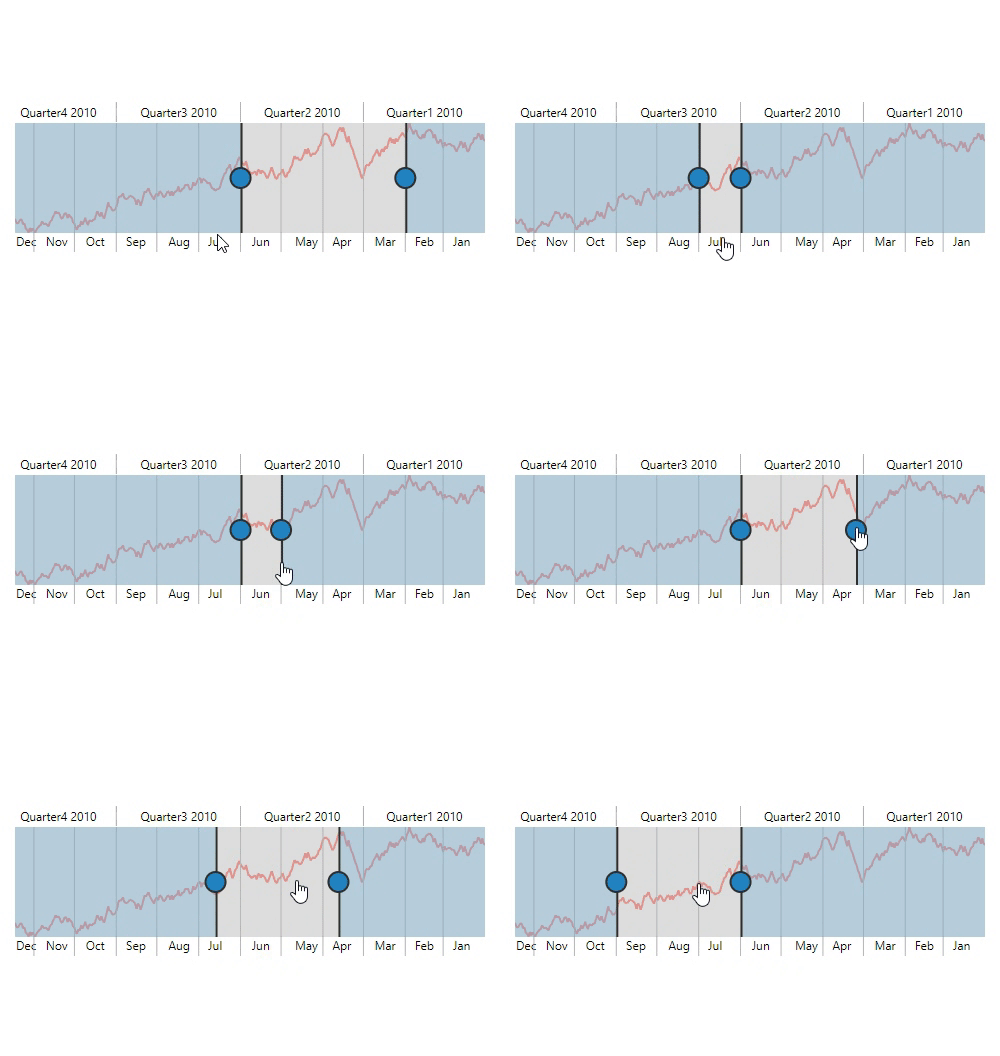
The range selector control provides the following ways to select a range.
- Select a range through labels.
- Drag the left and right thumbs.
- Drag the selected range to maintain the same delta.
Customization
All the elements of the JSP Range Selector control are highly customizable with built-in APIs.
Labels
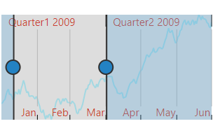
Customize the size, color, font family, font attribute, and alignment of the labels using built-in APIs.
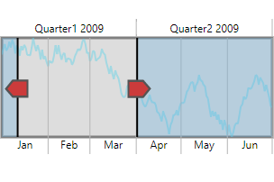
Thumbs
Customize the appearance of the left and right thumbs using built-in APIs.
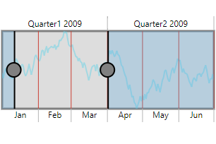
Gridlines
Customize the color, stroke width, and visibility of the major and minor gridlines using built-in APIs.
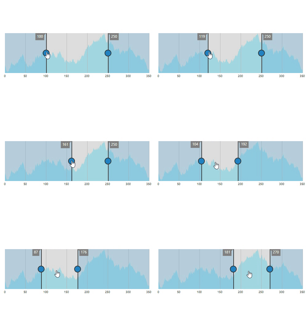
Tooltip
Tooltip in the JSP Range Selector control displays the start and end values of a selected range, allowing users to easily select the required range.
RTL
The range selector supports right-to-left rendering and allows the series and scale direction to be displayed from right to left. This improves the user experience and accessibility of RTL languages.

Touch and responsive support
The interactive JSP Range Selector control also supports touch interactions.

Touch support
All the features of the range selector will work on touch devices with zero configuration.

Responsive
You can view range selector on various devices. You can also hide specific elements in the range selector for particular screen sizes by making very minimal changes to the events.

Cross-browser support
You can render the JSP Range Selector control in all the modern browsers.
60+ JSP CONTROLS
Awards
Greatness—it’s one thing to say you have it, but it means more when others recognize it. Syncfusion® is proud to hold the following industry awards.
