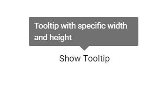
The Vue Tooltip component is a pop-up that shows information or a message when users hover, click, focus on or touch an image, button, anchor tag, etc. The information displayed in the Tooltip can include simple text, images, hyperlinks, or custom templates.
The Vue Tooltip has twelve different options to position it around the target. You can configure the Tooltip to follow the mouse or not. To position the tip pointer, there are four options: Right, left, top, and bottom.
The tooltip intelligently auto positions its content and arrows. It also fits in the best location of the view port or container.
Load content dynamically to Tooltip on demand using the AJAX callback.
Show or hide completely customizable animations in the Vue Tooltip. You can include animation effect, duration, and delay. You can also control transition effects at the application level.
The tooltip content can be loaded with HTML elements, images, hyperlinks, iframe, videos, maps, etc. Users can also add a title to the content.
Show or hide an Vue Tooltip using hover, click, double-click, focus, and custom modes. Use the custom mode to show or hide a tooltip.
Customize the offset position of a tooltip from a target element.
Prevent the tooltip from hiding after a short duration using the sticky mode.
Show the Vue Tooltip on hover, click, touch, and focus on any element.
The Vue Tooltip can be fully customized using CSS styles.
Both automatic and custom pixel values can be used to set tooltip’s height and width.


When the tooltip’s size exceeds the container space, the scroll mode displays an HTML scroll bar.
Vue Tooltip is shipped with several built-in themes: Material, Bootstrap, Fabric (Office 365), Tailwind CSS, and high contrast. Users can customize any one of these built-in themes or create new themes to achieve their own desired look and feel. It is achieved either by simply overriding SASS variables or using our Theme Studio application with ease.


Users just need a message and target element to make the JS Tooltip fully functional. It will work out of the box. However, it provides many options to change the position, animation, and appearance.
Best user experience on touch devices such as phones and tablets by recognizing touch gestures.

Vue Tooltip supports both SVG and canvas elements. Users can directly attach tooltips to HTML5 <svg> or <canvas> elements to show data visualization elements.
The Tooltip component is also available for our Blazor, React, Angular, and JavaScript frameworks. Check out the different Tooltip platforms from these links:
Fully supports WAI-ARIA accessibility to make it the component accessible to screen readers and assistive devices.
Follows the WCAG 2.0 standard, in the design of UI element visuals such as foreground color, background color, line spacing, text, and images.
Follows WAI-ARIA best practices for implementing keyboard interaction.
In Tooltip, you have control over all the UI elements and its behaviors. It provides the best user experience through a rich set of developer-friendly APIs.
Easily get started with the Vue Tooltip using a few simple lines of Vue code, as demonstrated below. Also explore our Vue Tooltip Example that shows you how to render and configure a Tooltip in Vue.
- <template>
- <div id="app">
- <ejs-tooltip ref="tooltip" content='Tooltip content' >
- <span>Show Tooltip</span>
- </ejs-tooltip>
- </div>
- </template>
- <script>
- import Vue from "vue";
- import { TooltipPlugin } from "@syncfusion/ej2-vue-popups";
- Vue.use(TooltipPlugin);
-
- export default {
- data() {
- return { };
- }
- }
- </script>
Syncfusion Vue ToolTip provides the following features:
We do not sell the Vue Tooltip separately. It is only available for purchase as part of the Syncfusion team license. This contains over 1,900 components and frameworks, including the Vue Tooltip. The price of the team license starts at $395 per month for 5 developers, and includes support and updates until the subscription expires. In addition, we might offer discounts based on currently active promotions. Please contact our product specialists today to see if you qualify for any additional discounts.
You can find our Vue Tooltip demo, which demonstrates how to render and configure the Tooltip.
No, our 1,900+ components and frameworks for web, mobile, and desktop, including our Vue Tooltip, are not sold individually. They are only available as part of a team license. However, we have competitively priced the product, so it only costs a little bit more than what some other vendors charge for their Tooltip component alone. We have also found that, in our experience, our customers usually start off using one of our products and then expand to several products quickly, so we felt it was best to offer all 1,900+ components and frameworks for a subscription fee that starts at $395 per month for a team of 5 developers. Additionally, we might be able to offer discounts based on currently active promotions. Please contact our product specialists today to see if you qualify for any additional discounts.
No, this is a commercial product and requires a paid license. However, a free community license is also available for companies and individuals whose organizations have less than $1 million USD in annual gross revenue, 5 or fewer developers, and 10 or fewer total employees.
A good place to start would be our comprehensive getting started documentation.
 Documentation
Greatness—it’s one thing to say you have it, but it means more when others recognize it. Syncfusion® is proud to hold the following industry awards.