


 Go Back

Watch video
Learn how easily you can create a chart component of Syncfusion in the react application using the create-react-app command. This video explains how to configure a few of the control's basic features like adding a title, legend, data label, and tooltip to the chart.
Download Example: Getting Started with React Charts

Watch video
Learn how easily you can create an accumulation chart component of Syncfusion in the react application. This video explains how to create pie, doughnut, pyramid, and funnel charts. Also, you will learn how to add a title, data label, legend, and tooltip to these charts.
Download Example: Getting Started with React Circular and Triangular Charts

Watch video
Learn how easily you can create a financial chart component of Syncfusion in the react application. This video explains how to create Hilo, Hilo Open Close, and Candle charts. Also, you will learn how to add a title, tooltip, and crosshair to these charts.
Download Example: Getting Started with React Financial Charts

Watch video
Learn how easily you can create polar and radar charts of syncfusion in a react application. This video explains how to add a title, marker, tooltip, and its various draw types to the Polar and Radar charts.
Download Example: Getting Started with React Polar and Radar Charts

Watch video
Learn how easily you can customize the category axis of Syncfusion React Charts. This video explains how to add a title, custom range, and intervals to the chart's category axis.
Download Example: Customize the Category Axis in React Charts

Watch video
Learn how easily you can customize the logarithmic axis of Syncfusion React charts. This video explains how to add a title, custom range, intervals, and log base value to the logarithmic axis in React charts.
Download Example: Customize the Logarithmic Axis in React Charts

Watch video
Learn how easily you can customize the date-time axis of Syncfusion React charts. This video explains how to customize the minimum and maximum axis range, interval, interval type, label format, title, range padding, and non-linear intervals to the chart's date-time axis.
Download Example: Customize the Date-Time Axis in React Charts
Watch video
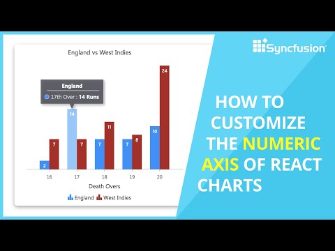
Learn how easily you can customize the numeric axis of Syncfusion React charts. This video explains how to customize the minimum and maximum axis range, interval, label format, title, range padding, and grouping separator to the chart's numeric axis.
Download Example: Customize the Numeric Axis in React Charts

Watch video
Learn how easily you can handle the zoom and pan behavior of Syncfusion React charts when working with many data points. This video explains how to work with different zooming options and modes, scroll the zoom area, and adjust its axis intervals.
Download Example: Zooming and Panning Options in React Charts>

Watch video
Learn how easily you can enable and customize the tooltip in the Syncfusion React charts. This video explains how to format the tooltip content and render an HTML template in the tooltip.
Download Example: Show Informative Tooltips in React Charts

Watch video
Learn how easily you can enable crosshairs and trackballs in Syncfusion React Charts. This video explains how to enable and customize the crosshair tooltip.
Download Example: Enable Crosshairs and Trackball in React Charts

Watch video
Learn how easily you can add an annotation in Syncfusion React Charts. This video explains how to position the annotation based on a chart or series region, with the coordination unit set to pixel or point.
Download Example: Add Annotations to React Charts

Watch video
Learn how easily you can arrange axis labels smartly in Syncfusion React Charts when they overlap with each other. This video explains how to adjust, position, and customize labels, use line breaks, and add multi-level labels.
Download Example: Customize Axis Labels in React Charts

Watch video
Learn how easily you can customize the Syncfusion React Charts axes. This video explains how to display a title, multiple axes, and an inversed axis, as well as how to set axis crossing, an opposed position, tick lines, and gridlines.
Download Example: Customize Axes in React Charts

Watch video
Learn how easily you can add legends to Syncfusion React Charts. This video explains how to align the legends, customize the legends and their icon sizes, select a series on clicking the legends, and enable animations.
Download Example: Add Legends to React Charts

Watch video
Learn how to make the Syncfusion React Chart component interactive by enabling selection. This video demonstrates various supported selection methods, including point selection, series selection, cluster selection, and region selection.

Watch video
Learn how to export charts in different formats. The export formats supported by Syncfusion React Charts are PDF, JPEG, PNG, SVG, XLSX, and CSV.

Watch video
Learn how to bind remote data using the Syncfusion Data Manager and customize the empty points in Syncfusion React Charts.