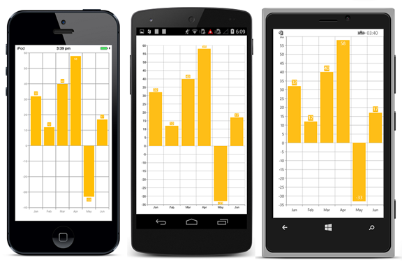
Syncfusion’s upcoming release will feature a number of new and improved features. The SfChart for Xamarin, iOS, and Android includes several new features and enhancements, including:
· User interactivity
· Bubble series
· Auto scrolling
· Data marker label position
User interactivity
SfChart now has the capability to respond to user interactions through the recently added functionalities of Point Selection, Zooming, and Panning.
Data point selection:
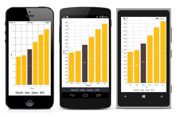
The data point selection feature helps the user to highlight a data point in a series by tapping on it. This feature has been enabled for all type of series like Line, Spline, Area, Bar, Column, Pie, Doughut, OHLC, Candle, and more.
Zooming and panning:
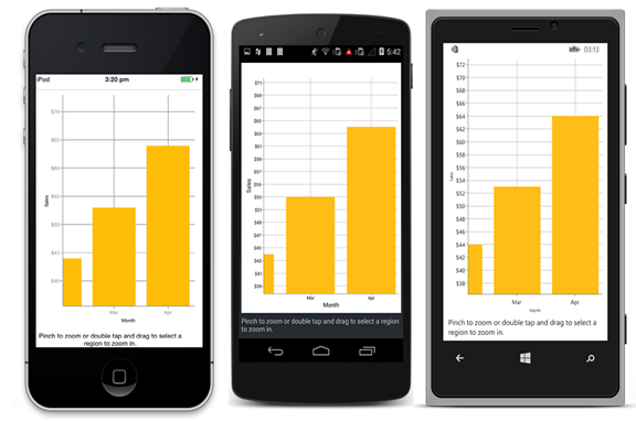
The zooming and panning feature helps the user get a closer look at the data points in a specific region of the chart area, which can be filled with a huge number of data points.
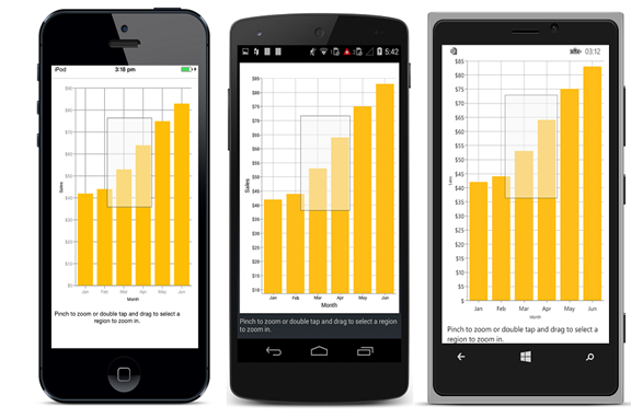
Zooming in and out can be achieved by pinching. The user can reset the zoom by double tapping on the chart.
Another way of zooming the chart is by selecting a particular region of interest. This selected region will be enlarged. This can be achieved by double tapping and dragging to form a rectangular selection without lifting the finger.
Bubble Series
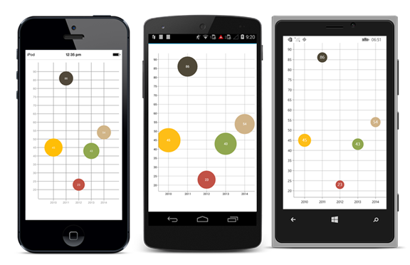
A bubble chart is used to visualize a data set in two dimensions with the ability to visually depict a comparative value. It has three sets of data, the first two visualized as coordinates and the third as size. Different bubble sizes are useful to visually emphasize specific values, particularly when comparing the data sets to one another.
Positioning Data Marker Label
You can now align data labels relative to data points. You can position the labels inside, outside, or center to data points by choosing any one of the alignment options like Auto, Inner, Outer, and Center. Auto is the default value.
Auto Scrolling
Auto scrolling allows the chart to automatically scroll to display the fixed range of current data points during real time updates. You can also pan to view previous data points.
