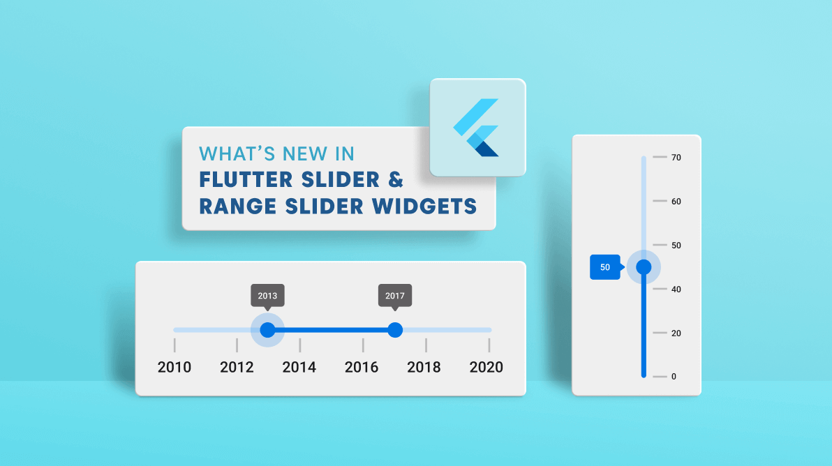
We are updating our Syncfusion Flutter Sliders package by adding new features in each release to make the widgets suitable for all kinds of uses. The 2021 Volume 3 release brings these updates to our Flutter Slider and Range Slider widgets:
- Drag mode in Flutter Range Slider
- Inverse support in Flutter Vertical Slider
- Inverse support in Flutter Vertical Range Slider
Drag mode in Flutter Range Slider
Various drag mode options have been provided in our Flutter Range Slider to control thumb dragging with the dragMode property. The available drag modes are:
- On thumb
- Between thumbs
- Both thumbs
Refer to the following code.
SfRangeValues _values = const SfRangeValues(40.0, 60.0);

@override
Widget build(BuildContext context) {
  return Scaffold(
    appBar: AppBar(title: const Text('Drag mode range slider')),
    body: SfRangeSlider(
      min: 0,
      max: 100,
      // Set the drag mode.
      dragMode: SliderDragMode.onThumb,
      interval: 20,
      values: _values,
      showLabels: true,
      showTicks: true,
      onChanged: (SfRangeValues newValues) {
        setState(() {
          _values = newValues;
        });
      },
    ),
  );
}
On thumb
When the dragMode is set to SliderDragMode.onThumb, you can move only the individual thumbs by separately dragging them like in the following GIF image.

Between thumbs
When the dragMode is set to SliderDragMode.betweenThumbs, we can move both the thumbs at the same time by dragging in the area between the start and end thumbs.

Both thumbs
When the dragMode is set to SliderDragMode.both, we can move an individual thumb, and also both the thumbs at the same time by dragging in the area between the start and end thumbs.

Note: For more details, check out the drag modes in the Flutter Range Slider demo.
Inversed Flutter Vertical Slider
From the 2021 Volume 3 onward, you can inverse the Flutter Vertical Slider widget with the isInversed property.
Refer to the following code example.
double _value = 40.0;

@override
Widget build(BuildContext context) {
  return Scaffold(
    appBar: AppBar(title: const Text('Inversed Vertical Slider')),
    body: SfSlider.vertical(
      min: 0,
      max: 100,
      value: _value,
      interval: 20,
      // Set the inversed property.
      isInversed: true,
      showTicks: true,
      showLabels: true,
      onChanged: (dynamic newValue) {
        setState(() {
          _value = newValue;
        });
      },
    ),
  );
}
| Vertical Slider | Inversed Vertical Slider |
 |
 |
Note: For more details, interact with our live demo for inversing the Flutter Vertical Slider.
Inversed Flutter Vertical Range Slider
Similar to the Flutter Slider widget, you can also inverse the Vertical Range Slider by setting the isInversed property to true.
Refer to the following code example.
SfRangeValues _values = SfRangeValues(20.0, 60.0);

@override
Widget build(BuildContext context) {
  return Scaffold(
    body:  SfRangeSlider.vertical(
      min: 0,
      max: 100,
      values: _values,
      interval: 20,
      // Set the inversed property
      isInversed: true,
      showTicks: true,
      showLabels: true,
      onChanged: (SfRangeValues newValues) {
        setState(() {
          _values = newValues;
        });
      },
    ),
  );
}
| Vertical Range Slider | Inversed Vertical Range Slider |
 |
 |
Note: For more details, interact with our live demo for inversing the Flutter Vertical Range Slider.
How to inverse the horizontal sliders
To inverse the horizontal sliders, you can use the textDirection property in the Directionality widget.
For more details, refer to the documentation:
Conclusion
In this blog post, we have seen the new updates to our Flutter Slider and Range Slider widgets rolled out in the 2021 Volume 3 release. Information on these features is also available in our Release Notes and What’s New pages. Try out these new features and leave your feedback in the comments section below!
For current customers, the newest version of Essential Studio® is available for download from the License and Downloads page. If you are not yet a Syncfusion customer, you can try our 30-day free trial to check out the available features.
Also, you can contact us through our support forums, Direct-Trac, or feedback portal. We are always happy to assist you!


