The Syncfusion Blazor components library offers over 80 responsive and lightweight UI components for building modern web apps. More exciting new features have been added in the Essential Studio® 2023 Volume 1 release. We’ll be taking a look at them in this blog.
Preview to production-ready components
The following Blazor components have been developed to meet industry standards and are now ready for production.
CRG–improvement
We have updated the CRG bundled resources delivery process. Now, the selected component’s resources download links will be shared via email instead of directly downloading them from the application.
Word Processor
The Blazor Word Processor component, also known as the document editor, has the following new feature enhancements.
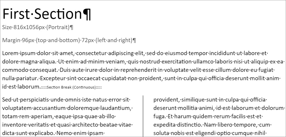
Continuous section break
This feature allows users to create a new section while staying on the same page in the Blazor Word Processor component. This is particularly useful when users want to adjust the number of columns for specific content without initiating a new page.
Drag and drop the selected content
This feature allows users to drag and drop selected content from one place to another within a Word document.

Show or hide bookmarks
Now, you can show or hide the start and end of bookmarks in the Word Processor component. The control can display square brackets at the beginning and end of each bookmark.

Optimize SFDT file size
The SFDT file generated by the Word Processor is now optimized to reduce its size. All static keys are minified, and the final JSON string is compressed. This reduces the file size of the SFDT relative to a DOCX file, providing the following benefits:
- Quick file transfer between client and server through faster internet services.
- The new, optimized SFDT files require less storage space than the old SFDT files.
This feature also has a public API to switch between the old and new optimized SFDT format, allowing backward compatibility.
Note: For more details, refer to the Blazor Word Processor demos.
Gantt Chart
The Blazor Gantt Chart gains the following new features in this 2023 Volume 1 release.
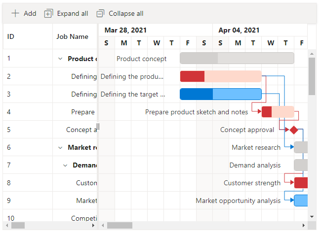
Critical path
This feature allows you to highlight a single task or a chain of linked tasks that directly impact the project’s end date. This feature gives users a visual representation of tasks critical to their project’s success.
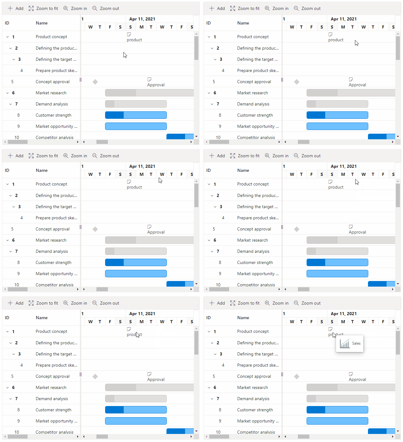
Template support for the timeline and indicator tooltips
Use the template support to display custom elements or content in the tooltips. This enables users to create more personalized and informative tooltips for their Gantt projects.
Improvements in custom adaptor
The custom adaptor feature has been improved to support sorting, filtering, and row dragging and dropping operations. This gives users greater control over their data and improves their project management experience.
Note: For more details, refer to the Blazor Gantt Chart demos.
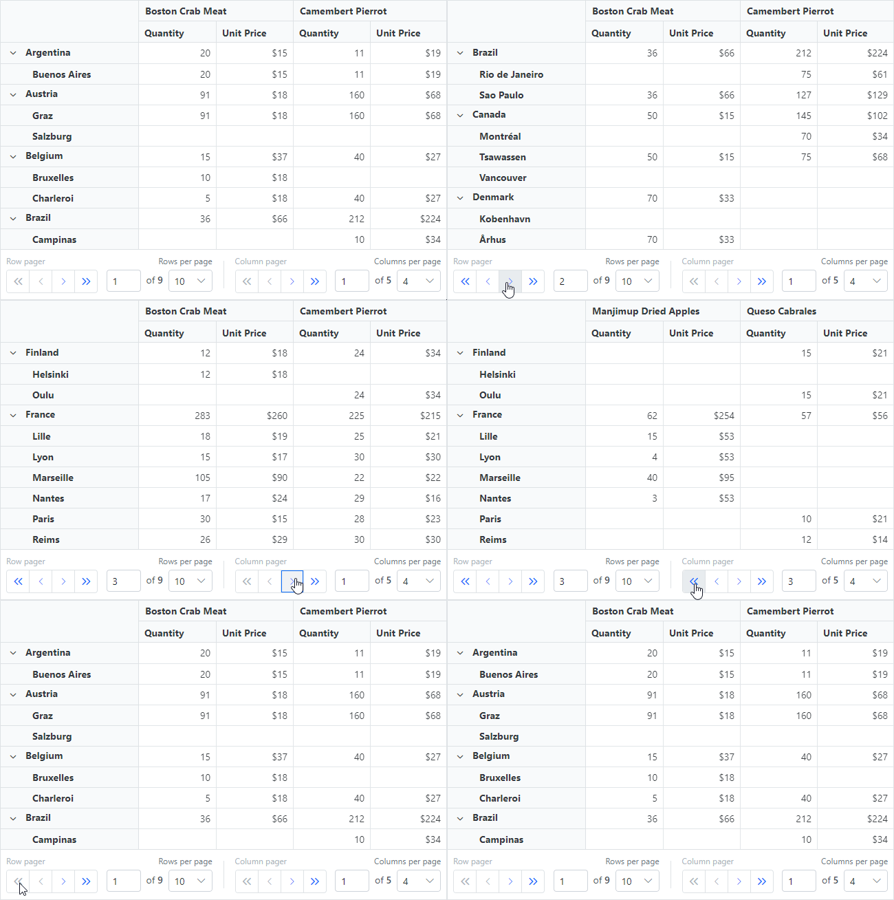
Paging and server-side engine support in the Blazor Pivot Table
The paging support allows users to break up and display a huge volume of data in pages. Thus, they improve the overall rendering performance of the Blazor Pivot Table. In addition, built-in navigation buttons are available to navigate among pages and change the page size at runtime.
Using server-side engine support, pivot operations such as aggregation, filtering, sorting, and grouping can be performed on a separate server. With this method, the cell information alone is sent to the Pivot Table’s viewport via the web service. This will reduce the network traffic and improve the rendering performance, especially when used in a Blazor WebAssembly app.
Note: For more details, refer to the Blazor Pivot Table demos.
Virtual scrolling in dropdown components
The Blazor Dropdown List, ComboBox, and AutoComplete components now support virtual scrolling functionality. This makes the scrolling experience smoother and more responsive, providing an enhanced user experience when navigating through a huge list of items.
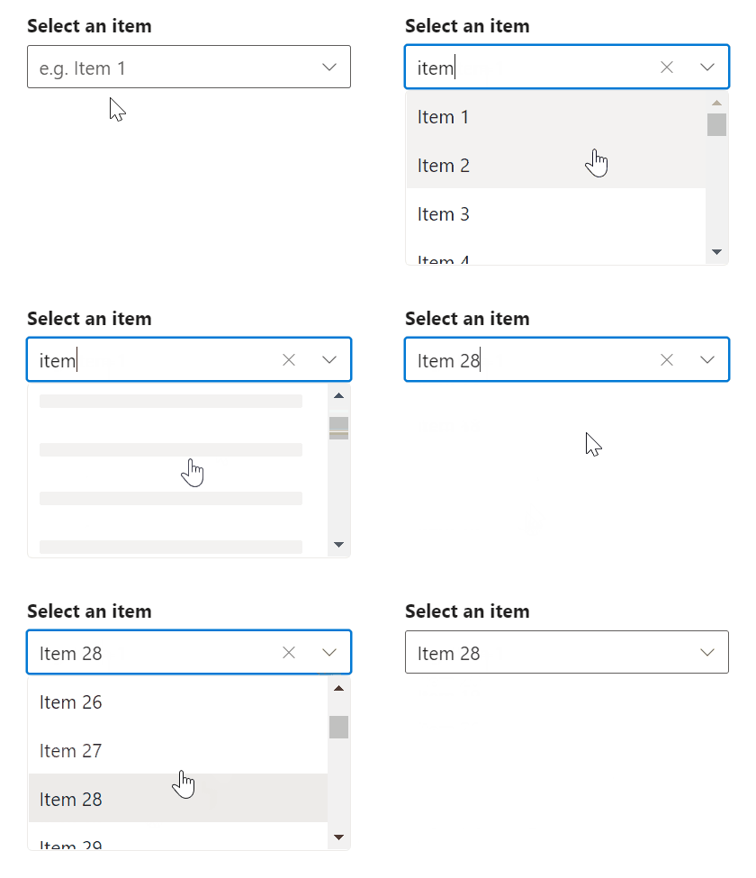
Note: For more details, refer to the Blazor Dropdown List, ComboBox, and AutoComplete components demos.
Blazor Charts
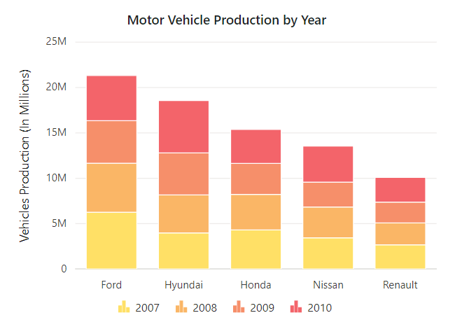
Sorting
Now, the Blazor Charts component enables users to sort data points in ascending or descending order. Also, the chart data can be sorted based on any field from the mapped data source.
Tooltip enhancements
We have improved the chart tooltip’s performance while handling a huge volume of data and when live updates are enabled in both server and WebAssembly apps.
Note: For more details, refer to the Blazor Charts demos.
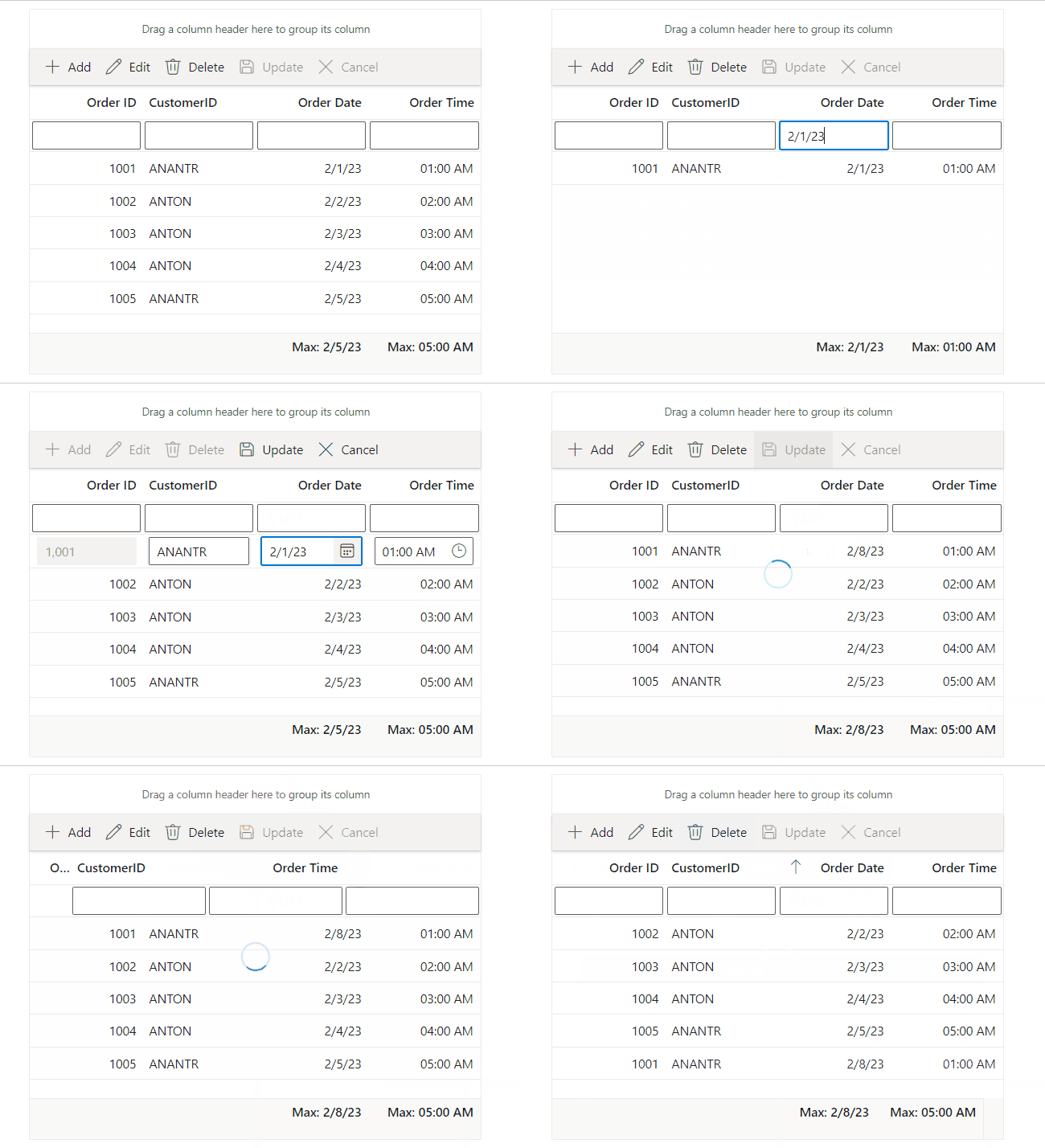
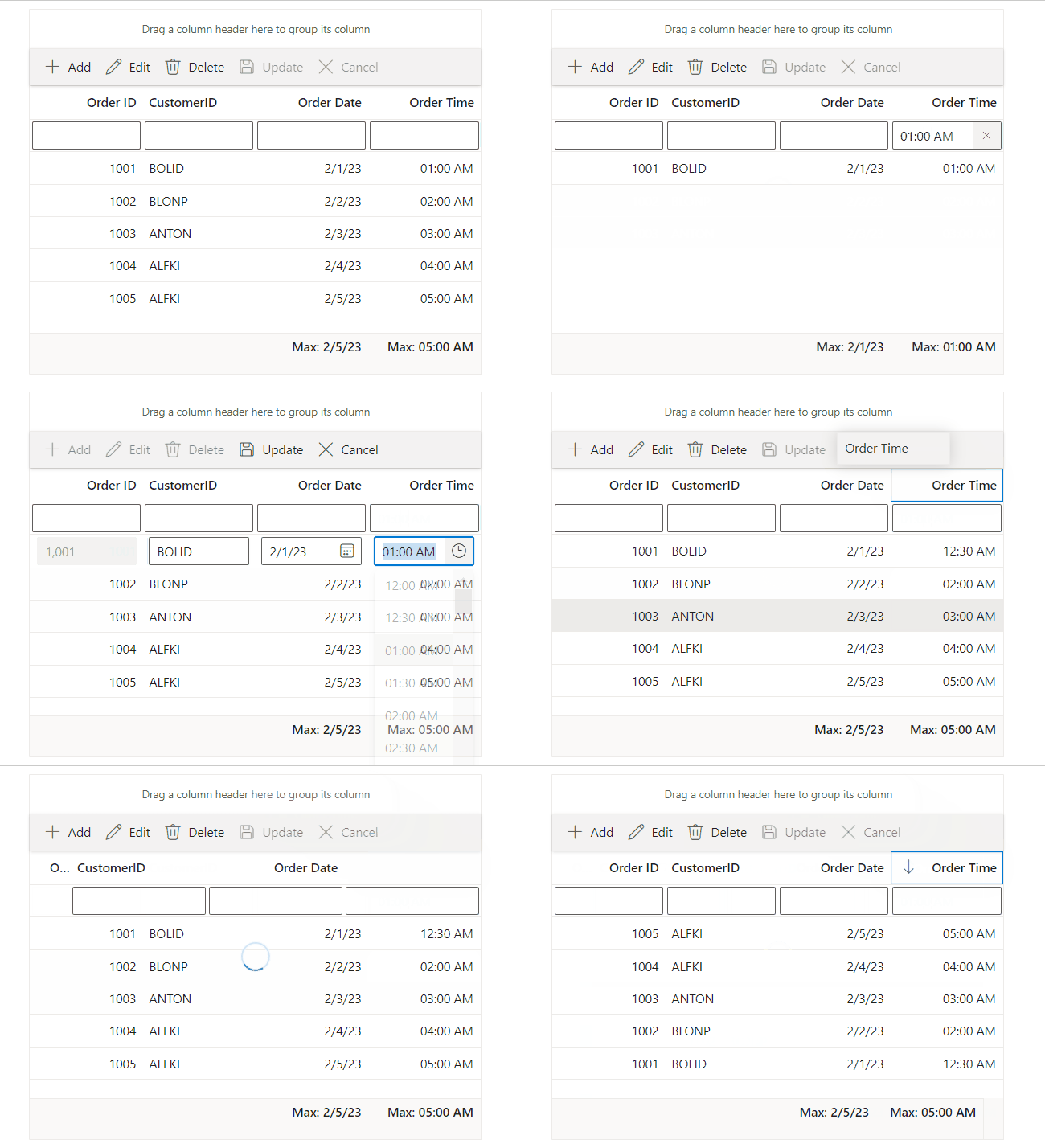
DateOnly and TimeOnly support in Blazor DataGrid
The Blazor DataGrid allows users to bind and manage date and time-only values easily. Users can also perform various data operations such as sorting, filtering, grouping, searching, and CRUD (create, read, update, delete). To simplify things further, built-in DatePicker and TimePicker editor components are rendered for editing and filtering operations.
The Blazor DataGrid component provides support for the following new features, too:
- Frozen columns with a stacked header.
- Initial filtering when the DataGrid is bound with a stacked header.
- Keyboard navigation support for toolbar icons and a detail template.
- Column virtualization with right-to-left rendering support.
- Event support to access the header cell information.
Note: For more details, refer to the Blazor DataGrid demos.
Auto-scroll support for the nodes in Blazor Diagram
Now, the Blazor Diagram component has an auto-scrolling feature for whenever the node is moved beyond the diagram’s boundary. The node is always visible during dragging, resizing, and multiple-selection operations.
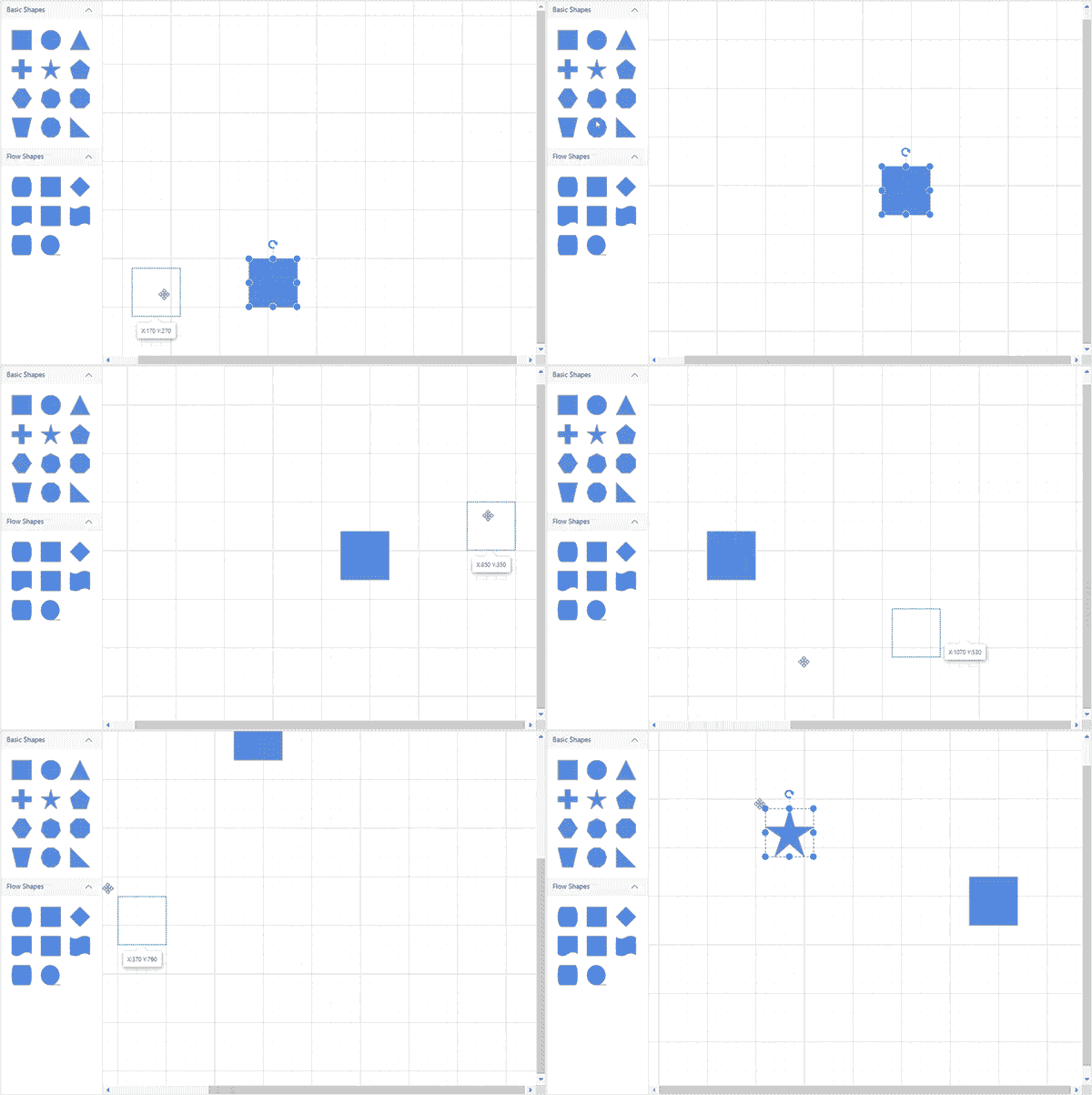
Other than this major update, you can also see the following new features in the Blazor Diagram component:
- Delete method to delete the diagram elements. When the diagram elements are not passed, the selected diagram elements will be deleted.
- Stack limit support to limit the history of entries stored on the undo or redo stack’s history list.
- Paste method with argument support to paste the diagram elements, which are clones of the existing elements. When the collection of diagram elements is passed, the passed items will be posted in the diagram. Otherwise, the cloned copy of elements from the internal clipboard will be pasted.
Note: For more details, refer to the Blazor Diagram component demos.
Upload large files in the Blazor File Upload component
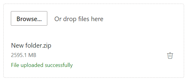
The Blazor File Upload component has been optimized to handle large files, specifically those of 2 GB or more. This enhances the user experience for those uploading and processing large files and makes the process more efficient.
Note: For more details, refer to the Blazor File Upload component demos.
Upload directory in Blazor File Manager
From the 2023 Volume 1 release on, you can upload a directory (folder) in the Blazor File Manager component. The directories can be uploaded through the toolbar or drag-and-drop actions. All the files and subdirectories are automatically included when we upload a directory. The feature is supported in physical, Node.js, Azure, and Amazon S3 providers.
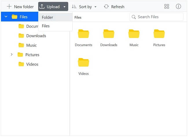
The Syncfusion Blazor Tooltip component has also been integrated with the File Manager component. This is achieved with a new Boolean property named ShowTooltip that controls the tooltips’ display for the File Manager toolbar, navigation pane, and large icons view items, with a default value of true.
Note: For more details, refer to the Blazor File Manager and Tooltip demos.
Enhancement in Blazor Rich Text Editor toolbar’s tooltip appearance
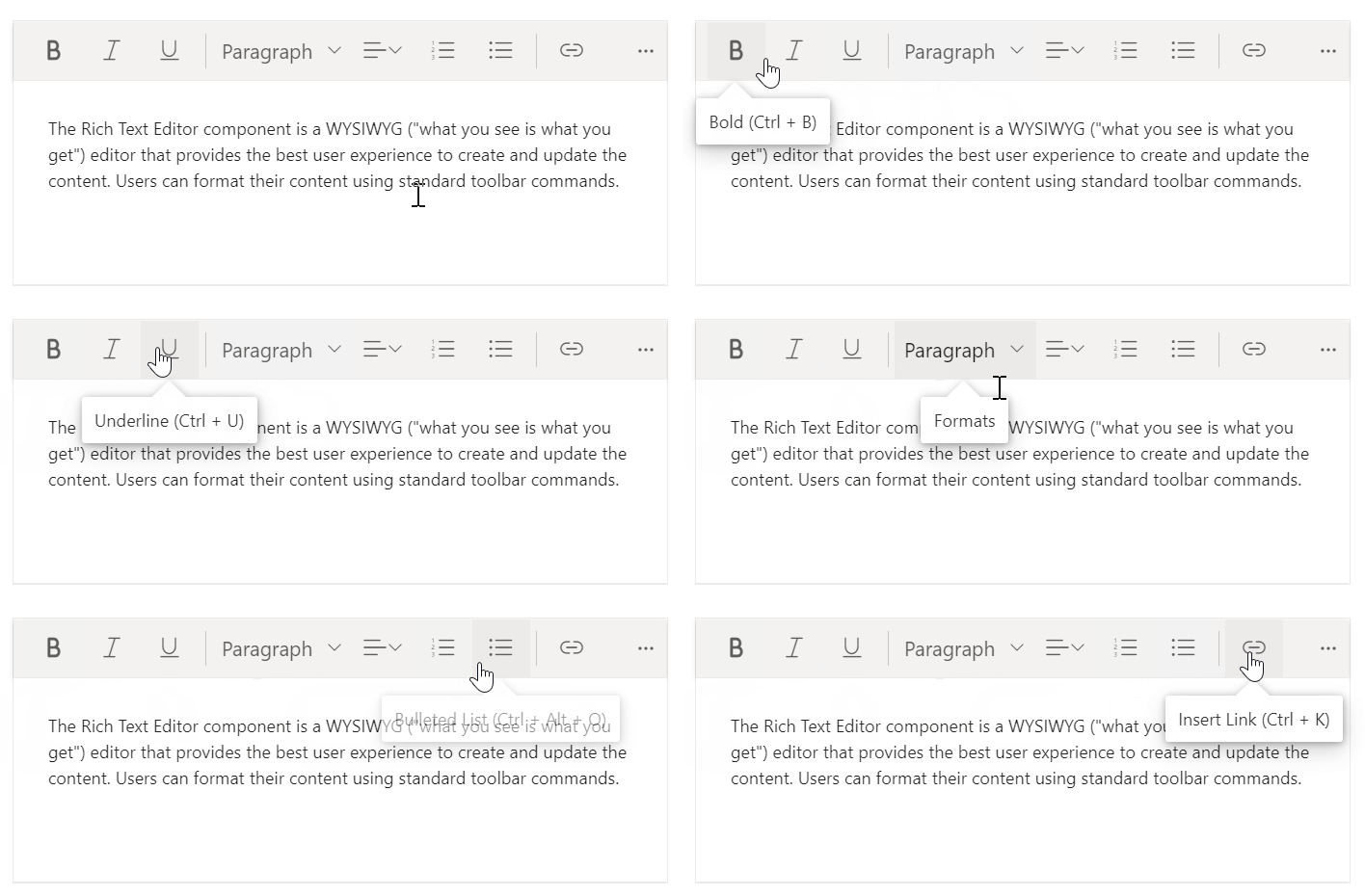
We have enhanced the appearance of the Blazor Rich Text Editor toolbar’s tooltips. These tooltips have been redesigned to display the keyboard shortcut information. Thus, it is easier for users to understand the functions of each toolbar item.
Note: For more details, refer to the Blazor Rich Text Editor demos.
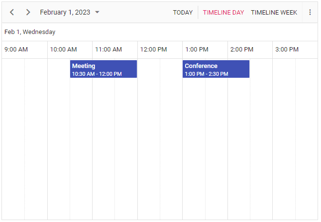
Timeline views without horizontal scroller in Blazor Scheduler
This feature allows users to see an overview of the schedule timeline without a horizontal scroller. This improves the usability and accessibility of the Blazor Scheduler component.
Note: For more details, refer to the Blazor Scheduler demos.
Reversible Range Slider
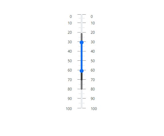
In the Blazor Range Slider, you can display the slide range in reverse order, i.e., from 100 to 0 or -100 to 0. With this feature, users can set a maximum value that is less than the minimum. This feature is available for all ranges and numeric sliders.
Note: For more details, refer to the Blazor Range Slider demos.
Row drag and drop with virtualization in Blazor TreeGrid
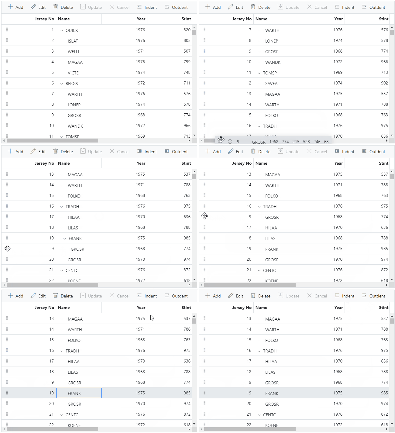
Users can reorder rows by dragging and dropping them when the row and column virtualization features are enabled in the Blazor TreeGrid component.
Note: For more details, refer to the Blazor TreeGrid demos.
Template support for the tooltip in Heatmap chart
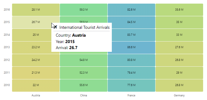
User-defined content can now be displayed in the Blazor Heatmap chart’s tooltip. It can include text, images, or any custom components.
Note: For more details, refer to the Blazor Heatmap chart demos.
Secondary progress bar customization
Now, you can customize the width and color of the secondary ProgressBar.

Note: Also, view the live demo for the Blazor ProgressBar.
Conclusion
Thanks for reading! In this blog, we have seen the new features added to the Syncfusion Blazor suite for the 2023 Volume 1 release. Details about these updates are available in our Release Notes and What’s New pages. Try them out and leave your feedback in the comments section below!
The new version of Essential Studio® is available for existing customers on the License and Downloads page. If you are not a Syncfusion customer, try our 30-day free trial to check out our available features.
If you have any questions, you can reach us through our support forum, support portal, or feedback portal. We are always happy to assist you!
Related blogs
- Load on Demand: A Solution to Handling Large Data Sets Efficiently in Blazor Gantt Chart
- Interview with Blazor WebAssembly Succinctly Author Michael Washington
- Instantly Update a Real-Time Chart with SignalR in Blazor Server-Side App
- Easily Integrate Blazor Components into Any SPA Framework as Custom Elements
