A common problem in the early stages of an organization is its design identity. Even though front-end developers do their best to re-create pixel-perfect versions of a Figma design, it is common to notice inconsistencies in the text, color, and spacing across screens. Beyond these things, the code is a mess, even though there are design guidelines and patterns in place.
Good design is one of the primary factors that leads to conversions and higher sales as it builds confidence in a customer that the product will be worth their every penny, Steve Jobs knew this from the beginning and thus focused on design and innovation more than anything else. The moment you see an Apple product, you feel a sense of trust and confidence.
Every successful organization maintains a set of design principles for its product to maintain consistency and uniqueness.
We can apply the same to software products by putting a design system in place. With one, it is easier to create a consistent, appealing, and modern design that provides better experiences for the end user. It provides a necessary overview of the product, its goals, and the driving vision behind it.
A design system is a piece of well-oiled machinery built with parts of art, technology, and industry, where each part is adjusted according to the requirements.
The following factors laid the foundation for this machine:
- The influence of technology on business.
- The rise of personal computers and the web.
- Technological advancements in web development (CSS, JavaScript).
- The shift from waterfall to agile methodologies.
What is a design system?
In technical terms, design systems are a set of common values and procedures that influence the work of designers, product managers, engineers, sales representatives, and marketers. They serve as the benchmark for the creation of a product’s user experience.
Design systems are not new. They have existed since the inception of responsive web design and development in the form of patterns and principles. These principles provide the governing standards and practical guidelines for applying a visual language across all areas of an organization.
Design systems establish the necessary discipline to bring digital products to life as well as provide a great user experience to the products.
Design systems and style guides
Often we confuse design system with style guides and component libraries. Though they have similarities, they are completely different. The primary difference is that the design system is the powerhouse that drives the processes and philosophies behind your design decisions within the organization. The core of a design system is tied to the codebase of your application, whereas style guides and component libraries are often static assets to help accelerate design and development.
Design systems improve productivity
Design systems assist front-end engineers in the development, implementation, and documentation of components. This is a crucial distinction that, in the end, aids your team in creating a number of parts that can be quickly referred to, used, and updated directly within your codebase. By removing unnecessary levels of translation between design and implementation, design systems enable teams to work more quickly.
Don’t let the term “design system” be a source of confusion for you. Design systems are not just for designers—they nourish the entire organization and offer a foundation for collaboration and innovation. They provide great assistance to build products at scale.
Different approaches to design systems
A design system has three target audiences: the organization’s employees, the organization, and the product’s users. The design system influences the end-to-end development of design no matter which approaches are followed. For example:
Atomic design
Google’s Material design follows atomic design in which design is defined by breaking components into basic building blocks, or atoms, and every piece of the component must be defined. The term was coined by Brad Frost. Frost developed the system on the basis of the atom.
In his book Atomic Design, Frost used the idea of atoms uniting to form molecules, then organisms, and ultimately all the matter of the universe to describe his design system.
In atomic design, interfaces are composed of smaller parts. As a result, we can start by disassembling complete interfaces into their basic components before reconstructing them back up. That sums up atomic design in its simplest form.
Atomic design consists of five separate levels:
- Atoms
- Molecules
- Organisms
- Templates
- Pages
Let us understand each of them.
Atoms
The basic building blocks in the design system. HTML tags, form inputs, labels, buttons, etc. can be considered atoms.
Molecules
Combining atoms together forms larger elements like a search box, navigation menu, or login form.
Organisms
Combine molecules along with atoms to form a complete component that can function independently as well as along with others. For example, a header.
Templates
Templates are mainly a group of organisms and molecules placed on the page to provide the final layout. This represents the final design of the page.
Pages
Pages are instances of templates with actual data.
Non-atomic design
While many organizations prefer using atomic design, there are many that don’t. For example, IBM’s carbon design system and Airbnb’s design language system (DLS) follow a different approach. In these systems, components aren’t broken down into atoms because this allows too many permutations. Instead, these systems specify the various parts that interact with one another to form an ecosystem.
Here’s a brief explanation of the Airbnb DLS from Karri Saarinen, the former Principal Designer and design systems lead at Airbnb:
“Instead of relying on individual atoms (or atomic design), we started considering our components as elements of a living organism. They have a function and personality, are defined by a set of properties, can co-exist with others, and can evolve (or die) independently. This is one of the key points about the system compared to more atomic ones—we don’t have complicated networks of interconnected parts and components.”
Source: Karri Saarinen
This approach continues to help Airbnb keep its identity even while it makes changes to accommodate the numerous cultures and languages they serve. Similarly, IBM’s carbon design system helps it maintain consistency across all of its platforms.
The structure of a design system
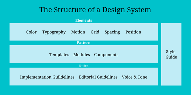
A strong design system ought to incorporate front-end code in its component library, as well as rules for use and implementation and guiding design principles.
 Depending upon your requirements, a design system can be implemented at different levels and then combined to form a bigger component.
Let us understand the different levels on which a design system can operate:
- Styles: Typography, color, iconography, sound, motion, interaction, illustration.
- Layout: Grid, spacing, positioning, etc.
- Components: Button, badge, modal, tab, popup, textbox, etc.
- Content: Voice and tone, writing style, copy.
- Usability: Internationalization, accessibility.
- Resources: Design files, design blogs, development blogs, fonts, icons (SVG), logos.
- Miscellaneous: Design principles, design tokens, marketing, theming.
Defining simple components like those listed above make it easier to keep things consistent and manageable. Well-defined elements make everything faster, from design to implementation.
Benefits of a design system at the organizational level
Often, many early-stage organizations focus more on delivering than standardization, and that’s acceptable as stability comes with growth. In such cases, using component libraries like Syncfusion’s provide a helping hand. They are customizable, adaptable, scalable, and support all the major front-end libraries. Therefore, we can customize and use them according to the organization’s need.
Though implementing a design system is not an easy task, once in place, everyone in the organization benefits from it:
- Designers: It serves as a single source of truth, helping tackle a variety of frustrations. Things are consistent, and this enables designers to move faster and be more productive.
- Developers: It makes resources easily accessible, makes solutions clear, and provides engineers with the means to produce independently.
- Product managers: It helps product managers concentrate on the bigger picture by reducing the cognitive load associated with micro-level interactions.
- Marketing and sales: Since a design system outlines common terminologies, ideas, and patterns particular to the product, it can be used for onboarding. Sales and marketing personnel can use it to acquaint themselves with the product and company terminology.
Summary
To summarize, by providing widely used usability patterns, usage standards, and predetermined styles at all times, a design system handles labor-intensive work. For UX and product managers, being able to cross-reference the specifics of an interface or interaction with those that are typically used throughout the application can save hours of effort.
A design system increases product to the employees at every level in the organization and gives sales teams knowledge about the organization’s distinctive strategy.
Thank you for reading!
Syncfusion has over 1,700 components and frameworks for WinForms, WPF, WinUI, .NET MAUI (Preview), ASP.NET (Web Forms, MVC, Core), UWP, Xamarin, Flutter, JavaScript, Angular, Blazor, Vue, and React. Use them to boost your application development speed.
For current customers, the newest Essential Studio® version is available for download from the License and Downloads page. If you are not yet a Syncfusion customer, you can try our 30-day free trial to check out our newest features.
If you have questions, you can reach us through our support forums, support portal, or feedback portal. As always, we are happy to assist you!
