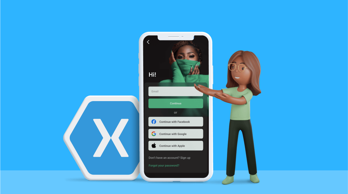
Howdy! We are going to replicate an app login screen in Xamarin.Forms based on this Dribble design.
In this UI design, we have two separate pages for validating email and password.
We are going to break down this UI to explain the step-by-step procedure to create the following pages:
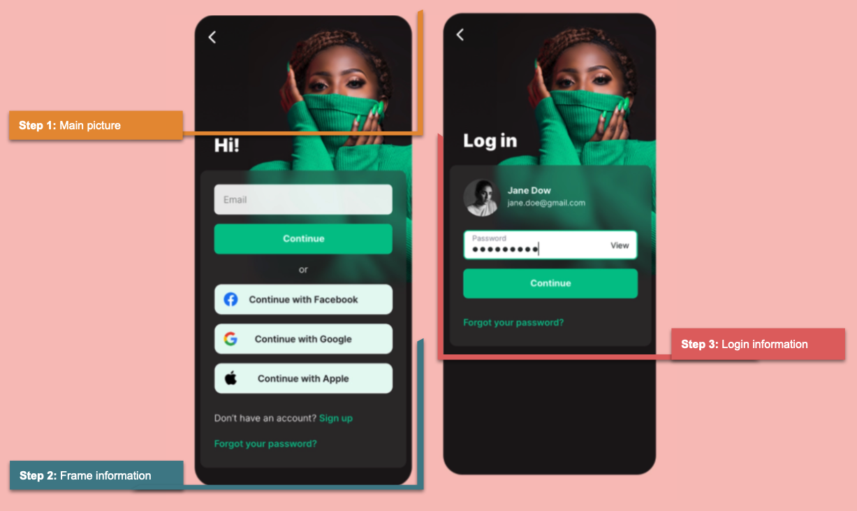
Before starting, let’s highlight some significant points in our approach:
- We will replicate a UI with XAML. To design the UI, we are going to use different components such as Frames, Label.FormattedText, and images. We will also use tips to handle overlapping controls.
- We are going to implement Syncfusion Xamarin.Forms controls such as Masked Entry (SfMaskedEdit) for email validation and Avatar View (SfAvatarView) to set our login avatar.
- We will learn how to build designs in a specific orientation (like in the Facebook app).
Let’s code!
Step 1: Main picture block and main layout structure
Let’s create a background by adding an image as shown below. To achieve this, we use the Grid to place the image and establish the main layout for the screen.
Pay attention to this step because we will implement it on this screen and the next!
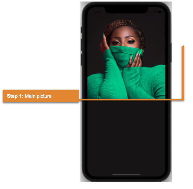 Refer to the following code example.
<!-- Main structure-->
  <Grid RowDefinitions="*,Auto">
     <!--Main image-->
     <Image Grid.RowSpan="2" Source="Model" VerticalOptions="Start" Aspect="AspectFit"/>

     <!—Content of the step 2 and 3 goes here -->

  </Grid>
Step 2: Frame information
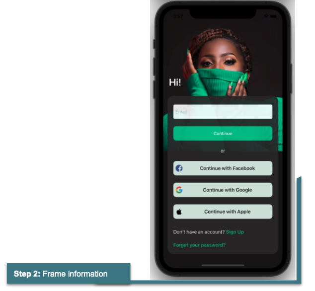
Let’s continue with designing the Frame information block! We have a set of controls to present the required information.
Title
Here, we are going to display the text “Hi!” just before the frame design. Refer to the following code example.
<!-- Title-->
 <Label Grid.Row="0" Text="Hi!" FontSize="34" TextColor="White" VerticalOptions="End" FontAttributes="Bold" Padding="20,0,0,20"/>

 <!-- Content of next step goes here -->
Information frame body
Now, add the frame and the layout to organize the information in it.
<!--Information Frame-->
  <Frame Grid.Row="1" HasShadow="False" Margin="15,0,15,50" VerticalOptions="FillAndExpand" CornerRadius="20" Opacity="0.9" BackgroundColor="#2e2b2c">
   <Grid RowDefinitions="Auto,Auto,Auto,Auto,Auto,Auto,Auto,Auto" RowSpacing="25" Padding="0,10,0,0">
       <!— Content of next step goes here -->
   </Grid>
  </Frame>
Information frame details
The frame contains the following components:
To integrate and validate the email address text box, we will use the Syncfusion Xamarin.Forms Masked Entry control. For more details, check the Getting Started with Xamarin.Forms Masked Entry documentation.
Refer to the following code example.
<!--Email validation with Syncfusion Masked Entry control-->
  <syncmaskededit:SfMaskedEdit Grid.Row="0" Watermark="Email" Mask="\w+@\w+\.\w+" MaskType="RegEx" HeightRequest="50"/>

  <!-- Content of next step goes here -->
Social networks
We will use Syncfusion Xamarin.Forms Button control to design the Continue and social network buttons (Continue with Facebook, Google, and Apple). For more details, check the Getting Started with Xamarin Button documentation.
Refer to the following code example.
<!--Syncfusion Buttons control-->
  <buttons:SfButton Grid.Row="1" Text="Continue" Style="{StaticResource Highlighted}"/>
  <Label Grid.Row="2" Text="or" VerticalTextAlignment="Center" HorizontalTextAlignment="Center" TextColor="White"/>
  <buttons:SfButton Grid.Row="3" ImageSource="Facebook" Text="Continue with Facebook" Style="{StaticResource SocialNetworks}" />
  <buttons:SfButton Grid.Row="4" ImageSource="Google" FontSize="17" Text="Continue with Google" Style="{StaticResource SocialNetworks}"/>
  <buttons:SfButton Grid.Row="5" ImageSource="Apple" FontSize="17" Text="Continue with Apple" Style="{StaticResource SocialNetworks}" />

  <!— Content of next step goes here -->
Labels
We are going to use a label to add all additional registration options (Don’t have an account? Forgot your password?). We are using the same label for these options but with different styles. To save time and for better app performance, we are using Label.FormattedText. It allows us to customize the size and style within the same Label. For more details, refer to this article on best practices for UI handling.
Refer to the following code example.
<Label Grid.Row="6" Margin="0,10,0,0">
  <Label.FormattedText>
     <FormattedString>
        <Span Text="Don't have an account? " TextColor="White"/>
        <Span Text="Sign Up" TextColor="{StaticResource MainColor}" FontAttributes="Bold"/>
     </FormattedString>
  </Label.FormattedText>
</Label>

<Label Grid.Row="7" Text="Forget your password?" TextColor="{StaticResource MainColor}" FontAttributes="Bold"/>
We’re done with our first screen !!
Step 3: Login information
Now, let’s continue with the replica of the second screen!
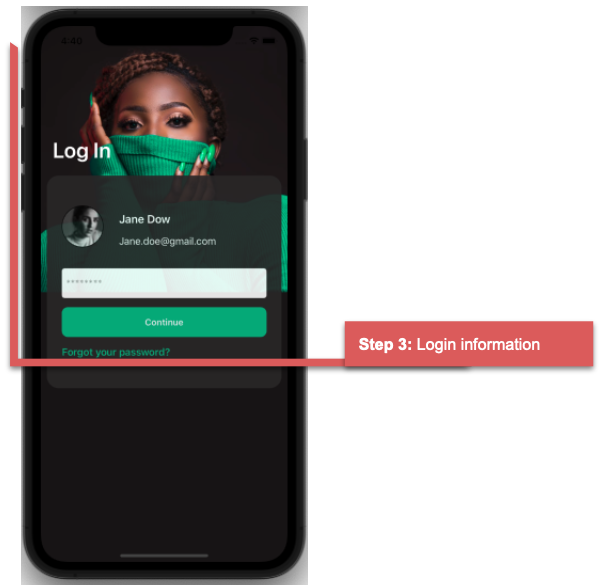 Let’s name this page Log In. We’ll use the same main layout structure as on the previous page.
Refer to the following code example.
<!-- Main structure-->
<Grid RowDefinitions="*,*">
  <!--Main image-->
  <Image Grid.Row="0"  Source="Model" VerticalOptions="Start" Aspect="AspectFill"/>
  <!-- Main information-->
  <Label Grid.Row="0" Text="Log In" FontSize="36" TextColor="White" FontAttributes="Bold" Padding="20,0,0,30" VerticalOptions="CenterAndExpand"/>

  <!— Content of next step goes here -->
</Grid>
Now, let’s design the structure of the frame and its layout in addition to the avatar view on the login page.
Frame and grid
Refer to the following code example.
<Frame Grid.Row="0" Grid.RowSpan="2" HasShadow="False" Padding="25,50" Margin="10,0,10,40" VerticalOptions="CenterAndExpand" CornerRadius="20" Opacity="0.9" BackgroundColor="#2e2b2c">
 <Grid ColumnDefinitions="Auto,*" RowDefinitions="*,Auto,Auto,Auto,Auto" RowSpacing="15">
    <!— Content of next step goes here -->
 </Grid>
</Frame>
Avatar view
To add the avatar image, I am going to use Syncfusion Xamarin.Forms Avatar View control. To do so, we have to add Syncfusion.Xamarin.Core NuGet package and then include the following namespace.
xmlns:sfavatar="clr-namespace:Syncfusion.XForms.AvatarView;assembly=Syncfusion.Core.XForms"
Next, we add the implementation logic for the Avatar View control, followed by the name and email as avatar information.
<sfavatar:SfAvatarView ContentType="Custom" Grid.Column="0" Grid.Row="0" Grid.RowSpan="2"
                       ImageSource="Profile"
                       VerticalOptions="Center"
                       HorizontalOptions="Center"
                       HeightRequest="70"
                       CornerRadius="35"
                       WidthRequest="70"
                       Margin="0,0,20,0"/>

 <!-- Avatar information-->
   <Label Grid.Column="1" Grid.Row="0" Text="Jane Dow" FontAttributes="Bold" TextColor="White" FontSize="19" VerticalTextAlignment="End"/>
   <Label Grid.Column="1" Grid.Row="1" Text="[email protected]" TextColor="White" VerticalTextAlignment="Start"/>

 <!-- Content of next step goes here -->
Password validation
Finally, we add the password field, the Continue button to send the information (using the Syncfusion Xamarin.Forms Button), and the label to retrieve a forgotten password.
Refer to the following code example.
<Entry Grid.ColumnSpan="2" Margin="0,20,0,0" Grid.Row="2" IsPassword="True" Placeholder="********" HeightRequest="50"/>
<buttons:SfButton Grid.ColumnSpan="2" Grid.Row="3" Text="Continue" Style="{StaticResource Highlighted}" />
<Label Grid.ColumnSpan="2" Grid.Row="4" Text="Forgot your password?" TextColor="{StaticResource MainColor}" FontAttributes="Bold"/>
And our UI is done!
GitHub reference
Check out our complete example code for replicating an app login screen in Xamarin.Forms on GitHub.
Conclusion
Thanks for reading! In this blog, we have seen how to replicate an app login screen using Syncfusion Xamarin.Forms UI controls. Try out the steps provided here and leave your feedback in the comments section below!
Syncfusion’s Xamarin suite offers over 150 UI controls, from basic editors to powerful, advanced controls like DataGrid, Charts, ListView, and Rich Text Editor. Use them to build elite applications!
You can contact us through our support forum, support tickets, or feedback portal. We are always happy to assist you!
