TL;DR: Let’s visualize transport emissions using a Flutter Semi-Doughnut Chart with Syncfusion. First, gather and organize your emission data. Next, create the chart, customize its colors, and adjust the angles to form a semi-doughnut shape. Finally, enhance clarity by adding data labels with icons and incorporating annotations and connector lines for better insights.
Welcome to the Chart of the Week blog series!
Doughnut charts are widely used to display data in an easy-to-understand and visually appealing manner. They help users quickly grasp relationships between different categories in a dataset. They are particularly effective for use cases like survey results, sales distributions, product compositions, market shares, and budget allocations.
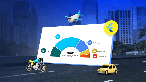
This blog will demonstrate how to visualize vehicle emissions per kilometer traveled using the Syncfusion Flutter Doughnut Chart. We’ll customize the Doughnut Chart by adjusting its angle, radius, annotation, and data label for better visualization and create a semi-doughnut chart.
Circular Charts
Syncfusion Flutter Circular Charts offer a straightforward way to visualize complex data. As the name suggests, circular charts represent a circular format, making information visually engaging and suitable for various apps like business analytics, scientific research, and decision-making.
Types of Circular Charts
The Syncfusion Flutter Circular Charts library features three types of circular chart series: pie series, doughnut series, and radial series. Each serves different data visualization needs, with the doughnut series being a key type that we will focus on in this blog post.
Doughnut Series
The Doughnut series creates a circular chart with a hollow center resembling a doughnut. This hollow space can be used to display additional information, making the chart more informative.
In this blog, we will focus on achieving the desired UI using the doughnut series from Syncfusion Flutter Circular Charts. Here are some key properties to enhance our doughnut series:
- DataLabelSettings: This property customizes data labels to provide detailed information about each data point.
- ConnectorLineSettings: This property allows us to customize the connector lines. Using this, we’ll customize the connector line width, color, length, and type. This connector line is rendered when the data label is placed outside the chart.
- Annotation: This feature highlights specific areas of interest in the chart by adding elements such as text labels, shapes, or images. Annotations provide context or additional information, enhancing the interpretation of the chart.
The following doughnut chart visually depicts carbon emissions produced by various modes of transport per kilometer traveled.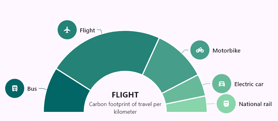
Let’s learn to create a Flutter semi-Doughnut Chart to visualize the vehicle emissions data!
Step 1: Gather the data
First, we need to collect real-time data on carbon emissions produced by different modes of transport per kilometer traveled, including electric cars, national rail, buses, motorbikes, and flights. We then organize this data into a list that specifies each transport mode and its carbon emissions (in grams) per kilometer. This list will serve as the data source for our chart.
Step 2: Define and load data into the chart
Next, we’ll define the CarbonEmission class to encapsulate the data for each segment of the doughnut chart. This class will contain the following attributes:
- x: Represents the label for the segment.
- y: Holds the corresponding value for the segment.
- Icon: Displays the icon related to the carbon emissions for different modes of transport on each segment label.
- Color: Specifies the color of the segment.
Refer to the following code example.
class CarbonEmission {
  CarbonEmission(this.x, this.y, this.icon, this.color);
  final String x;
  final double y;
  final IconData icon;
  final Color color;
}
The following list returns a collection of CarbonEmission objects, each corresponding to a specific segment of the doughnut series:
 ....
[
    CarbonEmission(
        'Bus', 97, Icons.directions_bus_outlined, const Color(0xff036666)),
    CarbonEmission('Flight', 246, Icons.flight, const Color(0xff248277)),
    CarbonEmission(
        'Motorbike', 114, Icons.pedal_bike_outlined, const Color(0xff469D89)),
    CarbonEmission('Electric car', 47, Icons.directions_car_filled_outlined,
        const Color(0xff67B99A)),
    CarbonEmission('National rail', 35, Icons.directions_railway_filled_sharp,
        const Color(0xff88D4AB)),
];
....
Step 3: Building the Doughnut Chart
Let’s render the doughnut series using the dataSource that defines the dataset for the chart. Each CarbonEmission object contains specific values to be displayed. The xValueMapper and yValueMapper will map the x and y values of the CarbonEmission data.
To apply unique colors to each data point in the doughnut series, we’ll use pointColorMapper with the color value from CarbonEmission. The default startAngle is 0 degrees, and the endAngle is 360 degrees, resulting in a circular chart with a hollow center resembling a doughnut, which looks like the following image.

Step 4: Building the semi-Doughnut Chart
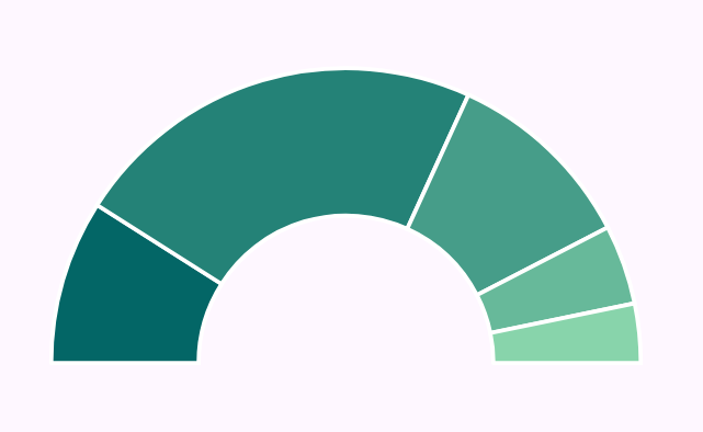
To create a semi-doughnut chart from the doughnut series, we’ll adjust the startAngle and endAngle properties. Setting the startAngle to 270 degrees and the endAngle to 90 degrees will give it a semi-doughnut appearance. These properties allow for flexible customization, enabling us to adjust the visible portion of the doughnut chart to any desired angle, making it suitable for various visualizations.
The radius property controls the overall size of the doughnut series, determining how large it appears relative to the parent widget. By default, the doughnut chart occupies 80% of the available space; this can be adjusted as needed. Here, we set the radius to 60%, reducing the overall size of the doughnut and leaving more space around the chart, which helps to accommodate the other chart elements like legend, title, and more.
Additionally, the strokeColor and strokeWidth properties can be used to customize the appearance of the semi-doughnut chart’s border. By default, the stroke color is transparent (no visible border), and the stroke width is set to 2.0. In this case, we changed the stroke color to white and increased the stroke width to 3.0. This adjustment helps us to visually separate the segments and make the semi-doughnut chart look better.
DoughnutSeries< CarbonEmission, String> _buildDoughnutSeries() {
    return DoughnutSeries< CarbonEmission, String>(
      radius: '60%',
      dataSource: carbonEmission,
      xValueMapper: (CarbonEmission data, int index) => data.x,
      yValueMapper: (CarbonEmission data, int index) => data.y,
      pointColorMapper: (CarbonEmission data, int index) => data.color,
      startAngle: 270,
      endAngle: 90,
      strokeColor: Colors.white,
      strokeWidth: 3,
  }
Refer to the following image.
Step 5: Enable the data label
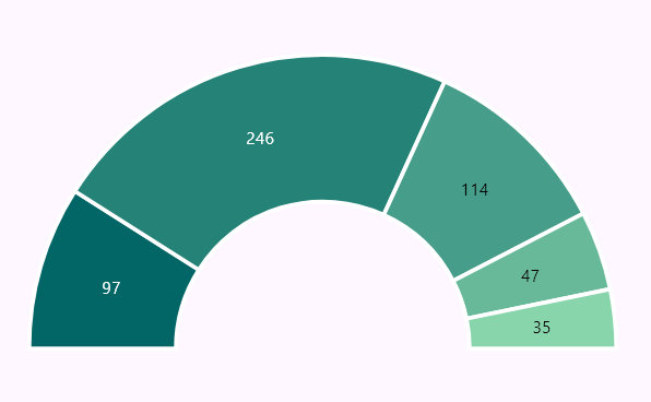
The dataLabelSettings property in the series is used to provide essential information by showing the value for each segment directly on the semi-doughnut chart. By default, the isVisible property is set to false. Enabling this property allows the data labels to appear on the doughnut chart and provides an option to toggle their visibility as needed.
Refer to the following code example.
 ....
 dataLabelSettings: const DataLabelSettings(
   ....
   isVisible: true,
   ....
 ),
 ....
Refer to the following image.
Step 6: Customizing the data label
The dataLabelSettings customization allows us to control how data labels appear in the Semi-Doughnut, making them more informative and visually appealing. Here, the builder property creates a custom layout for the data labels, adding icons and text for better visualization and readability.
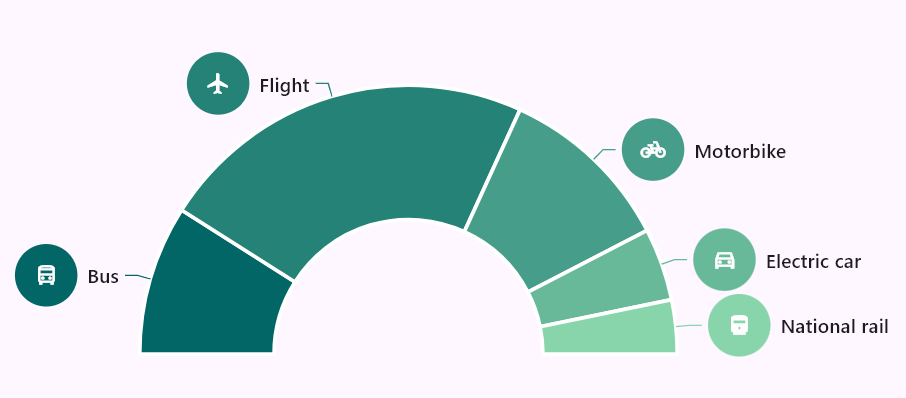
We use a Row widget to arrange a circular container with an icon and label text. The circular container uses the segment’s assigned color, providing a visual representation of the data. The icon inside clearly identifies the data point, while the text makes it more readable.
Some key customizations
Circular UI for data labels and label positioning
The circular appearance is achieved using a Container with BoxDecoration. The container’s color is set to the corresponding data segment’s color, making it consistent with the chart. A white border is added around the circular shape, and the Icon is centered within the circle for a clean look. This builder allows for flexible customization, enabling developers to adjust the style according to their desired data label appearance to suit different UI requirements.
By default, labelPosition is set to ChartDataLabelPosition.inside. Here, the labelPosition property is set to outside, placing the labels outside the chart segments for better readability. This property can also be used to place labels inside the segments if desired.
Smart labels
By setting labelIntersectAction to none, we ensure that the labels remain visible without getting trimmed or shifted due to overlapping. This differs from the default behavior, in which overlapping labels may shift to avoid overlap. Learn more about smart labels.
Connector line customization
The connectorLineSettings property is used to add connector lines that link the labels to their respective segments in the semi-Doughnut Chart. Since the labels are positioned outside, these lines help show the segment corresponds to each label. By default, the connector line is set to null, but this ranges from 0% to 100%. The length of the connector line is set to 5%, ensuring a clear connection between the label and the segment.
These settings enhance the data labels by making them more informative and visually appealing.
....
dataLabelSettings: DataLabelSettings(
  ....
    builder: (dynamic data, dynamic point, dynamic series,
    int pointIndex, int seriesIndex) {
     return Row(
      ....
       children: [
        Container(
           ....
           decoration: BoxDecoration(
            color: data.color,
            shape: BoxShape.circle,
            border: Border.all(color: Colors.white,),
           ),
           child: Icon(
             data.icon,
           ),
         ),
         const SizedBox(width: 8),
         Text(
             data.x,
         ),
       ],
     );
   },
   labelPosition: ChartDataLabelPosition.outside,
   labelIntersectAction: LabelIntersectAction.none,
   connectorLineSettings:
       const ConnectorLineSettings(length: '5%'),
),
....
After enabling and customizing the data label, the UI will appear as shown in the following image.
Step 7: Adding annotations for chart visualizations
By default, annotations in the Flutter Doughnut Chart are placed at the center. Like this, we’ll add annotations to display additional information in the center of the semi-Doughnut Chart. Here, we demonstrate how to add text inside the semi-Doughnut Chart to show the label of the largest segment in the chart and a brief description of the data being visualized. We’ll use the CircularChartAnnotation class to create an annotation in the chart’s center.
The CircularChartAnnotation class allows you to customize and position the annotation using radius and angle properties. Additionally, the width and height properties can be used to adjust the size of the annotation, ensuring that it fits with the overall design of the chart. This flexibility allows for enhanced customization, making it easy to position and style the annotation to match the desired appearance.
Additionally, the annotation will display the segment’s label with the largest y-value, allowing for easy identification of the largest data point compared to the other segments.
....
String largestSectorLabel = _buildLargestSectorLabel();

String _buildLargestSectorLabel() {
    final largestSector = carbonEmission.reduce(
      (current, next) => current.y > next.y ? current : next,
    );
    return largestSector.x;
}
....
Refer to the following code example to pass values for building annotation.
CircularChartAnnotation _buildCenterTextAnnotation() {
    return CircularChartAnnotation(
      widget: Column (
            mainAxisSize: MainAxisSize.min,
            children: [
              Text (
                _largestSectorLabel.toUpperCase(),
              ),
              Text (
                'Carbon footprint of travel per kilometer',
                textAlign: TextAlign.center,
              ),
            ],
      ),
    );
  }
}
After executing the above steps, the output will look like the following image.

GitHub reference
For more details, refer to the GitHub demo for creating a Flutter semi-Doughnut Chart for carbon impression of travel per kilometer.

Unlock the power of Syncfusion’s highly customizable Flutter widgets.
Conclusion
Thank you for reading this blog! We explored how to create a Flutter semi-Doughnut Chart to visually represent the carbon emissions produced by various modes of transport per kilometer travel. This guide aims to help you understand the importance of effective data visualization.
If you’re an existing customer, you can download the latest version of Essential Studio® from the License and Downloads page. For those new to Syncfusion, try our 30-day free trial to explore all our features.
For queries, you can contact us through our support forum, support portal, or feedback portal. We’re always happy to help you!
