To elegantly visualize the progression of tasks, you need a groundbreaking progress bar! In that regard, our new .NET MAUI ProgressBar satisfies your needs. This control is available in our Essential Studio® 2022 Volume 3 release.
The new .NET MAUI ProgressBar is a feature-rich notification control. It allows you to visualize the progress of work or an operation. In real-time scenarios, you can use this control to show the status of ongoing processes, such as loading an app, transferring a file, downloading, installation, data loading and recovery, and saving updates.
We have included two forms of the ProgressBar control in our .NET MAUI platform.
Linear ProgressBar
The .NET MAUI Linear ProgressBar, or progress indicator, is a type of graphical control that helps visualize the progress of any work or operation in a rectangular track.
Key features
Determinate state
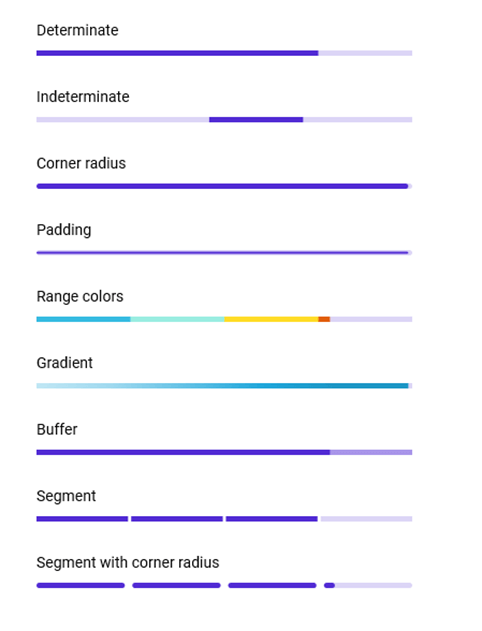
A determinate progress bar is mainly used when progression can be estimated. It shows the total amount of progress and how long it has left to go.
For example, you can use the determinate progress indicator to show the progress of a file downloading. The progress color and percentage are used to indicate the download completion and the remaining progress.
Indeterminate state
An indeterminate progress bar is mainly used when it is impossible to predict or calculate progression. It will show continuous animation without indicating how much progress remains.
For example, you can use this indicator type for something waiting for a response, like retrieving online data from a server.
Buffer state
A buffer-type progress indicator plays dual roles: secondary progress indicates an activity or loading, while primary progress indicates the current progress position.
For example, while streaming videos, we can use this type of progress bar to show both the streaming progress (in the background) and the current video play position.
Segmented progress
We can use the segment progress bar to split progress visualization into different segments. Both the segments’ gaps and counts are customizable. This helps avoid writing several lines of code to create and position multiple progress bars.
Range colors
The range colors allow users to easily differentiate the various statuses of a work in progress and enhance the look and feel for better communication.
For example, during online food ordering, placing an order may start the bar with a red color; as the order progresses, it turns orange; upon completion, it turns yellow; and finally, it turns green with a delivered status.
Track customization
The track color (background) is used to differentiate the progress indication from the track and you can also customize the track thickness to make the UI more approachable.
Corner radius
You can easily customize the corner radius of the ProgressBar to view the control with a rounded or sharp edge.
Circular ProgressBar
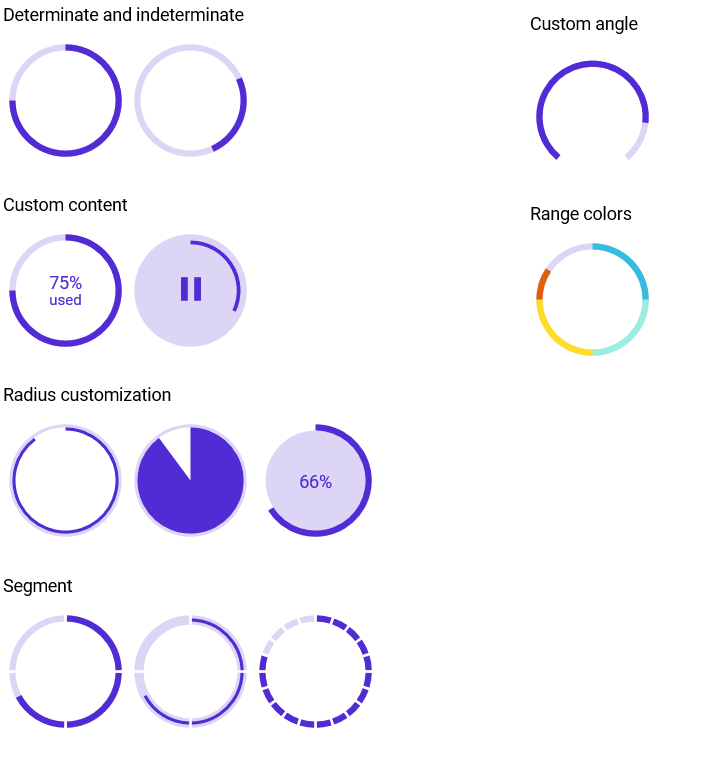
The .NET MAUI Circular ProgressBar, or progress indicator, is a type of graphical control that visualizes the progress of any work or operation in a round or semicircle track.
Similar to the Linear ProgressBar, you can also enjoy the following features in the Circular ProgressBar:
- Determinate and indeterminate states
- Range colors
- Segmented progress
- Track customization
- Corner radius
Let’s see the other unique features of the Circular ProgressBar.
Custom content
Add any view to the center of the Circular ProgressBar as content to indicate the completion of a task or process. You can add start, pause, or cancel buttons as content to control the progress interactively; add an image that indicates the actual task in progress; and add custom text that conveys the progress unit.
Radius and angles
Customize the start and end angles of the Circular ProgressBar to give it a unique style. Also, customize the radius of the circular track based on your application needs.
Add the .NET MAUI ProgressBar to your application
We have seen the key features of the .NET MAUI ProgressBar control. Let’s see how to create a simple .NET MAUI app with Linear ProgressBar and Circular ProgressBar to demonstrate their primary usage.
Step 1: Create a .NET MAUI app.
First, create a new .NET MAUI app in Visual Studio.
Step 2: Install the NuGet packages.
Syncfusion .NET MAUI controls are available in the NuGet Gallery. To add the ProgressBar control to your project, open the NuGet Package Manager in Visual Studio. Search for Syncfusion.Maui.ProgressBar and then install it.
Step 3: Handler registration.
The Syncfusion.Maui.Core NuGet package is a dependent package for all our Syncfusion .NET MAUI controls. In the MauiProgram.cs file, register the handler for Syncfusion core using the ConfigureSyncfusionCore() method.
Refer to the following code.
using Syncfusion.Maui.Core.Hosting;

namespace ProgressBar;

public static class MauiProgram
{
  public static MauiApp CreateMauiApp()
  {
    var builder = MauiApp.CreateBuilder();
    builder
      .UseMauiApp<App>()
      .ConfigureSyncfusionCore()
      .ConfigureFonts(fonts =>
       {
         fonts.AddFont("OpenSans-Regular.ttf", "OpenSansRegular");
         fonts.AddFont("OpenSans-Semibold.ttf", "OpenSansSemibold");
       });

       return builder.Build();
  }
}
Step 4: Import the namespace.
Then, import the control namespace Syncfusion.Maui.ProgressBar in your XAML or C# code.
xmlns:progressBar="clr-namespace:Syncfusion.Maui.ProgressBar;assembly=Syncfusion.Maui.ProgressBar"
Step 5: Initialize the ProgressBar and set the progress value.
Now, initialize the SfLinearProgressBar or SfCircularProgressBar control along with the progress value based on your application needs.
Linear ProgressBar:
<progressBar:SfLinearProgressBar Progress="75"/>

Circular ProgressBar:
<progressBar:SfCircularProgressBar Progress="75" />
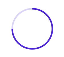
Note: By default, the value of progress should be specified between 0 and 100. To render the progress value between 0 and 1, set the Minimum property to 0 and the Maximum property to 1.
Step 6: Enabling the indeterminate state.
You can enable the indeterminate state for the ProgressBar using the IsIndeterminate property, as in the following code example.
Linear ProgressBar:
<progressBar:SfLinearProgressBar IsIndeterminate="True"/>

Circular ProgressBar:
<progressBar:SfCircularProgressBar IsIndeterminate="True" />

GitHub reference
For more information, refer to the .NET MAUI ProgressBar Getting Started demo on GitHub. Supercharge your cross-platform apps with Syncfusion's robust .NET MAUI controls.

Conclusion
Thanks for reading! In this blog, we walked you through the new Syncfusion .NET MAUI ProgressBar control and its features available in the 2022 Volume 3 release. For more information, refer to its user guide. Use this control to elegantly visualize work in progress.
Leave your feedback in the comments section given below.
Refer to our Release Notes and the What’s New pages to check the other updates in this release. Also, you can contact us through our support forums, support portal, or feedback portal. We are always happy to assist you!
