A rating UI control was one of the controls most requested by our mobile app developers. We at Syncfusion understand the requirement for this essential control and have now delivered the .NET MAUI Rating control in our 2022 Volume 4 release.
Let’s look at the key features of the new .NET MAUI Rating control and the steps to get started with it.
Key features
The .NET MAUI Rating control allows users to select a rating value from a group of visual symbols like stars. It can provide ratings for services provided or products, such as movies and software apps.
The control is packed with a lot of cool features, some of the most important being:
Rating precision
The .NET MAUI Rating control provides flexible precision support to handle full, half, or exact values.
Standard (full)
Users can select a rating from whole values.

Half
Users can select a rating to the nearest half-value.

Exact
Users can select precise values as their rating.

Rating shapes
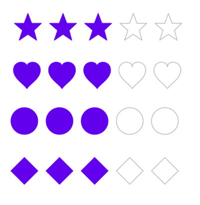
The .NET MAUI Rating control provides four predefined shapes and a custom shape option.
Predefined shapes
The following predefined shapes are available:
- Star (default)
- Heart
- Circle
- Diamond

Custom rating shapes
You can load custom path shapes as rating items, too.

Rating with read-only mode
The .NET MAUI Rating control can also be used in a read-only mode. In this mode, users cannot interact with the control.

Customization
You can customize the item color, border color, spacing, and selection color of the .NET MAUI Rating control to fit the items to your app’s theme.
Custom item size
You can make the Rating control more accessible and enhance its accuracy by customizing the item size.

Custom items count
Specify the number of items displayed in the Rating control (e.g., how many stars).

Custom item spacing
You can also specify the amount of space between each item in the Rating control like in the following image.

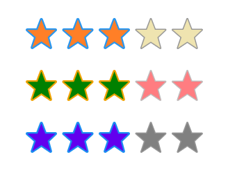
Selected and unselected colors
Customize the fill colors for the selected and unselected states for items.

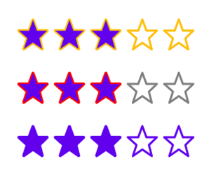
Custom items border color
An item’s border color can make its appearance more attractive. Customize the border color to highlight the selected and unselected items’ fill colors.

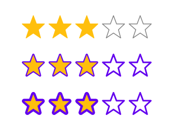
Custom stroke thickness
You can customize the stroke thickness of the item borders, like in the following image.

Getting started with .NET MAUI Rating control
We have seen the top features of the .NET MAUI Rating control. Let’s now see how to add it to your application.
Step 1: Create a .NET MAUI project.
First, create a .NET MAUI project.
Step 2: Add .NET MAUI Rating NuGet package.
Syncfusion .NET MAUI controls are available in the NuGet Gallery. To add the .NET MAUI Rating control to your project, open the NuGet package manager in Visual Studio, and search for Syncfusion.Maui.Inputs, and then install it.
Step 3: Register the handler.
In the MauiProgram.cs file, register the handler for Syncfusion core. Refer to the following code.
using Microsoft.Maui;
using Microsoft.Maui.Hosting;
using Microsoft.Maui.Controls.Compatibility;
using Microsoft.Maui.Controls.Hosting;
using Microsoft.Maui.Controls.Xaml;
using Syncfusion.Maui.Core.Hosting;
using Syncfusion.Maui.ListView.Hosting;

namespace RatingSample
{
    public static class MauiProgram
    {
        public static MauiApp CreateMauiApp()
        {
            var builder = MauiApp.CreateBuilder();
            builder
            .UseMauiApp<App>()
            .ConfigureSyncfusionCore()
            .ConfigureSyncfusionListView()
            .ConfigureFonts(fonts =>
            {
                fonts.AddFont("OpenSans-Regular.ttf", "OpenSansRegular");
            });

            return builder.Build();
        }
    }
}
Step 4: Add the namespace.
Now, add Syncfusion.Maui.Inputs namespace in your XAML page.
<xmlns:rating="clr-namespace:Syncfusion.Maui.Inputs;assembly=Syncfusion.Maui.Inputs"/>
Step 4: Initialize the Rating control.
Then, add the .NET MAUI Rating control with the required optimal name using the included namespace.
<rating:SfRating x:Name="rating" />
Step 5: Set the number of rating items.
In this demo, we will create a rating application with 5 items. To do so, we use the ItemCount property to define the number of rating items.
<rating:SfRating ItemCount="5" />
Note: The default value of ItemCount is 5. You can customize it.
Step 6: Set the rating value.
Now, let’s programmatically assign a value to the Value property to display the selected rating. We are setting the display value as 3.
<rating:SfRating Value="3" />
Note: The default value of the Value property is 0.
Step 7: Set precision.
Finally, we need to choose if full, half or exact values can be chosen for ratings. This can be set using the Precision property. By default, the precision mode is Standard.
<rating:SfRating Precision="Standard" />
Refer to the following image.


Supercharge your cross-platform apps with Syncfusion's robust .NET MAUI controls.
Conclusion
Thanks for reading! In this blog, we have seen the new .NET MAUI Rating control features available in our 2022 Volume 4 release. You can download Essential Studio® for .NET MAUI to evaluate this control. Check out our Release Notes and What’s New pages to see the other updates in this release.
If you need any clarification, please mention it in the comments section below! You can also contact us through our support forum, support portal, or feedback portal. We are always happy to assist you!


