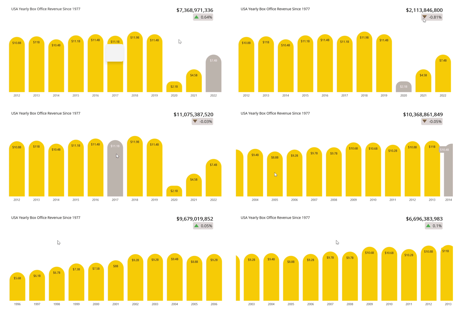
In our Chart of the Week series, we feature a range of charting solutions and techniques to create eye-catching visualizations, and we extend a warm welcome to you. This series will explore charting libraries, frameworks, and best practices for designing effective charts and graphs.
In this blog, we’ll use the Syncfusion .NET MAUI column chart to create a graph displaying yearly U.S. box office revenue data. This control is supported on both desktop (Windows and MacCatalyst) and mobile platforms (Android and iOS).
Due to the 2020 pandemic, box office revenue dropped to nearly $0 in March 2020, and the revenue generated during the entire year of 2020 was 82% lower than 2019.
Let’s see the steps to visualize yearly box office data using the Syncfusion .NET MAUI column chart.
Step 1: Gathering yearly box office data
First, gather the data from the Box Office Mojo site. This blog will obtain the yearly gross box office revenue data from 1977 to 2022. Save this data as a CSV file.
Step 2: Preparing the data for the chart
Create the BoxOfficeModel class to hold the year data with the help of Year, TotalGross, and other properties.
Refer to the following code example.
public class BoxOfficeModel
{
    public BoxOfficeModel(double year, double totalGross, double grossLastYearDelta, double releases, double averageGross, string topMovie)

    {
        Year = year;
        TotalGross = totalGross;
        GrossLastYearDelta = grossLastYearDelta;
        AverageGross = averageGross;
        TopMovie = topMovie;
        Releases = releases;
        TotalGrossInBillion = TotalGross / 1000000000;
    }

    public double Year { get; set; }
    public double TotalGross { get; set; }
    public double TotalGrossInBillion { get; set; }
    public double GrossLastYearDelta { get; set; }
    public double AverageGross { get; set; }
    public double Releases { get; set; }
    public string TopMovie { get; set; }

}
Then, generate the yearly box office revenue collection using the YearlyBoxOffice class and its RevenuesCollection property. Assign the CSV data to the yearly box office data collection using the ReadCSV method and store it in the RevenuesCollection property.
Additionally, expose the selection properties to meet the requirement for an interactive feature. In the section on adding interactive features, we will talk more about this.
public class YearlyBoxOffice : INotifyPropertyChanged
{
    List<BoxOfficeModel> yearlyRevenueCollection;
    public List<BoxOfficeModel> RevenueCollection
    {
        get
        {
            return yearlyRevenueCollection;
        }
        set
        {
            yearlyRevenueCollection = value;
            NotifyPropertyChanged();
        }
    }
    private int selectedIndex;
    public int SelectedIndex
    {
        get
        {
            return selectedIndex;
        }
        set
        {
            selectedIndex = value;
            SelectedYear = RevenueCollection[selectedIndex];
            NotifyPropertyChanged();

        }
    }
    private BoxOfficeModel selectedYear;
    public BoxOfficeModel SelectedYear
    {
        get
        {
            return selectedYear;
        }
        set
        {
            selectedYear = value;
            NotifyPropertyChanged();
        }
    }

    public YearlyBoxOffice()
    {
        RevenueCollection = new List<BoxOfficeModel>(ReadCSV());
        SelectedIndex = RevenueCollection.Count - 1;
        SelectedYear= RevenueCollection[selectedIndex];
    }

    public IEnumerable<BoxOfficeModel> ReadCSV()
    {
        Assembly executingAssembly = typeof(App).GetTypeInfo().Assembly;
        Stream inputStream = executingAssembly.GetManifestResourceStream("BoxOfficeChart.Resources.Raw.boxofficeyearlydata.csv");

        string? line;
        List<string> lines = new List<string>();

        using StreamReader reader = new StreamReader(inputStream);
        while ((line = reader.ReadLine()) != null)
        {
            lines.Add(line);
        }

        return lines.Select(line =>
        {
            string[] data = line.Split(',');
            return new BoxOfficeModel(Convert.ToDouble(data[0]), Convert.ToDouble(data[1]), Convert.ToDouble(data[2]), Convert.ToDouble(data[3]), Convert.ToDouble(data[4]), data[5]);
        });
    }


    public event PropertyChangedEventHandler PropertyChanged;


    private void NotifyPropertyChanged([CallerMemberName] String propertyName = "")
    {
        PropertyChanged?.Invoke(this, new PropertyChangedEventArgs(propertyName));
    }
}
Step 3: Configuring the Syncfusion .NET MAUI column chart
Now, configure the Syncfusion .NET MAUI column chart control by following this documentation.
Refer to the following code example.
<chart:SfCartesianChart Margin="10" BackgroundColor="White">
 <chart:SfCartesianChart.XAxes>
  <chart:CategoryAxis>
  </chart:CategoryAxis>
 </chart:SfCartesianChart.XAxes>

 <chart:SfCartesianChart.YAxes>
  <chart:NumericalAxis>
  </chart:NumericalAxis>
 </chart:SfCartesianChart.YAxes>
</chart:SfCartesianChart>
Step 4: Binding yearly box office data
Let’s bind the yearly box office data in the chart using the ColumnSeries.
Refer to the following code example.
<chart:ColumnSeries ItemsSource="{Binding RevenueCollection}" XBindingPath="Year" YBindingPath="TotalGrossInBillion">
</chart:ColumnSeries>
In this example, we’ve bound the RevenueCollection with the ItemSource property. We’ve also specified the XBindingPath and YBindingPath with the Year and TotalGrossInBillion properties, respectively.
Step 5: Customizing the chart appearance
Now, let’s customize the .NET MAUI column chart’s appearance by changing the axis element’s appearance, showing data labels in the columns, changing the column colors, and adding titles to the charts.
Set up the chart title and display the box office revenue for the selected year.
<chart:SfCartesianChart.Title>
    <Grid>
        <Grid.RowDefinitions>
            <RowDefinition Height="Auto"/>
        </Grid.RowDefinitions>
        <Grid.ColumnDefinitions>
            <ColumnDefinition Width="2*" />
            <ColumnDefinition Width="*" />
        </Grid.ColumnDefinitions>
        <Label HorizontalOptions="Start" Margin="20,0,0,0" Grid.Column="0" Text="USA Yearly Box Office Revenue Since 1977" FontSize="14" />
        <VerticalStackLayout HorizontalOptions="End" Margin="40,0,40,0" Grid.Column="1">
            <Label Text="{Binding SelectedYear.TotalGross, StringFormat='${0:###,###,###}'}" FontAttributes="Bold" FontSize="{OnIdiom 12, Phone=12, Tablet=20, Desktop=20}" />
            <Border StrokeThickness="0" HorizontalOptions="End">
                <Border.StrokeShape>
                    <RoundRectangle CornerRadius="5" />
                </Border.StrokeShape>
                <Grid ColumnDefinitions="Auto,Auto" BackgroundColor="#80BEB1AE">
                    <Image Grid.Column="0" Margin="4" WidthRequest="20" HeightRequest="20" VerticalOptions="Center" HorizontalOptions="Center"
                              Source="{Binding SelectedYear.GrossLastYearDelta,
                              Converter={StaticResource imageConverter}}" />
                    <Label VerticalTextAlignment="Center" Margin="4" Grid.Column="1" Text="{Binding SelectedYear.GrossLastYearDelta, StringFormat='{0:0.###}%'}" FontSize="{OnIdiom 12, Phone=10, Tablet=16, Desktop=16}" />
                </Grid>
            </Border>
        </VerticalStackLayout>
    </Grid>
</chart:SfCartesianChart.Title>
As mentioned in the following code example, customize the axis and its elements.
<chart:SfCartesianChart.XAxes>
 <chart:CategoryAxis ZoomFactor="0.24" ZoomPosition="0.76" ShowMajorGridLines="False" LabelPlacement="BetweenTicks">
  <chart:CategoryAxis.MajorTickStyle>
   <chart:ChartAxisTickStyle  TickSize="0"/>
  </chart:CategoryAxis.MajorTickStyle>
  <chart:CategoryAxis.AxisLineStyle>
   <chart:ChartLineStyle  StrokeWidth="0"/>
  </chart:CategoryAxis.AxisLineStyle>
 </chart:CategoryAxis>
</chart:SfCartesianChart.XAxes>

<chart:SfCartesianChart.YAxes>
 <chart:NumericalAxis ShowMajorGridLines="False" IsVisible="False" RangePadding="AppendInterval" >
 </chart:NumericalAxis>
</chart:SfCartesianChart.YAxes>
Refer to the following code example to configure the column color and enable data labels in columns with label formats.
<chart:ColumnSeries CornerRadius="100,100,0,0" Fill="#F7CB05"
                    ShowDataLabels="True"
                    ItemsSource="{Binding RevenueCollection}"
                    XBindingPath="Year"
                    YBindingPath="TotalGrossInBillion">
 <chart:ColumnSeries.DataLabelSettings>
  <chart:CartesianDataLabelSettings  >
   <chart:CartesianDataLabelSettings.LabelStyle>
    <chart:ChartDataLabelStyle LabelPadding="10" LabelFormat="$###.#B" />
   </chart:CartesianDataLabelSettings.LabelStyle>
  </chart:CartesianDataLabelSettings>
 </chart:ColumnSeries.DataLabelSettings>
</chart:ColumnSeries>
Step 6: Adding interactivity features
Let’s make our column chart more informative using the interactivity features, such as selection, auto-scrolling, and panning.
Selection features help us highlight a particular data point and raise the event or change the SelectedIndex property value based on the selected segments. Bind the SelectedIndex property to the chart’s title to show additional information based on the selection.
Refer to the following code example.
<chart:ColumnSeries.SelectionBehavior>
 <chart:DataPointSelectionBehavior SelectedIndex="{Binding SelectedIndex, Mode=TwoWay}" SelectionBrush="#BEB1AE" />
</chart:ColumnSeries.SelectionBehavior>
Now, add the AutoScrollingDelta property with the value 10 in the x-axis to show the last 10 sets of data in the axis.
<chart:SfCartesianChart.XAxes>
 <chart:CategoryAxis AutoScrollingDelta="10">
 </chart:CategoryAxis>
</chart:SfCartesianChart.XAxes>
Then, enable the panning feature in the chart with the help of the ZoomPanBehavior.
<chart:SfCartesianChart.ZoomPanBehavior>
 <chart:ChartZoomPanBehavior EnablePinchZooming="False" EnableDoubleTap="False" EnablePanning="True" />
</chart:SfCartesianChart.ZoomPanBehavior>
After executing the previous code examples, we’ll get an output similar to the following GIF image.

GitHub reference
For more information, refer to the project Box Office Charts on GitHub.
Conclusion
Thanks for reading! In this blog, we have seen how to visualize yearly box office data using the Syncfusion .NET MAUI column chart control. We encourage you to try the steps discussed in this blog and share your thoughts in the comments below.
You can also contact us via our support forum, support portal, or feedback portal. We are always happy to assist you!
See you in our next blog!


