The Visual State Manager (VSM) helps developers to specify a control’s appearance based on its visual state. You might have anticipated VSM support in the .NET MAUI platform, as I did.
In this blog, let’s explore what the VSM is and how to configure Syncfusion .NET MAUI controls using it with a couple of examples.
What is the Visual State Manager?
When updating a control’s property based on its state, traditionally, we look for direct properties to set values in various states. Otherwise, we might wait for the control’s state to change before updating it in the code behind.
You can easily do this with the help of the Visual State Manager. It allows you to add code to your XAML file that can change the visual appearance of a control’s view if the control is in any of the common states: normal, disabled, or focused.
For example, consider an Entry control. Here, we are going to change the background color to red when the control is disabled.
<Entry FontSize=”18”>
 <VisualStateManager.VisualStateGroups>
  <VisualStateGroup x:Name=”CommonStates”>
   <VisualState x:Name=”Disabled”>
    <VisualState.Setters>
     <Setter Property=”BackgroundColor” Value=”Red” />
    </VisualState.Setters>
   </VisualState>
  </VisualStateGroup>
 </VisualStateManager.VisualStateGroups>
</Entry>
VSM support in Syncfusion .NET MAUI controls with custom states
Applicable Syncfusion .NET MAUI controls are compatible with VSM. Some controls were built with custom states that, too, can be used for configuration.
Let’s see examples for the Syncfusion .NET MAUI Tab View and Slider controls.
.NET MAUI Tab View
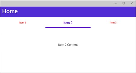
You can change the properties of the .NET MAUI Tab View control using the VSM based on the visual states set in the code. The visual states for which we have customized the properties are selected (custom), normal, and disabled. The selected state is a custom state added in addition to the common states.
Refer to the following code example.
<ContentPage xmlns="http://schemas.microsoft.com/dotnet/2021/maui"
             xmlns:x="http://schemas.microsoft.com/winfx/2009/xaml"
             xmlns:tabs="clr-namespace:Syncfusion.Maui.TabView;assembly=Syncfusion.Maui.TabView"
             x:Class="VSMMAUI.MainPage">
 <ContentPage.Resources>
  <Style TargetType="tabs:SfTabItem">
   <Setter Property="VisualStateManager.VisualStateGroups"> <VisualStateGroupList>
    <VisualStateGroup>
     <VisualState x:Name="Normal" >
      <VisualState.Setters>
       <Setter Property="TextColor" Value="Red" />
       <Setter Property="FontSize" Value="12" />
      </VisualState.Setters>
     </VisualState>
     <VisualState x:Name="Selected">
      <VisualState.Setters>
       <Setter Property="TextColor" Value="#6200EE" />
       <Setter Property="FontSize" Value="16" />
      </VisualState.Setters>
     </VisualState>
    </VisualStateGroup>
   </VisualStateGroupList>
   </Setter>
  </Style>
 </ContentPage.Resources>
 <ScrollView>
  <VerticalStackLayout>
   <tabs:SfTabView TabWidthMode="Default" HeightRequest="200"> <tabs:SfTabItem Header="Item 1">
    <Label Text="Item 1 Content" VerticalOptions="Center" HorizontalOptions="Center" />
   </tabs:SfTabItem>
   <tabs:SfTabItem Header="Item 2">
    <Label Text="Item 2 Content" VerticalOptions="Center" HorizontalOptions="Center" />
   </tabs:SfTabItem>
   <tabs:SfTabItem Header="Item 3" >
    <Label Text="Item 3 Content" VerticalOptions="Center" HorizontalOptions="Center" />
   </tabs:SfTabItem>
  </VerticalStackLayout>
 </ScrollView>
</ContentPage>
Since Item 2 is in the selected state, the corresponding customization property is applied to it.

.NET MAUI Slider
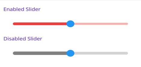
In the .NET MAUI Slider, we can modify the slider track properties based on the visual states using the VSM. The corresponding visual state values are disabled and enabled (default).
Refer to the following code example. In it, we have set false as the value to the IsEnabled property to disable the slider’s UI. The corresponding style is applied to the slider.
<ContentPage.Resources>
 <Style TargetType="sliders:SfSlider">
  <Setter Property="Interval" Value="0.25" />
  <Setter Property="VisualStateManager.VisualStateGroups">
   <VisualStateGroupList>
    <VisualStateGroup>
     <VisualState x:Name="Default">
      <VisualState.Setters>
       <Setter Property="TrackStyle">
        <Setter.Value>
         <sliders:SliderTrackStyle ActiveSize="8"
                                   InactiveSize="6"
                                   ActiveFill="#EE3F3F"
                                   InactiveFill="#F7B1AE"/>
        </Setter.Value>
       </Setter>
      </VisualState.Setters>
     </VisualState>
     <VisualState x:Name="Disabled">
      <VisualState.Setters>
       <Setter Property="TrackStyle">
        <Setter.Value>
         <sliders:SliderTrackStyle ActiveSize="10"
                                   InactiveSize="8"
                                   ActiveFill="Gray"
                                   InactiveFill="LightGray" />
        </Setter.Value>
       </Setter>
      </VisualState.Setters>
     </VisualState>
    </VisualStateGroup>
   </VisualStateGroupList>
  </Setter>
 </Style>
</ContentPage.Resources>
<ContentPage.Content>
 <VerticalStackLayout>
   <Label Text="Enabled Slider" Padding="0,10"/>
   <sliders:SfSlider/>
   <Label Text="Disabled Slider" Padding="0,10"/>
   <sliders:SfSlider IsEnabled="False"/>
 </VerticalStackLayout>
</ContentPage.Content>
Following is the screenshot for this.

Conclusion
Thanks for reading! In this blog, we saw the use of the Visual State Manager and how to configure the properties of Syncfusion .NET MAUI controls based on their current states using it. We also saw how to alter the properties based on the control’s common and unique states. So, try using VSM to configure controls easily, and leave your feedback in the comments section below!
Download Essential Studio® for .NET MAUI to see all its controls in action.
You can also contact us through our support forum, support portal, or feedback portal. We are always happy to assist you!


