TL;DR: Learn how to animate SVG paths in Angular Charts for dynamic and engaging data visualization. This blog walks you through creating charts, applying CSS animations, and adding strip lines to improve clarity. See how animations effectively highlight trends and transitions, making complex data easier to understand.
Syncfusion® Angular Charts is a well-crafted charting component for data visualization. It contains a rich UI gallery of 50+ charts and graphs, ranging from line to financial, that cater to all charting scenarios. Its high performance helps render large amounts of data quickly. It also includes features such as zooming, panning, tooltip, crosshair, trackball, highlight, and selection.
Adding animation to your chart not only enhances its visual appeal but also makes the data easier to comprehend. Animated charts draw the viewer’s attention and help highlight important data trends and transitions elegantly and smoothly.
In this blog, we’ll walk you through animating an SVG path in our Angular Charts.
Note: Before proceeding, refer to the getting started with Angular Charts documentation.
Step 1: Create the chart
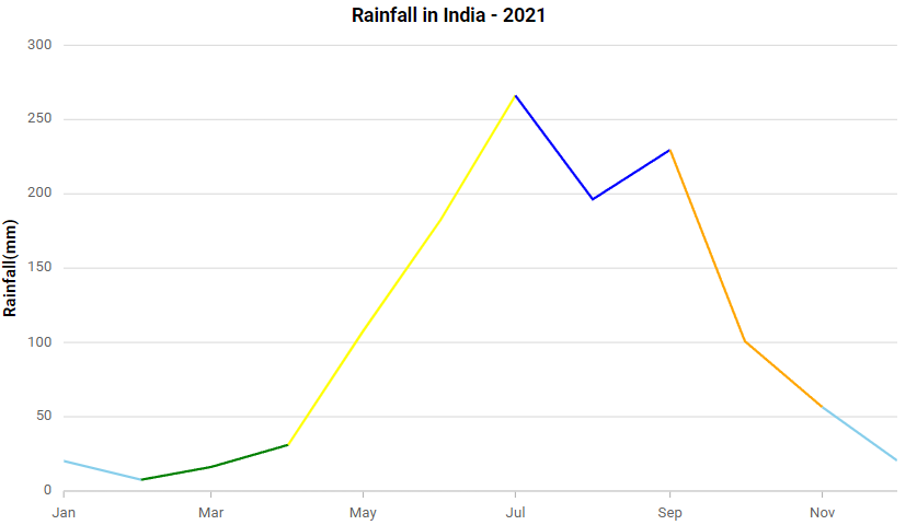
We’ll begin by creating a detailed chart that represents India’s monthly rainfall for 2021. The chart will use a multi-colored line to display the rainfall in millimeters (mm) for each month throughout the year.
The chart will visually present rainfall trends using different colors for each month’s data points. This approach will help users easily interpret variations in rainfall and see the distribution across different months of the year.
Refer to the following code example.
<e-series-collection>
  <e-series [dataSource]="dataValues" type="MultiColoredLine" xName="XValue"
	 yName="YValue" name="Rainfall" width="2.5" pointColorMapping="color">
  </e-series>
</e-series-collection>
Refer to the following image.

This chart currently appears static, showing only the highest and lowest rainfall periods without any dynamic elements. To enhance its effectiveness, we’ll animate the chart to reflect the varying amounts of rainfall. By doing so, the chart can visually demonstrate the changes and trends over time, which makes the data more engaging and easier to understand.
Step 2: Improving the details of chart visualization
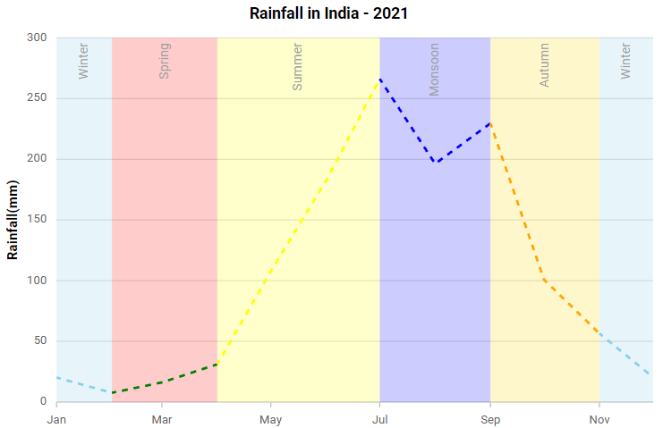
To create a chart that is both easy to understand and visually appealing, it is crucial to carefully design its elements. As part of this enhancement, we have decided to add a dynamic stripline to represent the different seasons in India. This stripline will provide a clear visual reference for the seasonal changes throughout the year, making it easier for the viewer to distinguish between different phases of rainfall.
Additionally, the line with the dashed array enabled will animate at varying speeds. As the recorded rainfall increases, the animation will accelerate, drawing attention to periods of more significant rainfall. This approach not only makes the chart more engaging but also helps emphasize and highlight important data trends, making it easier for viewers to interpret the data and understand the seasonal rainfall patterns in India.
Refer to the following code examples.
Index.html
<e-series-collection>
   <e-series [dataSource]="dataValues" type="MultiColoredLine" xName="XValue" yName="YValue" name="Rainfall" dashArray="6" width="2.5" pointColorMapping="color">
</e-series>
App.component.ts
export class AppComponent {
 public primaryXAxis: Object = {
    stripLines: [
      {   start: new Date(2021, 1, 1), opacity: 0.2, end: new Date(2021, 2, 32), sizeType: 'Auto',
        size: 1.5, text: 'Spring', color: 'red', visible: true, verticalAlignment: 'Start',
        textStyle: { size: '13px' }, border: { width: 0 }  },
      {  start: new Date(2021, 2, 32), opacity: 0.2, end: new Date(2021, 5, 31), sizeType: 'Auto',
        size: 1.5, text: 'Summer', color: 'Yellow', visible: true, verticalAlignment: 'Start',
        textStyle: { size: '13px' }, border: { width: 0 }  },
      {  start: new Date(2021, 6, 1), end: new Date(2021, 8, 1), opacity: 0.2,  sizeType: 'Auto',
        size: 1.5, text: 'Monsoon', color: 'blue', visible: true, verticalAlignment: 'Start',
        textStyle: { size: '13px'}, border: { width: 0 }  },
      {  start: new Date(2021, 8, 1), opacity: 0.2, end: new Date(2021, 9, 32), sizeType: 'Auto',
        size: 1.5, text: 'Autumn', color: 'Gold', visible: true, verticalAlignment: 'Start',
        textStyle: { size: '13px' }, border: { width: 0 }  },
      {   start: new Date(2021, 0, 1),opacity: 0.2, end: new Date(2021, 0, 32), sizeType: 'Auto',
        size: 1.5, text: 'Winter', color: 'Skyblue', visible: true, verticalAlignment: 'Start',
        textStyle: { size: '13px' }, border: { width: 0 }  },
      {   start: new Date(2021, 9, 32), opacity: 0.2, end: new Date(2021, 10, 32), sizeType: 'Auto',
        size: 1.5, text: 'Winter', color: 'Skyblue', visible: true, verticalAlignment: 'Start',
        textStyle: { size: '13px' }, border: { width: 0 }   },
    ]  }; }
Refer to the following image.

In the multi-colored line sample, each data point is rendered with a unique ID.
Step 3: Adding CSS to animate the chart
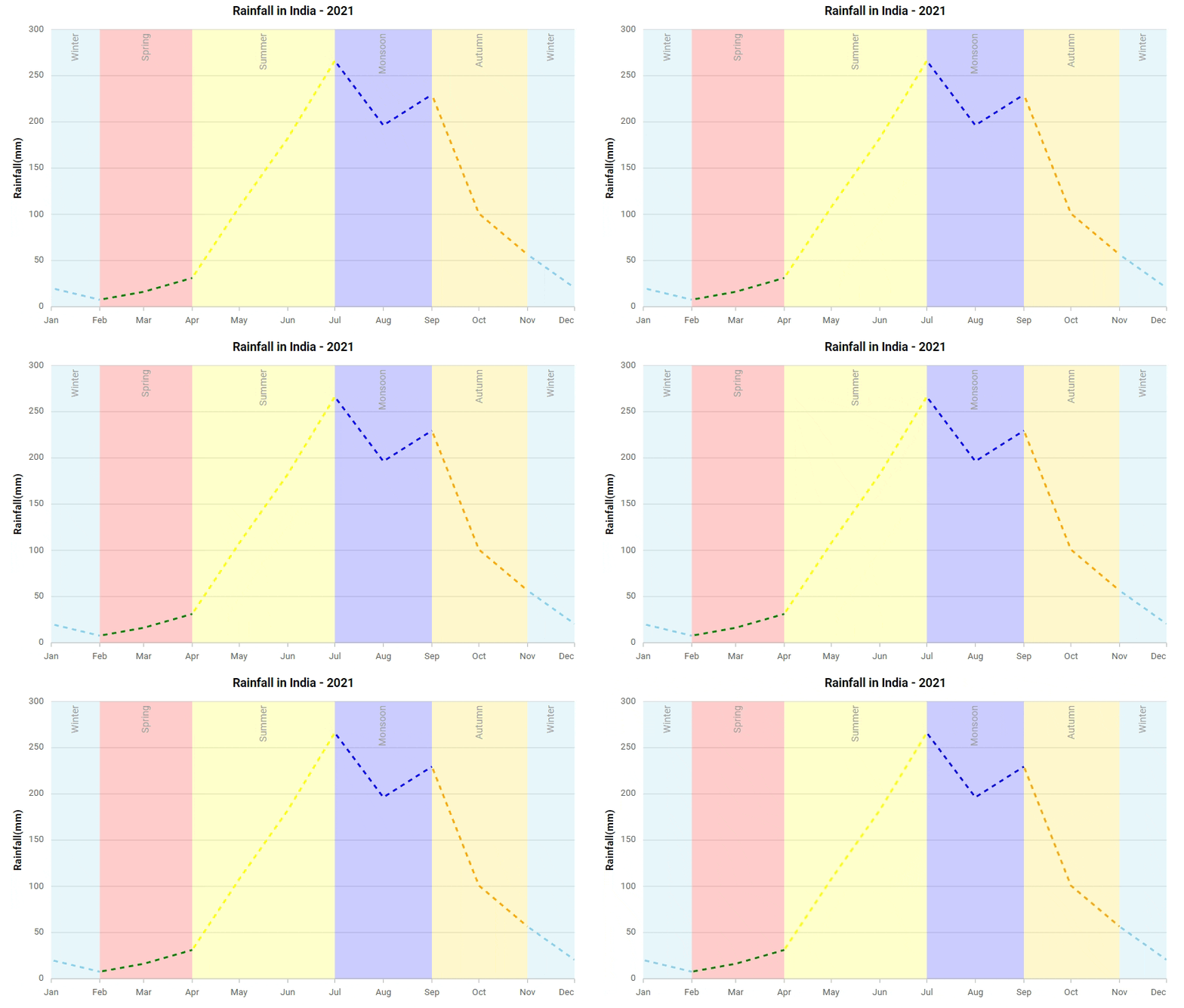
The final step in this blog involves adding CSS rules for the IDs assigned to the elements earlier. By referencing these IDs, we will ensure that each data point in the multi-colored line chart visually reflects its respective season. This CSS code will define styles, such as unique animations for each season, enhancing the chart’s clarity and aesthetic appeal.
Stylistic elements make the chart more visually engaging and help convey seasonal patterns effectively to the audience.
<style>
   @keyframes animatePath {
      0% { stroke-dashoffset: 100  }
      100% { stroke-dashoffset: 0; }
   }
   #container_Series_0_Point_0 {
      animation: animatePath 8s linear infinite;
   }
   #container_Series_0_Point_10 {
      animation: animatePath 8s linear infinite;
   }
   #container_Series_0_Point_7 {
      animation: animatePath 8s linear infinite;
   }
   #container_Series_0_Point_2 {
      animation: animatePath 8s linear infinite;
   }
   #container_Series_0_Point_5 {
      animation: animatePath 8s linear infinite;
   }
   #container_Series_0_Point_9 {
      animation: animatePath 8s linear infinite;
   }
</style>
Refer to the following image.

After going through this blog, you now have a clear understanding of how to create an animated flow on a chart. By incorporating CSS animations and ID-based styling for seasonal data points, you can significantly enhance both the visual appeal and clarity of your charts. This approach not only makes the data more engaging but also facilitates a better understanding of the seasonal trends represented in the data.
References
For more details, refer to how to animate SVG paths in the Angular Charts Stackblitz demo.

Harness the power of Syncfusion® feature-rich and powerful Angular UI components.
Conclusion
Thanks for reading! In this blog, we’ve seen how to animate SVG paths in the Syncfusion® Angular Charts for better data visualization. We encourage you to try out the steps discussed in this blog and leave your feedback in the comments below.
For questions, you can contact us through our support forum, support portal, or feedback portal. We are always happy to assist you!


