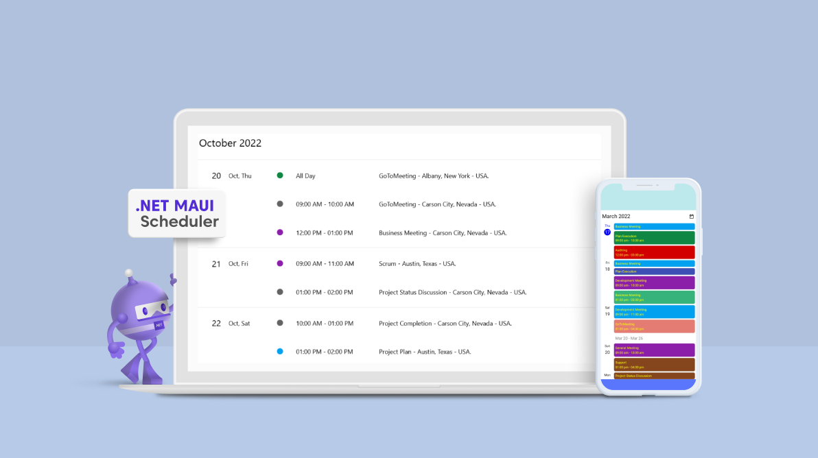
The agenda view in the Syncfusion .NET MAUI Scheduler is the best tool for task planners to create effective business scheduling software.
It shows appointments in a list format for each date between the minimum and maximum dates, grouped by week. Using the agenda view, you can show a list of appointments for a day with a day, week, or month header. You can customize each header with unique styles. Localization, globalization, and customization are also supported in this comprehensive feature set.
In this blog, we are going to explore the user-friendly features of the .NET MAUI Scheduler’s agenda view with code examples.
Note: If you are new to our .NET MAUI Scheduler control, please refer to its getting started documentation before proceeding.
Different UIs
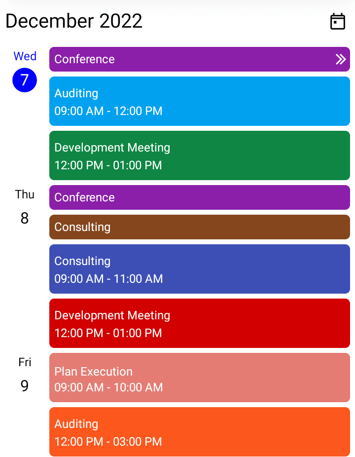
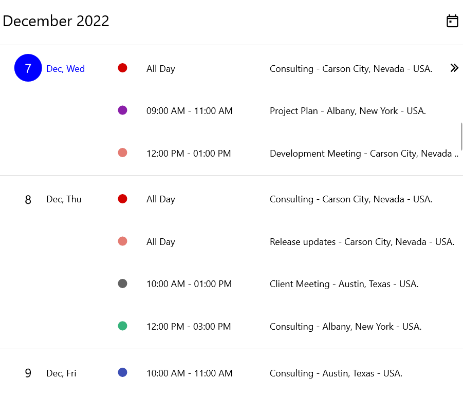
The agenda view displays the user interface in the following two ways:
- Android and iPhone apps: Display appointments with date, week, and month headers.
- Windows and Mac apps: Display appointments with only the date header.
|
|
|
Customizing the .NET MAUI Scheduler’s agenda view
The agenda view allows you to customize the appointment view, header views, and date and day formats. Let’s see how to customize them with code examples.
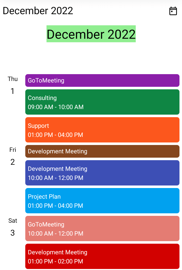
Month header customization
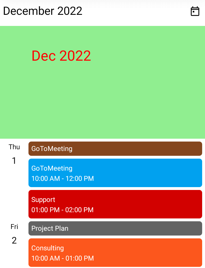
The month header in the .NET MAUI Scheduler shows the month and year at the start of a new month. You can customize the format and style of the month header in the Agenda View using the MonthHeaderSettings property.
The SchedulerMonthHeaderSettings class contains the properties that allow you to customize the month header in the agenda view. This can be done by setting unique values for the DateFormat, Height, TextStyle, and Background properties in the SchedulerMonthHeaderSettings.
Refer to the following code example.
XAML
<scheduler:SfScheduler x:Name=”Scheduler”
                         View=”Agenda”>
 <scheduler:SfScheduler.AgendaView>
  <scheduler:SchedulerAgendaView>
   <scheduler:SchedulerAgendaView.MonthHeaderSettings>
    <scheduler:SchedulerMonthHeaderSettings DateFormat=”MMM yyy”
                                            Height=”200”
                                            Background=”LightGreen” />
   </scheduler:SchedulerAgendaView.MonthHeaderSettings>
  </scheduler:SchedulerAgendaView>
 </scheduler:SfScheduler.AgendaView>
</scheduler:SfScheduler>
C#
SchedulerTextStyle textStyle = new SchedulerTextStyle()
{
   TextColor = Colors.Red,
   FontSize = 12,
};

SchedulerMonthHeaderSettings monthHeaderSetting = new SchedulerMonthHeaderSettings()
{
   DateFormat = “MMM yyy”,
   Height = 200,
   TextStyle = textStyle,
   Background = Brush.LightGreen
};

this.Scheduler.AgendaView = new SchedulerAgendaView()
{
   MonthHeaderSettings = monthHeaderSetting,
};
Also, you can customize the month header by replacing it with a custom header using the MonthHeaderTemplate property in the AgendaView.
Refer to the following code example.
XAML
<scheduler:SfScheduler x:Name=”Scheduler”
                         View=”Agenda”>
 <scheduler:SfScheduler.AgendaView>
  <scheduler:SchedulerAgendaView>
   <scheduler:SchedulerAgendaView.MonthHeaderTemplate>
    <DataTemplate>
     <Grid>
      <Label x:Name=”label”
               HorizontalOptions=”Center”
               Background=”LightGreen”
               VerticalOptions=”Center”
               TextColor=”Black”
               FontSize=”25”
               Text=”{Binding StringFormat=’{0:MMMM yyyy}’}” />
     </Grid>
    </DataTemplate>
   </scheduler:SchedulerAgendaView.MonthHeaderTemplate>
  </scheduler:SchedulerAgendaView>
 </scheduler:SfScheduler.AgendaView>
</scheduler:SfScheduler>
Day header customization
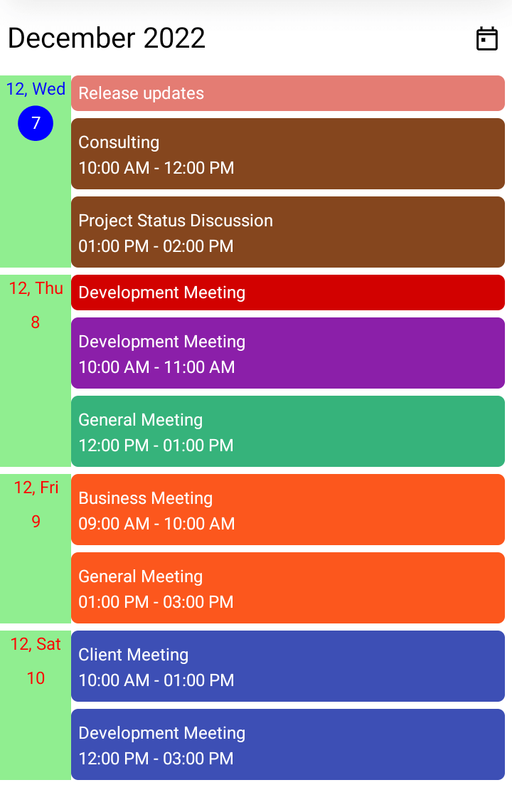
The day header is the UI shown on the left side of the agenda view. It shows the date and day of the appointment view. It is shown on the agenda view only when a date has an appointment. You can customize the format and style of the day header in the AgendaView using the DayHeaderSettings property.
The SchedulerDayHeaderSettings class contains the properties that allow you to customize the day header on the agenda view. This can be done by setting different values to the Background, DayFormat, Width, DayTextStyle, and DateTextStyle properties in the SchedulerDayHeaderSettings.
Refer to the following code example.
XAML
<scheduler:SfScheduler x:Name=”Scheduler”
                         View=”Agenda”>
 <scheduler:SfScheduler.AgendaView>
  <scheduler:SchedulerAgendaView>
   <scheduler:SchedulerAgendaView.DayHeaderSettings>
    <scheduler:SchedulerDayHeaderSettings DayFormat=”MM, ddd”
                                          Background=”LightGreen”/>
   </scheduler:SchedulerAgendaView.DayHeaderSettings>
  </scheduler:SchedulerAgendaView>
 </scheduler:SfScheduler.AgendaView>
</scheduler:SfScheduler>
C#
SchedulerTextStyle textStyle = new SchedulerTextStyle()
{
   TextColor = Colors.Red,
   FontSize = 12,
};

SchedulerDayHeaderSettings dayHeaderSetting = new SchedulerDayHeaderSettings()
{
   DayFormat = “MM, ddd”,
   Background = Colors.LightGreen,
   DayTextStyle = textStyle,
   DateTextStyle = textStyle,
};

this.Scheduler.AgendaView = new SchedulerAgendaView()
{
   DayHeaderSettings = dayHeaderSetting,
};
Week header customization
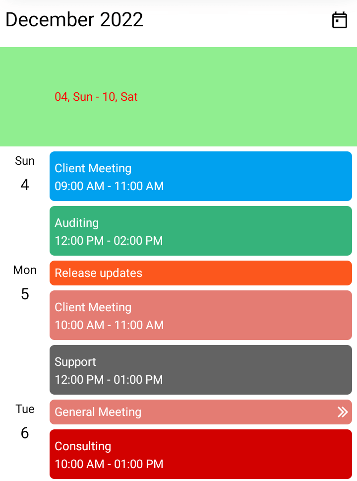
The week header shows the first and last dates of a week at the start of the week. You can customize the format and style of the week header in the AgendaView using the WeekHeaderSettings property.
The SchedulerWeekHeaderSettings class contains the properties that allow you to customize the week header on the agenda view. This can be done by setting different values to the DateFormat, Height, TextStyle, and Background properties in the SchedulerWeekHeaderSettings class.
Refer to the following code example.
XAML
<scheduler:SfScheduler x:Name=”Scheduler”
                         View=”Agenda”>
 <scheduler:SfScheduler.AgendaView>
  <scheduler:SchedulerAgendaView>
   <scheduler:SchedulerAgendaView.WeekHeaderSettings>
    <scheduler:SchedulerWeekHeaderSettings  DateFormat=”dd, ddd”
                                            Height=”100”
                                            Background=”LightGreen” />
   </scheduler:SchedulerAgendaView.WeekHeaderSettings>
  </scheduler:SchedulerAgendaView>
 </scheduler:SfScheduler.AgendaView>
</scheduler:SfScheduler>
C#
SchedulerTextStyle textStyle = new SchedulerTextStyle()
{
   TextColor = Colors.Red,
   FontSize = 12,
};

SchedulerWeekHeaderSettings weekHeaderSetting = new SchedulerWeekHeaderSettings()
{
   DateFormat = “dd, ddd”,
   Height = 100,
   TextStyle = textStyle,
   Background = Brush.LightGreen
};

this.Scheduler.AgendaView = new SchedulerAgendaView()
{
   WeekHeaderSettings = weekHeaderSetting,
};
Appointment text customization
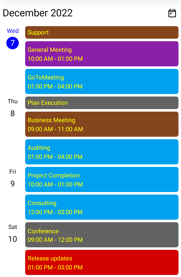
Also, you can customize the agenda view’s appointment text style using the AppointmentTextStyle property in the SfScheduler. Refer to the following code example.
XAML
<scheduler:SfScheduler x:Name=”Scheduler” View=”Agenda”/>
C#
SchedulerTextStyle appointmentTextStyle = new SchedulerTextStyle()
{
  TextColor = Colors.Yellow,
  FontSize = 12,
};

this.Scheduler.AppointmentTextStyle = appointmentTextStyle;

Supercharge your cross-platform apps with Syncfusion's robust .NET MAUI controls.
Conclusion
Thanks for reading! In this blog post, we had a quick overview of the key features of the agenda view in the Syncfusion .NET MAUI Scheduler. Use these marvelous features to effectively schedule and manage your appointments!
Also, try out our .NET MAUI controls demos on GitHub and share your feedback or ask questions in the comments section below.
If you are not yet a Syncfusion customer, you can try our 30-day free trial to see how our components can enhance your projects.
You can also reach us through our support forum, support portal, or feedback portal. We are always happy to assist you!
