Adding busy notifications is part of building your app. Especially when you are developing a cross-platform app like in .NET MAUI, busy notifications are essential to enhance the app’s appearance, user interaction, and experience.
The busy notification UI in your .NET MAUI app is essential because it will:
- Reassure users of the app’s responsiveness.
- Enrich the app’s visual graphics.
- Enhance the app’s readability.
Reassure users of app responsiveness
The response time of a mobile app varies by case. Slow loading and network speed might have an impact on the response rate. In these cases, the busy notification will reassure the user that the system is still operational and the item is being prepared.
Enrich the app’s visuals
It’s fantastic when we can make the users’ wait time more interesting when something is being prepared for their request. A good graphical busy notification will keep users feeling good since it can make the wait time less boring.
Enhance the app’s readability
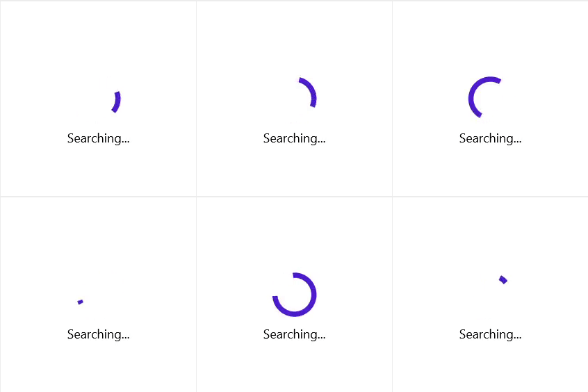
You can use busy notifications in your .NET MAUI apps that consist of text like “Searching…” or “Preparing” to indicate that things are getting ready. In general, though, just static text like this doesn’t provide enough sense of what is happening. A good busy notification will be an animated graphic that clearly acknowledges that time is passing and that this is expected, such as an arrow moving in a circle. So, instead of showing only static text, display meaningful indicators with or without text.
Best practices to show busy notifications in your .NET MAUI app
Following dos and don’ts will help you to add a busy notification in your .NET MAUI app better.
Dos
- Use busy notifications for short, indeterminate wait periods.
- Use busy notifications for indeterminate actions. For determinate actions, use progress indicators.
- Ensure that the busy notification is applied to all instances of a process in a consistent format.
- Use simple and single-colored busy notifications for more visual appeal in the UI.
Don’ts
- Don’t allow users to interact with the UI behind a busy notification.
- Don’t engage busy notifications for actions to be performed in the same thread.
- Don’t show inappropriate animations or graphics. The graphic should reflect the process. For example: Don’t show a searching graphic for loading a page.
- Don’t show a busy notification over the whole screen when a button is clicked; show it just over the button. Show the busy notification over the whole screen only when an entire page is being loaded.
Syncfusion .NET MAUI Busy Indicator control
Syncfusion delivered the .NET MAUI Busy Indicator control in our 2022 Volume 2 release. We finely crafted our .NET MAUI Busy Indicator control by considering all the previously discussed features and purposes.
This highly customizable busy notification control will allow you to:
- Use built-in animations.
- Show busy indications with custom messages.
- Adjust animation speed and size.
- Customize the busy indicator color.
- Customize the title text and placement.
Note: For more details, refer to the .NET MAUI Busy Indicator documentation.
Conclusion
Thanks for reading! In this blog, we have discussed the importance of busy notifications in a .NET MAUI app. Give our .NET MAUI Busy Indicator control a try, and leave your feedback in the comments section!
If you are not yet a Syncfusion customer, you can always download our free evaluation to see all our controls in action.
If you have any questions, you can contact us through our support forum, support portal, or feedback portal. We are always happy to assist you!
Related blogs
- Syncfusion Essential Studio 2022 Volume 2 Is Here!
- Introducing .NET MAUI Busy Indicator
- Introducing the New .NET MAUI Maps Control
- What’s New in .NET MAUI: 2022 Volume 2
