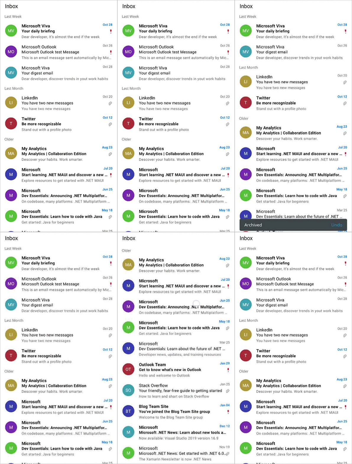
The .NET MAUI ListView component can virtually present data lists in a vertical or horizontal orientation with different layouts. Its rich feature set includes selection, template selectors, horizontal and vertical orientation, load more items, autofitting items, sorting, grouping, filtering, and more. It also supports swiping the ListView items in an Outlook-like fashion.
You can create an Outlook-like inbox appearance by customizing the ItemTemplate property and enabling the swiping feature using the AllowSwiping property. This blog will take you through the steps to do this.
Let’s get started!
Create the .NET MAUI ListView control
First, create a simple .NET MAUI app in Visual Studio and add the Syncfusion .NET MAUI ListView to it.
Data population
The .NET MAUI ListView is a data-bound control, so we have to create a data model to bind items to it.
Creating the data model
We need a model class to hold the data values, such as the sender, subject, and description, as in a simple data source to bind UI values. Additionally, I have used the IsAttached property to show the attachments in the emails and the IsImportant property to indicate the significance of the emails.
Refer to the following code example of the model class.
Public class InboxInfo : InotifyPropertyChanged
{

  #region Constructor

  public InboxInfo()
  {

  }

  #endregion

  #region Properties

  public string Name
  {
    get
    {
      return name;
    }
    set
    {
      name = value;
      OnPropertyChanged(“Name”);
    }
  }

  public string ProfileName
  {
    get { return profileName; }
    set
    {
      profileName = value;
      OnPropertyChanged(“ProfileName”);
    }
  }

  public string Subject
  {
    get
    {
      return subject;
    }

    set
    {
      subject = value;
      OnPropertyChanged(“Subject”);
    }
  }

  public string Description
  {
    get
    {
      return description;
    }

    set
    {
      description = value;
      OnPropertyChanged(“Description”);
    }
  }

  public DateTime Date
  {
    get
    {
      return date;
    }

    set
    {
      date = value;
      OnPropertyChanged(“Date”);
    }
  }

  public ImageSource Image
  {
    get
    {
      return image;
    }

    set
    {
      image = value;
      OnPropertyChanged(“Image”);
    }
  }

  public bool? IsAttached
  {
    get { return isAttached; }
    set
    {
      isAttached = value;
      OnPropertyChanged(“IsAttached”);
    }
  }

  public bool IsImportant
  {
    get { return isImportant; }
    set
    {
       isImportant = value;
       OnPropertyChanged(“IsImportant”);
    }
  }

  public bool IsOpened
  {
    get { return isOpened; }
    set
    {
      isOpened = value;
      OnPropertyChanged(“IsOpened”);
    }
  }

  #endregion

  #region Interface Member

  public event PropertyChangedEventHandler PropertyChanged;

  public void OnPropertyChanged(string name)
  {
    if (PropertyChanged != null)
    PropertyChanged(this, new PropertyChangedEventArgs(name));
  }

  #endregion
}
Creating the ViewModel
Let’s create a ViewModel and populate the InBoxInfos property with the data for the .NET MAUI ListView control. We have to populate each InBoxInfo property with its respective collection type property.
Refer to the following code example.
public class ViewModel : INotifyPropertyChanged
{
  #region Fields

  private ObservableCollection inboxInfos;

  #endregion

  #region Interface Member

  public event PropertyChangedEventHandler PropertyChanged;

  public void OnPropertyChanged(string name)
  {
    if (PropertyChanged != null)
       PropertyChanged(this, new PropertyChangedEventArgs(name));
  }

  #endregion

  #region Constructor

  public ListViewSwipingViewModel()
  {
    GenerateSource();
  }

  #endregion

  #region Properties

  public ObservableCollection<ListViewInboxInfo> InboxInfos
  {
    get { return inboxInfos; }
    set { inboxInfos = value; OnPropertyChanged("InboxInfos"); }
  }


  #endregion

  #region Generate Source

  private void GenerateSource()
  {
    ListViewInboxInfoRepository inboxinfo = new ListViewInboxInfoRepository();
    inboxInfos = inboxinfo.GetInboxInfo();
  }

  #endregion
}
Define swiping actions in the ViewModel
Now, we’ll define the indefinite swiping actions in the ViewModel using the elements of the SwipeTemplate property, like in the following code example.
public class ViewModel : INotifyPropertyChanged
{
  #region Fields

  ----------------

  #region Interface Member

  public event PropertyChangedEventHandler PropertyChanged;

  public void OnPropertyChanged(string name)
  {
    if (PropertyChanged != null)
       PropertyChanged(this, new PropertyChangedEventArgs(name));
  }

  #endregion

  #region Constructor

  public ViewModel()
  {

  }

  #endregion

  #region Properties

  public Command DeleteCommand
  {
    get { return deleteCommand; }
    protected set { deleteCommand = value; }
  }

  public Command UndoCommand
  {
    get { return undoCommand; }
    protected set { undoCommand = value; }
  }

  public Command ArchiveCommand
  {
    get { return archiveCommand; }
    protected set { archiveCommand = value; }
  }

  #endregion

  #region Generate Source

  private void GenerateSource()
  {
    ---------------------------------
    deleteCommand = new Command(OnDelete);
    undoCommand = new Command(OnUndo);
    archiveCommand = new Command(OnArchive);
  }

  private async void OnDelete(object item)
  {
    listViewItem = (ListViewInboxInfo)item;
    inboxInfo!.Remove(listViewItem);
  }

  private async void OnArchive(object item)
  {
    listViewItem = (ListViewInboxInfo)item;
    inboxInfo!.Remove(listViewItem);
  }

  private void OnUndo()
  {
    if (listViewItem != null)
    {
      inboxInfo!.Insert(listViewItemIndex, listViewItem);
    }
  }
}
Defining the ItemTemplate
Then, we’ll define the Outlook-like UI using the .NET MAUI ListView’s ItemTemplate property on the XAML page.
<ListView:SfListView.ItemTemplate>
 <DataTemplate>
  <Grid>
   <Grid.RowDefinitions>
     <RowDefinition Height=”5” />
     <RowDefinition Height=”20” />
     <RowDefinition Height=”20” />
     <RowDefinition Height=”20” />
     <RowDefinition Height=”5” />
   </Grid.RowDefinitions>
   <Grid.ColumnDefinitions>
     <ColumnDefinition Width=”72” />
     <ColumnDefinition Width=”*” />
     <ColumnDefinition Width=”70” />
   </Grid.ColumnDefinitions>

   <Grid Grid.Row=”1”
         Grid.Column=”0”
         Grid.RowSpan=”2”
         HeightRequest=”35”
         WidthRequest=”35”
         HorizontalOptions=”Center”
         VerticalOptions=”Center”>
    <Image Source=”{Binding Image}”
           HeightRequest=”40”
           WidthRequest=”40”
           Margin=”0, 15, 0, 0” />
    <Label Text=”{Binding ProfileName}”
           TextColor=”#FFFFFF”
           FontSize=”14”
           HorizontalTextAlignment=”Center”
           HorizontalOptions=”Center”
           VerticalOptions=”Center”
           VerticalTextAlignment=”Center”
           FontFamily=”Roboto-Regular”
           CharacterSpacing=”0.25”
           Margin=”0, 15, 0, 0” />
   </Grid>

   <Label Grid.Row=”1”
          Grid.Column=”1”
          Text=”{Binding Name}”
          FontFamily=”Roboto-Medium”
          FontSize=”14”
          TextColor=”#000000”
          Margin=”0, 2, 0, 0”
          LineBreakMode=”TailTruncation”
          CharacterSpacing=”0.25” />

   <Label Grid.Row=”2”
          Grid.Column=”1”
          Grid.ColumnSpan=”2”
          Text=”{Binding Subject}”
          FontFamily=”Roboto-Medium”
          FontSize=”13”
          Margin=”0,0,16,3”
          TextColor=”#000000”
          LineBreakMode=”TailTruncation”
          CharacterSpacing=”0.25” />

   <Label Grid.Row=”3”
          Grid.Column=”1”
          Grid.ColumnSpan=”2”
          Text=”{Binding Description}”
          FontFamily=”Roboto-Regular”
          FontSize=”12”
          TextColor=”#666666”
          Margin=”0,0,16,1”
          LineBreakMode=”TailTruncation”
          CharacterSpacing=”0.25” />

   <Label Grid.Row=”1”
          Grid.Column=”2”
          Text=”{Binding Date, Converter={StaticResource dateTimeConverter}}”
          TextColor=”#666666”
          FontFamily=”Roboto-Regular”
          HorizontalOptions=”End”
          HorizontalTextAlignment=”End”
          FontSize=”11”
          Margin=”0,0,16,0”
          CharacterSpacing=”0.15” />

   <Image Grid.Row=”2”
          Grid.Column=”2”
          HeightRequest=”30”
          WidthRequest=”30”
          Margin=”0, 0, 8, 0”
          Source=”paperclip.png”
          IsVisible=”{Binding IsAttached}”
          HorizontalOptions=”End”
          VerticalOptions=”Center”>
   </Image>

   <Image Grid.Row=”2”
          Grid.Column=”2”
          HeightRequest=”40”
          WidthRequest=”40”
          Margin=”0, 0, 2, 0”
          Source=”important.png”
          IsVisible=”{Binding IsImportant}”
          HorizontalOptions=”End”
          VerticalOptions=”Center”>
   </Image>
  </Grid>
 </DataTemplate>
</ListView:SfListView.ItemTemplate>
Defining swipe templates
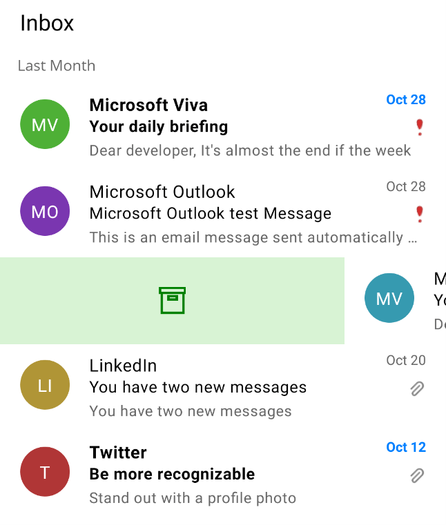
You can customize the UI to be displayed when performing swiping actions using the StartSwipeTemplate and EndSwipeTemplate properties.
In this demo, we are going to display the archive and delete icons at the start and end of swiping, respectively.
<ListView:SfListView.StartSwipeTemplate>
<DataTemplate>
<Grid BackgroundColor=”#D8F3D4”>
<Label Text=””
FontFamily=’{OnPlatform Android=ListViewFontIcons.ttf#,UWP=ListViewFontIcons.ttf#ListViewFontIcons,MacCatalyst=ListViewFontIcons,iOS=ListViewFontIcons}’
TextColor=”Green”
HorizontalOptions=”Center”
FontSize=”22”
FontAttributes=”Bold”
VerticalOptions=”Center”>
</Label>
</Grid>
</DataTemplate>
</ListView:SfListView.StartSwipeTemplate>
<ListView:SfListView.EndSwipeTemplate>
<DataTemplate>
<Grid BackgroundColor=”#F4DEDE”
x:Name=”listViewGrid”>
<Label Text=””
FontFamily=’{OnPlatform Android=ListViewFontIcons.ttf#,UWP=ListViewFontIcons.ttf#ListViewFontIcons,MacCatalyst=ListViewFontIcons,iOS=ListViewFontIcons}’
TextColor=”DarkRed”
HorizontalOptions=”Center”
FontSize=”26”
VerticalOptions=”Center”>
</Label>
</Grid>
</DataTemplate>
</ListView:SfListView.EndSwipeTemplate>
Refer to the following images.
|
|
|
Swipe actions defined in the ViewModel will be executed from the SwipeEnded event to achieve the Outlook-like swiping behavior. The SwipeEnded event will be raised when you complete the swiping action.
Refer to the following code example.
Private async void ListView_SwipeEnded(object sender, Syncfusion.Maui.ListView.SwipeEndedEventArgs e)
{
  if (e.Offset <= 100)
  {
    return;
  }

  if (e.Direction == SwipeDirection.Right)
  {
    ViewModel.ArchiveCommand.Execute(null);
  }

  if (e.Direction == SwipeDirection.Left)
  {
    ViewModel.DeleteImageCommand.Execute(null);
  }
}
Finally, the actual code does the indefinite swiping, like in Outlook. In it, we use the SwipeOffset property by considering the width or height of the .NET MAUI ListView control with the SfListView.Orientation property accordingly.
Private void ListView_PropertyChanged(object sender, PropertyChangedEventArgs e)
{
  if (e.PropertyName == “Width” && ListView.Orientation == ItemsLayoutOrientation.Vertical && ListView.SwipeOffset != ListView.Width)
     ListView.SwipeOffset = ListView.Width;
  else if (e.PropertyName == “Height” && ListView.Orientation == ItemsLayoutOrientation.Horizontal && ListView.SwipeOffset != ListView.Height)
     ListView.SwipeOffset = ListView.Height;
}
To summarize, each InboxInfo model population and swiping action is done in the ViewModel’s InboxInfos collection property and Commands, respectively. The InboxInfos collection will be bound to the .NET MAUI ListView on your XAML page. The SwipeOffset will be updated based on the orientation, swiping will be updated based on the swiping actions listed in the SwipeEnded event, and other UI-related actions will be handled in the Behavior class.
After executing the previous code examples, we will get output like the following GIF image.

GitHub reference
You can download the entire code example for Outlook-like swiping in .NET MAUI ListView on GitHub.
Conclusion
Thanks for reading! In this blog, we have seen how to achieve an Outlook-like swiping feature in your .NET MAUI app using the Syncfusion .NET MAUI ListView. Try out the steps in this blog and leave your feedback in the comments section below!
For current customers, the newest version of Essential Studio for .NET MAUI is available from the License and Downloads page. If you are not a Syncfusion customer, you can always download our free evaluation to see all our controls.
For questions, you can reach us through our support forum, support portal, or feedback portal. We are always happy to assist you!


Comments (2)
Maybe it’s better to use:
https://learn.microsoft.com/en-us/windows/communitytoolkit/mvvm/introduction
In sample projects?
It’s really simplyfying things such INotifyPropertyChanged!
https://www.youtube.com/watch?v=aCxl0z04BN8
Nice example, but as your are using a MVVM approach, could you redo the example without code behind and instead use and EventToCommandBehavior for the SwipeEnded event?