TL;DR: Syncfusion’s Chart of the Week series hits 75 blogs! From investment trends to stock forecasts, each post showcases versatile, cross-platform charts in .NET MAUI, WinUI, and WPF. Stay tuned for more innovative data visualizations!
It’s a moment of great pride as we celebrate the 75th blog in our Chart of the Week series! As the Product Owner of Syncfusion’s Chart controls across platforms like .NET MAUI, Xamarin, WinUI, WPF, and WinForms, this series has been an incredible journey of exploration, innovation, and education for both me and the community.
Each blog has been an opportunity to showcase our chart controls’ versatility, performance, and customization capabilities, helping developers craft meaningful data visualizations for a wide range of apps.
A glimpse into our chart journey
Over the past months, our Chart of the Week series has brought a variety of chart types to life, each tailored to solve real-world problems and highlight meaningful data insights.
Here’s a look back at some of the most notable highlights:
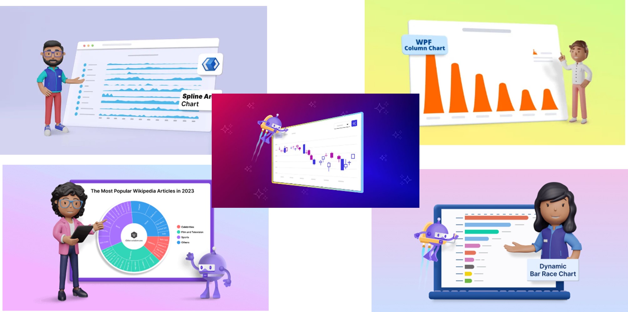
1. Creating a WinUI Spline Area Chart for Top Google Investing Searches in 2022
This blog explores top Google search trends for investing in 2022, visualized through the Syncfusion WinUI Spline Area Chart. With investment trends constantly evolving, tracking these changes offers crucial insights. This post showcases unique visual effects to enhance the clarity of spline graphs.
2. Creating a WPF Column Chart for Countries with the Most Active Volcanoes
Dive into volcanic activity data with this blog, where we use the Syncfusion WPF Column Chart to represent the world’s most active volcanoes since 1950. Inspired by the awe-inspiring nature of volcanoes, we crafted a series template to resemble the fiery eruptions themselves, adding a thematic touch to this compelling dataset.
3. Creating a .NET MAUI Dynamic Bar Race Chart for the Top 10 Populations in the World
Bar race charts are powerful for showing changes over time, and this blog demonstrates how to create an engaging one using the Syncfusion .NET MAUI Cartesian Charts control.
4. Creating a .NET MAUI Sunburst Chart to Visualize the Most Popular Wikipedia Articles
In this post, we visualize the most-viewed Wikipedia articles of 2023 with the .NET MAUI Sunburst Chart. Given Wikipedia’s role as a global information hub, this chart captures users’ most popular queries, offering a fascinating view into global curiosity and knowledge-seeking trends.
5. Forecasting Stock Trends with an AI-Powered .NET MAUI Candle Chart
Discover the power of predictive analytics with our AI-enhanced .NET MAUI Candle Chart. This blog provides a step-by-step guide to using historical data and Azure OpenAI for forecasting stock trends, enabling readers to make data-driven trading decisions with insights into future market movements.
The power of versatility
One of the strengths of Syncfusion’s Chart controls is their cross-platform versatility. Whether you’re building a mobile app in .NET MAUI or a desktop app in WPF, our charts provide seamless experiences across platforms. Each blog in the series has demonstrated the adaptability of our charts to meet the needs of different use cases, offering support for Cartesian charts, circular charts, and more.
What’s next?
While we’ve reached a milestone, the journey is far from over. The world of charts is constantly evolving, and there are endless possibilities for new explorations. In the coming weeks, I’m excited to continue bringing you new use cases, advanced techniques, and innovative ways to leverage charts to solve complex business problems. The best is yet to come!
Stay updated with our chart of the week series
We hope you’ve enjoyed this journey through data visualization and are inspired by the possibilities each chart offers. To make sure you don’t miss future posts, subscribe to our Chart of the Week series via our RSS feed. Stay connected and be the first to discover new insights, techniques, and real-world data visualization apps!
Conclusion
I’d like to extend my heartfelt thanks to the developer community, my team, and all the readers who have followed the series. Your support, feedback, and enthusiasm have been crucial in making this journey successful. This milestone would not have been possible without you.
Our existing customers can download the new version of Essential Studio® from the License and Downloads page. If you are not a Syncfusion customer, try our 30-day free trial to check out our incredible features.
If you require assistance, please don’t hesitate to contact us via our support forum, support portal, or feedback portal. We are always eager to help you!


