The React Menu Bar is a graphical user interface component that serves as a navigation header for your web application. It supports data binding, templates, icons, navigation, a hamburger menu, multilevel nesting, and orientation features. It can be populated using an array of JavaScript objects. In this blog, I am going to walk you through five major features of the Menu Bar control:
Data binding
The React Menu component provides options to load data either from local data sources or from remote data services. This can be done through the items property, which accepts an array of JavaScript objects, and the fields property, which is used to map the items property.
The component supports the following types of data bindings:
JSON data
The React Menu Bar can generate menu items through an array of objects by mapping fields from the fields property.
Hierarchical Data
The React Menu can be populated with a hierarchical data source that contains a nested array of JSON objects. You can directly assign hierarchical data to the items property, and map all the field members with corresponding keys from the hierarchical data to the fields property.
The following code example showcases the model of a hierarchical data source.
The rendering is done using the following code.
The following GIF image showcases hierarchical data binding in the React Menu Bar.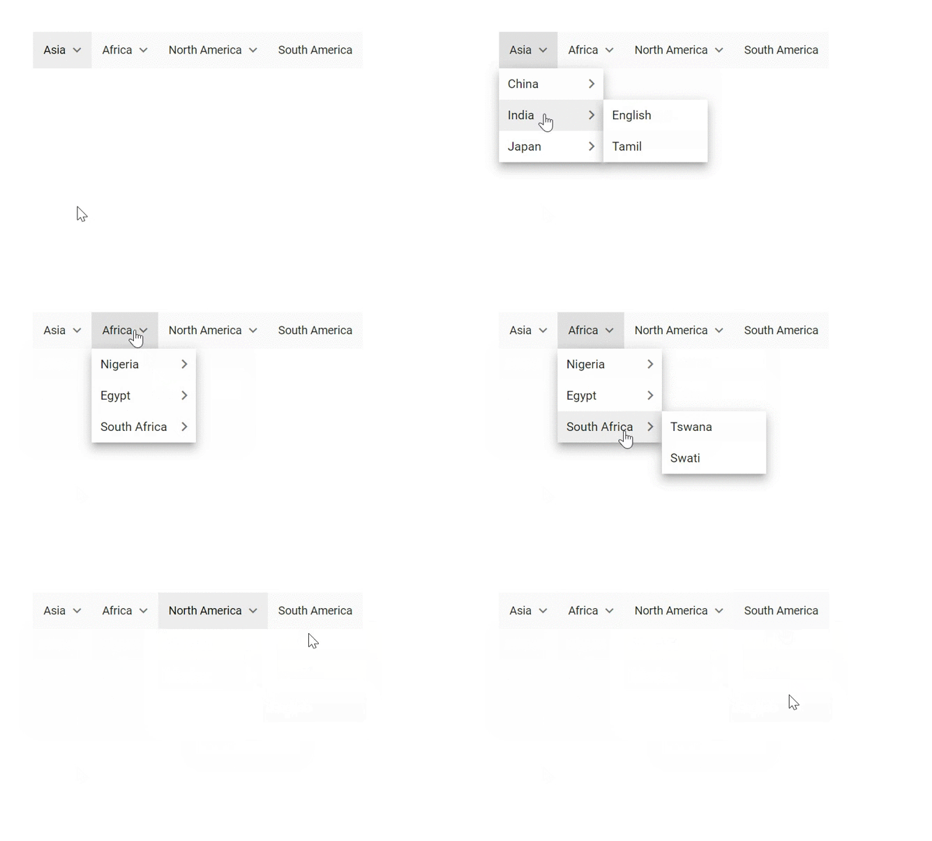
Self-referential data
The Menu Bar can be populated from a self-referential data structure that contains an array of JSON objects with parentId mapping. You can directly assign self-referential data to the items property, and map all the field members with corresponding keys from self-referential data to the fields property. To render the root-level nodes, specify the parentId as null, or just skip specifying the parentId in items. In the following example, the id, pId, and text columns from self-referential data have been mapped to the itemId, parentId, and text fields, respectively.
The following code example showcases the model of a hierarchical data source.
And the rendering is done as follows.
The following GIF image showcases hierarchical data binding in the Menu Bar.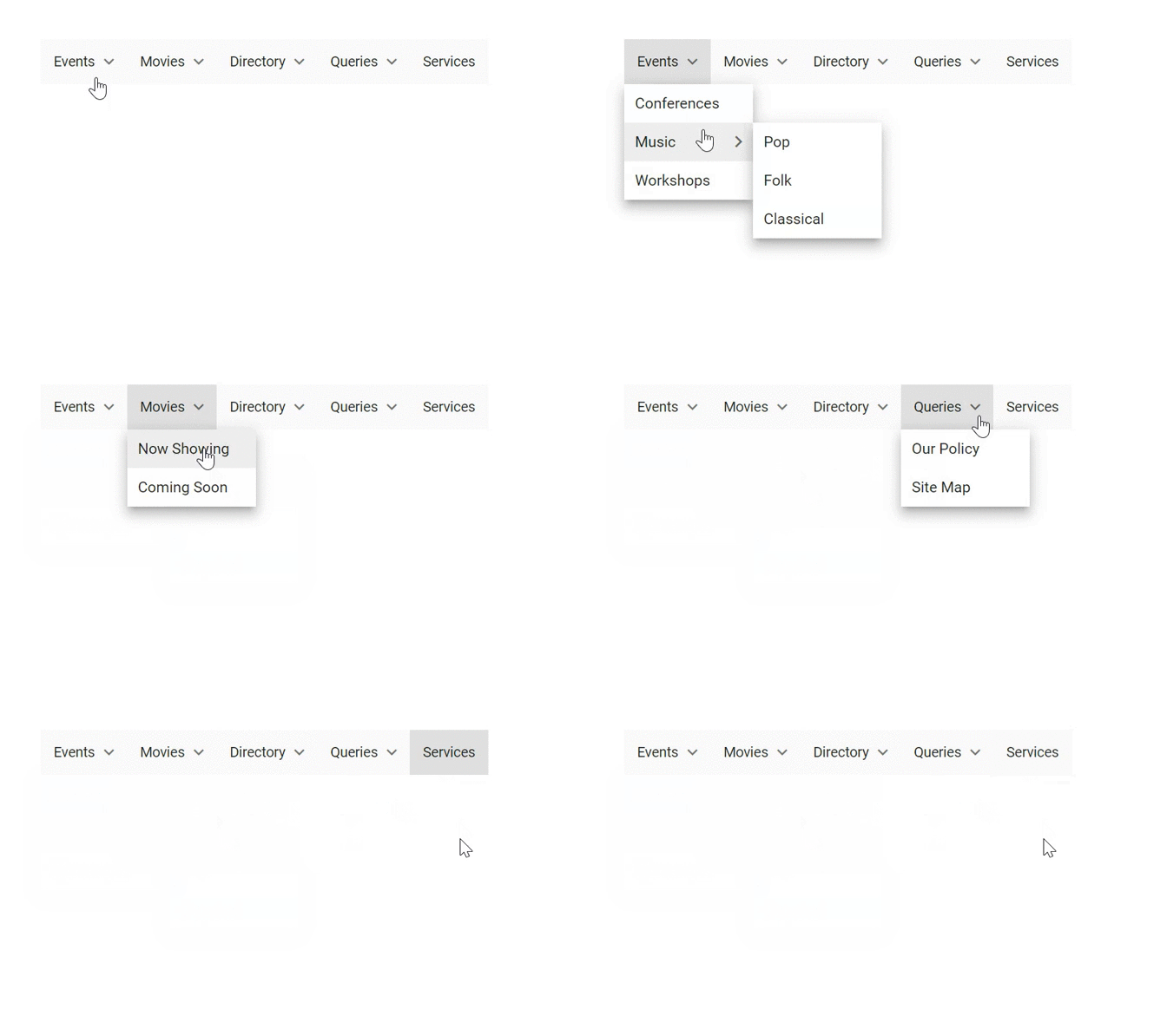
Data service
The React Menu Bar can be populated using remote data as a data service. You can achieve this by using the DataManager. The items property has been assigned with the resultant data in the callback function.
And the rendering is done using the following code.
Orientation
The React Menu Bar supports two types of orientation that are used to specify the direction in which a menu is to be rendered. The types of orientations are:
- Portrait (vertical)
- Landscape (horizontal)
Vertical orientation
The React Menu Bar can also be rendered vertically by setting the orientation property. You can use this for web applications that need to display the items as a side panel.
The following animation showcases a vertical menu.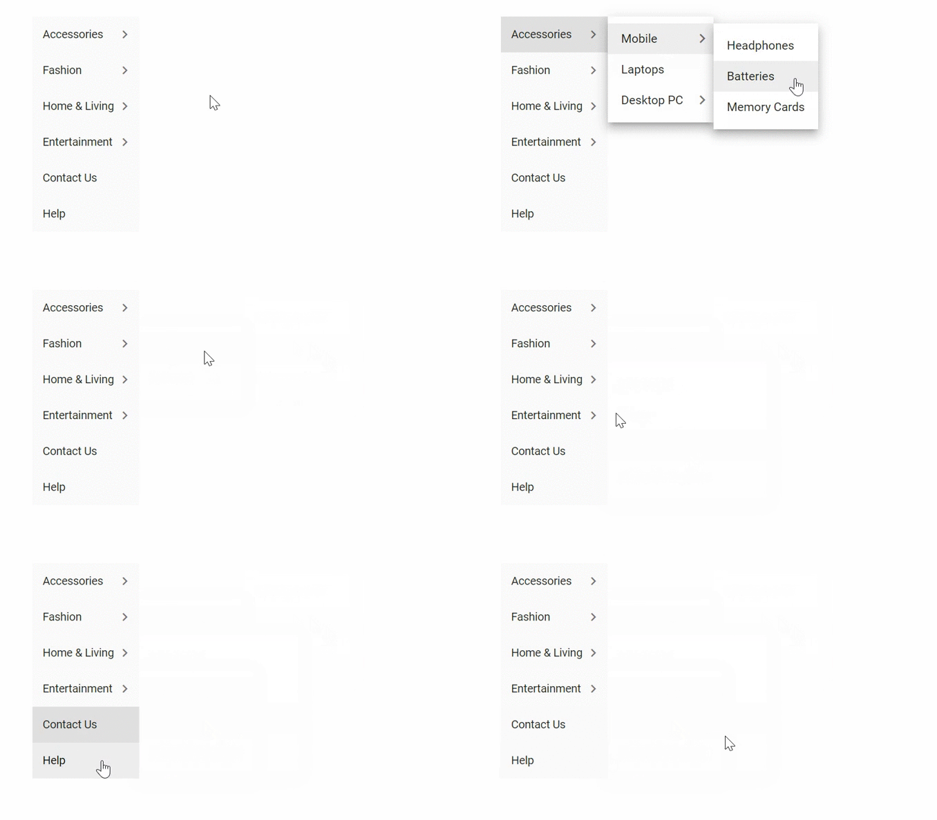
Horizontal orientation
Horizontal orientation displays the menu items horizontally and is the default orientation. You can use this for web applications that need to display items as a header.
Icons and navigation
The React Menu Bar supports icons and navigation in the header menu items as well as submenu items.
Icons
Each menu item can contain an icon or image in it to provide a visual representation of an action. To place an icon on a menu item, set the iconCss property with the required icon CSS. By default, the icon is positioned at the left of the menu item.
You can refer to the following link to view the available icons and their codes:
https://ej2.syncfusion.com/react/documentation/appearance/icons/?no-cache=1
Navigation
The React Menu Bar can be used to navigate from one page to another webpage when a menu item is clicked. This can be achieved by providing a link to the menu item using the url property. You can add this navigation in header menus and submenus by using the url property.
Hamburger menu
The hamburger menu or hamburger icon is the name given to the menu icon found on websites that hides the traditional file menu. This is alternatively referred to as the hotdog menu or three-line menu. Using a hamburger menu makes it easier to view program options on mobile devices. You can enable this option using the hamburgerMode property. You can use the showItemOnClick property to open the menu when the hamburger is clicked.
You can create two types of hamburger menus with the help of the orientation property. They are:
- Horizontal hamburger menu
- Vertical hamburger menu
Horizontal hamburger menu
This menu is also called a three-line menu, and it is very suitable for mobile-oriented applications since it occupies a small space and is displayed only in the header.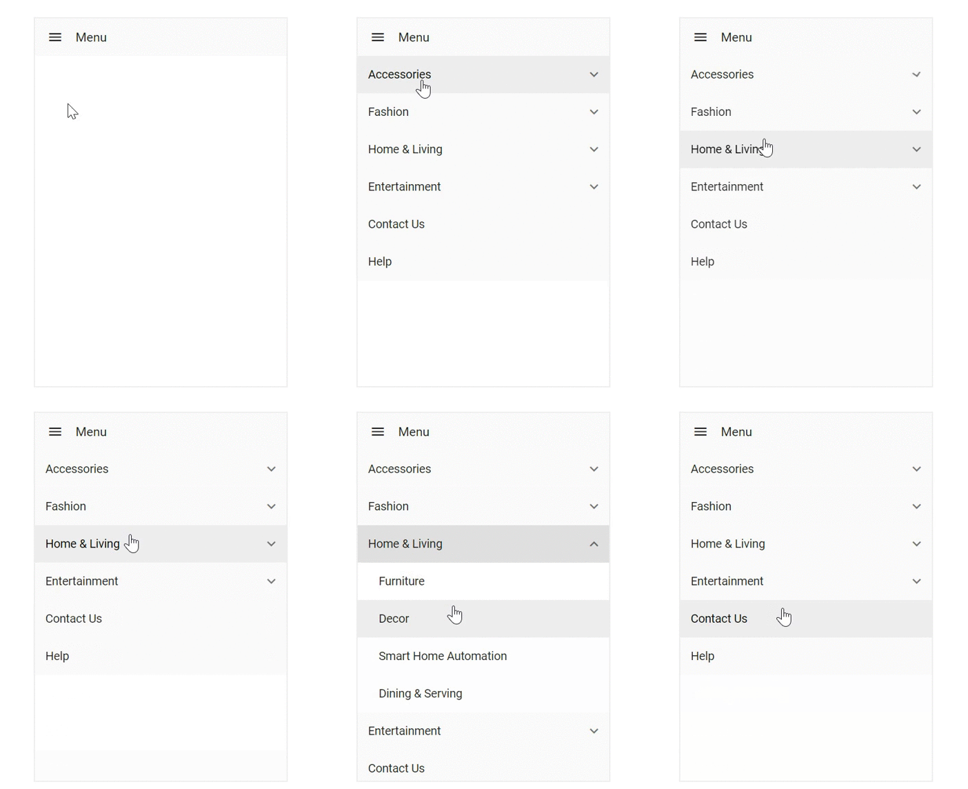
Vertical hamburger menu
This menu is just like the horizontal hamburger menu, but it opens the submenu downward instead of popping up to the right side of the button.
The following GIF image showcases a vertical hamburger menu.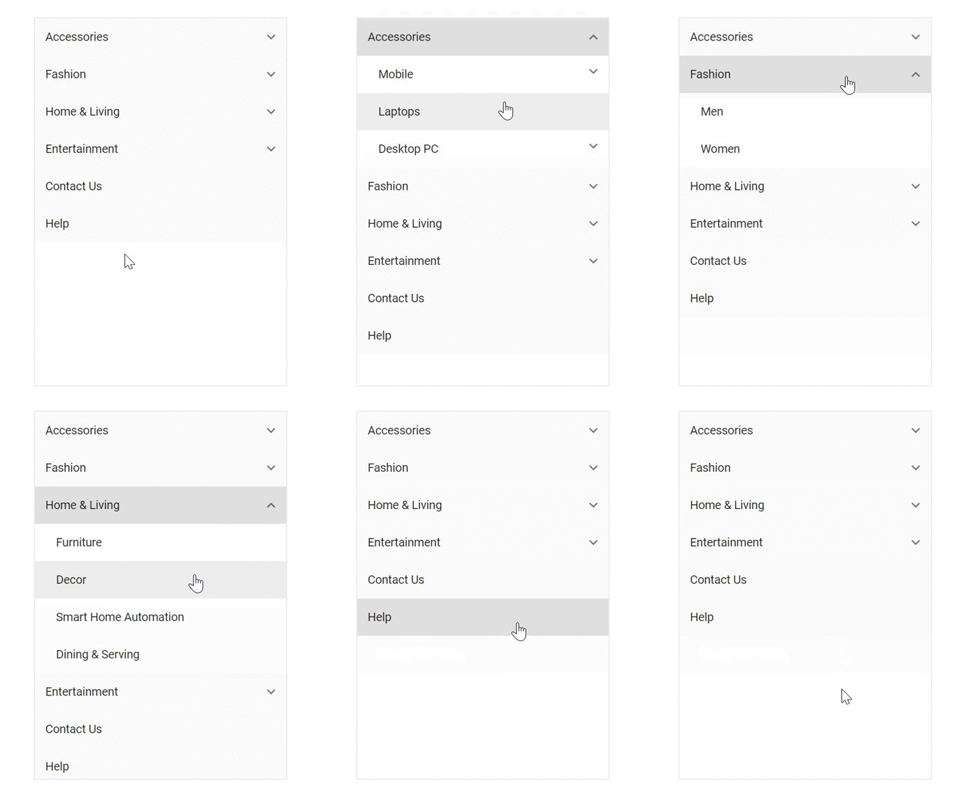
Template
To provide flexibility, the React Menu Bar component offers template support. You can render a custom user interface to display menu items using the template property. A template can include a mixture of static HTML and web controls. You can customize the menu using two kinds of templates:
- Header template to customize the menu header element.
- Item template to customize the menu item element.
The following code example showcases templating with header and item customization.
The template code follows.
The rendering code is as follows.
The following GIF image showcases templates in the Menu Bar.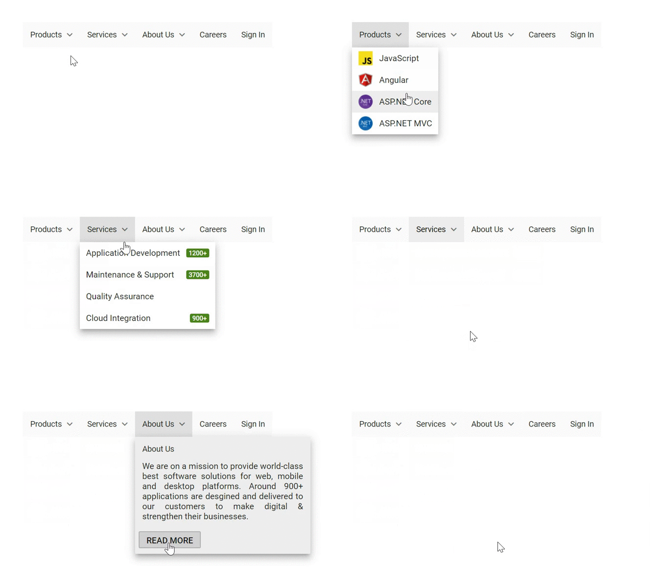
Conclusion
I hope you now have a better understanding of the major features supported by the React Menu Bar control.
What else do you expect from a list box? Please share your thoughts in the comments section below.
If you’re already a Syncfusion user, you can download the product setup to try out this control. Otherwise, you can download a free 30-day trial.
If you have any questions about these features, please contact us through our support forum, Direct-Trac, or Feedback Portal. We are happy to assist you!
