Vue is one of the leading JavaScript libraries used for web development. Since its launch in 2014, Vue has grown steadily in popularity, providing amazing features to attract developers. For example, its component-based UI design approach allows developers to build complex UIs in no time.
In this article, I will discuss 10 Vue component libraries that can make developers’ life easier.
1. BootstrapVue
BootstrapVue is a Bootstrap-based CSS library that combines concepts of both Bootstrap and Vue. Using this library, you can create responsive, mobile-first, ARIA-accessible web projects.
Bootstrap Vue has more than 350,000 weekly NPM downloads and 14,000 GitHub stars.
Features of Bootstrap Vue
- Responsive, modular, and configurable components.
- Library based on Bootstrap.
- Documentation is simple and easy to understand.
- Faster completion of front-end applications.
- Strong and proactive community support.
- There are more than 1,000 icons, many directives, 45+ accessible plugins, and more than 85 components.
Installation
You can easily install Bootstrap Vue using NPM or Yarn, as follows.
// Using NPM
npm install bootstrap-vue
// Using Yarn
yarn add bootstrap-vue
Example usage
The following code shows an example of a Bootstrap Vue button.
// app.js file
import Vue from 'vue'
import { BootstrapVue, IconsPlugin } from 'bootstrap-vue'

import 'bootstrap/dist/css/bootstrap.css'
import 'bootstrap-vue/dist/bootstrap-vue.css'

Vue.use(BootstrapVue)
Vue.use(IconsPlugin)
// app.vue fileQuasar
<div>
  <b-button variant="outline-primary">Button</b-button>
</div>

Syncfusion Vue UI component suite is the developers’ choice to build user-friendly web applications. You deserve them too.
2. Vuetify
Vuetify is a beautiful Vue UI package that uses Material design specifications. It comes with various responsive, modular Material components that you do not require any design skills to use.
Vuetify has more than 433,000 weekly NPM downloads and 35,000 GitHub stars.
Features of Vuetify
- It allows you to customize applications using dynamic layouts.
- You can use SASS libraries to style your components.
- It supports Vue CLI-3, accessibility standards, and all modern browsers.
- It offers a variety of interchangeable UI elements, including navigations, carousels, and cards.
- Basic templates are also available from Vuetify for Apache Cordova, a la carte, Electron, PWA, NUXT, Webpack, and simple HTML.
Installation
You can easily install Vuetify using NPM or Yarn, as follows.
// Using NPM
npm install vuetify
// Using Yarn
yarn add vuetify
Example usage
The following code shows an example of a Vuetify button.
// app.js file
import Vue from 'vue'
import Vuetify from "vuetify";
import "vuetify/dist/vuetify.min.css";

Vue.use(Vuetify);

new Vue({
vuetify: new Vuetify(opts),
render: h => h(App)
}).$mount("#app");
// app.vue file

<template>
  <v-btn depressedcolor="primary">
      Primary
  </v-btn>
</template>
3. Buefy
Buefy is a lightweight Vue UI component library based on Bulma. Bulma is primarily static CSS that offers no practical advantages. Buefy fixes that by providing valuable elements that utilize Bulma’s CSS right out of the box. Buefy is an excellent library to use if you are familiar with Bulma, since it offers a solid integration.
Buefy has more than 64,000 weekly NPM downloads and 9,000 GitHub stars.
Features of Buefy
- The features of Bulma and Vue combine to enable attractive application creation with minimum code.
- Despite having a distinctive appearance and feel by default, the framework is incredibly adaptable.
- Customizations are quick and straightforward. You can define your brand colors, sizing guidelines, and more.
- Buefy uses Sass to customize global variables.
- Lightweight and no internal dependencies.
Installation
You can easily install Buefy using NPM, as follows.
// Using NPM
npm install buefy
Example usage
The following code shows an example of a Buefy button.
// app.js file

import Vue from 'vue'
import Buefy from 'buefy'
import 'buefy/dist/buefy.css'

Vue.use(Buefy)
// app.vue file

<template>
  <section>
    <b-button @click="click">Click</b-button></section>
</template>

<script>
  export default {
   methods: {
      click() {
        this.$buefy.notification.open('Button Clicked!!')
      }
    }
  }
</script>

Explore the best and most comprehensive Vue UI components library in the market.
4. Quasar
Quasar is another popular Vue component framework introduced to implement high-performance Vue.js user interfaces. It offers support for desktop and mobile browsers right out of the box. It has more than 85,000 weekly NPM downloads and 21,000 GitHub stars.
Features of Quasar
- It can be used for desktop, web, and mobile browsers.
- Supports SPA, SSR, PWA, mobile app, desktop app, and browser extension build modes.
- Capable of automatic dead code elimination (tree shakable).
- It is easily customizable and extendable.
- Regularly updated.
- It is a performance-focused framework.
Installation
You can easily install Quasar using NPM or Yarn, as follows.
// Using NPM
npm install quasar
// Using Yarn
yarn add quasar
Example usage
The following code shows an example of a Quasar button.
// app.js file

import Vue from 'vue'
import { Quasar } from "quasar";

Vue.use(Quasar);
// app.vue file

<template>
  <q-btn color="purple" label="Purple" />
</template>
5. Element Plus
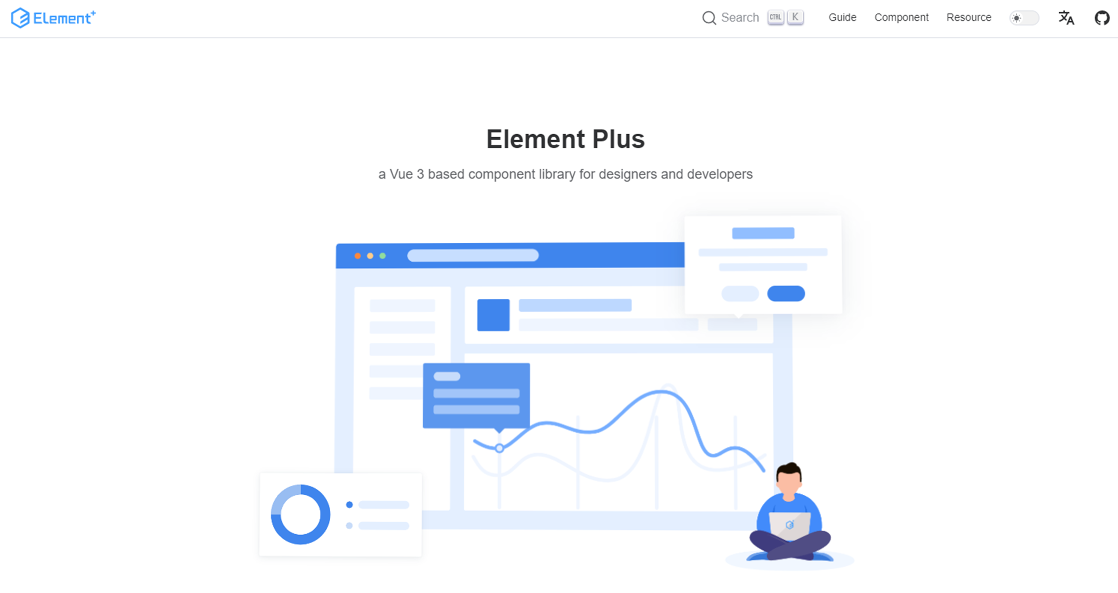
Element Plus is a UI component library based on Vue 3 that was introduced as the successor of the popular library, Element UI. It offers a set of complex UI components to make developers’ work easier, including timelines, calendars, data pickers, and trees. In addition, you can translate every string in Element Plus UI components using the i18n standard.
Element Plus has more than 97,000 weekly NPM downloads and 17,000 GitHub stars.
Features of Element Plus
- Was written in TypeScript.
- Provides built-in transitions.
- Supports translations for more than 30 languages.
- Has a dark mode.
- It is highly customizable using SCSS variables.
Installation
You can easily install Element Plus using NPM or Yarn, as follows.
// Using NPM
npm install element-ui
// Using Yarn
yarn add element-ui
Example usage
The following code shows an example of an Element Plus button.
// app.js file

import Vue from 'vue'
import ElementPlus from "element-plus";
import "element-plus/dist/index.css";

Vue.use(ElementPlus);
// app.vue file

<template>
  <el-button type="success">Success</el-button>
</template>

Every property of the Syncfusion Vue components is completely documented to make it easy to get started.
6. Syncfusion Vue UI
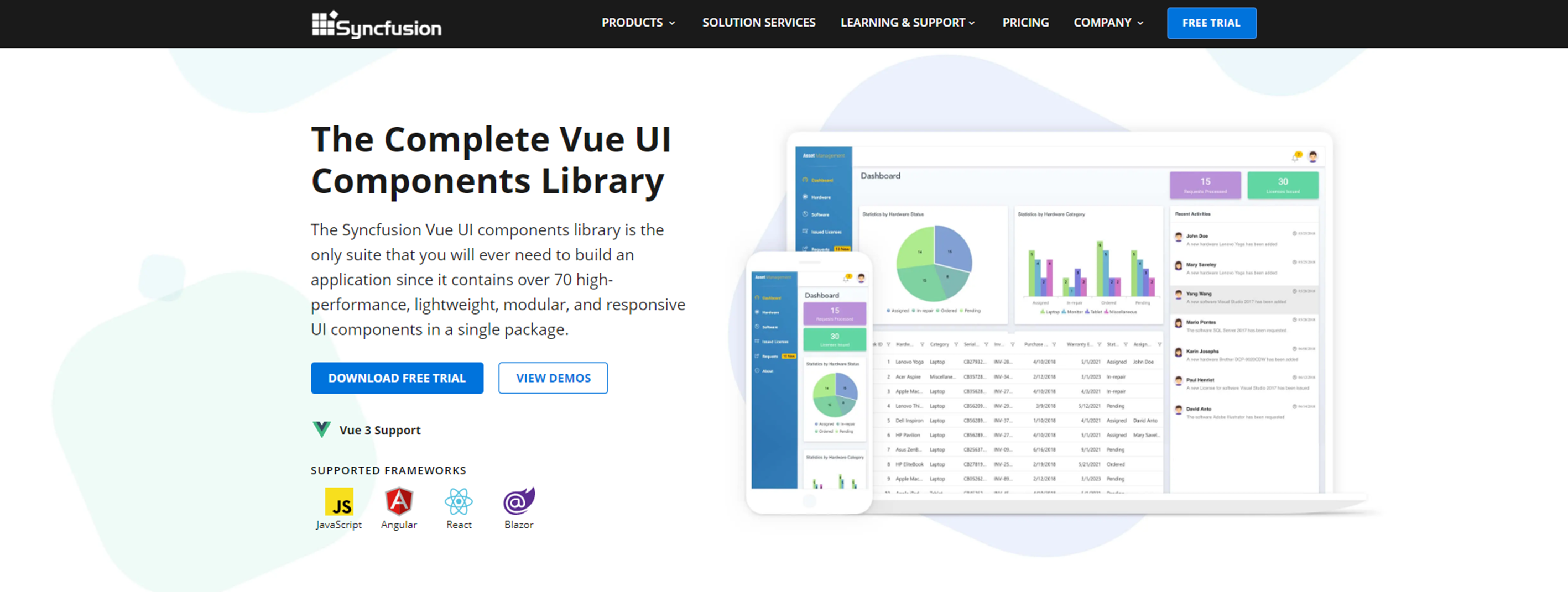
The Syncfusion Vue UI components library provides 70+ high-performance, lightweight, modular, and responsive UI components in a single package. It includes a number of complex UI components designed to make developers’ work easier, such as a Data Grid, Scheduler, Calendar, TreeView, Maps, Pivot Table, and Spreadsheet. In addition to Vue, it has JavaScript, Angular, React, and Blazor libraries.
Features of Syncfusion Vue UI suite
- To facilitate selective referencing, all components are designed as modules.
- The components are touch-friendly and adaptable to multiple devices.
- A global audience in various languages and cultures can use these components.
- Extensive demos and documentation.
- Regular updates.
- Lightweight.
Installation
You can easily install Syncfusion Vue UI using NPM as follows.
// Using NPM
npm install @syncfusion/ej2-vue-base
Example usage
The following code shows an example of a Syncfusion Vue UI button.
// app.js file

import Vue from 'vue'
import { ButtonPlugin } from "@syncfusion/ej2-vue-buttons";

Vue.use(ButtonPlugin);
// app.vue file

<template>
  <ejs-button :isPrimary="true">Primary</ejs-button>
</template>
7. Vue Material
Vue Material is a simple, lightweight Vue component library built based on Material design specs. It provides more than 50 fully responsive components, allowing you to create well-designed applications for any solution.
Vue Material has more than 15,000 weekly NPM downloads and 9,000 GitHub stars.
Features of Vue Material
- Support for all modern web browsers.
- Dynamic themes and on-demand components.
- Lightweight and simple to use.
- Responsive components for any screen size.
Installation
You can easily install Vue Material using NPM or Yarn, as follows.
// Using NPM
npm install vue-material
// Using Yarn
yarn add vue-material
Example usage
The following code shows an example of a Vue Material button.
// app.js

import Vue from 'vue'
import VueMaterial from 'vue-material'
import 'vue-material/dist/vue-material.min.css'
import 'vue-material/dist/theme/default.css'

Vue.use(VueMaterial)
// app.vue file

<template>
  <md-button class="md-primary">Primary</md-button>
</template>

Explore the different application UIs developed using Syncfusion Vue components.
8. Mint UI
Mint UI is a library of mobile UI elements based on Vue. It provides styles for pages and handles elements similar to what we see in mobile applications allowing developers to build mobile-like UIs using Vue.
Mint UI has more than 3,500 weekly NPM downloads and 16,000 GitHub stars.
Features of Mint UI
- On-demand loading to import styles only when needed.
- The compressed package size is around 30KB.
- Mobile-friendly components built with CSS and JavaScript.
- Animations are handled using CSS3 to avoid complications in mobile devices.
Installation
You can easily install Mint UI using NPM, as follows.
// Using NPM
npm install mint-ui
Example usage
The following code shows an example of a Mint UI button.
// app.js

import Vue from 'vue'
import MintUI from "mint-ui";
import "mint-ui/lib/style.css";

Vue.use(MintUI)
// app.vue file

<mt-button type="primary">primary</mt-button>
9. iView
iView is a top-notch Vue UI component library that provides various functional and attractive components. It provides many ready-to-use features and components, including a login/logout page, breadcrumb and tab navigation, a lock screen, a message center, forms, and table elements.
iView has more than 12,000 weekly NPM downloads and 24,000 GitHub stars.
Features of iView
- A powerful CLI.
- Extensive demos and documentation.
- User-friendly API with regular updates.
Installation
You can easily install iView using NPM or Yarn as follows.
// Using NPM
npm install iview
//Using Yarn
yarn add iview
Example usage
The following code shows an example of an iView button.
// app.js

import Vue from 'vue'
import iView from "iview";
import "iview/dist/styles/iview.css";

Vue.use(iView)
// app.vue file

<template>
  <Button>Default</Button>
  <Button type="primary">Primary</Button>
</template>

See how Syncfusion Vue components can be transformed into beautiful and efficient applications.
10. Vux
Vux is a UI library that provides mobile UI components based on Vue and WebUI. Vux documentation is primarily written in Chinese and has a Chinese provenance.
Vux has more than 1,900 weekly NPM downloads and 17,600 GitHub stars.
Features
- Globalization support.
- You have the complete freedom to use any other library or component alongside Vux components.
- Custom themes can be configured.
Installation
You can easily install Vux using NPM, as follows.
// Using NPM
npm install vux
Example usage
The following code shows an example of a Vux button.
// app.js

import Vue from 'vue'
import { XButton } from 'vux'
Vue.component('x-button', XButton)
// app.vue file
<template>
<x-button class="weui-btn weui-btn_default"> Button </x-button>
</template>

Integrate Syncfusion Vue components into your web apps today and watch them shine like never before.
Conclusion
In this article, I discussed 10 different Vue component libraries. Each of them has unique features and can be used based on your requirements.
I hope my descriptions help you choose the best Vue component library for your project. Thank you for reading.
For questions, you can contact us through our support forum, support portal, or feedback portal. We are always happy to assist you!
