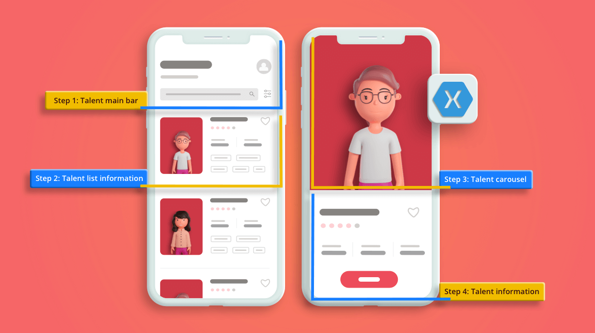
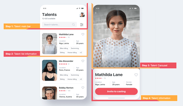
In this blog, we’ll be replicating a talent-casting UI in Xamarin.Forms obtained from this Dribble design site.
Our design contains the following screens:
- Talents: Shows the list of candidates and their details.
- TalentsDetails: Shows more details about the candidate.
Refer to the following screenshot.
Designing the Talents page
We will start by designing the first screen:
- First, we’ll name it TalentPage.
- To create the rating bar, we’ll be using the Syncfusion Xamarin Rating control.
- Then, we are going to use a CollectionView to display a list of data. If you want to know more about it, you can refer to this blog.
- Finally, we’ll add the PancakeView package to all our projects using the following namespace.
xmlns:PanCake="clr-namespace:Xamarin.Forms.PancakeView;assembly=Xamarin.Forms.PancakeView"
Let ‘s code!
Main layout structure
It’s important to make a good selection in the layouts that we will be using. In this case, for the main layout structure, I used the grid from the following namespace.
<!-- Main structure-->
 <Grid RowSpacing="0" RowDefinitions="Auto,Auto,Auto,*" ColumnDefinitions="*,Auto" Padding="25,60,25,0">
      <!-- You must write here what is explained from the step number 1 -->
 </Grid>
I recommend this article, which will help you a lot while building UIs with grids.
Step 1: Talent main bar
 To start with, let’s divide the talent main bar into the following controls:
- Title and number of talents
- Profile picture (to make the rounded edges of the photos, we will use Pancake View.)
- Search controls.
Code implementation
<!-- Header structure-->
  <!-- Title-->
  <Label Grid.Row="0" Grid.Column="0" Text="Talents" FontAttributes="Bold" FontSize="30"/>
  <!-- Profile imagen with rounded corners-->
  <PanCake:PancakeView Grid.Row="0" Grid.Column="1" HeightRequest="100" Grid.RowSpan="2"  CornerRadius="15">
         <Image Source="Nick"/>
  </PanCake:PancakeView>
  <!-- Subtitle with number of talents-->
  <Label Grid.Row="1" Grid.Column="0" Text="12 420 available" FontSize="15" TextColor="#90999f"/>
  <!-- Talent search bar-->
  <SearchBar Grid.Row="2" Grid.Column="0" Placeholder="Search talents ..." BackgroundColor="Transparent" Margin="0,15,0,0"/>
  <!-- Settings Icon -->
  <Image Grid.Row="2" Grid.Column="1" Source="Settings" Margin="15,20,15,0"/>

<!-- You must add here what is explained in the next step -->
Step 2: Talent list information
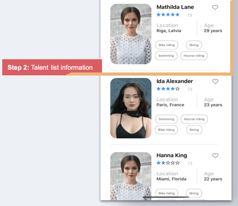 As the main control, we will use the CollectionView to show the list of data.
Let’s learn how to do it step by step:
-
- Use the following namespace to include the collection view in your application.
<!-- Talent list information--> <CollectionView Grid.Row="3" Grid.Column="0" Grid.ColumnSpan="2" Margin="5,0" VerticalScrollBarVisibility="Never" HeightRequest="445" ItemsSource="{Binding talents}"> <CollectionView.ItemTemplate> <DataTemplate> <!-- You must add here what is explained in the next step --> </DataTemplate> </CollectionView.ItemTemplate> </CollectionView> - Now the CollectionView is created. Let’s focus on how to create the layout that will contain the structure of the information. We’ll implement a grid that will have three columns and five rows using the following namespace.
<Grid RowDefinitions="Auto,Auto,Auto,Auto,Auto" ColumnDefinitions="Auto,*,Auto">
   <!-- You must add here what is explained in the next step -->
</Grid>
- Within the previous step, we are going to add the following information:
- Main image
- Talent name
- Heart icon
To do so, use the following namespace in your application.
<!--Main imagen --> <PanCake:PancakeView Grid.Row="1" Grid.Column="0" Grid.RowSpan="6" CornerRadius="20"> <Image Source="{Binding Picture}" HeightRequest="200" WidthRequest="130" Aspect="Fill"/> </PanCake:PancakeView> <!--Talent Name--> <Label Grid.Row="1" Grid.Column="1" Grid.ColumnSpan="2" Padding="10,0,0,0" Text="{Binding Name}" FontSize="18" FontAttributes="Bold"/> <!--Heart icon--> <Image Grid.Row="1" Grid.Column="2" HorizontalOptions="End" Margin="0,0,10,0" Source="Heart"/> <!-- You must add here what is explained in the next step --> - And now, it’s time to add the Rating control. To create this, we will use the Syncfusion Xamarin Rating control, as we said earlier in this blog post.Add the Syncfusion.Xamarin.SfRating NuGet package to all your projects. (You can read more information about it in this control documentation.)

- Then, add the following namespace in your XAML file.
xmlns:rating="clr-namespace:Syncfusion.SfRating.XForms;assembly=Syncfusion.SfRating.XForms"
- And then, let’s add the rating control to our screen using the following namespace.
<!--Rating component--> <rating:SfRating Grid.Row="2" Grid.Column="1" Grid.ColumnSpan="2" Margin="10,0,0,0" ItemCount="5" Value="{Binding Rating}" ReadOnly="true" ItemSize="13" ItemSpacing="2" /> <Label Grid.Column="1" Grid.Row="2" Text="72" FontAttributes="Bold" TextColor="Silver" FontSize="13" HorizontalOptions="End" TranslationX="-20" /> <!-- You must add here what is explained in the next step --> - Now, add the age and location information in the screen. Here, I would like to highlight some controls that we use:
- I have used FormattedString. This is a good option when we want a single label with different formats.
- For the line, I have used the Xamarin.Forms Shapes. (You can read more information about it in this documentation.)
Refer to the following code.
<!--Location information--> <Label Grid.Row="3" Grid.Column="1" Padding="10,10,0,0"> <Label.FormattedText> <FormattedString> <Span Text="Location " TextColor="Silver" FontAttributes="Bold"/> <Span Text="{Binding Location}" TextColor="#393e42" FontSize="14" FontAttributes="Bold"/> </FormattedString> </Label.FormattedText> </Label> <Line Grid.Row="3" Grid.Column="1" HorizontalOptions="End" Y1="50" Margin="5" StrokeThickness="0.5" Stroke="Silver"/> <!--Age information--> <Label Grid.Row="3" Grid.Column="2" Padding="10,10,0,0"> <Label.FormattedText> <FormattedString> <Span Text="Age " TextColor="Silver" FontAttributes="Bold"/> <Span Text="{Binding Age}" TextColor="#393e42" FontSize="14" FontAttributes="Bold"/> </FormattedString> </Label.FormattedText> </Label> <!-- You must add here what is explained in the next step --> - And finally, we add the set of Skills using the following code.
<!--Skills-->
<CollectionView Grid.Row="4" Grid.Column="1" Grid.ColumnSpan="2" ItemsSource="{Binding skills}"
                HorizontalScrollBarVisibility="Never"
                HeightRequest="72">
                <CollectionView.ItemsLayout>
                    <GridItemsLayout Orientation="Horizontal" Span="2" />
                 </CollectionView.ItemsLayout>
                 <CollectionView.ItemTemplate>
                                 <DataTemplate>
                                   <StackLayout Padding="5">
                                      <Button Text="{Binding Descripcion}" BackgroundColor="Transparent" CornerRadius="12" BorderColor="#9ca3a8" FontSize="9" BorderWidth="1.3" TextColor="Black" Opacity="0.7" HeightRequest="30" Padding="10" HorizontalOptions="Start"/>
                                   </StackLayout>
                             </DataTemplate>
                  </CollectionView.ItemTemplate>
</CollectionView>
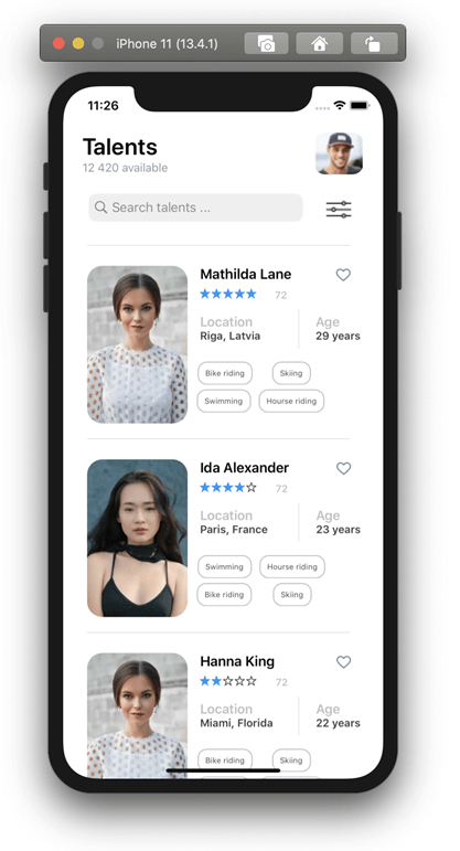
We finally have our first screen ready!
- Use the following namespace to include the collection view in your application.
Designing the TalentDetails page
Let’s continue with the last screen.
- We’ll name it TalentDetailPage.
- To include the images, we will use the CarouselView and IndicatorView.
Step 3: Talent carousel

- Let’s add the main structure of our page using the following namespace.
<!-- Talent image Carousel--> <Grid RowDefinitions="*,Auto"> <!-- You must add here what is explained in the next step --> </Grid> - Then, add a ContentPage.Resources with the following code.
<ContentPage.Resources> <ResourceDictionary> <DataTemplate x:Key="itemTemplate"> <Image Source="{Binding Picture}" Aspect="AspectFill" HorizontalOptions="FillAndExpand"/> </DataTemplate> </ResourceDictionary> </ContentPage.Resources> - Let’s continue by adding the CarouselView and the IndicatorView with the following code.
<!-- Talent image Carousel-->
<CarouselView Grid.Row="0" ItemsSource="{Binding talents}"
                      IndicatorView="indicatorView">
                <CarouselView.ItemTemplate>
                    <DataTemplate>
                        <StackLayout>
                            <Image Grid.Row="0" Aspect="AspectFill" Source="{Binding Picture}"/>
                        </StackLayout>
                    </DataTemplate>
                </CarouselView.ItemTemplate>
            </CarouselView>
<!-- Talent image IndicatorView-->
<IndicatorView Grid.Row="1" x:Name="indicatorView" VerticalOptions="Start" TranslationY="-75"
          IndicatorsShape="Circle"
          IndicatorColor="LightGray"
          SelectedIndicatorColor="DarkGray" />

<!-- You must add here what is explained in the next step -->
Step 4: Talent information
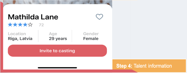 Finally, we are going to add the Talent information. As the main component, everything will be contained in a frame.
Note: To make the rounded edges stand out a little, we will be using the TranslationY property with negative values.
We immediately create the structure of the layout that will organize the information. In this case, it is a grid divided into four rows and three columns.
Refer to the following code.
<!-- Talent informacion-->
<Frame Grid.Row="1" HasShadow="False" TranslationY="-30" CornerRadius="25" HeightRequest="205">
   <Grid RowDefinitions="Auto,Auto,Auto,Auto" ColumnDefinitions="*,*,*">
          <!-- You must add here what is explained in the next step -->
   </Grid>
</Frame>
Within this structure, we will add all the following detailed information:
- Talent Name
- Heart icon
- Rating component
- Location, age, and gender information
- Invite to casting button
Refer to the following code.
<!--Talent Name-->
<Label Grid.Row="0" Grid.Column="0" Grid.ColumnSpan="2" Text="Mathilda Lane" FontAttributes="Bold" FontSize="30" Padding="0,15,0,0"/>
<!--Heart icon-->
<Image Grid.Row="0" Grid.Column="2" HorizontalOptions="End" Margin="0,15,10,0" Aspect="Fill" WidthRequest="35" HeightRequest="35" Source="Heart"/>
<!--Rating component-->
<rating:SfRating Grid.Row="1" Grid.Column="0" Grid.ColumnSpan="2" ItemCount="5" Value="4" ReadOnly="true" ItemSize="17" ItemSpacing="2" />
<Label Grid.Row="1" Grid.Column="0" Text="72" FontAttributes="Bold" TextColor="Silver" FontSize="16" HorizontalOptions="End" TranslationX="16" />
<!--Location information-->
<Label Grid.Row="2" Grid.Column="0" Padding="0,10,0,0" FontAttributes="Bold" HorizontalOptions="Start">
       <Label.FormattedText>
             <FormattedString>
                 <Span Text="Location
" TextColor="Silver"/>
                 <Span Text="Riga, Latvia" TextColor="#393e42"/>
             </FormattedString>
       </Label.FormattedText>
</Label>
<Line  Grid.Row="2" Grid.Column="0" HorizontalOptions="End"  Y1="50" Margin="5" StrokeThickness="0.5" Stroke="Silver"/>
<!--Age information-->
<Label Grid.Row="2" Grid.Column="1" Padding="5,10,0,0" FontAttributes="Bold" HorizontalOptions="Center">
       <Label.FormattedText>
           <FormattedString>
              <Span Text="Age
" TextColor="Silver"/>
             <Span Text="29 years" TextColor="#393e42"/>
           </FormattedString>
       </Label.FormattedText>
</Label>
<Line  Grid.Row="2" Grid.Column="1" HorizontalOptions="End"  Y1="50" Margin="5" StrokeThickness="0.5" Stroke="Silver"/>
<!--Gender information-->
<Label Grid.Row="2" Grid.Column="2" Padding="5,10,0,0" FontAttributes="Bold" HorizontalOptions="Center">
       <Label.FormattedText>
             <FormattedString>
                 <Span Text="Gender
" TextColor="Silver"/>
                 <Span Text="Female" TextColor="#393e42"/>
             </FormattedString>
       </Label.FormattedText>
</Label>
<!-- Invite to casting button-->
<Button Grid.Row="3" Grid.Column="0" Grid.ColumnSpan="3" Text="Invite to casting" FontSize="18" HeightRequest="50" TextColor="White" FontAttributes="Bold" CornerRadius="20" BackgroundColor="#ef5360"/>
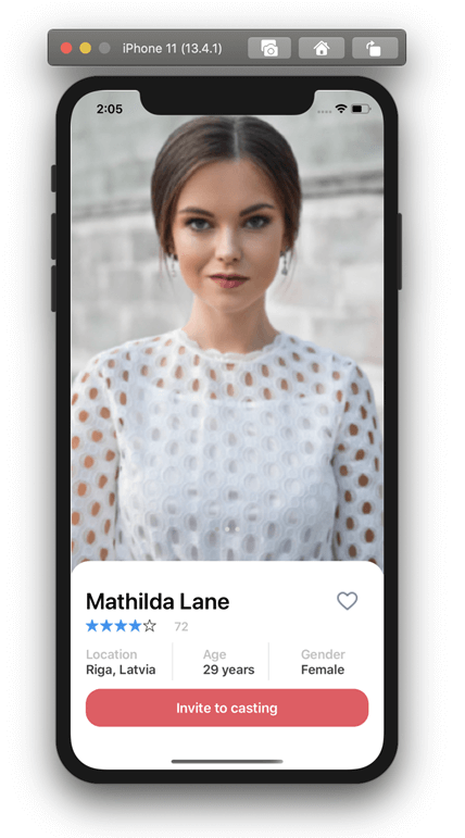
We finally have our second screen ready!
Reference
To see the complete code structure, please refer to this Github repository.
Conclusion
Thanks for reading! In this blog post, we have seen how to replicate a talent-casting UI in Xamarin.Forms. Let’s practice these steps and build our own UI!
Syncfusion’s Xamarin suite offers over 150 UI controls, from basic editors to powerful, advanced controls like DataGrid, Charts, ListView, and RTE. Try them out and leave your comments below.
You can also contact us through our support forum, Direct-Trac, or feedback portal. We are always happy to assist you!
If you liked this post, we think you will also like the following articles:
