In Syncfusion’s Essential Studio® 2023 Volume 3 release, we introduced a new CheckBox control for the .NET MAUI platform.
The new .NET MAUI CheckBox is a selection control that allows users to select one or more options from a list of predefined choices. You can also customize the appearance of different visual states using the visual state manager.
In this article, we’ll explore the key features of the new .NET MAUI CheckBox control and the steps to get started with it.
Key features
The .NET MAUI CheckBox supports many user-friendly features. Some of them are listed here:
States
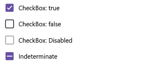
The CheckBox control has three selection states: selected, unselected, and indeterminate. Use the indeterminate state when a collection of sub-choices has both unselected and selected states. You can also use the disabled option to prevent the toggling of checkbox values.
Touch interactions
Touch interaction in checkboxes refers to users’ tactile experience when tapping mobile screens to interact with checkbox elements. The checkboxes automatically change their states upon touch interactions.
Customizations
The .NET MAUI CheckBox control allows you to customize its shape, color, and text. Let’s see how to achieve them in brief.
Shape customization
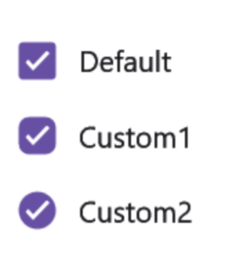
You can customize the .NET MAUI CheckBox’s shape by altering the corner radius of the default shape.
State color customization
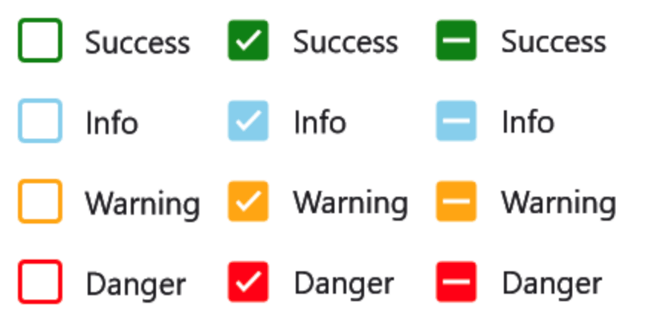
You can apply desired colors to distinguish the different states of the .NET MAUI CheckBox control.
Stroke thickness customization
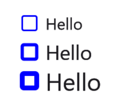
The stroke thickness of the checkbox can easily be customized to a desired value.
Text customization
You can also define the checkbox caption text and format its font name, style, size, and color with ease.
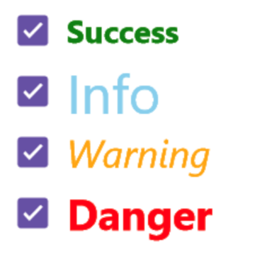
Note: Refer to the .NET MAUI CheckBox control documentation for more details.
Getting started with the .NET MAUI CheckBox control
We have seen the key features of the .NET MAUI CheckBox (SfCheckBox) control. Let’s learn how to integrate it into your .NET MAUI app and utilize its features by following these steps:
Step 1: Create a .NET MAUI application
First, create a .NET MAUI application.
Step 2: Add the required NuGet package
Syncfusion .NET MAUI controls are available on the NuGet Gallery. To add the .NET MAUI CheckBox control to your project, open the NuGet package manager in Visual Studio. Search for Syncfusion.Maui.Buttons and then install it.
Step 3: Register the handler
In the MauiProgram.cs file, register the handler for Syncfusion core. Refer to the following code example.
using Microsoft.Maui;
using Microsoft.Maui.Hosting;
using Microsoft.Maui.Controls.Compatibility;
using Microsoft.Maui.Controls.Hosting;
using Microsoft.Maui.Controls.Xaml;
using Syncfusion.Maui.Core.Hosting;
namespace CheckBoxSample
{
  public static class MauiProgram
  {
    public static MauiApp CreateMauiApp()
    {
       var builder = MauiApp.CreateBuilder();
       builder
          .UseMauiApp<App>()
          .ConfigureSyncfusionCore()
          .ConfigureFonts(fonts =>
          {
            fonts.AddFont("OpenSans-Regular.ttf", "OpenSansRegular");
          });
       return builder.Build();
    }
  }
}
Step 4: Add the namespace
Now, add Syncfusion.Maui.Buttons namespace in your XAML page.
xmlns:buttons="clr-namespace:Syncfusion.Maui.Buttons;assembly=Syncfusion.Maui.Buttons"
Step 5: Initialize the Syncfusion .NET MAUI CheckBox control
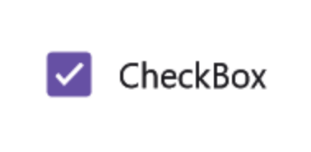
Then, initialize the Syncfusion .NET MAUI CheckBox control. Here, we’ll use a simple checkbox in the checked state. Refer to the following code example.
<buttons:SfCheckBox x:Name="checkBox" IsChecked="True" Text="CheckBox"/>
After executing these code examples, we’ll get output like in the following image.
GitHub reference
For more details, check out the .NET MAUI CheckBox control demo on GitHub.
Conclusion
Thanks for reading this blog! We’ve delved into the functionalities of the newly introduced Syncfusion .NET MAUI CheckBox control in the 2023 Volume 3 release. To learn more about the other thrilling updates in this release, check out our Release Notes and What’s New pages. Your feedback is important to us, so feel free to share your thoughts in the comments section!
Download Essential Studio® for .NET MAUI to start evaluating them immediately.
You can also contact us through our support forum, support portal, or feedback portal. We are always happy to help you!
Related blogs
- Syncfusion Essential Studio® 2023 Volume 3 Is Here!
- Creating a .NET MAUI Smart PDF Viewer App with Auto-Summary Generation using OpenAI’s ChatGPT
- Advanced Date Customization in .NET MAUI Calendar Control
- Introducing the 9th Set of new .NET MAUI Controls and Features


