TL;DR: The Blazor Sankey Diagram simplifies visualizing complex data flows like energy distribution, user behaviors, or financial breakdowns. It features nodes, links, labels, legends, and tooltips for intuitive understanding. Easily bind data and customize elements for clarity and style. This versatile component transforms intricate data into interactive, visually appealing insights.
Visualizing complex data relationships and flows has long been a challenge for developers and data analysts alike. Traditional charts and graphs often fail to represent multi-layered, interconnected data such as financial breakdowns, energy distribution, or user behavior patterns.
The Sankey Diagram is a powerful visualization tool that simplifies understanding these relationships through proportional flows and connections. With the introduction of the Sankey Diagram component in the Syncfusion Blazor suite, .NET developers now have a robust solution at their fingertips.
The Blazor Sankey Diagram component is packed with features that make it a versatile tool for various visualization needs.
Let’s explore the key features of the Blazor Sankey Diagram with a practical example for analyzing energy usage.
Getting started with Blazor Sankey Diagram
Refer to the getting started documentation for Blazor Sankey Diagram installation and configuration.
Key features
The Blazor Sankey Diagram component supports the following key features:
Data binding
The Blazor Sankey Diagram component provides an intuitive way to visualize relationships and flows between categories using nodes and links. Data binding allows you to easily provide the necessary information for the Sankey diagram to render effectively. The diagram relies on collections of SankeyDataNode and SankeyDataLink objects, which are predefined in Syncfusion.Blazor.Sankey namespace, eliminating the need for custom data models.
Nodes represent entities or categories in the flow and include properties like Id and customizable labels. Links define connections with properties such as SourceId, TargetId, and Value to represent flow magnitudes. To bind data, developers need to create and populate these collections, allowing the component to dynamically generate the diagram.
Nodes
Nodes are essential elements in the Blazor Sankey Diagram. They represent entities or stages within a process flow and are defined using a collection of SankeyDataNode objects. Each node requires a unique ID and can include additional properties for customization. Nodes can be further styled with options like color, width, padding, and label settings.
Links
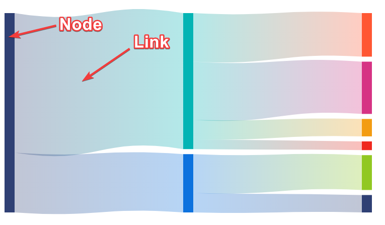
Links in a Sankey Diagram visually represent the flow of quantities between nodes, illustrating connections and relationships across different stages or entities in a process. Each link is defined using a SankeyDataLink object with a SourceId (starting node), TargetId (ending node), and a Value that determines the link’s thickness, reflecting the flow quantity.
The SankeyLinkSettings allow customization of link appearance, including Color for visual distinction (HEX or RGBA), Opacity for transparency (ranging from 0.0 to 1.0), and advanced options like ColorType to align link colors with the source, target, or a gradient blend of both. Additionally, properties such as HighlightOpacity and InactiveOpacity enhance interactivity by visually emphasizing active links while dimming inactive ones.
These settings help create clear, aesthetically pleasing visualizations that effectively communicate data flows.
Refer to the following image.
Labels
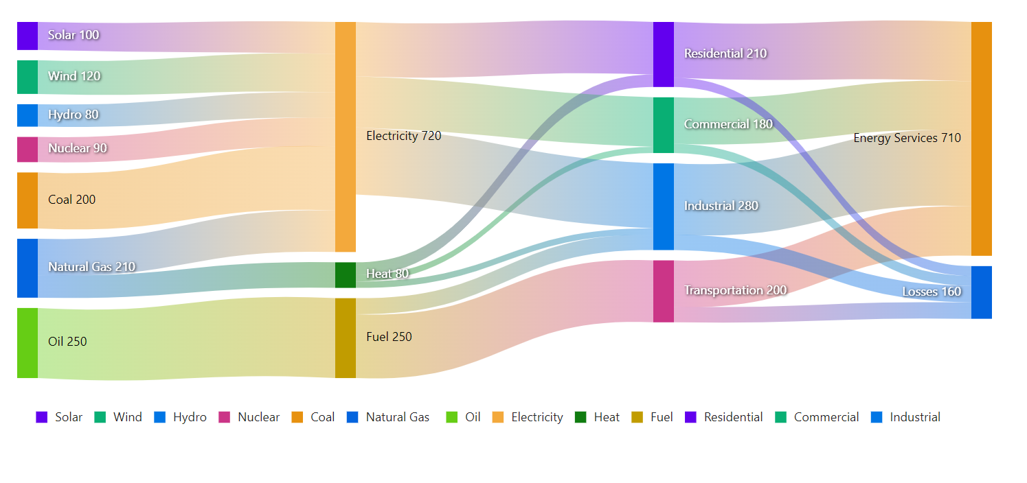
Labels are used to convey textual information about nodes, enhancing the readability and comprehension of data flows.
The SankeyLabelSettings provides extensive customization options, including font size, color, weight, padding, and style adjustments, allowing seamless alignment with the app’s design aesthetics.
These settings ensure labels are not only visually appealing but also effectively communicate the underlying information, resulting in a more refined and professional data visualization.
Refer to the following image.
Legends
Legends play a vital role in visually representing the categories or elements within the data flow, aiding in the interpretation and analysis of the diagram.
The SankeyLegendSettings offers comprehensive customization options, enabling control over visibility, position, size, and various stylistic properties. With features like adjustable dimensions, padding, background color, opacity, and optional titles, legends can be tailored to align with app aesthetics and functional requirements.
Additionally, advanced settings like item highlighting, order inversion, and item reversal further enhance interactivity and clarity, providing users with a visually appealing and intuitive way to understand complex data relationships.
Refer to the following image.

Tooltips
Tooltips provide dynamic, contextual information about nodes and links, enhancing the user’s ability to interpret the data flow. The SankeyTooltipSettings enables extensive customization of tooltips, ensuring they complement the diagram’s aesthetics and usability.
Tooltips can be customized for appearance, behavior, and content, including properties like background color, opacity, and animations. Advanced configurations allow for tailored templates using SankeyNodeTemplate and SankeyLinkTemplate, enabling precise control over the layout and content of tooltips. This flexibility ensures tooltips effectively communicate relevant details, enriching the overall data visualization experience.
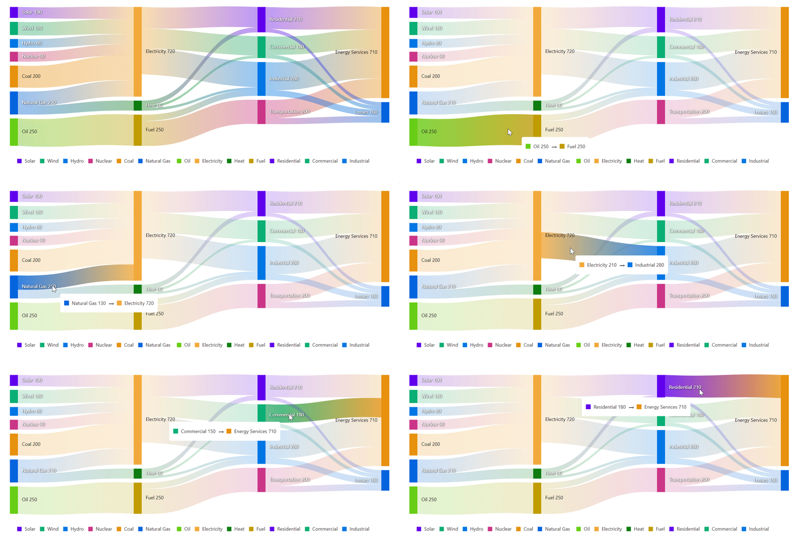
The best part of the Blazor Sankey Diagram is that features like link color gradient (blend type), legend, animation, and tooltips are enabled by default to ensure the best appearance and interactions with minimal code.
Energy flow analysis
We’ve explored the stunning features of the Blazor Sankey Diagram. Now, let’s see how to visualize energy usage data using this component.
We’ll start with the source categories, break them down into carriers, and split them into usage sectors.
Refer to the following code.
@page "/"
@using Syncfusion.Blazor
@using Syncfusion.Blazor.Sankey

<SfSankey Nodes=@Nodes Links=@Links>
   <SankeyTooltipSettings Enable="true"></SankeyTooltipSettings>
</SfSankey>

@code {
    private List<SankeyDataNode> Nodes = new List<SankeyDataNode>();
    private List<SankeyDataLink> Links = new List<SankeyDataLink>();

protected override void OnInitialized()
{
    Nodes = new List<SankeyDataNode>()
    {
        new SankeyDataNode() { Id = "Solar", Label = new SankeyDataLabel() { Text = "Solar" } },
        new SankeyDataNode() { Id = "Wind", Label = new SankeyDataLabel() { Text = "Wind" } },
        new SankeyDataNode() { Id = "Hydro", Label = new SankeyDataLabel() { Text = "Hydro" } },
        new SankeyDataNode() { Id = "Nuclear", Label = new SankeyDataLabel() { Text = "Nuclear" } },
        new SankeyDataNode() { Id = "Coal", Label = new SankeyDataLabel() { Text = "Coal" } },
        new SankeyDataNode() { Id = "Natural Gas", Label = new SankeyDataLabel() { Text = "Natural Gas" } },
        new SankeyDataNode() { Id = "Oil", Label = new SankeyDataLabel() { Text = "Oil" } },
        new SankeyDataNode() { Id = "Electricity", Label = new SankeyDataLabel() { Text = "Electricity" } },
        new SankeyDataNode() { Id = "Heat", Label = new SankeyDataLabel() { Text = "Heat" } },
        new SankeyDataNode() { Id = "Fuel", Label = new SankeyDataLabel() { Text = "Fuel" } },
        new SankeyDataNode() { Id = "Residential", Label = new SankeyDataLabel() { Text = "Residential" } },
        new SankeyDataNode() { Id = "Commercial", Label = new SankeyDataLabel() { Text = "Commercial" } },
        new SankeyDataNode() { Id = "Industrial", Label = new SankeyDataLabel() { Text = "Industrial" } },
        new SankeyDataNode() { Id = "Transportation", Label = new SankeyDataLabel() { Text = "Transportation" } },
        new SankeyDataNode() { Id = "Energy Services", Label = new SankeyDataLabel() { Text = "Energy Services" } },
        new SankeyDataNode() { Id = "Losses", Label = new SankeyDataLabel() { Text = "Losses" } }
    };

    Links = new List<SankeyDataLink>()
    {
        // Energy Sources to Carriers
        new SankeyDataLink() { SourceId = "Solar", TargetId = "Electricity", Value = 100 },
        new SankeyDataLink() { SourceId = "Wind", TargetId = "Electricity", Value = 120 },
        new SankeyDataLink() { SourceId = "Hydro", TargetId = "Electricity", Value = 80 },
        new SankeyDataLink() { SourceId = "Nuclear", TargetId = "Electricity", Value = 90 },
        new SankeyDataLink() { SourceId = "Coal", TargetId = "Electricity", Value = 200 },
        new SankeyDataLink() { SourceId = "Natural Gas", TargetId = "Electricity", Value = 130 },
        new SankeyDataLink() { SourceId = "Natural Gas", TargetId = "Heat", Value = 80 },
        new SankeyDataLink() { SourceId = "Oil", TargetId = "Fuel", Value = 250 },

        // Energy Carriers to Sectors
        new SankeyDataLink() { SourceId = "Electricity", TargetId = "Residential", Value = 170 },
        new SankeyDataLink() { SourceId = "Electricity", TargetId = "Commercial", Value = 160 },
        new SankeyDataLink() { SourceId = "Electricity", TargetId = "Industrial", Value = 210 },
        new SankeyDataLink() { SourceId = "Heat", TargetId = "Residential", Value = 40 },
        new SankeyDataLink() { SourceId = "Heat", TargetId = "Commercial", Value = 20 },
        new SankeyDataLink() { SourceId = "Heat", TargetId = "Industrial", Value = 20 },
        new SankeyDataLink() { SourceId = "Fuel", TargetId = "Transportation", Value = 200 },
        new SankeyDataLink() { SourceId = "Fuel", TargetId = "Industrial", Value = 50 },

        // Sectors to End Use and Losses
        new SankeyDataLink() { SourceId = "Residential", TargetId = "Energy Services", Value = 180 },
        new SankeyDataLink() { SourceId = "Commercial", TargetId = "Energy Services", Value = 150 },
        new SankeyDataLink() { SourceId = "Industrial", TargetId = "Energy Services", Value = 230 },
        new SankeyDataLink() { SourceId = "Transportation", TargetId = "Energy Services", Value = 150 },
        new SankeyDataLink() { SourceId = "Residential", TargetId = "Losses", Value = 30 },
        new SankeyDataLink() { SourceId = "Commercial", TargetId = "Losses", Value = 30 },
        new SankeyDataLink() { SourceId = "Industrial", TargetId = "Losses", Value = 50 },
        new SankeyDataLink() { SourceId = "Transportation", TargetId = "Losses", Value = 50 }
    };
    base.OnInitialized();
}
In the above code example,
- Nodes: Represent energy sources such as Solar, Wind, and Hydro, energy carriers like Electricity, Heat, and Fuel, and usage sectors such as Residential, Commercial, Industrial, and Transportation.
- Links: Define the flow connections between nodes, showing the proportional energy flow from sources to carriers, carriers to usage sectors, and sectors to end uses or losses.
This visualization clearly explains energy flow from sources to carriers and their distribution across various usage sectors. It highlights the proportions of energy that is utilized effectively versus energy lost.
By leveraging the Blazor Sankey Diagram component, you can transform complex energy data into an intuitive and visually appealing representation, offering immediate insights into energy distribution and consumption within your apps.
Refer to the following image.


Syncfusion Blazor components can be transformed into stunning and efficient web apps.
Conclusion
Thanks for reading! The new Blazor Sankey Diagram component empowers developers to create meaningful visualizations of complex data flows with minimal effort. Its flexibility and rich feature set make it an invaluable tool for a wide range of apps, from financial analysis to process optimization.
Explore the possibilities of Blazor Sankey Diagram and elevate your data visualization game! Try it out and leave your feedback in the comments section below.
Our existing customers can download the latest version from the License and Downloads page. If you are not a Syncfusion® customer, try our 30-day free trial to check out our newest features.
You can also contact us through our support forum, support portal, or feedback portal. We are always happy to assist you!
