TL;DR: Discover how to create an interactive data visualization with Syncfusion’s .NET MAUI Fast Line Chart and Range Selector to analyze U.S. Gulf Coast kerosene-type jet fuel prices from 1990 to 2024. This guide covers data binding, range selection, and how to apply plotbands for price range highlights. Users can explore historical price trends, zoom in on specific dates, and gain insights through a mini chart range selector.
Welcome to our Chart of the Week blog series!
Today, we’ll demonstrate how to use the Syncfusion .NET MAUI Fast Line Chart and interactive Range Selector to visualize the weekly U.S. Gulf Coast kerosene-type jet fuel spot price from 1990 to 2024. We will also showcase how to highlight price ranges using plotband support and use the DateTime Range Selector with the chart to help users interactively select specific data ranges.
A Fast Line Chart is a line chart optimized for efficiently handling large datasets. It is ideal for time-series data and allows users to easily track trends and changes over time, making it perfect for visualizing financial or technical data.
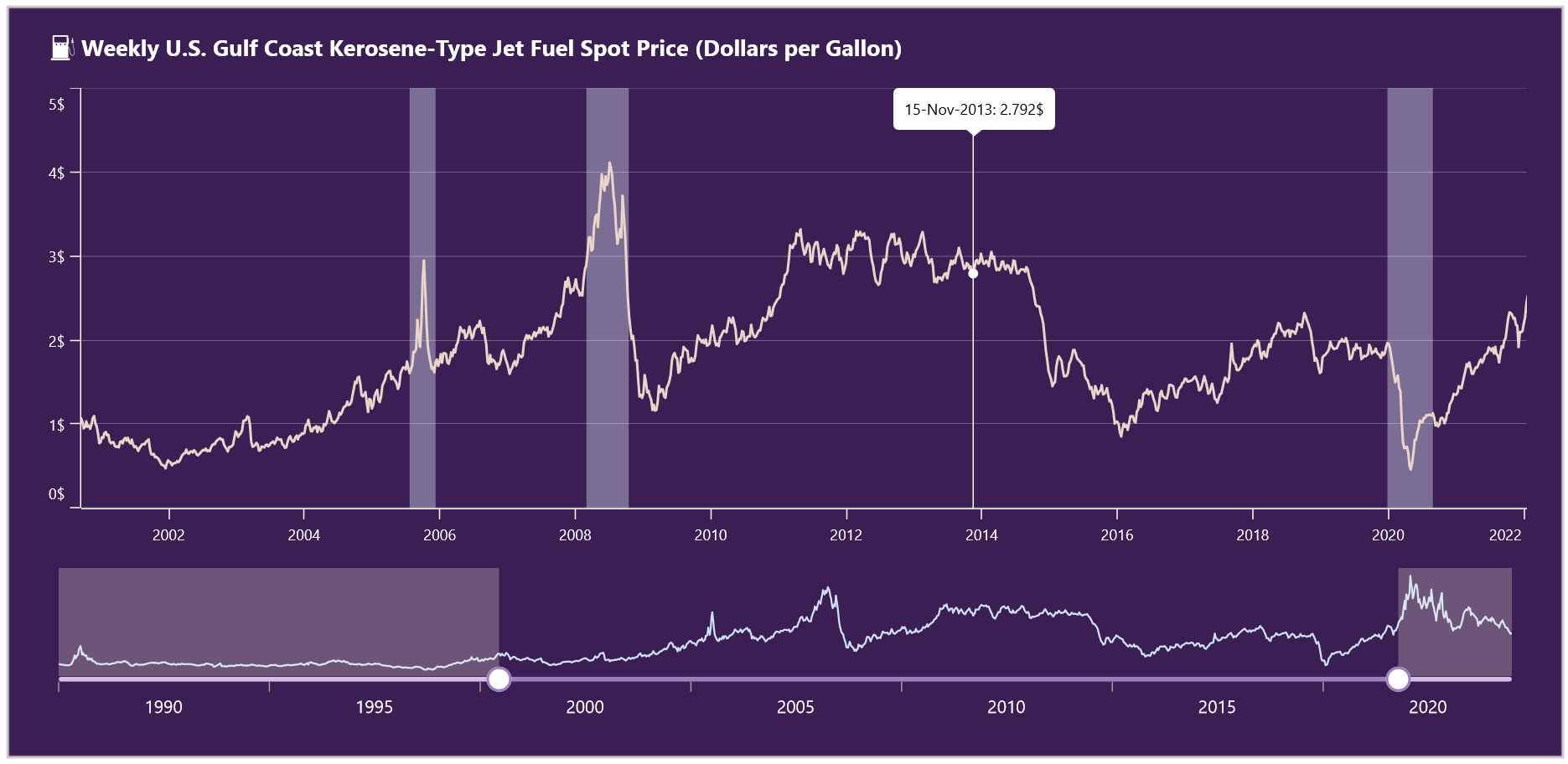
The following image shows the Fast Line Chart we’re going to create.
Let’s get started!
Step 1: Gathering the data
Before building the .NET MAUI Fast Line Chart, we must collect the necessary data from the U.S. Energy Information Administration. You can also download the data in CSV format from the website.
Step 2: Preparing the data for the chart
Then, we need to organize the data properly. First, we define a Model class to structure our data. Then, we initialize the ViewModel class that connects the data to the chart.
In our case, the Model class contains two properties: Date and Price.
public class Model
{
    public DateTime Date {  get; set; }

    public double Price {  get; set; }
}
Next, we define the ViewModel class. This class includes a WeeklyPriceData property, which holds a collection of our data points. The ViewModel also retrieves and processes the CSV data.
Refer to the following code example.
public class ViewModel
{
    public ObservableCollection<Model> WeeklyPriceData { get; set; }

    public ViewModel()
    {
        WeeklyPriceData = new ObservableCollection<Model>();
        ReadCSV();
    }
}
Finally, we implement the ReadCSV method, which retrieves the data from the CSV file (downloaded earlier), processes each entry, and converts it into the correct format. Once processed, the data is stored in the WeeklyPriceData property, making it available for the chart to display.
Refer to the following code example.
public void ReadCSV()
{
    Assembly executingAssembly = typeof(App).GetTypeInfo().Assembly;
    Stream? inputStream = executingAssembly.GetManifestResourceStream("USJetFuelPrice.Resources.Raw.data.csv");

    string? line;
    List<string> lines = new List<string>();

    if (inputStream != null)
    {
        using StreamReader reader = new StreamReader(inputStream);
        while ((line = reader.ReadLine()) != null)
        {
            lines.Add(line);
        }
        lines.RemoveAt(0);

        foreach (var dataPoint in lines)
        {
            string[] data = dataPoint.Split(',');

            var dateDetails = data[0].Split("/");
            var month = int.Parse(dateDetails[0]);
            var day = int.Parse(dateDetails[1]);
            var year = int.Parse(dateDetails[2]);

            var date = new DateTime(year, month, day);
            var price = Convert.ToDouble(data[1]);

            WeeklyPriceData.Add(new Model { Date = date, Price = price });
        }
    }
}
Step 3: Configure the layout for the chart
In this demo, we’ll implement two controls: the Syncfusion .NET MAUI Fast Line Chart and the DateTime Range Selector. Let’s define the layout to place these controls and enhance visual appeal and clarity.
Refer to the following code example.
<ContentPage xmlns="http://schemas.microsoft.com/dotnet/2021/maui"
             xmlns:x="http://schemas.microsoft.com/winfx/2009/xaml"
             xmlns:local="clr-namespace:USJetFuelPrice"
             x:Class="USJetFuelPrice.MainPage">

  //Border for the all controls.
  <Border Padding="20"
         Margin="20"
         StrokeThickness="2">

    <Grid RowDefinitions="190*,130"
        ColumnDefinitions="*"
        RowSpacing="15">                                         .        .        .         .
        ...
    </Grid>
  </Border>

</ContentPage>
Step 4: Configure the Syncfusion .NET MAUI Cartesian Charts
Then, configure the Syncfusion .NET MAUI Cartesian Charts control using this documentation.
<ContentPage xmlns="http://schemas.microsoft.com/dotnet/2021/maui"
             xmlns:x="http://schemas.microsoft.com/winfx/2009/xaml"
             xmlns:local="clr-namespace:USJetFuelPrice"
             xmlns:charts="clr-namespace:Syncfusion.Maui.Charts;assembly=Syncfusion.Maui.Charts"
             x:Class="USJetFuelPrice.MainPage">

 <charts:SfCartesianChart x:Name="Chart" Margin="8,0">

  <charts:SfCartesianChart.XAxes>
   <charts:DateTimeAxis />
  </charts:SfCartesianChart.XAxes>

  <charts:SfCartesianChart.YAxes>
   <charts:NumericalAxis />
  </charts:SfCartesianChart.YAxes>

  <charts:SfCartesianChart.Series>
   <charts:FastLineSeries />
  </charts:SfCartesianChart.Series>

 </charts:SfCartesianChart>

</ContentPage>
Step 5: Binding data to .NET MAUI FastLine series
Next, bind the data to the Syncfusion .NET MAUI FastLineSeries. Before doing that, we need to set the ViewModel as the BindingContext for the ContentPage. This will allow us to access the ViewModel across the entire page. If we set it only for the SfCartesianChart, we won’t be able to access the ViewModel globally within the page.
Refer to the following code example.
<ContentPage.BindingContext>
 <local:ViewModel x:Name="viewModel"/>
</ContentPage.BindingContext>
  ....
<charts:SfCartesianChart x:Name="Chart" Margin="8,0">

 <charts:SfCartesianChart.Series>
  <charts:FastLineSeries ItemsSource="{Binding WeeklyPriceData}"
                         XBindingPath="Date"
                         YBindingPath="Price"
  </charts:FastLineSeries>
 </charts:SfCartesianChart.Series>

</charts:SfCartesianChart>
In this example, we’ve bound the WeeklyPriceData property from the ViewModel to the ItemsSource property of the FastLineSeries. This binding ensures that whenever the data in the collection changes, the Fast Line Chart updates automatically to reflect the changes. We’ve also set the XBindingPath to Date and YBindingPath to Price properties. This helps the chart fetch values from the respective properties in the model.
Step 6: Adding the plot band to the Fast Line Chart
Plot bands are horizontal or vertical-colored bands that highlight specific regions on a chart. They’re commonly used in financial or scientific apps to mark interest ranges, such as normal ranges, risk zones, or thresholds.
Let’s add plot bands in the .NET MAUI Fast Line Chart. In our case, we’ll add the plot bands vertically along the X-axis.
Refer to the following code example.
<charts:SfCartesianChart.XAxes>
 <charts:DateTimeAxis >
  <charts:DateTimeAxis.PlotBands>
   <charts:DateTimePlotBandCollection>
    <charts:DateTimePlotBand
     Start="1990-07-27" End="1990-12-21"
     Fill="#60E4F1FF" />

    <charts:DateTimePlotBand
     Start="2005-07-22" End="2005-12-09"
     Fill="#60E4F1FF" />

    <charts:DateTimePlotBand
     Start="2008-03-01" End="2008-10-15"
     Fill="#60E4F1FF" />

    <charts:DateTimePlotBand
     Start="2019-12-27" End="2020-08-28"
     Fill="#60E4F1FF" />


    <charts:DateTimePlotBand
     Start="2022-02-18" End="2023-05-12"
     Fill="#60E4F1FF" />

   </charts:DateTimePlotBandCollection>
  </charts:DateTimeAxis.PlotBands>

 </charts:DateTimeAxis>
</charts:SfCartesianChart.XAxes>
In this example, we’ve used the DateTimePlotBand to highlight sudden peaks and a low range of price movement on the X-axis. If you’re working with a Numerical axis, you can use the NumericalPlotBand instead. You need to set the Start and End values for the plot band because these values indicate the highlighted range.
Note: For more details, refer to the plot band documentation for additional options and usage scenarios.
Step 7: Configure the .NET MAUI DateTime Range Selector with Chart
Let’s add the .NET MAUI DateTime Range Selector to make the chart more interactive. This will allow users to zoom in and select specific date ranges in the chart.
Configure the Syncfusion .NET MAUI DateTime Range Selector
First, we configure the DateTimeRangeSelector to our ContentPage because this is a separate control from the Syncfusion .NET MAUI suite.
<ContentPage xmlns:sliders="clr-namespace:Syncfusion.Maui.Sliders;assembly=Syncfusion.Maui.Sliders"
             x:Class="USJetFuelPrice.MainPage">
 <sliders:SfDateTimeRangeSelector x:Name="Selector"
                                  Grid.Row="1"
                                  Minimum="1990-04-06"
                                  Maximum="2024-09-27"
                                  RangeStart="2000-05-01"
                                  RangeEnd="2021-09-01"
                                  Interval="5"
                                  IntervalType="Years"
                                  ShowTicks="True"
                                  ShowLabels="True"
                                  LabelsPlacement="BetweenTicks"
                                  DragBehavior="Both">

  </sliders:SfDateTimeRangeSelector>

</ContentPage>
In the SfDateTimeRangeSelector, we specify the data range by setting the Minimum, Maximum, RangeStart, and RangeEnd properties. These properties define the chart’s full range and currently selected range.
Adding the SfCartesianChart inside the SfDateTimeRangeSelector
Let’s see how to add the chart inside the DateTimeRangeSelector. The chart’s height and width depend on the SfDateTimeRangeSelector’s width and height. We can directly add the SfCartesianChart inside the SfDateTimeRangeSelector and customize it as needed.
Refer to the following code example.
<sliders:SfDateTimeRangeSelector x:Name="Selector">

 <charts:SfCartesianChart>
  <charts:SfCartesianChart.XAxes>
   <charts:DateTimeAxis Minimum="1990-04-06T05:30:00"
                        Maximum="2024-09-24T05:30:00">
   </charts:DateTimeAxis>
  </charts:SfCartesianChart.XAxes>

  <charts:SfCartesianChart.YAxes>
   <charts:NumericalAxis />
  </charts:SfCartesianChart.YAxes>

  <charts:SfCartesianChart.Series>
   <charts:FastLineSeries ItemsSource="{Binding WeeklyPriceData}"
                          XBindingPath="Date"
                          YBindingPath="Price"
   </charts:FastLineSeries>
  </charts:SfCartesianChart.Series>
 </charts:SfCartesianChart>
</sliders:SfDateTimeRangeSelector>
Step 8: Connect the DateTime Range Selector to the chart
In our case, we use the SfDateTimeRangeSelector to easily select a specific date range. To achieve this, we bind the RangeStart and RangeEnd properties of the SfDateTimeRangeSelector to the Minimum and Maximum values of the chart’s X-axis.
Refer to the following code example.
<charts:SfCartesianChart.XAxes>
 <charts:DateTimeAxis Minimum="{Binding RangeStart, Source={x:Reference Selector}}"
                      Maximum="{Binding RangeEnd, Source={x:Reference Selector}}" >
 </charts:DateTimeAxis>
</charts:SfCartesianChart.XAxes>
Step 9: Customize the Fast Line Chart and DateTime Range Selector appearance
Let’s customize the appearance of the .NET MAUI Fast Line Chart and DateTime Range Selector to enhance its readability.
Customizing the chart title
Refer to the following code example to customize the chart title.
<charts:SfCartesianChart.Title >
 <HorizontalStackLayout Margin="0,0,20,20">
  <Image Source="oildrum.png"
         Margin="5,0,5,0"
         HeightRequest="{OnPlatform Android=16, WinUI=20, iOS= 16, MacCatalyst= 20}"
         WidthRequest="{OnPlatform Android=16, WinUI=20, iOS= 16, MacCatalyst= 20}"/>
  <Label Text="Weekly U.S. Gulf Coast Kerosene-Type Jet Fuel Spot Price (Dollars per Gallon)"
         TextColor="White"
         FontFamily="TimeSpan"
         FontAttributes="Bold"
         Margin="0,2,0,0" />
 </HorizontalStackLayout>

</charts:SfCartesianChart.Title>
Customizing the FastLine series
Refer to the following code example to customize the FastLine series.
<charts:SfCartesianChart.Series>
 <charts:FastLineSeries  Fill="#E9D5CA"
                         ShowTrackballLabel="True"
                         StrokeWidth="2">
 </charts:FastLineSeries>
</charts:SfCartesianChart.Series>
Customizing the chart axis
Refer to the following code example.
<charts:SfCartesianChart.XAxes>
 <charts:DateTimeAxis ShowMajorGridLines="False">
 </charts:DateTimeAxis>
</charts:SfCartesianChart.XAxes>

<charts:SfCartesianChart.YAxes>
 <charts:NumericalAxis EnableAutoIntervalOnZooming="True"
                       EdgeLabelsDrawingMode="Shift"
                       RangePadding="Round" Interval="1"
                       IsVisible="True">

  <charts:NumericalAxis.LabelStyle>
   <charts:ChartAxisLabelStyle LabelAlignment="Center" LabelFormat="0'$'" />
  </charts:NumericalAxis.LabelStyle>
 </charts:NumericalAxis>
</charts:SfCartesianChart.YAxes>
Customizing the DateTime Range Selector
Refer to the following code example to customize the .NET MAUI DateTime Range Selector.
<sliders:SfDateTimeRangeSelector x:Name="Selector">

 <sliders:SfDateTimeRangeSelector.TrackStyle>
  <sliders:SliderTrackStyle ActiveFill="#9B7EBD"
                            InactiveFill="#D4BEE4" />
 </sliders:SfDateTimeRangeSelector.TrackStyle>

 <sliders:SfDateTimeRangeSelector.ThumbStyle>
  <sliders:SliderThumbStyle Fill="White"
                            StrokeThickness="2"
                            Stroke="#9B7EBD" />
 </sliders:SfDateTimeRangeSelector.ThumbStyle>

 <sliders:SfDateTimeRangeSelector.ThumbOverlayStyle>
  <sliders:SliderThumbOverlayStyle Fill="#4DD4BEE4" />
 </sliders:SfDateTimeRangeSelector.ThumbOverlayStyle>

 <sliders:SfDateTimeRangeSelector.LabelStyle>
  <sliders:SliderLabelStyle
   InactiveFontSize="{OnPlatform 14, Android=10, iOS=10}"
   ActiveFontSize="{OnPlatform 14, Android=10, iOS=10}" />
 </sliders:SfDateTimeRangeSelector.LabelStyle>
</sliders:SfDateTimeRangeSelector>
Customizing the trackball labels
To display the date and price on touch interactions, enable the trackball labels like in the following code example.
<charts:SfCartesianChart.TrackballBehavior>

 <charts:ChartTrackballBehavior DisplayMode="GroupAllPoints">

  <charts:ChartTrackballBehavior.LabelStyle>
   <charts:ChartLabelStyle TextColor="Black" Background="White" />
  </charts:ChartTrackballBehavior.LabelStyle>

  <charts:ChartTrackballBehavior.LineStyle>
   <charts:ChartLineStyle Stroke="White"/>
  </charts:ChartTrackballBehavior.LineStyle>

  <charts:ChartTrackballBehavior.MarkerSettings>
   <charts:ChartMarkerSettings Fill="White"/>
  </charts:ChartTrackballBehavior.MarkerSettings>

 </charts:ChartTrackballBehavior>
</charts:SfCartesianChart.TrackballBehavior>
After executing the previous code examples, we will get the output that resembles the following image.
GitHub reference
For more details, refer to visualizing U.S. Gulf Coast kerosene-type jet fuel prices from 1990 to 2024 GitHub demo.

Supercharge your cross-platform apps with Syncfusion's robust .NET MAUI controls.
Conclusion
Thanks for reading! In this blog, we’ve seen how to use the Syncfusion .NET MAUI Fast Line Chart to visualize U.S. Gulf Coast kerosene-type jet fuel prices. We strongly encourage you to follow the steps outlined in this blog and share your thoughts in the comments below.
Existing customers can download the new version of Essential Studio® on the License and Downloads page. If you are not a Syncfusion customer, try our 30-day free trial to check out our incredible features.
You can also contact us through our support forums, support portal, or feedback portal. We are always happy to assist you!
