We are happy to introduce the new Carousel component to the Blazor suite in our 2022 Volume 1 release. The Blazor Carousel component has been one of the most anticipated and upvoted components in our feedback portal.
It allows users to display images with content, links, and more, like a slide show. Typical uses of carousels include scrolling news headlines, featured articles on home pages, and image galleries.
Let’s explore the Blazor Carousel component, its UI design, and its features with code examples.
Blazor Carousel overview
The Blazor Carousel component is a responsive and completely customizable control. Its built-in options provide the flexibility to create slides and configure its look and feel to match your requirements. It also supports web-standard functionalities like accessibility, keyboard interactions, and events.
Key features
The key features of the new Blazor Carousel component are as follows:
- Slide creation.
- Navigation buttons.
- Play/pause button.
- Indicators.
- Animation and transitions.
- WAI-ARIA compliance and keyboard accessibility.
Create slides
Slides are super easy to create in the Blazor Carousel component. Design your own slide content and assign it to the CarouselItem as shown in the following code example.
<div class="control-container">
    <SfCarousel>
        <CarouselItem>
            <figure class="img-container">
                <img src="images/carousel/bridge.png" alt="Golden Gate Bridge, San Francisco" style="height:100%;width:100%;" />
                <figcaption class="img-caption">Golden Gate Bridge, San Francisco</figcaption>
            </figure>
        </CarouselItem>
        <CarouselItem>
            <figure class="img-container">
                <img src="images/carousel/trees.png" alt="Spring Flower Trees" style="height:100%;width:100%;" />
                <figcaption class="img-caption">Spring Flower Trees</figcaption>
            </figure>
        </CarouselItem>
        <CarouselItem>
            <figure class="img-container">
                <img src="images/carousel/waterfall.png" alt="Oddadalen Waterfalls, Norway" style="height:100%;width:100%;" />
                <figcaption class="img-caption">Oddadalen Waterfalls, Norway</figcaption>
            </figure>
        </CarouselItem>
        <CarouselItem>
            <figure class="img-container">
                <img src="images/carousel/sea.png" alt="Anse Source d'Argent, Seychelles" style="height:100%;width:100%;" />
                <figcaption class="img-caption">Anse Source d'Argent, Seychelles</figcaption>
            </figure>
        </CarouselItem>
        <CarouselItem>
            <figure class="img-container">
                <img src="images/carousel/rocks.png" alt="Stonehenge, England" style="height:100%;width:100%;" />
                <figcaption class="img-caption">Stonehenge, England</figcaption>
            </figure>
        </CarouselItem>
    </SfCarousel>
</div>

<style>
    .control-container {
        height: 300px;
        margin: 0 auto;
        width: 500px;
    }

    .img-container {
        height: 100%;
    }

    .img-caption {
        bottom: 4em;
        color: #fff;
        font-size: 12pt;
        height: 2em;
        position: relative;
        padding: 0.3em 1em;
        text-align: center;
        width: 100%;
    }
</style>
The following image shows the output of this example.

Navigation buttons
The Previous and Next navigation buttons are used to perform slide transitions manually. You can show or hide them using the ButtonsVisibility property. The property values can be any of the following:
- Hidden: Hide the navigator buttons.
- Visible: Show the navigator buttons.
- VisibleOnHover: Show the navigator buttons only when hovering over the Carousel.
Also, you can use the template options to customize the navigation buttons.
The following code example demonstrates how to show the navigator buttons on the mouse hover in the Carousel component.
<div class="control-container">
    <SfCarousel ButtonsVisibility="CarouselButtonVisibility.VisibleOnHover">
        <CarouselItem>
            <div class="slide-content">Slide 1</div>
        </CarouselItem>
        <CarouselItem>
            <div class="slide-content">Slide 2</div>
        </CarouselItem>
        <CarouselItem>
            <div class="slide-content">Slide 3</div>
        </CarouselItem>
        <CarouselItem>
            <div class="slide-content">Slide 4</div>
        </CarouselItem>
        <CarouselItem>
            <div class="slide-content">Slide 5</div>
        </CarouselItem>
    </SfCarousel>
</div>

<style>
    .control-container {
        background-color: #adb5bd;
        height: 300px;
        margin: 0 auto;
        width: 500px;
    }

    .slide-content {
        align-items: center;
        display: flex;
        font-size: 1.25rem;
        height: 100%;
        justify-content: center;
    }
</style>
Play/pause button
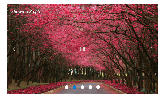
You can control the autoplay slide functionality using the play button. The ShowPlayButton property is used to show or hide the play button in the user interface. You can also customize the play button using the template option.
Refer to the following image.

Indicators
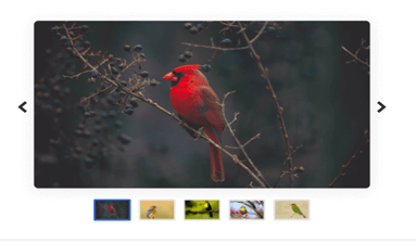
Indicators in the Blazor Carousel component depict the total slides and currently active slide. You can show or hide the indicators using the ShowIndicators property, and show a preview of a slide or thumbnail in the indicators by using the IndicatorsTemplate property.
Refer to the following image.

Note: For more details on previewing slides, check out the template examples in the Blazor Carousel component.
Animation and transitions
You can smoothly navigate among the slides with the built-in slide and cross-fade animation effects.
The Carousel provides auto-play functionality wherein a slide transition is performed after a specified or default interval. On reaching the last slide, the slides will be repeated with the selected transition by default.
You can enable or disable infinite slide transitions using the loop property.
WAI-ARIA compliance and keyboard accessibility
We have designed the Carousel component based on WAI-ARIA specifications, applying WAI-ARIA roles, states, and properties along with keyboard support for people who use assistive devices.
Also, you can easily interact with the Blazor Carousel component using the following keyboard shortcuts:
| Key | Functionality |
| Arrow keys | Navigate between slides. |
| Home | Navigate to the first slide. |
| End | Navigate to the last slide. |
| Space | Play or pause the slide transitions. |
| Enter | Perform the action in focus. |
References
For more details, refer to our Getting Started with Blazor Carousel Component documentation and demos.
What’s coming in 2022 Volume 2
We are planning to include the following features in the Blazor Carousel component for the 2022 Volume 2 release:
- Show one complete slide and a partial view of the adjacent (previous and next) slides simultaneously.
- Provide custom animations in slide transitions.
- Upgrade the Blazor Carousel component to be production-ready.
Conclusion
Thanks for reading! We hope you enjoyed this quick introduction to the Blazor Carousel component which rolled out in the 2022 Volume 1 release. Try out this great control and provide your feedback in the comments section below. Also, check out our Release Notes and What’s New pages to see all the new updates in this release.
The Carousel component is also available in our Angular, React, Vue, JavaScript, ASP.NET (Core and MVC), WinForms, WPF, Xamarin, and UWP platforms. Try it out in your platform of choice and enjoy hassle-free slide navigation!
As always, you can contact us through our support forums, support portal, or feedback portal. We are always happy to assist you!


