We are happy to introduce our newest widget in the Flutter platform, the Radial Gauge. The beta version of the Syncfusion Flutter gauges package is available in pub.dev.
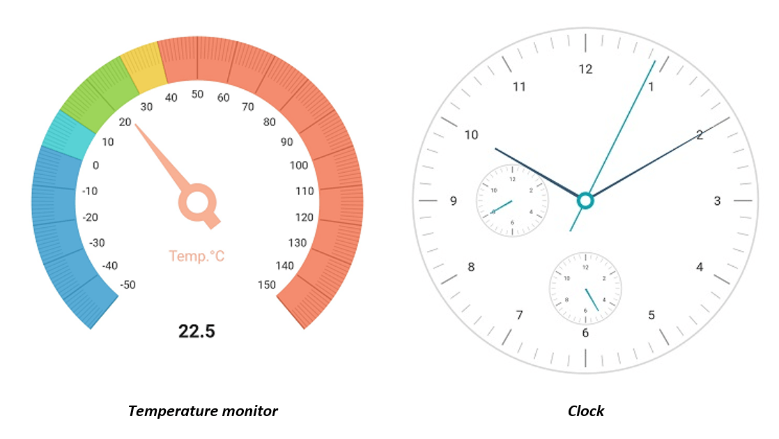
The Syncfusion Flutter gauges library includes a radial gauge, which is a data visualization widget written in Dart for creating modern, interactive, animated gauges for high-quality iOS and Android user interfaces. It allows users to create various application requirements, such as a speedometer, temperature monitor, dashboard, meter gauge, multiple-axis clock, gauge watch, modern activity gauge, or compass.
Let’s now briefly see the features of the Radial Gauge, and then I’ll walk you through the steps to add one to your application.
Flutter Radial Gauge features
The Syncfusion Flutter Radial Gauge has a rich set of features:
- Axes
- Ranges
- Pointers
- Annotations
These are fully customizable and extendable.
Axis
The radial gauge axis is a circular arc on which a set of values are displayed along a linear or custom scale based on the design requirements. You can add any number of axes inside the gauge. Axis features allow users to further customize the gauge axis element to make an axis more readable: label styles, tick styles, label rotation, custom scales, custom labels, inversed axis, outside axis position, and multiple axis support.
Range
The gauge range is a visual element that helps to quickly visualize where a value falls on an axis. You can add any number of ranges inside an axis. We can customize the start and end width of a range and annotate the text in it, to improve readability.
Pointers
Pointers are used to indicate values on an axis. The Radial Gauge control supports three types of pointers:
- Needle pointer
- Marker pointer
- Range pointer
You can customize all these pointers as needed.
The needle pointer is used to indicate a value with a highly customizable needle-type element. One end of the needle is positioned at the middle of the gauge, and the other endpoints to the value of the axis. Use the knob and tail elements in the needle pointer to improve the look of the pointer.
The marker pointer is used to indicate a value with built-in shapes, such as a circle, diamond, triangle, inverted triangle, or rectangle. You can use text and images as a pointer.
The range pointer is used to indicate the value from the starting value of the axis. We can customize the pointer corner style to be a rounded curve.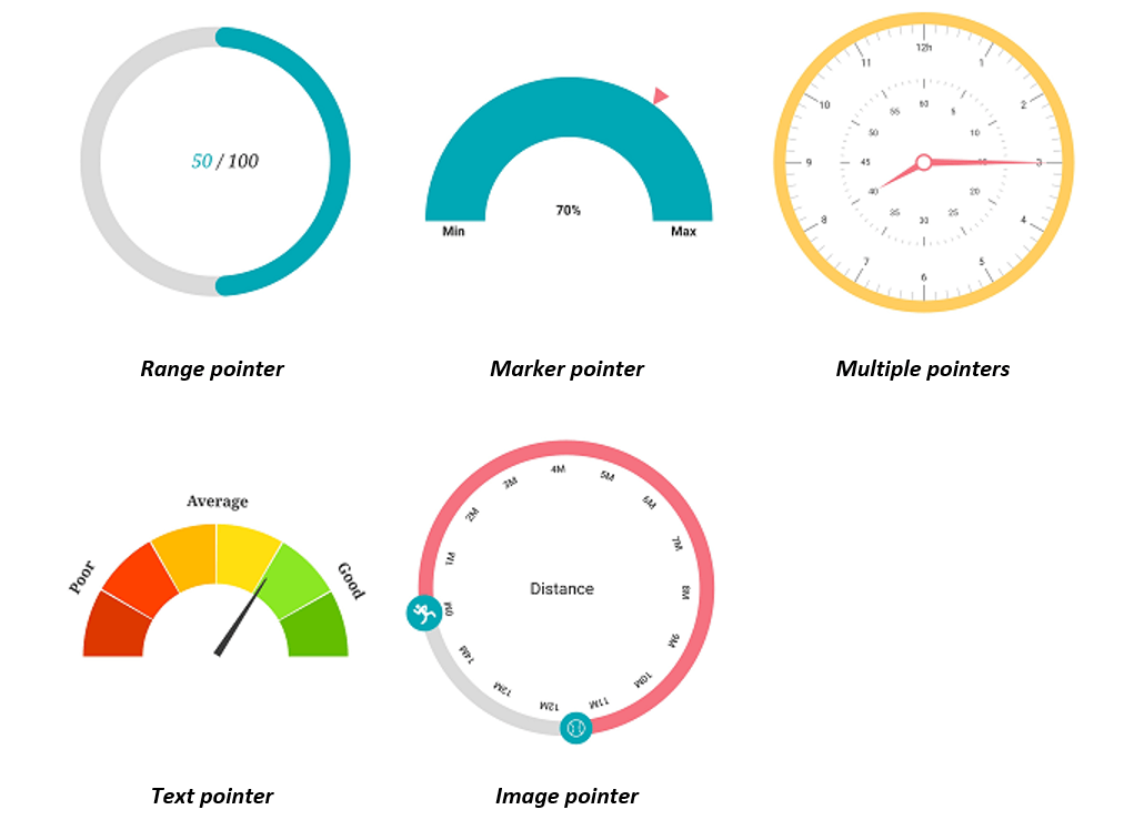
Annotation
You can add multiple widgets, such as text and images as annotations, at specific points of interest in the Radial Gauge.
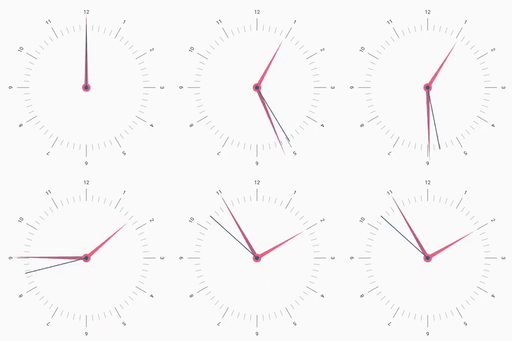
Pointer animation
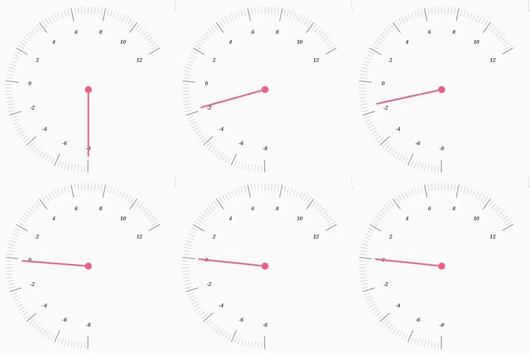
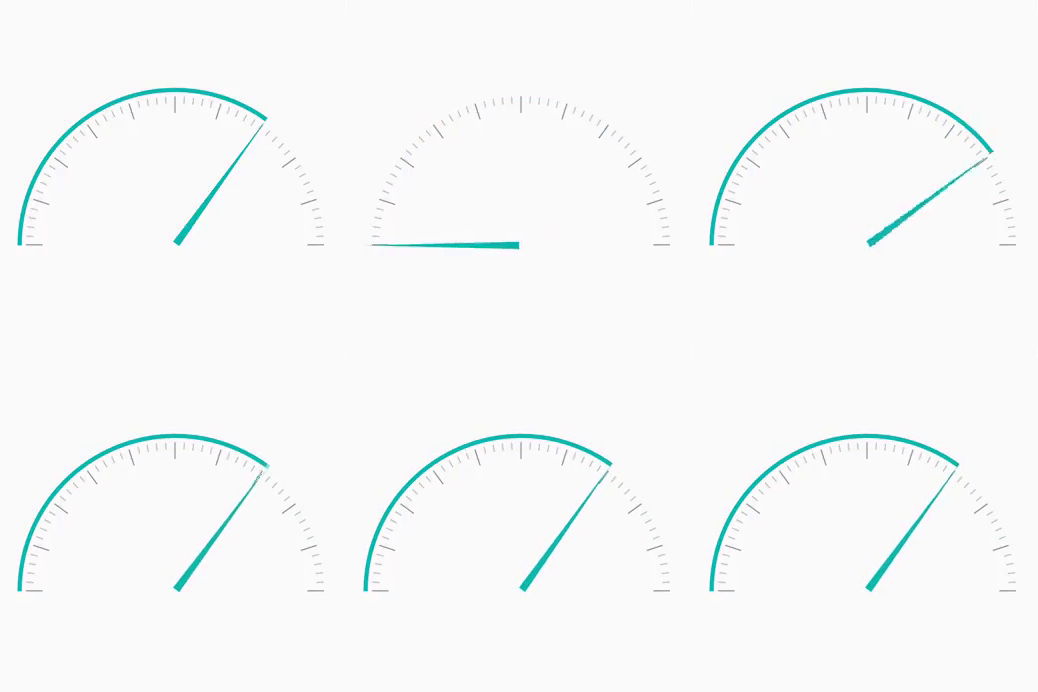
You can animate the pointer in a visually appealing way when the pointer moves from one value to another. Our Radial Gauge supports various pointer animations.
Pointer interaction
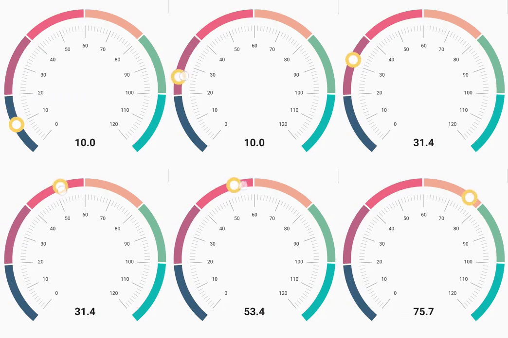
Radial Gauge provides an option to drag a pointer from one value to another. Use it to change the value at run time.
Add a Flutter radial gauge to your app
This section explains how to create a simple radial gauge to demonstrate basic gauge usage.
Add dependency
Add the Syncfusion Flutter Gauge dependency to your pub spec file.
| dependencies:
syncfusion_flutter_gauges: ^1.0.0-beta |
Get packages
Run the following command to get the required packages.
$ flutter pub get
Import package
Import the following package in your Dart code.
import 'package:syncfusion_flutter_gauges/gauges.dart';
Add a radial gauge to the widget tree
After importing the package, initialize SfRadialGauge as a child of any widget, such as a container widget.
@override
  Widget build(BuildContext context) {
    return MaterialApp(
      home: Scaffold(
      body: Center(
        child: Container(
          child: SfRadialGauge()
          )),
    ));
  }
Add radial gauge elements
Add gauge elements: ranges to display different color ranges; a pointer to indicate the current value, and annotation to show the current value.
@override
  Widget build(BuildContext context) {
    return MaterialApp(
      home: Scaffold(
      body: Center(
        child: Container(
          child: SfRadialGauge(
          axes: <RadialAxis>[
            RadialAxis(minimum: 0, maximum: 150,
            ranges: <GaugeRange>[
              GaugeRange(startValue: 0, endValue: 50, color:Colors.green),
              GaugeRange(startValue: 50,endValue: 100,color: Colors.orange),
              GaugeRange(startValue: 100,endValue: 150,color: Colors.red)],
            pointers: <GaugePointer>[
              NeedlePointer(value: 90)],
            annotations: <GaugeAnnotation>[
              GaugeAnnotation(widget: Container(child:
                 Text('90.0',style: TextStyle(fontSize: 25,fontWeight: FontWeight.bold))),
                 angle: 90, positionFactor: 0.5
              )]
          )])
      ))),
    );
  }
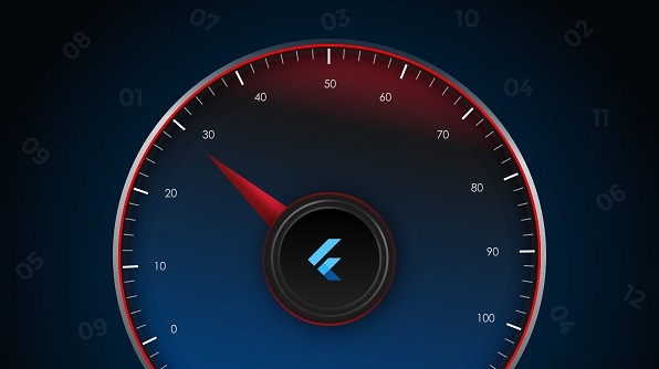
The following screenshot illustrates the result of the previous code sample.
Explore Flutter gauge examples and demos
- You can see Syncfusion’s Flutter app with many examples in this GitHub location.
- Additionally, take a look at our demo app in the Play Store and App store.
If you want an in-depth learning experience on how to create a complete Flutter app, be sure to read Flutter Succinctly by Ed Freitas. It’s part of Syncfusion’s library of free technical ebooks.
Conclusion
In this blog post, we walked through our new Syncfusion Flutter Radial Gauge and its features. Try them and share your feedback in the comments section. To get started, you can refer to this video tutorial.
Also, if you need a new widget in the Flutter framework, please let us know in the comments section. As always, we are happy to assist you!


Comments (5)
[…] Introducing Radial Gauge Widget in Flutter (Sheik Syed) […]
Hi,
I want to use this widget, the radial gauge, in our production app. Do I need to get the entire syncfusion paid license for that? Is there a custom one time payment option available for just this widget? Would be a great help. Thanks!
Hi Jagrati,
We are glad that you are interested in buying our Flutter widgets. You can check the pricing of our Flutter widgets in here.
https://www.syncfusion.com/sales/products/flutter
For more details please contact our sales team ([email protected])
Thanks,
Suresh
How do I adjust the size of the radialguage inside of a container?
Hi Alfie,
There is no direct property for the radial gauge to adjust its size. You can place the radial gauge inside the layout widgets such as SizedBox or Padding widget and adjust its size as in the code below.
Widget build(BuildContext context) {
return MaterialApp(
home: Scaffold(
body: Center(
child: Container(
child: SizedBox(
height: 300,
width: 300,
child: SfRadialGauge(),
)
)),
));
}