The following blog is a closer look at mobile app onboarding by Malcolm Jack, originally posted on his Medium and Blogspot pages. You can follow him on Twitter at @InquisitorJax. More information about Syncfusion Xamarin controls is available here.
In my previous post, I talked about how awesome Xamarin is for creating cross-platform mobile apps. I’ve been thinking a lot about customer onboarding recently, so I thought I’d do another proof of concept app to illustrate it using Xamarin.
As before, I prefer using real companies to illustrate the point. I’m a big fan of Highrise, and how they build product, so I thought they’d make a good candidate this time around, especially since they’re pretty transparent about their processes and value proposition, so it was pretty easy to generate content.
Here’s a quick walkthrough of the result:
https://www.youtube.com/watch?v=8QIpoZFGif0
So I’m not going to go into too much technical detail here—if you want to check out the source code, check out the GitHub repo. Instead I’m going to break down the app page by page:
The Splash Page
There’s nothing great about the Android splash screen, except to note that it’s a 9-patch image, which scales and stretches no matter what orientation or screen size the device is.
The Welcome Page
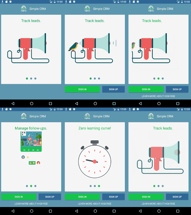
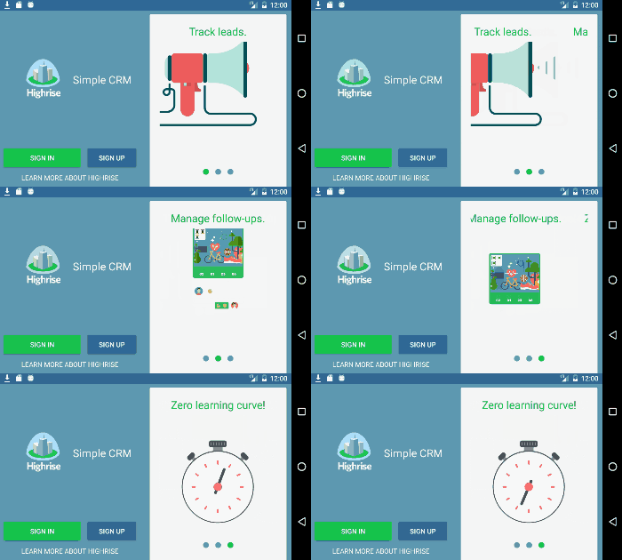
This page is really the main point of doing the proof of concept. It’s the first thing potentially new customers will see, so it really needs to sell your value proposition. Highrise recently went through a jobs-to-be-done exercise with their customers, and came out with three main points, which you’ll now find on their homepage. So it makes sense to have this on the landing page, along with sign up/sign in options. (Here’s another example of this pattern from Charlin Agramonte). As in Charlin’s example, and this one, it’s a good idea to have some sort of movable media to draw the user’s attention. In this case I’m using the wonderfully cross-platform Lottie Animation Xamarin Bindings from Martijn van Dijk.

 Points of interest on this page:
- Xamarin.Forms animation is used to sequentially animate the buttons and Learn More About Highrise controls.
- The layout and logo image sizing are adaptive to the orientation of the device.
- The Syncfusion rotator control is used to automatically cycle through the value proposition animations.
- A Learn More link in case the user needs some more information before submitting credentials—such as pricing, etc.
The Sign In/Sign Up Page
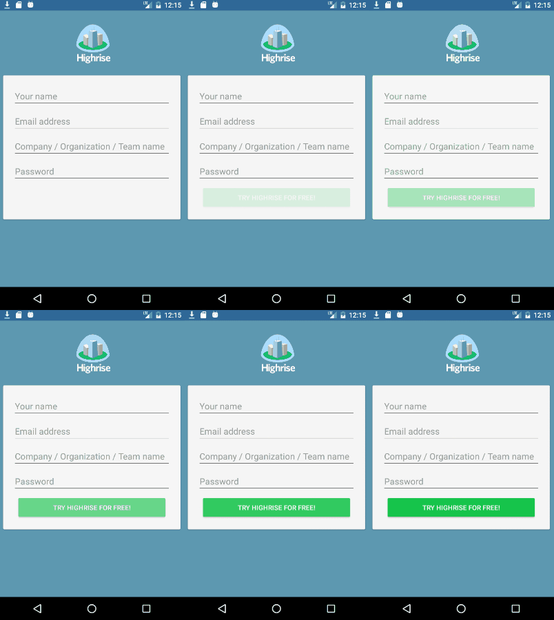
These pages are pretty basic. Keep it simple. Animations are purposefully left out of this page as they would detract from the important info, which is the data entry.

Points of interest:
- Making use of the floating label design pattern for data entry. This increases the available real estate when working with entry controls.
- The button animates in to draw attention to the text. Don’t worry—it doesn’t flash, that’s just the gif animation recycling :P. (Syncfusion editor’s note: We are currently not able to post animated GIFs on our blog. You can view the animated GIF here.)
- The logo becomes invisible when the device is in landscape mode to ensure enough real estate for the entry fields.
The Landing Page
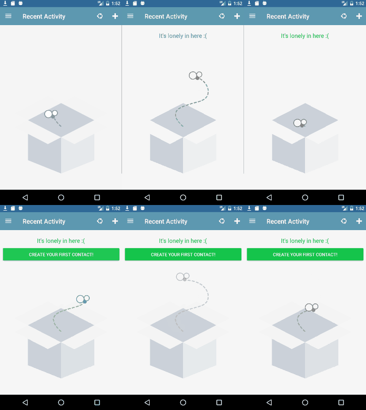
Okay, so the user made it through the signup process, but still has no idea (or at least very little) what the app can do. The idea conveyed here is to guide the user with visual queues, and get them to do the simplest action that is the main value proposition of the app. In this case it’s creating a contact.

One other thing I wanted to play around with was gamification. So once you’ve created that first contact, the app gives an immediate reward of unlocking your first achievement, along with links to other help topics and features the user may find useful.

The other thing to be aware of, is giving your users opportunities to share their app experience via social messaging. The landing page has a generic “I think Highrise is awesome” share button in the toolbar, and each user achievement has an “I just achieved X with Highrise” share link.
Some More Links for Related Reading
- Lottie Animations Step by Step in Xamarin Forms
- LottieFiles—Free Lottie animations
- Bring Stunning Animations to Your Apps with Lottie
- Xamarin Android 9-Patch Image Splashscreen
- Mobile App Gamification: 5 Main Things to Consider
- Adaptive UI with Xamarin.Forms
- Syncfusion Xamarin Controls
I used the Rotator and ListView (with left and right swipe actions) controls for this project. I also added an animating radial menu control to the contact page, but it’s not working atm.
- Highrise—Simple CRM
- Highrise CEO Nathan Kontny YouTube channel where he talks all things product
Have any thoughts on mobile app onboarding? Share them in the comments on Medium or Blogspot.
