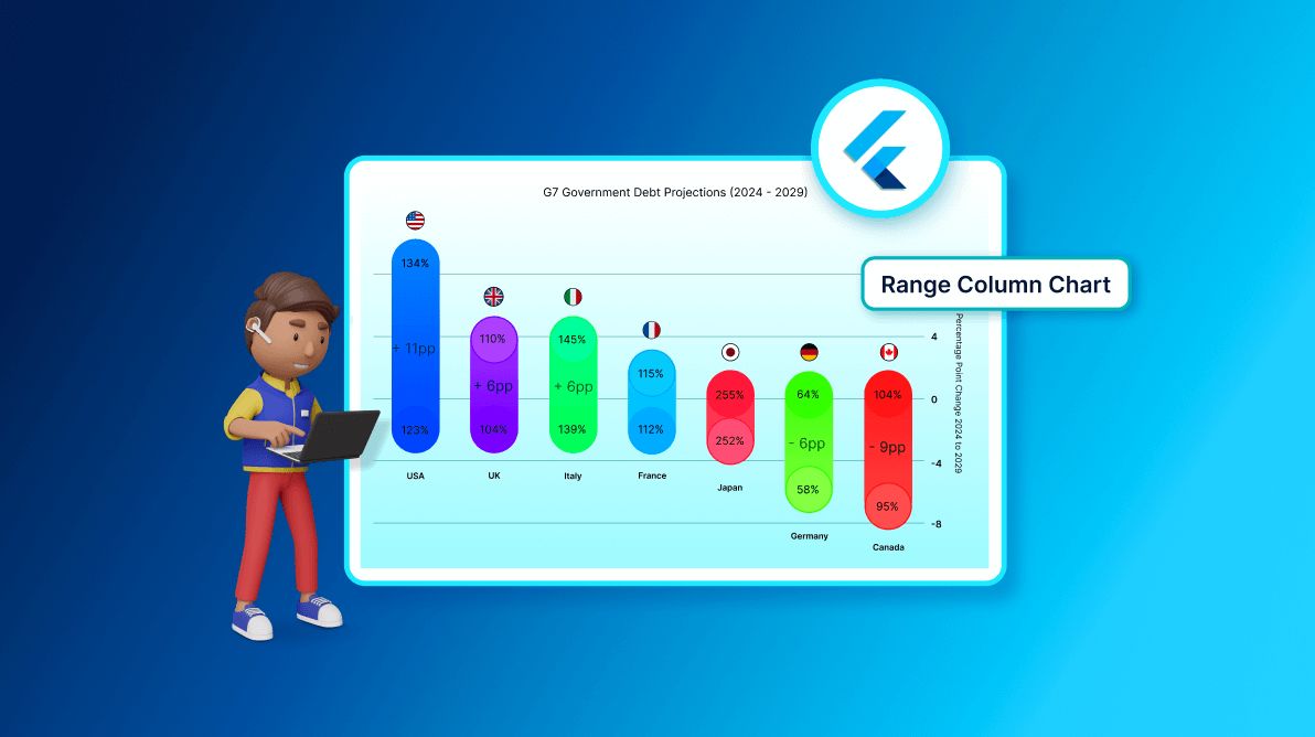
TL;DR: Let’s visualize the G7 countries’ debt projections from 2024 to 2029 using the Syncfusion Flutter Range Column Chart. We’ll customize the chart with custom data labels, tooltips, and a tailored column series for better insights. The chart will display debt changes with color-coded columns, annotations, and flags for clarity. This approach helps compare debt projections effectively across countries.
Welcome to our Chart of the Week blog series!
In this blog, we’ll visualize the debt projections for G7 countries from 2024 to 2029 using the Syncfusion Flutter Range Column Chart. This chart will show changes in debt levels across countries, with custom labels and annotations for added clarity. With these enhancements, we can easily compare debt projections for each country.
Range column chart
A Range Column Chart displays data as vertical bars, showing both minimum and maximum values for each category. It’s perfect for illustrating changes, such as growth or decline, within specific groups. This chart is especially useful for comparing ranges, like debt changes over time across different countries.
Custom data label
Custom data labels allow us to display important information directly on the chart, making it easier for viewers to understand the data. In this visualization, we’ll customize the data labels to show country names and icons. Syncfusion Flutter Charts make this simple using the builder property in the dataLabelSettings, allowing for a highly tailored display.
Custom tooltip
The custom tooltipBehavior in Flutter Charts enhances interactivity by displaying detailed information when a user taps or hovers on a chart point. In this example, we’ll customize the tooltip to display debt information for specific years.
The builder property supports a personalized tooltip layout. We’ll use it to show the debt percentages for 2024 and 2029 and the difference between them. This approach makes the tooltip more informative and visually engaging, improving the overall user experience when interacting with the chart.
Custom range column series
A custom range column series allows for advanced customization of the range column chart’s appearance. Using a custom renderer, we can modify how each column should be drawn and apply unique styles like gradients, custom borders, and effects. This customization enhances the chart’s visual appeal and interactivity.
The onCreateRenderer property is key to implementing a custom renderer, providing complete control over the rendering process. With this feature, you can tailor the chart to meet specific design requirements and create more engaging visualizations.
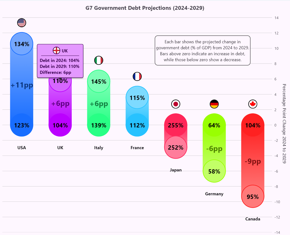
Let’s visualize the government debt projections for G7 countries using the Syncfusion Flutter Range Column Chart!
Refer to the following image.
Step 1: Gathering the data
Let’s gather data on government debt projections for G7 countries from the International Monetary Fund, including each country’s gross debt in 2024 and 2029 and the difference in percentage points between those years.
Step 2: Define and populate data on the chart
Now, define a G7DebtData model class that contains details for the country name, year 2024 debt, year 2029 debt, the percentage change between the current year debt and the projected year debt, and a segment color to update the color for each segment.
Refer to the following code example.
class G7DebtData {
  G7DebtData(this.country, this.year2024Debt, this.year2029Debt, this.percentageChange, this.segmentColor);
  final String country;
  final double year2024Debt;
  final double year2029Debt;
  final double percentageChange;
  final Color segmentColor;
}
Then, create a list to hold the government debt projection data from the financial year 2024 to 2029, which will be used as the data source for the range column chart.
Refer to the following code example.
late List<G7DebtData> _g7DebtData;

@override
void initState() {
  _g7DebtData = [
    G7DebtData( 'USA', 123.3, 133.9, 10.6, const Color.fromARGB(255, 24, 109, 255)),
    G7DebtData('UK', 104.3, 110.1, 5.8, const Color.fromARGB(255, 187, 0, 255)),
    G7DebtData('Italy', 139.2, 144.9, 5.7, const Color.fromARGB(255, 40, 255, 133)),
    G7DebtData('France', 111.6, 115.2, 3.6, const Color.fromARGB(255, 39, 194, 255)),
    G7DebtData('Japan', 254.6, 251.7, -2.9, const Color.fromARGB(255, 255, 38, 89)),
    G7DebtData('Germany', 63.7, 57.7, -6.0, const Color.fromARGB(255, 153, 255, 1)),
    G7DebtData('Canada', 104.3, 95.4, -9.3, const Color.fromARGB(255, 255, 33, 33)),
  ];
  super.initState();
}
Step 3: Configuring the Flutter Range Column Chart
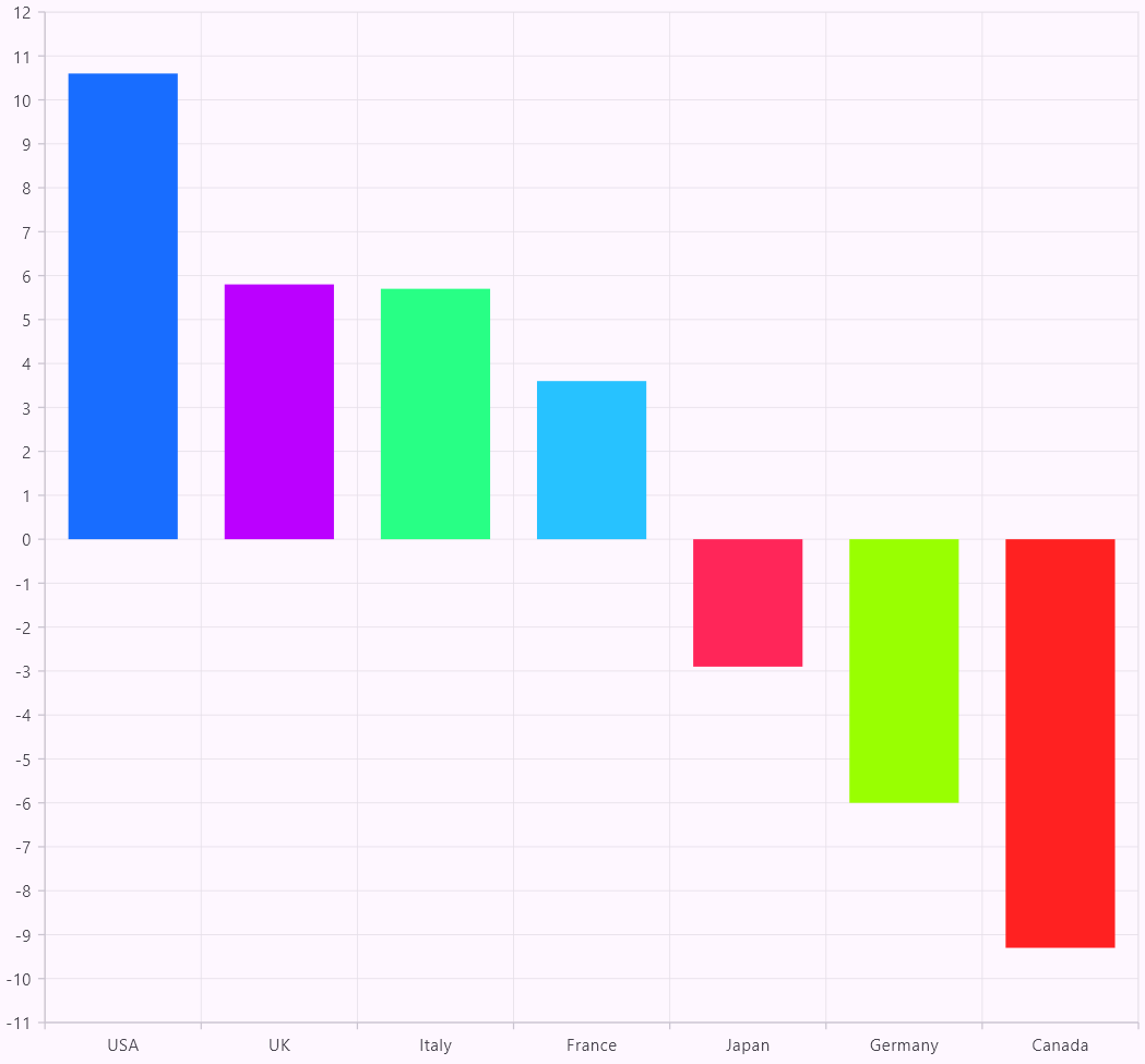
To visualize the government debt projections, we’ll use the Syncfusion Flutter RangeColumnSeries. The X-axis is set to CategoryAxis, which represents the country names, while the Y-axis is set to NumericAxis, displaying the change in government debt as numeric values.
The RangeColumnSeries is configured to show the range of values by mapping the low and high values using lowValueMapper and highValueMapper, respectively. The color of each column is dynamically assigned using pointColorMapper, which uses the segmentColor from the data, ensuring each country is visually distinct in the chart.
This approach allows the user to easily compare debt changes for each country, with the added benefit of color-coding for clarity.
Refer to the following code example.
@override
Widget build(BuildContext context) {
  return Scaffold(
    body: SfCartesianChart(
      primaryXAxis: CategoryAxis(),
      primaryYAxis: NumericAxis(),
      series: [
        RangeColumnSeries< G7DebtData, String>(
          dataSource: _ g7DebtData,
          xValueMapper: (G7DebtData data, int index) =>  data.country,
          lowValueMapper: (G7DebtData data, int index) => data.change > 0 ? 0 :
            data.percentageChange,
          highValueMapper: (G7DebtData data, int index) => data.change > 0 ?
            data.percentageChange : 0,
          pointColorMapper: (G7DebtData data, int index) => data.segmentColor,
        ),
Refer to the following image.
Step 4: Customizing axis appearance
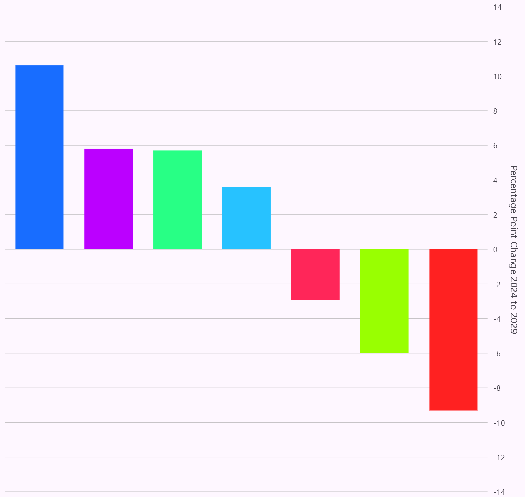
Here, we’ll disable the X-axis by setting the isVisible property to false, keeping the chart clean without displaying the axis.
The Y-axis is customized with the title “Percentage Point Change 2024 to 2029” and hides the axis line and tick lines. The Grid lines are faint with a width of 0.5. The range is set from -14 to 14 and positioned on the opposite side for better readability.
Refer to the following code example.
plotAreaBorderWidth: 0,
primaryXAxis: CategoryAxis(
  isVisible: false,
),
primaryYAxis: NumericAxis(
  title: AxisTitle(text: 'Percentage Point Change 2024 to 2029'),
  axisLine: AxisLine(width: 0),
  majorTickLines: MajorTickLines(width: 0),
  majorGridLines: MajorGridLines(width: 0.5, color: Colors.grey),
  minimum: -14,
  maximum: 14,
  opposedPosition: true,
),
Refer to the following image.
Step 5: Adding chart title
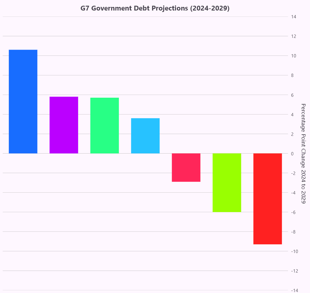
The ChartTitle widget is used to customize the title in this chart. The text property is set to “G7 Government Debt Projections (2024-2029).” The title text is styled with textStyle. The title is set to bold for a clear, prominent appearance at the top of the chart.
Refer to the following code example.
title:ChartTitle(
  text: 'G7 Government Debt Projections (2024-2029)',
  textStyle: TextStyle(fontWeight: FontWeight.bold),
),
Refer to the following image.
Step 6: Create and configure a custom range column series renderer
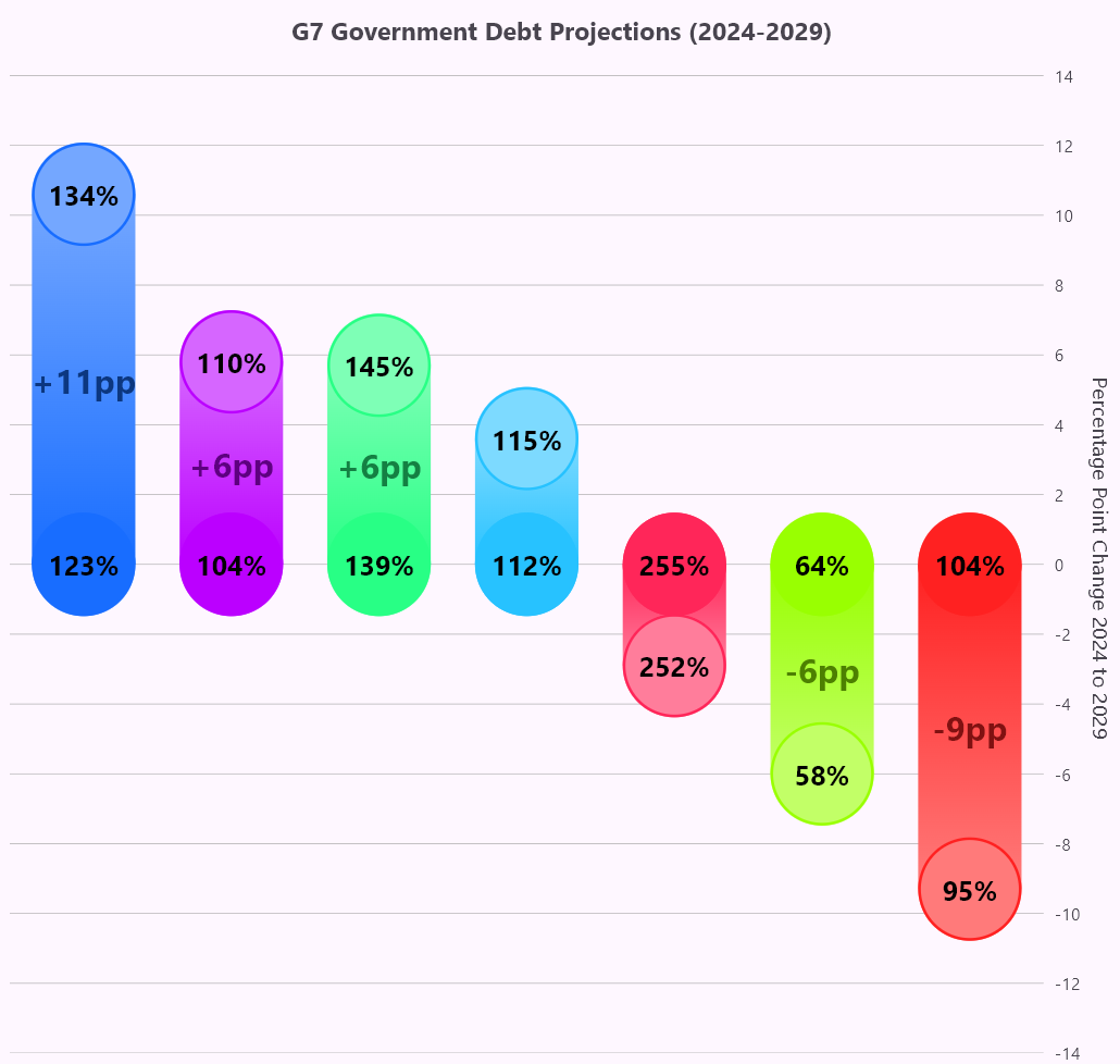
The onCreateRenderer callback is used to create a custom series renderer for the range column chart. By returning the _CustomRangeColumnSeriesRenderer, you can extend the default renderer to apply unique visualizations to each segment.
The custom renderer handles tasks such as creating segments from data points and customizing how the chart is drawn. This allows for greater flexibility and personalization when displaying the chart’s data.
Refer to the following code example.
series: [
  RangeColumnSeries< G7DebtData, String>(
    ....
    onCreateRenderer: (series) {
      return _CustomRangeColumnSeriesRenderer();
    },
  ),
]
The _CustomRangeColumnSeriesRenderer class extends RangeColumnSeriesRenderer to create a custom visualization using the GovernmentDebtProjectionData model. It overrides the createSegment method to return a custom segment, _RangeColumnCustomPainter, which handles the specific drawing requirements. The onPaint method customizes each segment’s size and position using segmentRect and applies a gradient for visual depth.
The key customizations include:
- Circles: Drawn at the top and bottom of each segment, with color changes indicating positive or negative debt changes.
- Text Labels: Displayed at the top, bottom, and center of each segment, representing projected debt, current debt, and percentage change. These labels are dynamically positioned and styled for clarity.
This combination of visual enhancements ensures the chart is engaging, informative, and easy to interpret.
Refer to the following code example.
class _CustomRangeColumnSeriesRenderer extends RangeColumnSeriesRenderer<G7DebtData, String> {
    _CustomRangeColumnSeriesRenderer();

    @override
    RangeColumnSegment< G7DebtData, String> createSegment() {
      return _RangeColumnCustomPainter();
    }
}

class _RangeColumnCustomPainter extends RangeColumnSegment< G7DebtData, String> {
  _RangeColumnCustomPainter();

  void paintText(Canvas canvas, String text, Offset position, double fontSize,
      {bool isCenter = false, Color baseColor = Colors.black}) {
    final TextSpan span = TextSpan(
      style: TextStyle(
        color:
            isCenter ? Color.lerp(baseColor, Colors.black, 0.50)! : baseColor,
        fontSize: fontSize,
        fontWeight: FontWeight.bold,
      ),
      text: text,
    );

    final TextPainter tp = TextPainter(
      text: span,
      textAlign: TextAlign.center,
      textDirection: TextDirection.ltr,
    );
    tp.layout();
    tp.paint(canvas,
        Offset(position.dx - tp.width / 2, position.dy - tp.height / 2));
  }

  void drawCustomCircle(Canvas canvas, Offset center, double radius,
      Paint fillPaint, Paint strokePaint) {
    canvas.drawCircle(center, radius, fillPaint);
    canvas.drawCircle(center, radius - 1, strokePaint);
  }

  @override
  void onPaint(Canvas canvas) {
    if (segmentRect == null) return;
    final double center = segmentRect!.center.dx;
    final double top = segmentRect!.top;
    final double bottom = segmentRect!.bottom;
    final segment = series.dataSource![currentSegmentIndex];
    final double centerText = segment.change;
    final bool isPositiveChange = centerText > 0;
    final double topText =
        isPositiveChange ? segment.projectedYearDebt : segment.currentYearDebt;
    final double bottomText =
        isPositiveChange ? segment.currentYearDebt : segment.projectedYearDebt;

    final Paint customPaint = Paint()
      ..color = Color.lerp(fillPaint.color, Colors.white, 0.40)!
      ..style = PaintingStyle.fill;
    final Gradient gradient = LinearGradient(
      colors: [fillPaint.color, customPaint.color],
      begin: isPositiveChange ? Alignment.bottomCenter : Alignment.topCenter,
      end: isPositiveChange ? Alignment.topCenter : Alignment.bottomCenter,
    );

    final Paint gradientPaint = Paint()
      ..shader = gradient.createShader(segmentRect!.outerRect);
    final Paint strokePaint = Paint()
      ..color = fillPaint.color
      ..style = PaintingStyle.stroke
      ..strokeWidth = 2.0;

    canvas.drawRRect(segmentRect!, gradientPaint);
    drawCustomCircle(canvas, Offset(center, top), segmentRect!.width / 2,
        isPositiveChange ? customPaint : fillPaint, strokePaint);
    drawCustomCircle(canvas, Offset(center, bottom), segmentRect!.width / 2,
        isPositiveChange ? fillPaint : customPaint, strokePaint);

    paintText(canvas, '${topText.round()}%', Offset(center, top), 20);
    paintText(canvas, '${bottomText.round()}%', Offset(center, bottom), 20);
    if (centerText.abs() > 5) {
      paintText(
        canvas,
        '${centerText >= 0 ? '+' : ''}${centerText.round()}pp',
        segmentRect!.center,
        25,
        isCenter: true,
        baseColor: fillPaint.color,
      );
    }
  }
}
Refer to the following image.
Step 7: Adding custom data labels to the chart
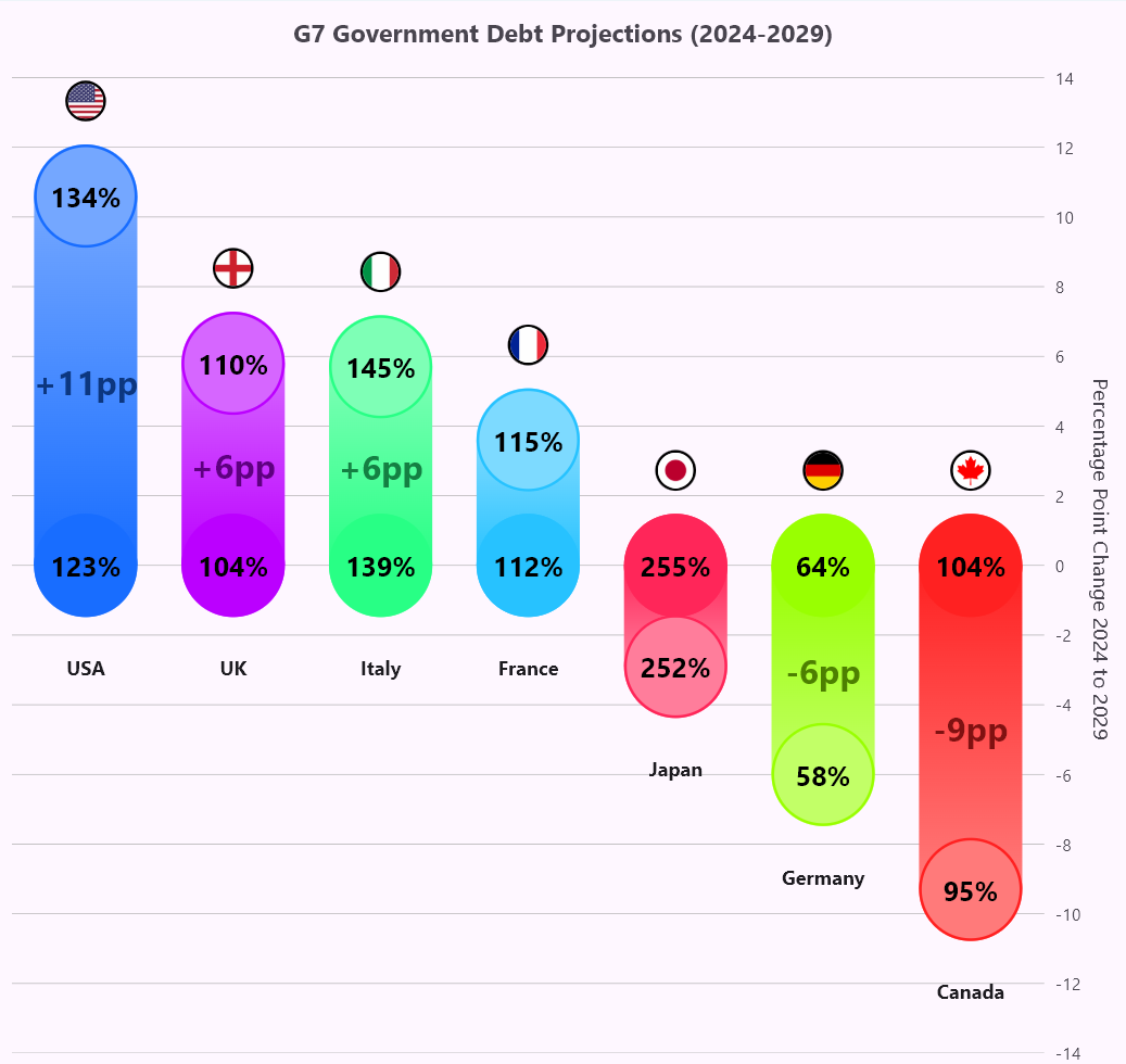
To make the chart more engaging, custom data labels are added to display each country’s flag at the top of their respective columns using the builder property in the dataLabelSettings.
In this setup, the builder checks the pointIndex and dynamically returns either the country’s flag or its name. If the flag is displayed, the image is loaded from a local directory, with the file name matching the country field from the GovernmentDebtProjectionData object. The flag is styled inside a circular container with a border for visual distinction.
Refer to the following code example.
RangeColumnSeries< G7DebtData, String>(
dataLabelSettings: DataLabelSettings(
  isVisible: true,
  builder: (dynamic data, dynamic point, dynamic series,
    int pointIndex, int seriesIndex) {
    final bool isDifferentIndex = pointIndex != index;
    index = pointIndex;
    final Widget content = isDifferentIndex ? Container(width: 30, height: 30,
        decoration: BoxDecoration(
          border: Border.all(color: Colors.black, width: 2),
          borderRadius: BorderRadius.circular(50),
        ),
        child: Image.asset(
          'Image/${data.country}.png',
           width: 30,
           height: 30,
           fit: BoxFit.contain,
        ),
      )
      : Text(
        '${data.country}',
         style: TextStyle(fontWeight: FontWeight.bold),
      );
      return Padding(
        padding: EdgeInsets.only(bottom: isDifferentIndex ? 50 : 0, top: isDifferentIndex ? 0 : 50),
        child: content,
       );
    },
 ),
Additionally, the required flag images should be added to the assets in your pubspec.yaml file to ensure proper loading and display of each country’s flag in the chart. This approach gives the chart a visually appealing and informative touch.
Refer to the following code example.
flutter:
  assets:
    - Image\Canada.png
    - Image\France.png
    - Image\Germany.png
    - Image\Italy.png
    - Image\Japan.png
    - Image\UK.png
    - Image\USA.png
Refer to the following image.
Step 8: Adding annotations to the chart
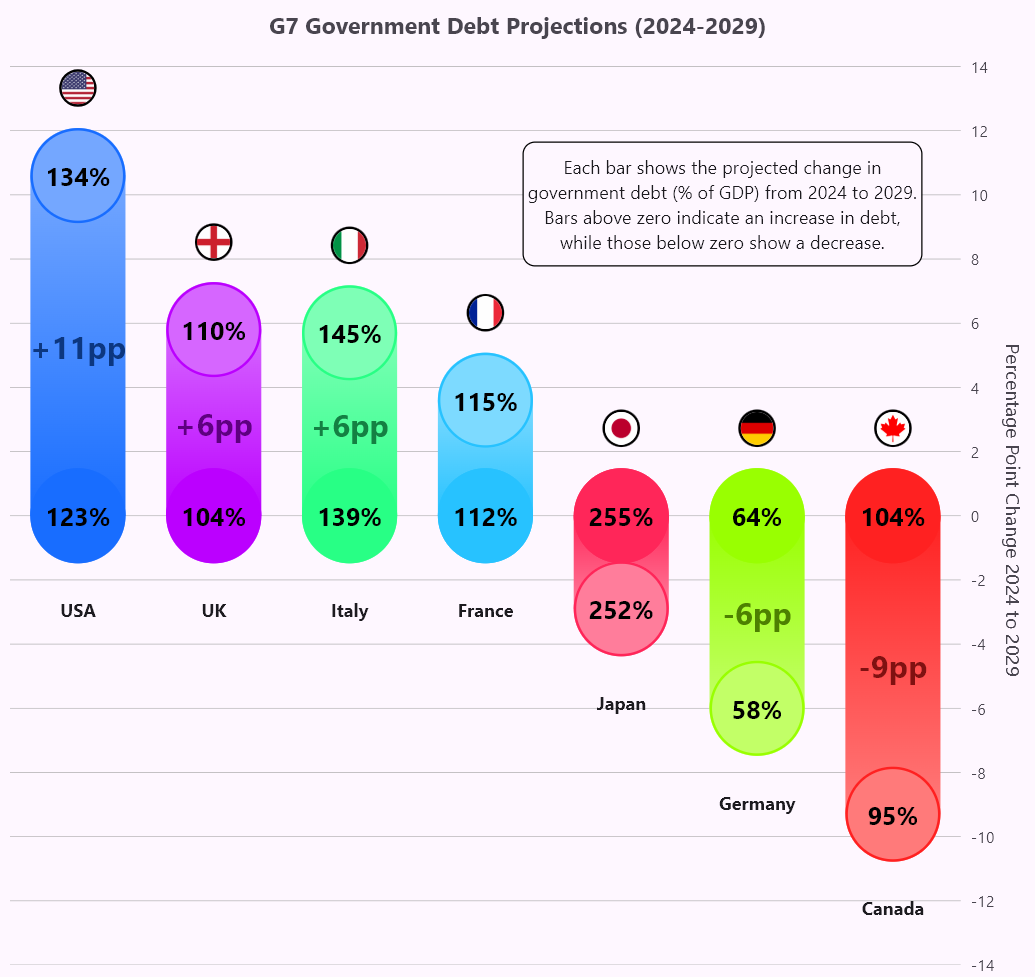
The CartesianChartAnnotation class is used to add a custom annotation, explaining the projected change in government debt from 2024 to 2029. The text is centered in a container with rounded corners, a border, and a background color for clarity.
The annotation is positioned at specific chart coordinates to help users understand the data, with bars above zero indicating an increase and those below showing a decrease in debt.
Refer to the following code example.
annotations: <CartesianChartAnnotation>[
  CartesianChartAnnotation(
    widget: Container(
      height: 100,
      width: 320,
      decoration: BoxDecoration(
        color: ThemeData().canvasColor,
        borderRadius: BorderRadius.circular(10),
        border: Border.all(width: 1, color: Colors.black)),
        alignment: Alignment.center,
        child: Text(
                'Each bar shows the projected change in \ngovernment debt (% of GDP) from 2024 to
                 2029.\nBars above zero indicate an increase in debt, \nwhile those below zero show
                 a decrease.',
          style: TextStyle(fontSize: 14),
          textAlign: TextAlign.center,
         ),
       ),
      x: 570,
      y: 120,
      coordinateUnit: CoordinateUnit.logicalPixel,
    ),
],
Refer to the following image.
Step 9: Adding a custom tooltip to the chart
Custom tooltips are added using the tooltipBehavior property to show detailed data when interacting with a column. The builder displays the country name and logo at the top, along with the debt for 2024 and 2029 and the percentage difference, all in bold text on a background color based on the segment.
This makes the chart more interactive by providing additional information when a user taps or hovers over a segment.
Refer to the following code example.
tooltipBehavior: TooltipBehavior(
  enable: true,
  builder: (dynamic data, dynamic point, dynamic series, int pointIndex, int seriesIndex) {
    final G7DebtData debtData = data;
    final Color darkSegmentColor = Color.lerp(debtData.segmentColor, Colors.black, 0.70)!;
    final Color lightSegmentColor = Color.lerp(debtData.segmentColor, Colors.white, 0.60)!;
    return Container(
      width: 155,
      padding: const EdgeInsets.all(8),
      decoration: BoxDecoration(
        color: lightSegmentColor,
        borderRadius: BorderRadius.circular(5),
        border: Border.all(color: darkSegmentColor),
      ),
      child: Column(
        mainAxisSize: MainAxisSize.min,
        crossAxisAlignment: CrossAxisAlignment.start,
        children: [
          Center(
            child: Row(
              mainAxisSize: MainAxisSize.min,
              children: [
                Container(
                  width: 25,
                  height: 25,
                  decoration: BoxDecoration(
                    border:
                        Border.all(color: darkSegmentColor, width: 2),
                    borderRadius: BorderRadius.circular(50),
                  ),
                  child: Image.asset(
                    'Image/${debtData.country}.png',
                    fit: BoxFit.contain,
                  ),
                ),
                const SizedBox(width: 5),
                Text(
                  debtData.country,
                  style: TextStyle(
                      fontWeight: FontWeight.bold,
                      color: darkSegmentColor),
                ),
              ],
            ),
          ),
          Divider(
              color: darkSegmentColor,
              thickness: 1,
              height: 10,
              indent: 5,
              endIndent: 5),
          ...[
            'Debt in 2024: ${debtData.year2024Debt.round()}%',
            'Debt in 2029: ${debtData.year2029Debt.round()}%',
            'Difference: ${(debtData.percentageChange).round()}pp',
          ].map(
            (text) => Text(
              text,
              style: TextStyle(
                fontWeight: FontWeight.bold,
                color: darkSegmentColor,
              ),
            ),
          ),
Refer to the following image.

GitHub reference
For more details, refer to the Visualizing the government debt projections for G7 countries using the Flutter Range Column Chart GitHub demo.

Unlock the power of Syncfusion’s highly customizable Flutter widgets.
Conclusion
Thanks for reading! In this blog, we’ve seen how to visualize the government debt projections for G7 countries using the Syncfusion Range Column Chart. We hope you find the outlined steps helpful in achieving similar results.
If you’re an existing customer, you can download the latest version of Essential Studio® from the License and Downloads page. For those new to Syncfusion, try our 30-day free trial to explore all our features.
For queries, you can contact us through our support forum, support portal, or feedback portal. As always, we are happy to assist you!
