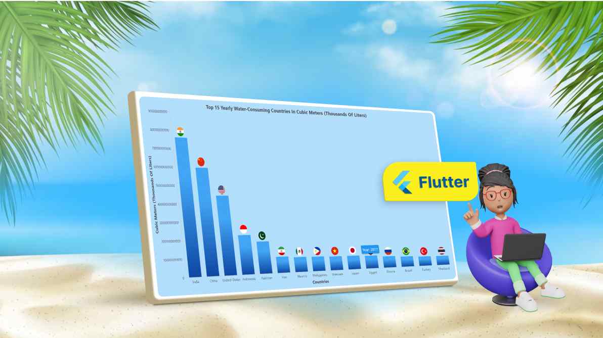
TL;DR: Let’s visualize the top 15 water-consuming countries using the Syncfusion Flutter Column Chart. We’ll gather data from worldometers and use a Column Chart for comparisons. Custom tooltips and data labels enhance interactivity, while gradient effects and a minimalist layout highlight water usage trends.
Welcome to our Chart of the Week blog Series!
Charts are powerful tools to simplify complex datasets, turning them into engaging visual representations. They are widely used across sectors such as business, education, and environmental studies, allowing users to explore trends, comparisons, and relationships easily. By visualizing data, we can uncover patterns that might remain hidden in raw numbers.
In this blog, we’ll visualize the world’s top 15 water-consuming countries using the Syncfusion Flutter Column Chart with tooltips and custom data labels to improve clarity and interactivity.
Column Chart
A Column Chart is a popular tool to represent categorical data using vertical bars. It’s ideal for comparing values across different groups, like water usage per country.
Custom data labels
Data labels allow us to display key information directly on the chart, making it easier for viewers to interpret the data. In this visualization, we’ll customize the data labels to show the country icons. Syncfusion Flutter Charts make this easy using the builder property in the dataLabelSettings.
Custom tooltips
Tooltips enhance the chart’s interactivity by displaying additional data when users tap or hover over a column, especially on mobile devices where hover options are not available. Here, we’ll customize the tooltip to display the year of water consumption. Syncfusion Flutter Charts widget offers straightforward customization of tooltips through the builder property in TooltipBehavior.
Let’s visualize the data of the top 15 water-consuming countries using the Syncfusion Flutter Column Chart!
Refer to the following image.
Step 1: Gathering data on water consumption
Let’s collect data on the top 15 water-consuming countries from worldometers. Organize this information into a list that includes each country’s name and its yearly water consumption in cubic meters (Thousands of liters). This will serve as the dataset for our chart.
Step 2: Preparing the data for the chart
Create a WaterConsumptionData model that contains details of the country name, yearly water usage, and the year when the data was recorded.
Refer to the following code example.
class WaterConsumptionData {
  WaterConsumptionData(this.country, this.yearlyWaterUsage, this.year);
  final String country;
  final double yearlyWaterUsage;
  final double year;
}
Next, create a list to hold the country’s water usage data and the year the data was recorded, which we will use as the source for the Flutter Chart.
late List _yearlyWaterUsageData;
@override
void initState() {
  super.initState();
  _yearlyWaterUsageData = [
    WaterConsumptionData('India', 761000000000, 2010),
    WaterConsumptionData('China', 598100000000, 2015),
    WaterConsumptionData('United-States', 444300000000, 2015),
    WaterConsumptionData('Indonesia', 222600000000, 2016),
    WaterConsumptionData('Pakistan', 183500000000, 2008),
    WaterConsumptionData('Iran', 93300000000, 2004),
    WaterConsumptionData('Mexico', 86580000000, 2016),
    WaterConsumptionData('Philippines', 85140000000, 2016),
    WaterConsumptionData('Vietnam', 82030000000, 2005),
    WaterConsumptionData('Japan', 81450000000, 2009),
    WaterConsumptionData('Egypt', 77500000000, 2017),
    WaterConsumptionData('Russia', 69500000000, 2016),
    WaterConsumptionData('Brazil', 63500000000, 2016),
    WaterConsumptionData('Turkey', 58950000000, 2016),
    WaterConsumptionData('Thailand', 57310000000, 2007),
 ];
Step 3: Configure the Flutter Cartesian Charts
Let’s create a SfCartesianChart to configure both the X and Y axes. In this setup, the X-axis uses CategoryAxis to represent the country names, while the Y-axis employs NumericAxis to display the water usage values in cubic meters.
Refer to the following code example.
SfCartesianChart(
  primaryXAxis: const CategoryAxis(),
  primaryYAxis: const NumericAxis(),
),
Step 4: Binding data in the Flutter Column Chart
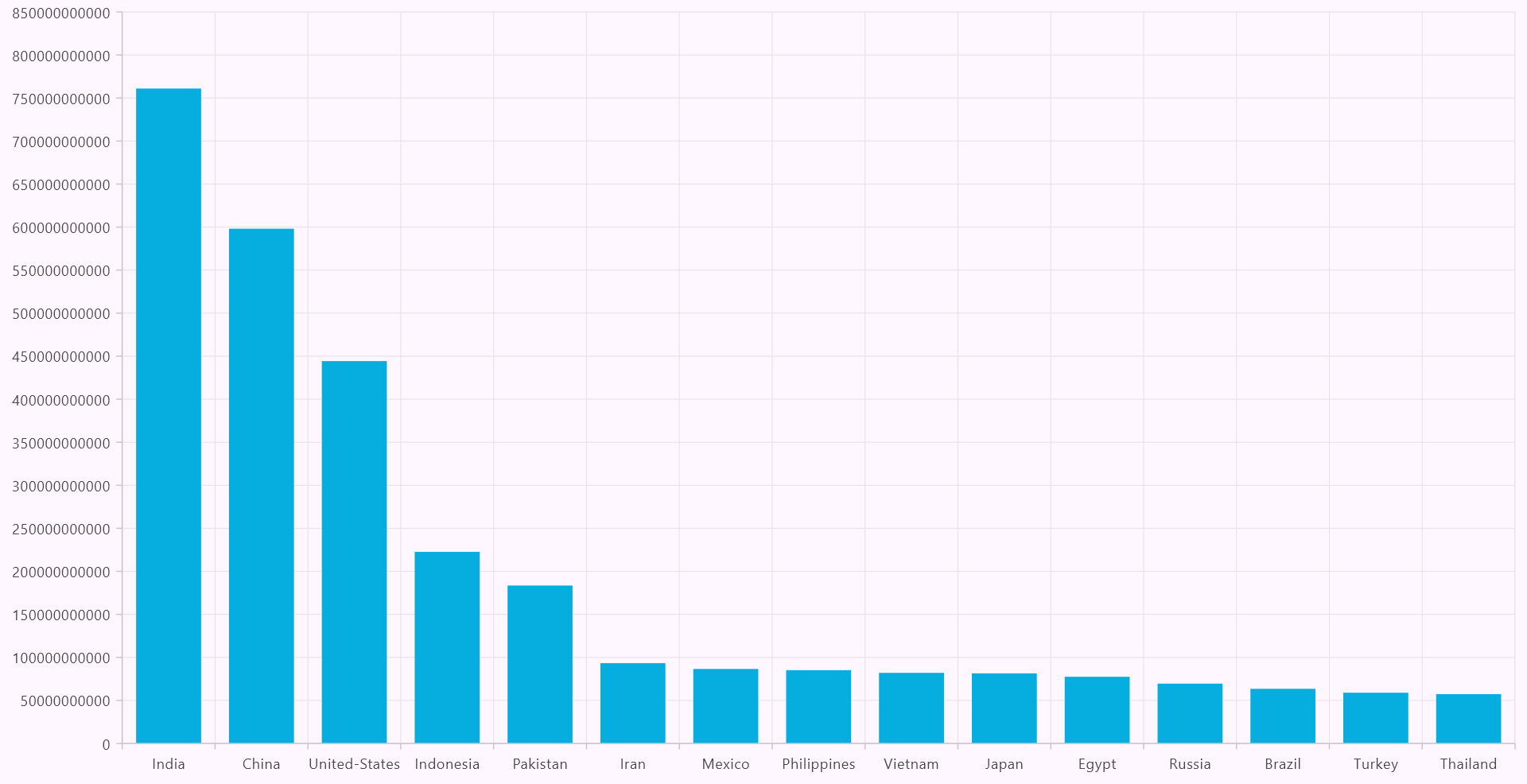
Now, create a Column Chart and bind the data using the ColumnSeries.
Refer to the following code example to map the data source to the Flutter Column Chart.
series: <columnseries<waterconsumptiondata, string="">>[
  ColumnSeries<waterconsumptiondata, string="">(
    dataSource: _yearlyWaterUsageData,
    xValueMapper: (WaterConsumptionData data, int index) => data.country,
    yValueMapper: (WaterConsumptionData data, int index) =>
        data.yearlyWaterUsage,
  ),
],
Refer to the following image.
Step 5: Applying a gradient to the Flutter Column series
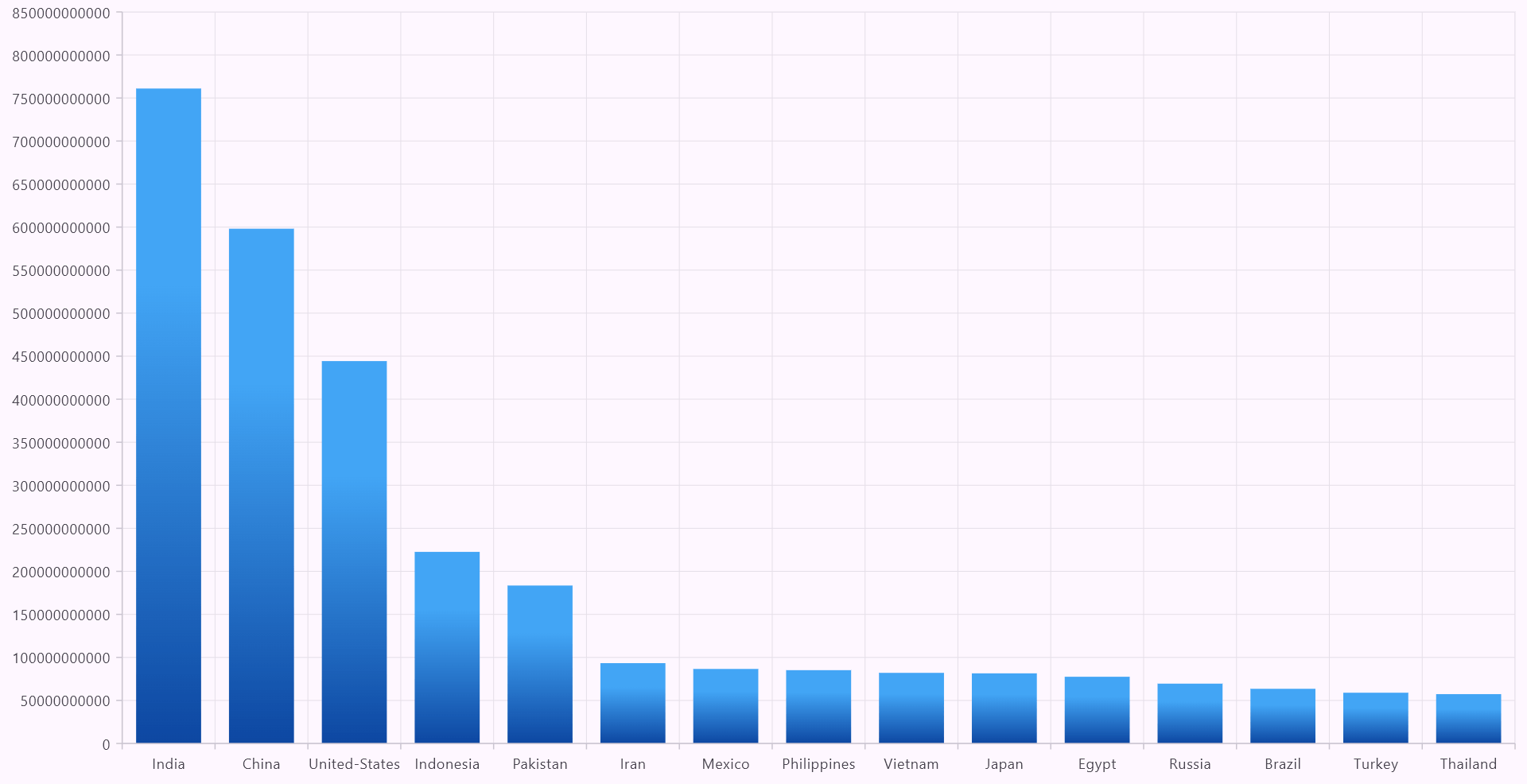
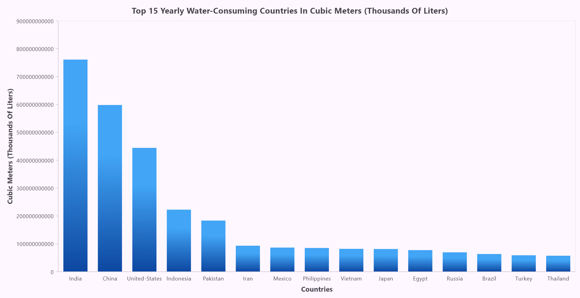
The next step is to apply a color gradient to the columns for a smoother transition between water usage levels. This is done by using the LinearGradient property within the ColumnSeries to transition from a lighter blue at the top of the column to a darker blue at the bottom.
The gradient provides a polished and modern look, enhancing the overall design. The colors property defines the two gradient shades: the top starts with Colors.blue.shade400, and the bottom transitions to Colors.blue.shade900. The stops property indicates where the color transitions occur along the column, while the begin and end properties specify the direction of the gradient, ensuring it moves from the top to the bottom of each column.
Refer to the following code example.
series: <columnseries<waterconsumptiondata, string="">>[
  ColumnSeries<waterconsumptiondata, string="">(
    gradient: LinearGradient(
      colors: [
        Colors.blue.shade400,
        Colors.blue.shade900,
      ],
      stops: const [0.3, 1.0],
      begin: Alignment.topCenter,
      end: Alignment.bottomCenter,
   ),
Refer to the following image.
Step 6: Customizing the chart axes
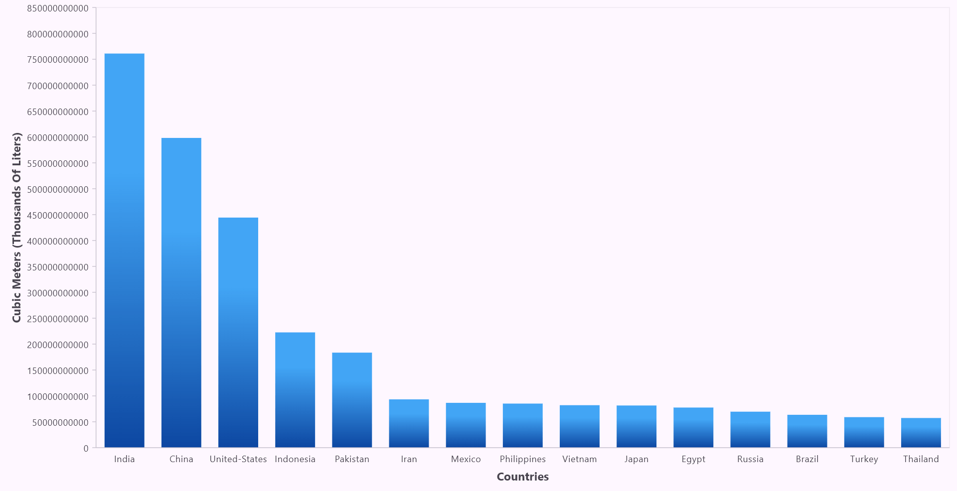
To streamline the chart’s appearance and focus on the data, we set the majorGridLines width to 0, ensuring no grid lines are displayed on the X and Y axes. Similarly, we disable the majorTickLines for the X-axis to create a focused chart layout without any tick marks. This minimalist approach helps us to reduce clutter and emphasizes the water consumption data presented in the columns.
To make the axes more informative, we add titles by setting the text property to “Cubic Meters (Thousands Of Liters)” for the Y-axis and “Countries” for the X-axis.
Refer to the following code example.
SfCartesianChart(
  primaryXAxis: const CategoryAxis(
    title: AxisTitle(
      text: 'Countries',
      textStyle: TextStyle(
        fontWeight: FontWeight.bold,
      ),
    ),
    majorGridLines: MajorGridLines(width: 0),
    majorTickLines: MajorTickLines(width: 0),
  ),
  primaryYAxis: const NumericAxis(
    title: AxisTitle(
      text: 'Cubic Meters (Thousands Of Liters)',
      textStyle: TextStyle(
        fontWeight: FontWeight.bold,
      ),
    ),
    majorGridLines: MajorGridLines(width: 0),
  ),
Refer to the following image.
Step 7: Adding a chart title
The ChartTitle widget allows us to place a title above the chart. By setting the text property, we can specify the title of the chart. Additionally, the textStyle property is used to adjust the font style and size for the title, making it more prominent.
Refer to the following code example.
SfCartesianChart(
  title: const ChartTitle(
    text:
        'Top 15 Yearly Water-Consuming Countries In Cubic Meters (Thousands Of Liters)',
    textStyle: TextStyle(
      fontWeight: FontWeight.bold,
    ),
  ),
Refer to the following image.
Step 8: Adding custom data labels to the chart
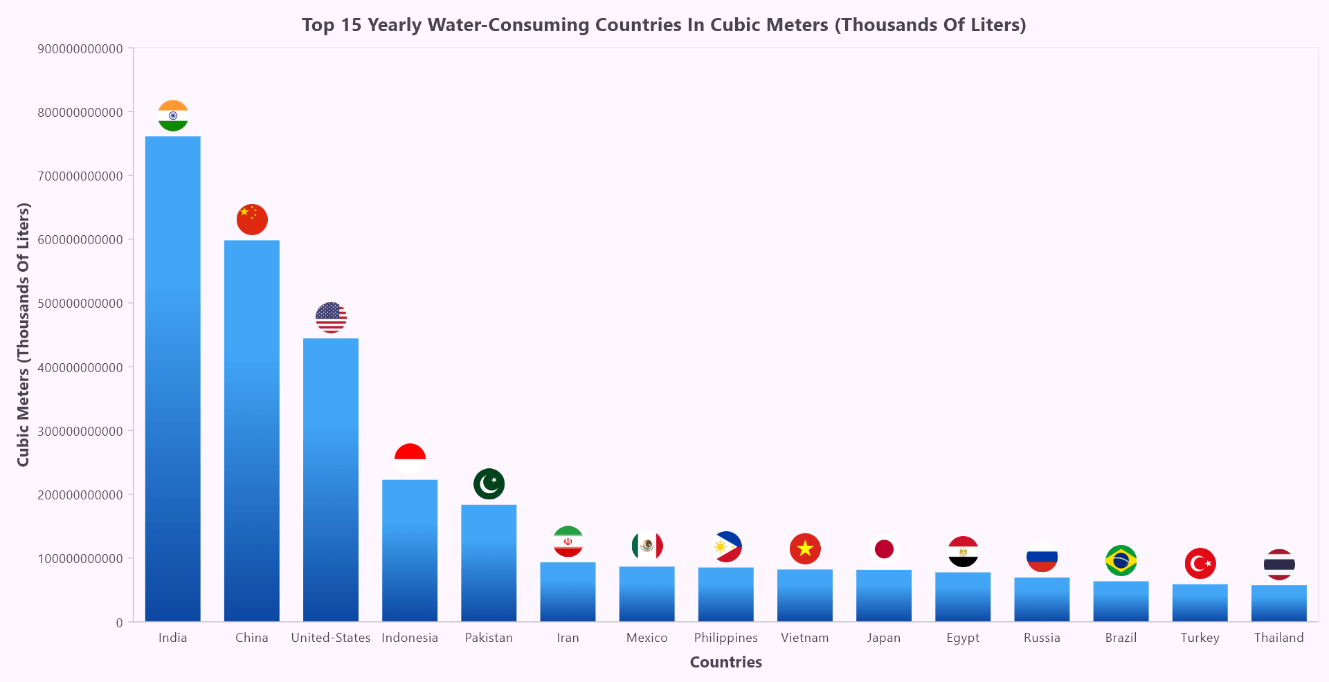
To make our chart more engaging, we can enhance it by adding custom data labels that display the flags of each country at the top of their corresponding columns. This is done by using the builder property of dataLabelSettings.
In this case, we’ll load an image representing the country’s flag from the local directory. Each image file is named according to the country field of the WaterConsumptionData object.
To ensure the flags are displayed properly, add the necessary assets in your pubspec.yaml file, including each country’s flag image, as in the following code.
flutter:
  assets:
    - assets/images/India.png
    - assets/images/China.png
    - assets/images/United-States.png
    - assets/images/Indonesia.png
    - assets/images/Pakistan.png
    - assets/images/Iran.png
    - assets/images/Mexico.png
    - assets/images/Philippines.png
    - assets/images/Vietnam.png
    - assets/images/Japan.png
    - assets/images/Egypt.png
    - assets/images/Russia.png
    - assets/images/Brazil.png
    - assets/images/Turkey.png
    - assets/images/Thailand.png
Here’s the optimized code to implement custom data labels for your chart.
series: <columnseries<waterconsumptiondata, string="">>[
  ColumnSeries<waterconsumptiondata, string="">(
    dataLabelSettings: DataLabelSettings(
      isVisible: true,
      builder: (dynamic data,
          ChartPoint point,
          ChartSeries<dynamic, dynamic=""> series,
          int pointIndex,
          int seriesIndex) {
            return Image(
              image: AssetImage('assets/images/${data.country}.png'),
              width: 30,
              height: 30,
            );
          },
      ),
Refer to the following image.
Step 9: Enabling tooltips
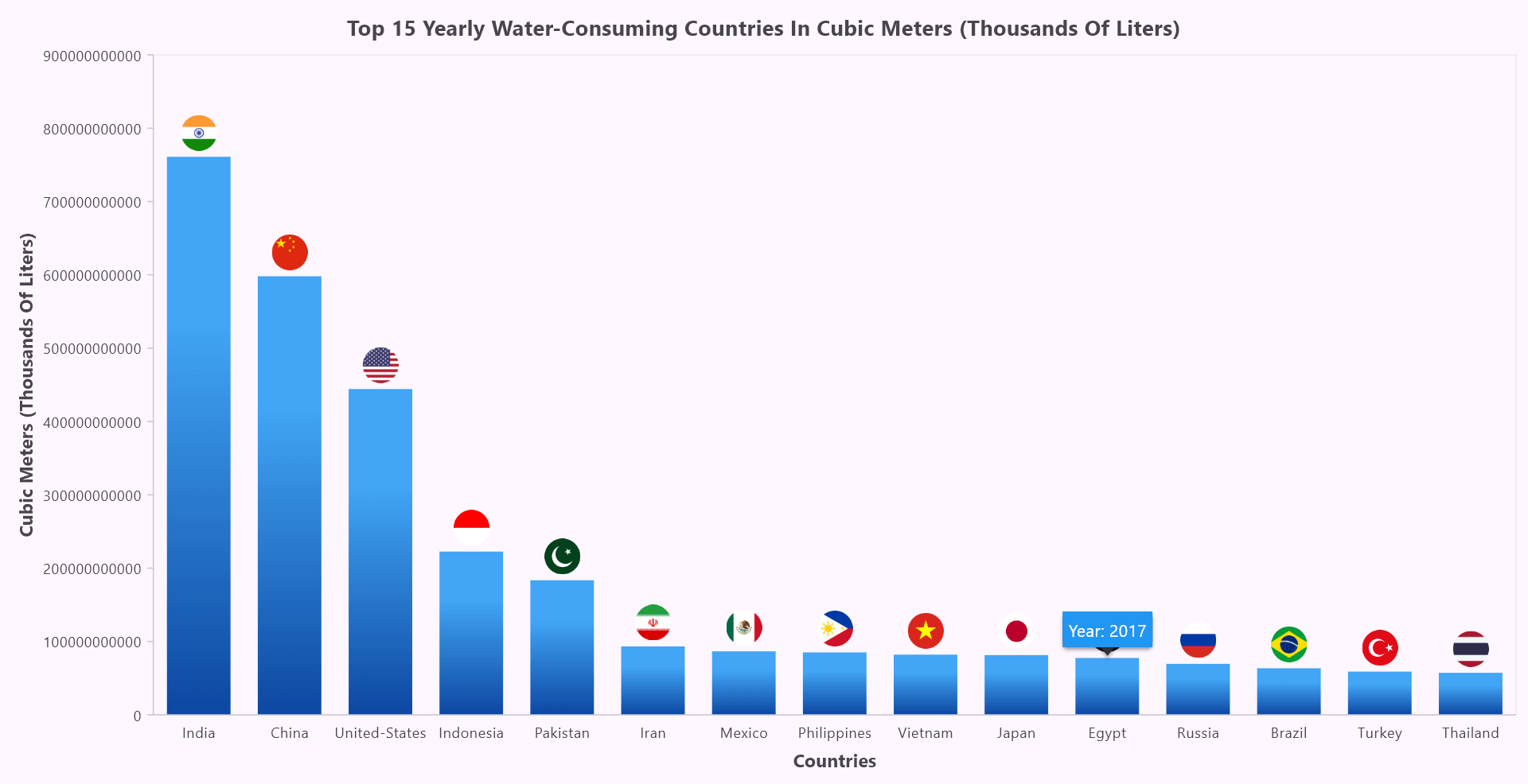
To further enhance the chart’s interactivity, we enable the tooltip and create a custom display using the builder property in TooltipBehavior. The tooltip will show the year of water usage for the selected country, with a customized appearance.
Refer to the following code example to enable and customize the tooltip.
SfCartesianChart(
  tooltipBehavior: TooltipBehavior(
    enable: true,
    builder: (dynamic data, dynamic point, dynamic series, int pointIndex,
      int seriesIndex) {
        return Container(
          padding: const EdgeInsets.all(5),
          color: Colors.blue,
          child: Text(
            'Year: ${data.year.toInt()}',
            style: const TextStyle(color: Colors.white),
          ),
        );
      },
    ),
Refer to the following image.
Step 10: Customizing the chart’s background
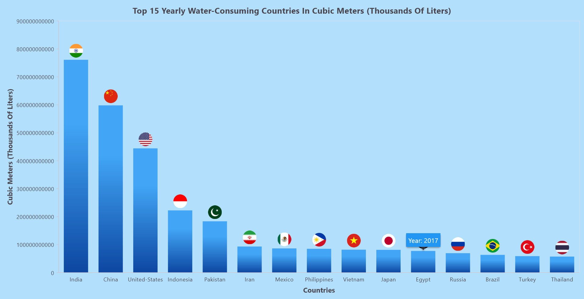
Finally, to enhance the chart’s aesthetics with a modern look, we have added a background color using the backgroundColor property in the SfCartesianChart. This color adds a subtle, visually appealing effect to the overall chart.
Refer to the following code example.
SfCartesianChart(
  backgroundColor: Colors.lightBlue.withOpacity(0.3),
After executing the above code examples, the output will resemble the following image.
GitHub reference
For more details, refer to visualizing the top 15 water-consuming countries in the world using the Flutter Column Chart GitHub demo.

Unlock the power of Syncfusion’s highly customizable Flutter widgets.
Conclusion
Thank you for reading! In this blog, we’ve explored how to visualize the top 15 water-consuming countries in the world using the Syncfusion Flutter Column Chart. We strongly encourage you to follow the steps outlined in this blog and share your feedback in the comments section below.
The existing customers can download the new version of Essential Studio®® on the License and Downloads page. If you are not a Syncfusion customer, try our 30-day free trial to check out our incredible features.
You can also contact us through our support forums, support portal, or feedback portal. We are always happy to assist you!
