Nowadays, e-commerce businesses are making every effort to make the use of their stores as easy as possible for their customers. Part of that is a requirement to maintain multiple carts to check out items at different times. The drag-and-drop functionality of Xamarin.Forms comes in handy here. You can move items to a specific cart and proceed with purchases in batches.
This article shows you how to add drag-and drop-gesture support to your Xamarin.Forms applications to make your app more user-friendly.
Drag and drop
Drag-and-drop support is a pointing device gesture. A user selects a virtual object in one location, then drags it to a different location or drops it onto another virtual object.
The drag-and-drop gestures in Xamarin.Forms enable users to select data, drag it from one onscreen location, and drop it to another onscreen location.
Required packages
Install the following packages to enable the drag-and-drop support in Xamarin.Forms. You can enable this feature only in Xamarin.Forms version 5.0 and above.

Drag source and drop target
The drag source is the element responsible for the initiation of a drag-and-drop operation. It provides the data that we will transfer from one object to another by populating a data package object.
The drop target is the element on which we will drop the drag source’s data.
DragGestureRecognizer and its properties
In Xamarin.Forms, the DragGestureRecognizer class provides recognition for drag gestures.
The DragGestureRecognizer class defines the following properties.
| Properties | Definition |
| CanDrag |
|
| DragStartingCommand |
|
| DragStartingCommandParameter |
|
| DropCompletedCommand |
|
| DropCompletedCommandParameter |
|
Also, the DragGestureRecognizer class defines the DragStarting and DropCompleted events.
DropGestureRecognizer and its properties
In Xamarin.Forms, the DropGestureRecognizer class provides recognition for drop gestures.
The DropGestureRecognizer class defines the following properties.
| Properties | Definition |
| Allow Drop |
|
| DragOverCommand |
|
| DragOverCommandParameter |
|
| DropCommand |
|
| DropCommandParameter |
|
Also, the DropGestureRecognizer class defines the DragOver, DragLeave, and Drop events.
Displaying items using Syncfusion Xamarin.Forms ListView
The Syncfusion Xamarin.Forms ListView control is a list interface. It can render a set of data items vertically or horizontally with a linear or grid structure.
We are going to use the ListView control to display a list of gift items and enable drag-and-drop gestures to move the gift items to the cart.
Refer to the following code example. Here, we will display the items vertically.
<listView:SfListView
   x:Name="ItemsListView"
   Margin="10"
   ItemSpacing="10"
   AutoFitMode="DynamicHeight"
   SelectionBackgroundColor="Transparent"
   ItemsSource="{Binding ItemsCollection}">
   <listView:SfListView.LayoutManager>
        <listView:GridLayout SpanCount="2"/>
   </listView:SfListView.LayoutManager>
   <listView:SfListView.ItemTemplate>
        <DataTemplate>
            <StackLayout>
                <Frame BorderColor="Gray" CornerRadius="6">
                    <StackLayout>
                       <Image
                          Source="{Binding Image}"
                          HeightRequest="100"
                          WidthRequest="100"/>
                       <Label
                          Text="{Binding Name}"
                          FontAttributes="Bold"
                          FontSize="16"
                          TextColor="Black">
                       </Label>
                       <Label
                          Text="{Binding Price}"
                          FontSize="16"
                          TextColor="Black">
                       </Label>
                     </StackLayout>
                 </Frame>
              </StackLayout>
         </DataTemplate>
   </listView:SfListView.ItemTemplate>
</listView:SfListView>

How to enable drag and drop in Xamarin.Forms apps
Enable drag-and-drop support in your Xamarin.Forms application:
Step 1: Enable dragging.
You can enable the drag gesture on an element by adding a DragGestureRecognizer object to its GestureRecognizer collection. Then, set the CanDrag property in the DragGestureRecognizer object to true.
The following XAML code demonstrates how to enable the drag gesture for image controls.
<Image
   Source="user.png"
   HeightRequest="30"
   WidthRequest="30">
   <Image.GestureRecognizers>
       <DragGestureRecognizer CanDrag="True"/>
   </Image.GestureRecognizers>
</Image>
If you want to drag one or more controls inside the layout, then add a DragGestureRecognizer object to that layout’s GestureRecognizer collection.
The following XAML code demonstrates how to enable the drag gesture for the StackLayout, to use it inside the ListView ItemTemplate.
<StackLayout>
  <Frame BorderColor="Gray" CornerRadius="6">
    <StackLayout>
      <Image
        Source="{Binding Image1}"
        HeightRequest="100"
        WidthRequest="100"/>
      <Label
        Text="{Binding Name}"
        FontAttributes="Bold"
        FontSize="16"
        TextColor="Black">
      </Label>
      <Label
        Text="{Binding Price}"
        FontSize="16"
        TextColor="Black">
      </Label>
      <StackLayout.GestureRecognizers>
        <DragGestureRecognizer
          CanDrag="True"/>
      </StackLayout.GestureRecognizers>
    </StackLayout>
  </Frame>
</StackLayout>
Step 2: Building a data package.
Xamarin.Forms automatically builds a data package when we initiate a drag for the text and image controls. For other controls, we have to build our data package for the drag source.
The DataPackage class will represent the data packages with the following properties.
| Properties | Definition |
| Properties |
|
| Image |
|
| Text |
|
| View |
|
In the DataPackagePropertySet class, the properties are stored as Dictionary<string,object>.
Storing drag source data
Store any data (including images and text) associated with a drag source in the DataPackage.Properties collection. We can accomplish this in the handler for the DragStarting event.
The DragStarting event is triggered when a drag gesture is detected on the ListView items.
The following code demonstrates how the StackLayout in the ListView items’ DragGestureRecognizer registers the handler for the DragStarting event and executes the DragStarting handler.
<StackLayout.GestureRecognizers>
  <DragGestureRecognizer
    CanDrag="True"
    DragStarting="OnDragStarting"/>
</StackLayout.GestureRecognizers>
You can modify the Properties collection in the DataPackage to store the StackLayout object.
/// <summary>
/// Invoked when drag is started.
/// </summary>
/// <param name="sender"></param>
/// <param name="e"></param>
private void OnDragStarting(object sender, DragStartingEventArgs e)
{
    var layout = (sender as Element).Parent as StackLayout;
    e.Data.Properties.Add("Layout", layout);
}
Step 3: Enable drop.
You can enable the drop gesture on an element by adding a DropGestureRecognizer object to its GestureRecognizer collection. Then, set the AllowDrop property in the DropGestureRecognizer object to true.
We are going to use another ListView control to enable the drop gesture with a different layout.
The following code demonstrates the user’s collection ListView, where we will enable the drop gesture for the grid layout inside the ListView ItemTemplate.
<listView:SfListView
  x:Name="UsersListView"
  IsVisible="False"
  AutoFitMode="DynamicHeight"
  SelectionBackgroundColor="Transparent"
  Orientation="Horizontal"
  HeightRequest="460"
  ItemSpacing="10"
  ItemsSource="{Binding UsersCollection}">
  <listView:SfListView.ItemTemplate>
    <DataTemplate>
      <Frame CornerRadius="6" BorderColor="Gray" Padding="10">
        <Grid>
          <Grid.RowDefinitions>
            <RowDefinition Height="Auto"/>
            <RowDefinition Height="Auto"/>
            <RowDefinition Height="Auto"/>
          </Grid.RowDefinitions>
          <Grid.ColumnDefinitions>
            <ColumnDefinition Width="Auto"/>
            <ColumnDefinition Width="Auto"/>
          </Grid.ColumnDefinitions>
          <StackLayout
            HorizontalOptions="CenterAndExpand"
            Grid.Row="0"
            Grid.ColumnSpan="2"
            Margin="10,0,10,0">
            <Image
              Source="users1.jpg"
              HeightRequest="70"
              WidthRequest="70"/>
            <Label
              HorizontalOptions="CenterAndExpand"
              Text="{Binding Name}"
              FontSize="20"
              FontAttributes="Bold"
              TextColor="Black"/>
          </StackLayout>
          <Label
            Grid.Row="1"
            Grid.Column="0"
            FontAttributes="Bold"
            IsVisible="False"
            FontSize="16"
            TextColor="Black"/>
          <Label
            Grid.Row="2"
            IsVisible="False"
            FontSize="16"
            Grid.Column="0"
            TextColor="Black"/>
          <Image
            Grid.Column="1"
            Grid.Row="1"
            Grid.RowSpan="2"
            HeightRequest="60"
            WidthRequest="60"/>
        </Grid>
      </Frame>
    </DataTemplate>
  </listView:SfListView.ItemTemplate>
</listView:SfListView>
The following screenshot shows the user’s collection using the ListView horizontally.

Now, enable the drop gesture in the grid layout. Refer to the following code example.
<Grid.GestureRecognizers>
    <DropGestureRecognizer
        AllowDrop="True"/>
</Grid.GestureRecognizers>
Step 4: Processing a data package.
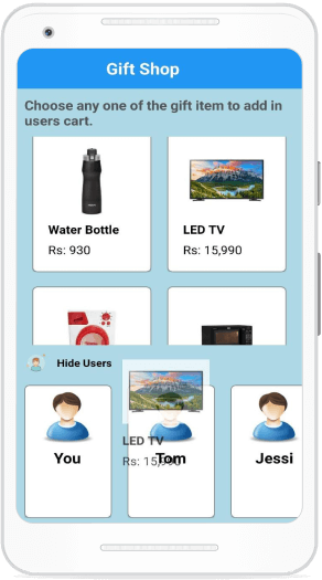
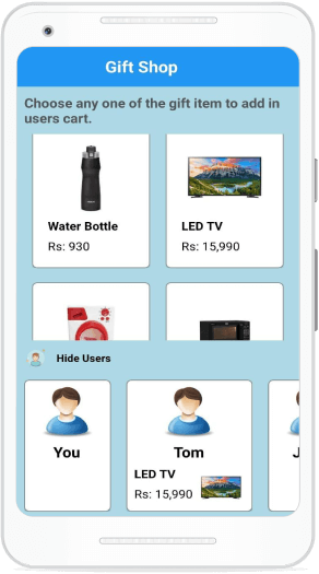
In Xamarin.Forms, a data package is processed when the drop event is triggered. The drop event is triggered when the drag source is dropped on the drop target.
Xamarin.Forms will automatically retrieve the data for text and image controls. For other controls, we have to retrieve the data from the data package in the handler of the Drop event, using the Properties collection of the DataPackage.
The following code demonstrates how to retrieve data from the data package for a StackLayout and use those values to show the dragged items in a user collection ListView.
/// <summary>
/// Invoked when drag source is dropped over the drop target.
/// </summary>
/// <param name="sender"></param>
/// <param name="e"></param>
private void OnDrop(object sender, DropEventArgs e)
{
   var itemsLayout = (StackLayout)e.Data.Properties["Layout"];
   //code to show the items in user collection.
}
GitHub reference
For more details, refer to the complete example for drag-and-drop support in Xamarin.Forms.
Conclusion
Thanks for reading! In this blog, we have learned how to use drag-and-drop gestures in Xamarin.Forms applications. With this, users can easily select items by just dragging and dropping them into the specific cart and proceed with purchases in batches.
Syncfusion’s Xamarin suite offers over 150 UI controls, from basic editors to powerful, advanced controls like DataGrid, Charts, ListView, and Rich Text Editor. Try them out and leave your feedback in the comments section below!
You can also contact us through our support forums, Direct-Trac, or feedback portal. We are always happy to assist you!
