Overview
In this blog post, we will look at the React DateTime Picker component in Essential JS 2. You will learn how easy it is to select a date and time with this simple DateTime Picker component and how to enable several of its notable features by extending a sample with brief code snippets. This component is typically used in an application where you need to handle operations related to dates and times, such as appointment scheduling.
This blog provides a walk-through of the React DateTime Picker component and its available features.
Select date and time
The React DateTime Picker is a form component that allows users to enter or select date and time values from a pop-up calendar or drop-down list. The DateTime Picker presents two different icons for choosing date and time. Clicking the date icon will display the calendar pop-up, which has an option to move between year and decade views for quickly navigating to the desired date. Clicking the time icon displays the time drop-down list for selecting a time.
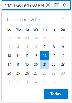
Select date and time within a range
The DateTime Picker component can restrict the date and time values to a specific range, so the values outside the range cannot be selected. The date and time values can be restricted by entering or selecting the min and max date-time options in the React DateTime Picker. When the min and max properties are configured and the selected date-time value is out of range or invalid, the model value will be set to the out-of-range date-time value or null, respectively, with a highlighted error class indicating the date-time value is out of range or invalid.
For an example, refer to this date and time range demo.
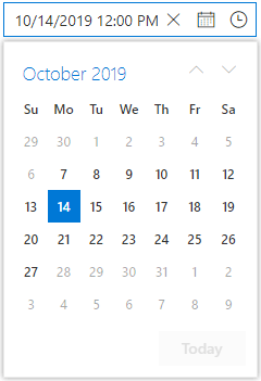
Set the date and time in a specific format
The React DateTime Picker component allows changing the default culture’s date and time formats in the component’s text box to improve its readability. The component supports custom format strings with any combination of characters.
For an example, refer to this date-and-time format demo.
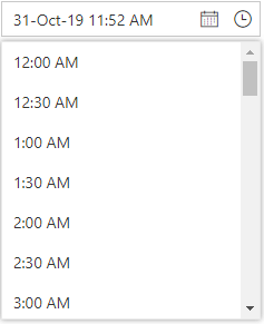
Special date and time indication
The React DateTime Picker supports UI customization based on your application requirements. It can be customized using the renderDayCell event, which provides an option to customize each day cell to indicate a special date (like events occurring on that day).
For an example, refer to this special date demo.
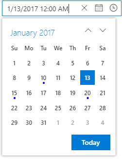
Globalization support
You can update the culture-specific date-time format, customize the first day of the week, and translate the text of the month, day, and today buttons to any supported language with the globalization features of the React DateTime Picker component.
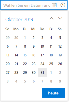
Change first day of week
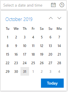
The DateTime Picker component automatically updates the first day of the week based on the specified culture. It can also be changed based on your application requirements.
Change the first day of the week using the firstDayOfWeek property. The day of the week ranges from 0 (Sunday) to 6 (Saturday). In the following code, we will set Tuesday as the first day of the week.
<DateTimePickerComponent firstDayOfWeek= {2} />
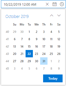
Display week number
The React DateTime Picker component allows showing the week number of the selected day in the pop-up calendar by enabling the week number option.
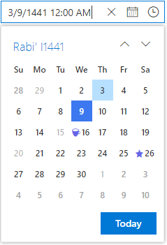
Islamic DateTime Picker (Hijri DateTime Picker)
The Islamic DateTime Picker, or Hijri DateTime Picker, is a lunar calendar consisting of 12 months in a year of 354 or 355 days. To learn more about the Islamic calendar, refer to this Wikipedia article.
By default, the component’s calendar is Gregorian. You can enable the Islamic mode by setting the calendarMode to Islamic. You can also import and inject the IslamicService module into the providers.

Explore the endless possibilities with Syncfusion’s outstanding React UI components.
Conclusion
We hope you find this blog as a useful overview of the React DateTime Picker component and its important features. Check out the other features of the calendar by downloading the free 30-day trial or cloning it from GitHub. Also, feel free to have a look at our online samples and documentation to explore other available options. If you wish to send us feedback or would like to ask any questions, please feel free to post in the comments section below or contact us through our support forum, support portal, or feedback portal.
Related blogs
- Designing a React E-Commerce App for Digital Products—Part 2 (Handling Authentication and Authorization)
- How to Build Synchronized Charts in React for Trade Analysis [Webinar Show Notes]
- Designing a React E-Commerce App for Digital Products—Part 1
- Level Up Your React Charts: Mastering Scrollbar Customization
