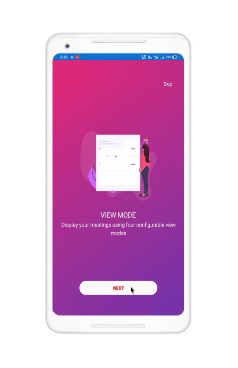
A wizard control is an interactive, customizable user interface that can hold more than one page. It is useful in showcasing step-by-step processes, and also helps break a complex task into simple steps. Using a wizard interface in a project simplifies the design and code work of developers. In this blog, we are going to create a simple walk-through page (wizard view) for a scheduler component using the Syncfusion Xamarin Rotator control.
Our Xamarin Rotator control is a UI that provides an interactive way to move from one image to another and navigate through a collection of views. It supports various navigation options like swiping, autoplay, and tapping. It has all the necessary features that a wizard control possesses. So, let’s design a beautiful wizard view with it!

Creating a wizard view
Follow these steps to create a wizard view using the Xamarin Rotator control:
- Follow the Getting Started with Xamarin Rotator Control documentation to add a Xamarin.Forms SfRotator control to your application.
- Let’s initialize the Rotator control and set the following necessary properties based on the UI requirements:
- Set the DotPlacement property as none and the NavigationDirection property as horizontal.
- Then, enable the swiping gesture in the Rotator control by setting the EnableSwiping property as True and disable looping by setting the EnableLooping property as False.
Refer to the following code example.
<sfRotator:SfRotator x:Name="Rotator" BackgroundColor="Transparent" DotPlacement="None" EnableLooping="False" EnableSwiping="True" NavigationDirection="Horizontal" > - In this walk-through, I’m going to load a Scalable Vector Graphics (SVG) image. Create a DataTemplate with an SVG image and two labels for the header and content of the page. Then, assign the DataTemplate to the ItemTemplate property of the Xamarin Rotator control.Refer to the following code example.
<sfRotator:SfRotator.ItemTemplate> <DataTemplate> <StackLayout BackgroundColor="Transparent" Spacing="0" VerticalOptions="Center"> <!-- Image for display svg image --> <svg:SVGImage BackgroundColor="Transparent" Source ="{Binding ImagePath}" VerticalOptions="Center" /> <!-- Label to display header --> <Label FontFamily="{StaticResource Montserrat-SemiBold}" FontSize="20" HorizontalTextAlignment="Center" Text="{Binding Header}" VerticalTextAlignment="Center" /> <!-- Label to display content --> <Label FontFamily="{StaticResource Montserrat-Medium}" FontSize="16" Text="{Binding Content}" VerticalTextAlignment="Center" /> </StackLayout> </DataTemplate> </sfRotator:SfRotator.ItemTemplate> - Then, create a model class with the required properties for the page.
public class PageModel { #region Properties /// <summary> /// Gets or sets the image. /// </summary> public string ImagePath { get; set; } /// <summary> /// Gets or sets the header. /// </summary> public string Header { get; set; } /// <summary> /// Gets or sets the content. /// </summary> public string Content { get; set; } /// <summary> /// Gets or sets the view. /// </summary> public View RotatorItem { get; set; } #endregion } - Now, create a ViewModel class containing the business logic for the wizard control.
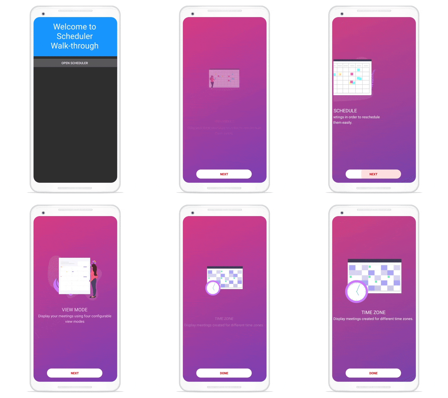
public class PageViewModel { #region Fields private ObservableCollection<PageModel> pages; #endregion #region Constructor /// <summary> /// Initializes a new instance for the <see cref=" PageViewModel " /> class. /// </summary> public PageViewModel () { this.Pages= new ObservableCollection<PageModel> { new PageModel() { ImagePath = "ReSchedule.png", Header = "RESCHEDULE", Content = "Drag and drop meetings in order to reschedule them easily.", RotatorItem = new WalkthroughItemPage() }, new Boarding() { ImagePath = "ViewMode.png", Header = "VIEW MODE", Content = "Display your meetings using four configurable view modes", RotatorItem = new WalkthroughItemPage() }, new Boarding() { ImagePath = "TimeZone.png", Header = "TIME ZONE", Content = "Display meetings created for different time zones.", RotatorItem = new WalkthroughItemPage() } }; } #endregion #region Properties public ObservableCollection<PageModel> Pages { get { return this.pages; } set { if (this.pages== value) { return; } this.pages= value; this.NotifyPropertyChanged(); } } #endregion - Finally, assign the Pages property of the ViewModel to the ItemsSource property of the Rotator control.
<sfRotator:SfRotator
         x:Name="Rotator"
           DotPlacement="None"
           EnableLooping="False"
           EnableSwiping="True"
           ItemsSource="{Binding Boardings}"
           NavigationDirection="Horizontal"
           SelectedIndex="{Binding SelectedIndex, Mode=TwoWay}">

    <sfRotator:SfRotator.ItemTemplate>
       <DataTemplate>
          <StackLayout>

            <!--  Image for display svg image  -->
            <svg:SVGImage BackgroundColor="Transparent"
                  Source ="{Binding ImagePath}" />

             <!--  Label to display header  -->
             <Label Text="{Binding Header}" />

             <!--  Label to display content  -->
             <Label Text="{Binding Content}" />
         </StackLayout>
      </DataTemplate>
   </sfRotator:SfRotator.ItemTemplate>
 </sfRotator:SfRotator>
Output
After executing the above code examples, we will get the wizard view pages shown in the .gif image.

Resource
For more information refer to the Creating Wizard View using Xamarin Rotator sample.
Conclusion
Thanks for reading! I hope you now have a clear idea of how to create a wizard view using our Xamarin Rotator control. With a wizard view, you can easily add a sequence for your users by splitting it into stages. This will reduce your workload and save coding time, and also help you create a highly customizable component.
Our Rotator control is available in our ASP.NET Web Forms, UWP, and Xamarin platform suites. Try them out and leave your feedback in the comments section below!
If you are an existing Syncfusion user, you can download the latest version from the License and Downloads page and try the new features for yourself. Also, our NuGet packages are available on NuGet.org.
If you aren’t a customer yet, you can try our 30-day free trial to check out these features. Also, try our other samples from this GitHub location.
You can also contact us through our support forums, Direct-Trac, or feedback portal. We are always happy to assist you!
Related blogs
- Easily Create a Meeting Room Calendar using Xamarin.Forms Scheduler
- Replicating a Facebook Like UI in Xamarin
- Create Custom Renderers for a Control in Xamarin.Forms
- Connect Azure Bot Service to Xamarin.Forms Chat Control
- 5 Simple Steps to Create a Marquee Control in Your Xamarin.Forms Apps

Comments (2)
Hi! thanks for the tutorial. Could you clarify how did you include the Next & Done buttons? Is that part of the SfRotator options?
Hi Javier,
Greetings from Syncfusion. We don’t have built-in Next and Done buttons in Rotator control. In the above blog, we had a grid control where the Rotator and the done and next buttons are placed as an overlay. Please have a look at the below sample codes.
sample: https://github.com/SyncfusionExamples/xamarin-sfrotator-samples/tree/main/WizardControlXamarin
Please contact our support if you have any queries or any requirements. We will guide you.
Regards,
Paul Anderson