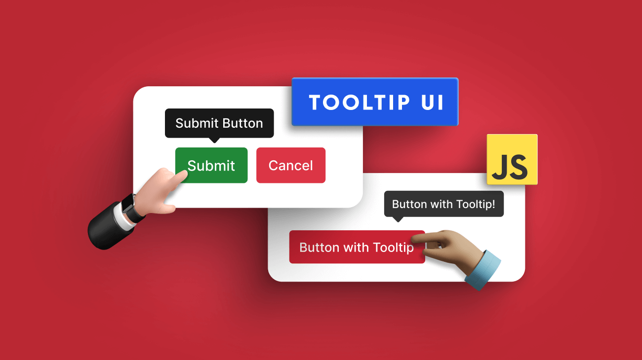
A tooltip is a little pop-up text window that appears when a user moves the pointer over a UI element. Tooltips allow users to view more information about an element without clicking it.
With the growing complexities of modern UIs, tooltips help developers in many scenarios, like displaying product or image information, call-to-action buttons, and image descriptions. As a result, various third-party libraries are available to implement tooltips. But it is not easy to choose one since they all have unique features.
So, in this article, I will discuss six different JavaScript-based tooltip libraries to help you select the best one for your project.
1. Tippy.js
Tippy.js is a powerful library that makes it simple to implement tooltips. It provides tooltip functionality for HTML objects that can be extended and used in various ways, including setting tooltip themes, nesting tooltips, and changing tooltip display locations.
The setup process is also quite simple, and you can install Tippy through NPM, Yarn, or a CDN to use it directly on HTML pages. The Tippy website also includes examples for each loading situation and provides detailed instructions on adding or removing features.
Tippy.js has more than 10,700 GitHub stars.
Features
- Lightweight, user-friendly library.
- Supports all positions (top, bottom, left, right).
- Helpful callback solutions.
- Supports any HTML markup in the tooltip.
- Multiple tooltips are allowed on the same element.
Installation
You can easily install Tippy.js using NPM or Yarn as follows:
// Using NPM
npm i tippy.js
// Using Yarn
yarn add tippy.js
Otherwise you can install it through the CDN:
<!-- Development -->
<script src="https://unpkg.com/tippy.js@6/dist/tippy-bundle.umd.js"></script>
<!-- Production -->
<script src="https://unpkg.com/tippy.js@6"></script>
You can find a working demo of Tippy.js on StackBlitz.
Output

Explore the best and most comprehensive JavaScript UI controls library in the market.
2. Hint CSS
Hint.css is a very simple pure-CSS library for your JavaScript projects. Compared to others, this library is pretty lightweight and specialized for tooltips. It allows you to customize your tooltips’ color, size, style (with arrows, rounded corners, etc.), and animation effects. Hint.css has more than 8,300 GitHub stars.
Features
- 1.5 KB in size after minified and gzipped.
- No additional configurations are required.
- Supports accessibility with aria-label attributes.
- Only CSS. No JavaScript.
- Works with all modern browsers.
Installation
You can easily install CSS.hint using NPM or CDN as follows:
// Using NPM
npm install --save hint.css
// Using CDN
<link rel="stylesheet" href="hint.min.css" />
You can find a working demo of Hint.css on JSFiddle.
Output
3. Popper
Popper is another lightweight JavaScript library that allows you to create tooltips and popovers easily. It solves all the major issues in using pure CSS for tooltips and preserves application performance. It is widely used in libraries like Bootstrap, Foundation, and Material UI. Popper has more than 12,000 weekly NPM downloads.
Features
- Allows placing tooltips relative to the reference.
- Prevents tooltips from being clipped or cut off when screen size changes.
- Only 2 KB when minzipped.
- Position updates happen in less than a millisecond.
- Suitable for any UI element, including mobile views, scroll bars, and more.
- Supports multiple configurations.
Installation
You can easily install Popper using NPM or Yarn as follows:
// Using NPM
npm i @popperjs/core
// Using Yarn
yarn add @popperjs/core
Or you can install it through the CDN:
<!-- Development -->
<script src="https://unpkg.com/@popperjs/core@2/dist/umd/popper.js"></script>
<!-- Production -->
<script src="https://unpkg.com/@popperjs/core@2"></script>
You can find a working demo of Popper on StackBlitz.
Output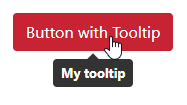

Every property of the Syncfusion JavaScript controls is completely documented to make it easy to get started.
4. Bootstrap Tooltip
Bootstrap tooltip is a part of the Bootstrap framework. It allows you to add custom tooltips when users hover, focus, or tap an element using CSS, JavaScript, and CSS3. It uses Popper for positioning and requires util.js if you build Bootstrap JavaScript from the source.
Bootstrap, in general, has more than 4.5 million weekly NPM downloads and 162,000 GitHub stars.
Features
- Tooltips with titles of zero length are automatically hidden.
- Tooltips won’t activate on hidden elements.
- Tooltips will be centered when activated by hyperlinks that cross multiple lines.
- An element inside a shadow DOM can cause tooltips to appear.
Installation
You can easily install Bootstrap Tooltip using NPM as follows:
npm i bootstrap-tooltip
You can find a working demo of Bootstrap Tooltip on StackBlitz.
Output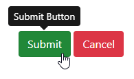
5. Floating UI

Floating UI is a widely used library for anchor positioning. It allows you to create floating elements like tooltips and popovers while ensuring the main element view is not obstructed. Floating UI is only 0.6 KB in size after being minified and Brotli-compressed. However, it provides amazing features like multiple placement options, flipping, arrows, and more.
Floating UI has 2.5 million weekly NPM downloads and more than 24,700 GitHub stars.
Features
- Allow placing tooltips relative to any coordinate.
- Supports interactions for React with hooks for events like click, focus, hover, typeahead, and more.
- Dynamically position the arrow of the tooltip at the center of the element.
- Automatically change the tooltip size to keep it in the display.
- Automatically flips the tooltip position to keep it in the display.
Installation
You can easily install Floating UI using NPM as follows:
# Vanilla JavaScript
npm install @floating-ui/dom
# React DOM — positioning + interactions
npm install @floating-ui/react
# React DOM — positioning only
npm install @floating-ui/react-dom
# React Native — positioning only
npm install @floating-ui/react-native
# Vue
npm install @floating-ui/vue
You can find a working demo of Floating UI on StackBlitz.
Output

To make it easy for developers to include Syncfusion JavaScript controls in their projects, we have shared some working ones.
6. Syncfusion
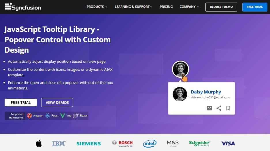
Syncfusion Tooltip is a widely used JavaScript-based pop-up control for displaying context-sensitive help, tips, or additional information as tooltips in web applications. The tooltips are highly customizable and offer a wide range of features and options for adjusting their size, position, and appearance. Syncfusion Tooltip has nearly 100,000 weekly NPM downloads.
Features
- Supports 12 different positions to display tooltips.
- Supports various triggers, such as hover, click, focus, and touch.
- Allows creating tooltips with images, links, or custom HTML content.
- Supports a range of animations and effects to enhance the user experience.
- Built with performance and accessibility in mind.
- Supports smart positioning based on the viewport.
Installation
You can easily install Syncfusion Tooltip using NPM as follows:
npm i @syncfusion/ej2-popups
You can find a working demo of the Syncfusion Tooltip on StackBlitz.
Note: Syncfusion offers a free Community License that allows you to access this control for free.
Output
 Conclusion
A tooltip can help you display extra details when a user hovers over an object on your website. It has become a powerful UI element in modern web applications.
This article discussed six different libraries to create tooltips in JavaScript with unique features. I hope my suggestions help you choose the best library for your project. Thank you for reading.
The Syncfusion JavaScript suite is the only toolkit you will ever need to build an application. It contains over 80 high-performance, lightweight, modular, and responsive UI components in a single package. Download the free trial and evaluate the controls today.
If you have any questions or comments, you can contact us through our support forums, support portal, or feedback portal. We are always happy to assist you!
Related blogs
- Top 8 JavaScript Notification Libraries
- 10 Tips and Tricks to Handle JavaScript Objects
- JavaScript SOLID Principles: How to Write Maintainable Code
- Integrating JavaScript Scheduler with PHP and MySQL for Dynamic CRUD Operations
