Our Syncfusion WPF AutoComplete text box control is a complete MVVM-structured (model-view-viewmodel) control. It provides autocomplete functionality with features like data binding, different search modes, drop-down customization, and themes. This control is the best choice if you need autocomplete functionality in the WPF ComboBox. It can also be used as a multiselect combo box by enabling the multiselect mode in it.
In this blog post, I will give you a quick walk-through of our Syncfusion WPF AutoComplete text box control and its top six features:
- Different filtering modes
- Multiple-selection support
- Text highlighting support
- Custom search
- Diacritic sense
- Customizing AutoComplete control as a ComboBox
Different filtering modes
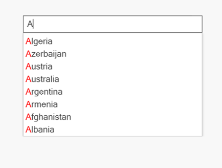
The WPF AutoComplete control comes with a predefined set of filtering modes that filter suggestions based on the characters typed in the text box. The preferred mode is StartsWith, which filters the suggestions when the beginning of the string has matches in the list.
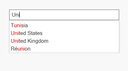
The Contains mode lists all the suggestion words that contain the character typed in the text box, similar to the Google search engine.
Refer to the following code example.
<syncfusion:SfTextBoxExt AutoCompleteSource="{Binding Countries}"
                         AutoCompleteMode="Suggest"
                         SuggestionMode="Contains"/>
Refer to the following screenshot.
Multiple selection
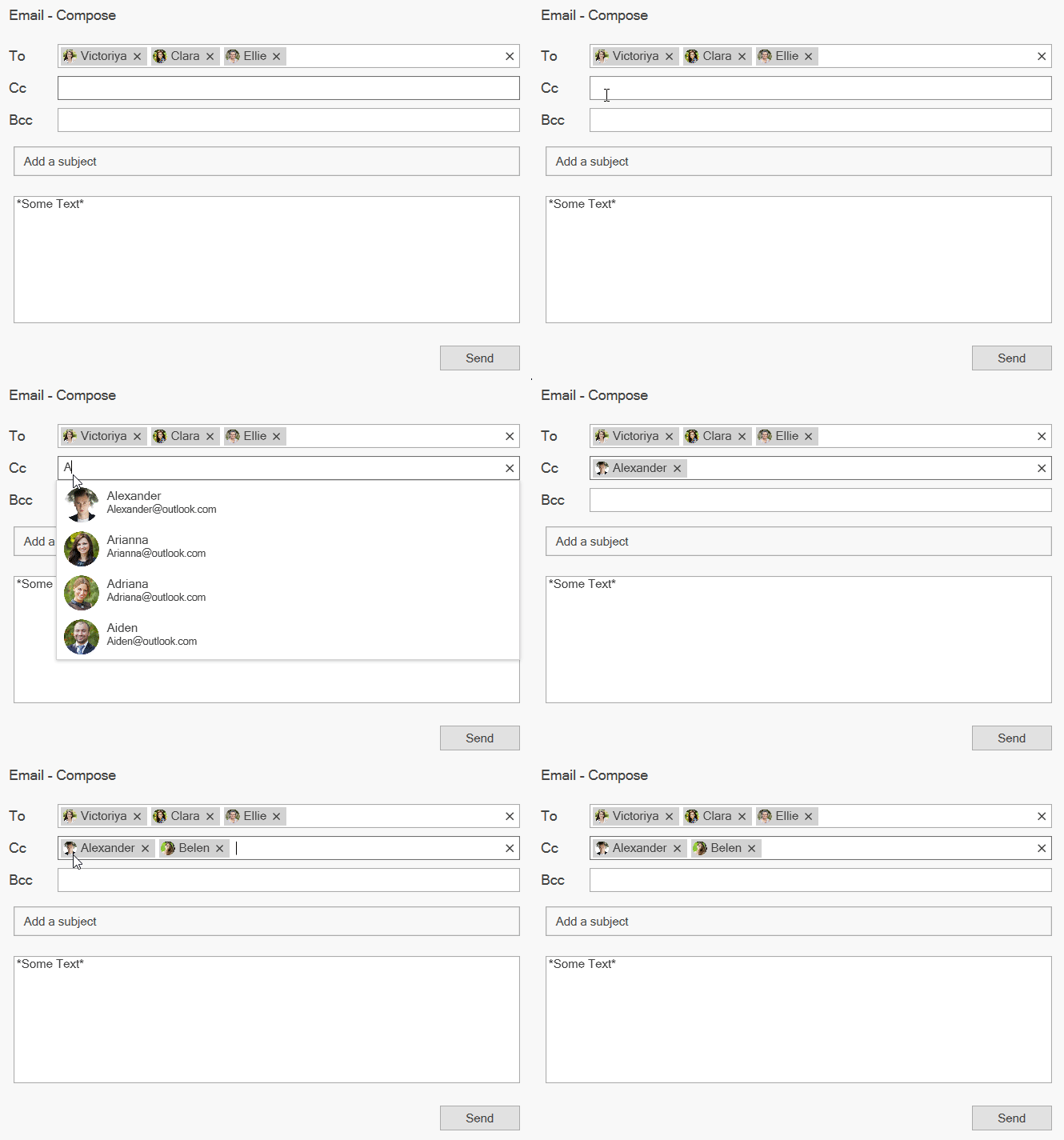
This feature allows you to select multiple items, similar to the email search bar available in the Outlook application. Users can select multiple items either by token representation or by simply dividing them with a delimiter. To do so, we have to set the MultiSelectMode property to Token or Delimiter.
Customizable token representation allows users to remove an item with a close button. With this, users can divide the selected items with characters they choose, such as dollar representation ($), or by using the traditional comma.
Refer to the following code example.
<Syncfusion:SfTextBoxExt AutoCompleteSource="{Binding Countries}"
                         AutoCompleteMode="Suggest"
                         MultiSelectMode="Token"/>
Refer to the following GIF image.
Text highlighting
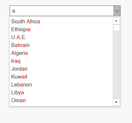
This feature highlights the matching text in each suggested item. This helps users detect how the items are filtered (in which filtering mode) and pick items with more clarity. It also makes the search easy with this UI.
Using TextHighlightMode, users can choose whether to highlight a single instance or multiple occurrences of the character typed.
Refer to the following code example.
<Syncfusion:SfTextBoxExt AutoCompleteSource="{Binding Countries}"
                         AutoCompleteMode="Suggest"
                         SuggestionMode="Contains"
                         TextHighlightMode="MultipleOccurrence"
                         HighlightedTextColor="Red"/>
Refer to the following screenshot.
Custom search
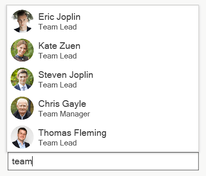
This feature allows users to perform a multipath search, or a custom search based on search criteria other than the predefined filtering modes. This can be done by setting the SuggetionMode property to Custom. Users can also define a custom filter and assign it to the Filter property.
Refer to the following code example.
{
     this.textboxext.SuggestionMode = SuggestionMode.Custom;
     this.textboxext.Filter = Filtering;
}

public bool Filtering(string search, object item)
    {
        var model = item as Model;
        if (model != null)
        {
            if ((model.Name.ToLower().Contains(search.ToLower())) || ((model.ID).ToString().ToLower().Contains(search.ToLower())))
            {
                return true;
            }
        }
        return false;
    }
Refer to the following screenshot.
Diacritic sense
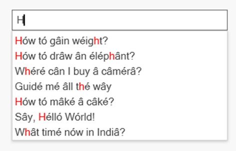
The AutoComplete control comes with a special feature for supporting languages with letters containing diacritic marks and searching for them with English characters from the keyboard. This feature helps populate items for your search by either considering or ignoring the diacritic.
Refer to the following code example.
<Syncfusion:SfTextBoxExt AutoCompleteSource="{Binding DiacriticCollection}"
                         AutoCompleteMode="Suggest"
                         IgnoreDiacritic="False"
                         SuggestionMode="Contains"/>
Refer to the following screenshot.
Customizing WPF AutoComplete control as a ComboBox
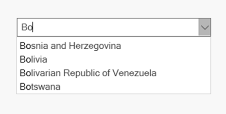
The WPF AutoComplete control can also be used as a ComboBox with autocomplete functionality by enabling the drop-down button. This can be done by setting the ShowDropDown property to true.
Refer to the following code example.
<Syncfusion:SfTextBoxExt AutoCompleteSource="{Binding Countries}"
                         AutoCompleteMode="Suggest"
                         ShowDropDown="True"/>
Refer to the following screenshot.
Conclusion
Thanks for reading! In this blog, we have covered the top six features of our Syncfusion WPF Autocomplete control to improve your application. Refer to our UG documentation to learn about all the available features. You can also try our WPF AutoComplete demos.
If you aren’t a customer yet, you can try our 30-day free trial to check out these features.
If you wish to send us feedback or would like to submit any questions, please feel free to post them in the comments section of this blog post. You can also contact us through our support forum, feedback portal, or Direct-Trac support system. We are always happy to assist you!
If you liked this blog post, we think you’ll also like the following articles:
