When it comes to technology’s latest and greatest, major developers and freelancers alike are striving to give access to as many people as possible. In cool news this summer, developer Abhishek Singh has created a prototype mod for Amazon’s Alexa that allows it to understand sign language.
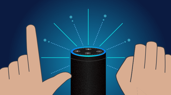
In an interview with The Verge, Singh pointed out that voice-based devices like Alexa are prevalent and growing in importance. But while this is great for visually impaired people, it doesn’t help the auditorily impaired access such personal assistants. “Seamless design needs to be inclusive in nature,” he said to his interviewer. So he designed a system that deciphers sign language by hooking an Amazon Echo up to a laptop with a webcam and using back-end machine learning software. The program was able to decipher the gestures it was taught, meaning it could learn full sign languages.
Amazon is already dipping into making Alexa more accessible, though it hasn’t gotten to the auditorily impaired community. The Echo Show now allows you to activate Alexa using the touchscreen instead of your voice. It’s also expanding captioning options to several more countries.
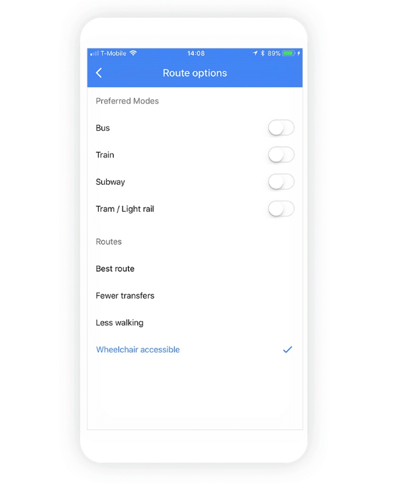
Google, too, is working hard on improving accessibility to people with impairments. It has a team entirely dedicated to testing new products and UIs for accessibility, and lately that team has been expanding its reach to improve the lives of impaired people. This year, Google Maps released a new route type, wheelchair accessible, for public transportation directions. People with mobility issues can now easily figure out which stations and routes are viable for wheelchairs, walkers, crutches, and strollers in cities.
 Wheelchair accessibility option in Google Maps (image: The Android Soul)
Google has also produced the Lookout app for smartphones that audibly describes what is visible in its camera range to give visually impaired users a better idea of what’s around them. It also offers a free, online course on developing apps with accessibility in mind.
Syncfusion is also careful to build accessibility options into our products. Many of our controls work with on-screen readers and assistive technology, providing text that can replace images and animations, for example. UI element visuals are based on WCAG 2.0 standards, and many controls conform to W3C’s WAI-ARIA (Web Accessiility Initiative–Accessible Rich Internet Applications) standards and recommendations for best practices. Most controls are also Section 508 compliant, fully supporting accessibility features like clearly indicating where the focus is in interactive interface elements.

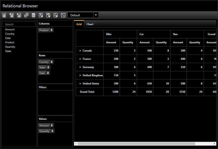
A dark theme in Syncfusion’s pivot client control for ASP.NET Core
Recently, a customer with a Community License was so pleased with Syncfusion’s accessibility options that he kindly wrote a customer story for us. Josep Balague is making an app to help give visually impaired people more independence over managing their finances. He found one of our dark themes helpful in giving his UI high contrast, which is easier for visually impaired people to read, and appreciated the OCR capabilities of our WPF controls.
Syncfusion is happy to be a part of Balague’s project, but we also know there’s always room for improvement. Have you noticed one of our controls lacking an accessibility feature you think would be useful? Do you have a suggestion for improving the accessibility of our controls or website? Or have you read about really cool accessibility improvements somewhere else recently? Let us know in the comments below or on Facebook or Twitter.

