How To Customize The Header Of WPF Kanban


custom-header
kanban
sfkanban
wpf
This article explains how to add the desired view in the header of Syncfusion WPF SfKanban control cards as show in below.
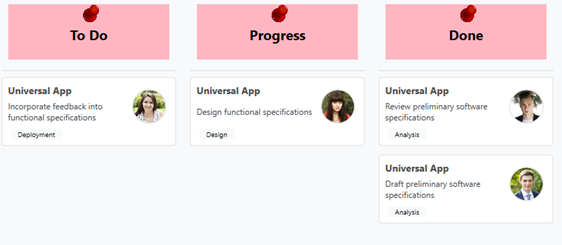
It has been achieved by using ColumnHeaderTemplate support. We can add the desired view into template view as shown in below code snippet.
[XAML]
          <syncfusion:SfKanban ColumnMappingPath="Category" Background="LightPink" ItemsSource="{Binding Tasks}" >
            <syncfusion:SfKanban.ColumnHeaderTemplate>
                <DataTemplate>
                    <StackPanel Width="300" Height="80" Margin="10"  Background="LightPink" HorizontalAlignment="Center" VerticalAlignment="Center">
                        <Image Source="pin.png" Height="30" Width="30"/>
                        <TextBlock  Text="{Binding  Header}" FontSize="20" Foreground="Black"  FontWeight="Bold" HorizontalAlignment="Center"/>
                    </StackPanel>
                </DataTemplate>
            </syncfusion:SfKanban.ColumnHeaderTemplate>
            <syncfusion:KanbanColumn Categories="Open" Title="To Do" />
            <syncfusion:KanbanColumn Categories="In Progress" Title="Progress" />
            <syncfusion:KanbanColumn Categories="Review,Done" Title="Done" />
         </syncfusion:SfKanban>
ColumnHeaderTemplate of Kanban keeps ColumnTag as DataContext.
KB article - How-to-customize-the-header-of-WPF-Kanban
See also
How to add the card template to the WPF SfKanban cards