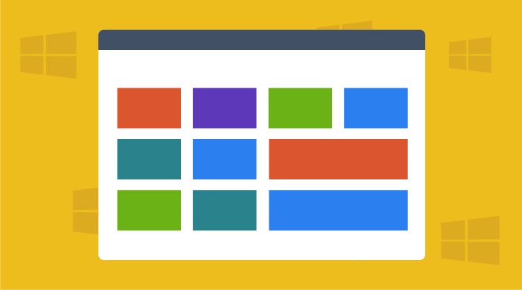

Windows 8 gives us a new paradigm in digital design, one that tethers iconography, photography, and copy together to communicate the purpose and status of an app. Microsoft’s Live Tiles not only represent an app’s identity, they also display updates to the app’s key content. Live tiles on the Start screen do more than declare what the app is; they convey to users that your app is dynamic, active, and constantly updated.
As designers contemplate how images and words will interact in this theater, many seem concerned with the interplay between icons and titles; they neglect the importance text—what’s actually written. Most articles on designing for Windows 8 speak to the rules on logo and icon size, style, and nature. When addressing text, they stick to the measurable: font size and type. They shy away from the subjective: word choice, sentence length, effective syntax.
Writing to the Windows design paradigm is a new endeavor. What follows are some initial thoughts on how to write effectively for Live Tiles.
Lead without breaking
As evidence that writing too often takes a back seat to illustrations and photos, I offer the example of the widowed idea: that is, the sentence too long for a line, so it’s abruptly cut down by ellipses.
Barber says he will make one last cut…
Does this mean Coach Barber will cut another member of his team, or that a local barber is closing shop? I’m sure the writer would have wanted the reader to know, and enough space has been afforded, but the sentence isn’t constructed in a way that adequately communicates the full idea.
This mistake often happens with apps that are updated with news stories. The program is probably set to display the headline of an article, as if that is enough. Headlines, however, vary. You can’t always assume everything the user needs to know is in the first seven words of a headline, and certainly not within the subheading or first sentence. Granted, this may be an automated evil—as with apps that import investor press releases—but it’s good to keep in mind that editorial oversight is sometimes needed to ensure that the copy, although current, is meaningful.
Long-time barber, Ed Smith, retires…
Photo, then copy
It’s encouraging to see the role of photography in the new Windows interface, which seats it equal to icons and titles. A photo lends itself to the same design principles driving Windows 8—a flat style that doesn’t seek to artificially emulate items onscreen as if they were three-dimensional objects. Icons without gradients and buttons without shadows are a few examples of this idea in action.
The nature of a photograph, too, isn’t artificial. Photos do not emulate reality, they capture it. When using a photo to communicate the purpose or content of your app, consider how the photo will coordinate with the copy. Photos and copy coexist in two ways: either the photo comes with text in the form of a caption; or the photo is shown separately from the text, which is displayed before or after the image. Captions will be discussed in another blog, but for now, consider scenarios where photos and text are separate.
Presenting an image after you’ve introduced a block of text describing the image isn’t a bad way to go, but communication is more powerful when the image comes first and is then followed by explanatory text. Think of your own experience. A good photograph intrigues you, and you immediately want to know more about its context and meaning. That’s the suspenseful setup. The dramatic delivery comes with the copy, which can affirm your initial thoughts on the photo or surprise you.
Either way, the connection between image and description should make sense. In cases where you’re trying to grab a user’s attention with suspense, that connection should have a feeling of revelation, which is best delivered by presenting the text after the photograph.
Watch abbreviations and acronyms
With captions, you’ll have room for 8-10 words. Tiles without images, only text, will afford you around 16-20 words. Such constraints will tempt you to abbreviate, but restrict your use of acronyms and shortened words to the following guidelines:
1. Use discernable acronyms—If you choose to use an acronym in a live tile, be sure it will not be confused with another acronym, such as PM. If it precedes a person’s name, we can assume it means prime minster.
PM Jordan to hold talks with Senegal.
If it comes after a time, we can assume it means afternoon.
Rain likely after 4:00 PM.
But if not tied to those elements, it could be ambiguous.
PM will bring rain to Senegal.
The prime minster has power, but not the power to make it rain. The above line must refer to the afternoon, but the meaning isn’t clear.
2. Use internationally recognizable acronyms—Some acronyms or either too cryptic or too regional to warrant use in a globally distributed app. In such cases, sacrificing space may ensure the main topic is conveyed.
WHO fears TB outbreak in prisons.
Some global users will understand that WHO stands for World Health Organization, but TB is obscure. It’s better to recast the line like this:
Tuberculosis feared in prisons.
The actor, the WHO, has been dropped, but the main topic, the disease, is intact and still tells the reader where the danger resides—in prisons, not in schools or food processing plants. For guidance on which acronyms are prolific enough to be used in Live Tiles, refer to the current edition of The Associated Press Stylebook. Use only acronyms that are condoned on first mention.
3. Avoid abbreviations that are also words—Some abbreviations can also be construed as words. The most notorious is No. used for number.
Patient No. 5 is ready.
We know 5 is a number, so you could simply say:
Patient 5 is ready.
Experiment
This new way of conveying the ever-changing state of an app will present a challenge to those working within the presentation layer—designers and developers alike—who are charged with copywriting. The formula for doing it best will arrive through trial and error, and differ from app to app. It’s a privilege to take on this challenge, however, because it means we are engaged in a form of user interface that is truly different. It is active, engaging, and yes, to use Microsoft’s term, immersive. We just can’t let the copy fail the simplicity of the design.
The next installment of this blog will address the dynamic between font type, letter spacing, and display time, and how this affects writing for Live Tiles. It will also provide tips for writing captions that read like headlines and include ways to render tile copy down to its essential essence.