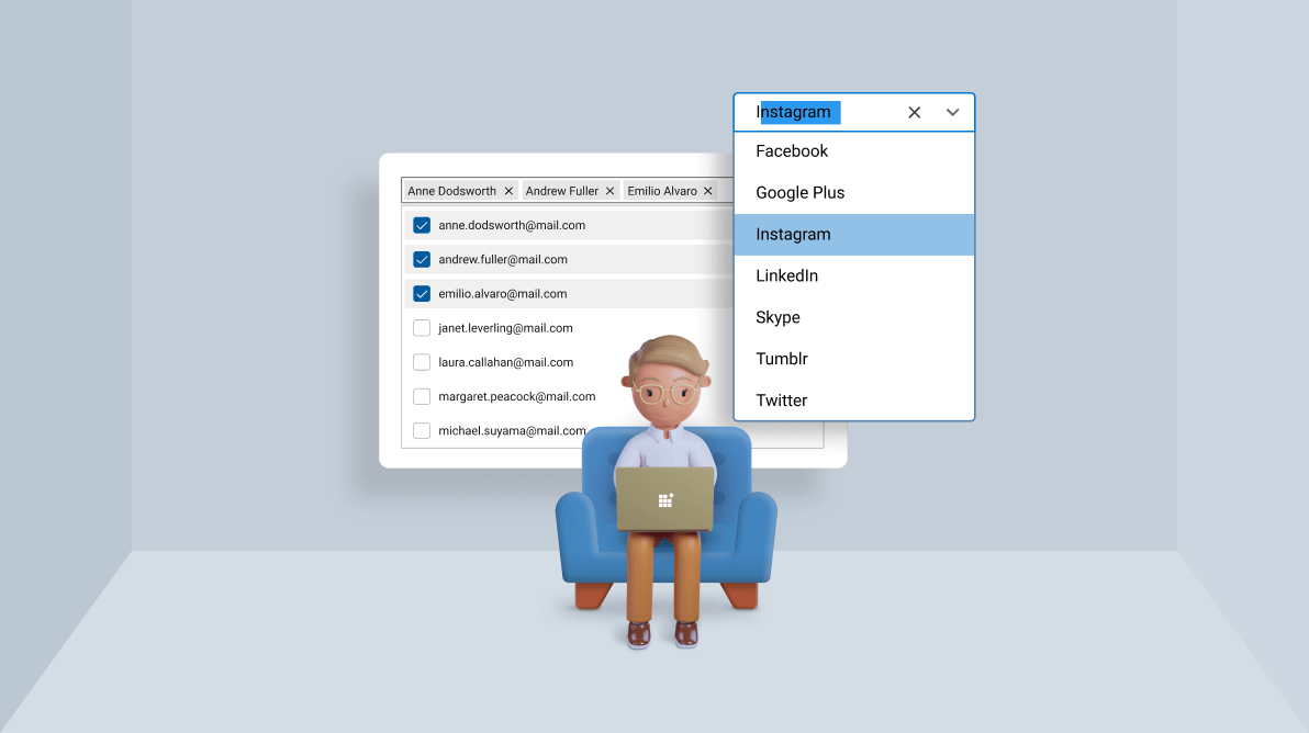

The ComboBox and AutoComplete controls are both used to select one or more items from a list. Though there are many similarities between them, one can’t be completely replaced with the other.
In this blog, we’ll discuss how the ComboBox and AutoComplete controls differ and when to choose one over the other.
The ComboBox control is just a list box that saves a lot of on-screen space by showing the list from which you can select items in a pop-up.
If there are only a few items to choose from (eg., male or female), you can use a list box or radio button. But when the list grows larger and there is not enough space to list everything on the screen, you can choose the ComboBox control. A good example is selecting a font from a list of supported fonts in a text editor.
The use cases for the ComboBox are:

The AutoComplete is a text box control. It gives suggestions to users as they type. The best example is a search engine. When you search for something in a search engine, it gives suggestions based on the popular phrases searched for by other users.
The use cases of the AutoComplete control are:
The primary advantage of using the AutoComplete control over ComboBox is its dynamic items. Let’s summarize the other differences.
| ComboBox | AutoComplete |
| A minimal version of a list box. | A text box control that shows suggestions based on user input. |
| Example: Selecting a font in a text editor. | Example: Searching for a product during online shopping. |
| Used when we want to choose items from a finite set of items. | Used when we want to choose items from a huge set of data or items which are decided at runtime. |
| Choose items by opening a dropdown and choosing them from a list. | No dropdown. Suggestions will be shown based on the user input. |
| When there are a huge number of items, the filtering feature shortens the list in the dropdown and makes it easier to select the required items. | It may or may not deal with a predefined set of items. As the user input changes, it will prepare a fresh set of suggestions. |
| Editing and filtering are optional features. | Editing and filtering are default features that cannot be turned off. |
Thanks for reading! We just explored the features of and differences between Syncfusion’s AutoComplete and ComboBox controls. You can enjoy multiple selection, themes, UI customization, and more features in both of these controls.
The AutoComplete and ComboBox controls are available in our Blazor, ASP.NET (Core, MVC, Web Forms), Angular, JavaScript, Xamarin, React, UWP, Vue, WinUI, WinForms, and WPF platforms. Try out them and choose the one that satisfies your needs.
For existing customers, the newest version of Essential Studio® is available for download from the license and downloads page. If you are not yet a customer, you can try our 30-day free trial to check out these new features.
For questions, you can contact us through our support forums, feedback portal, or the support portal. We are always happy to assist you!