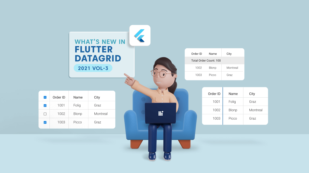

We are updating our Syncfusion Flutter DataGrid by adding new features in each release to make the control suitable for all kinds of uses. That’s why we have provided the following new features and enhancements for the Flutter DataGrid in the 2021 Volume 3 release.
Let’s have a look at them!
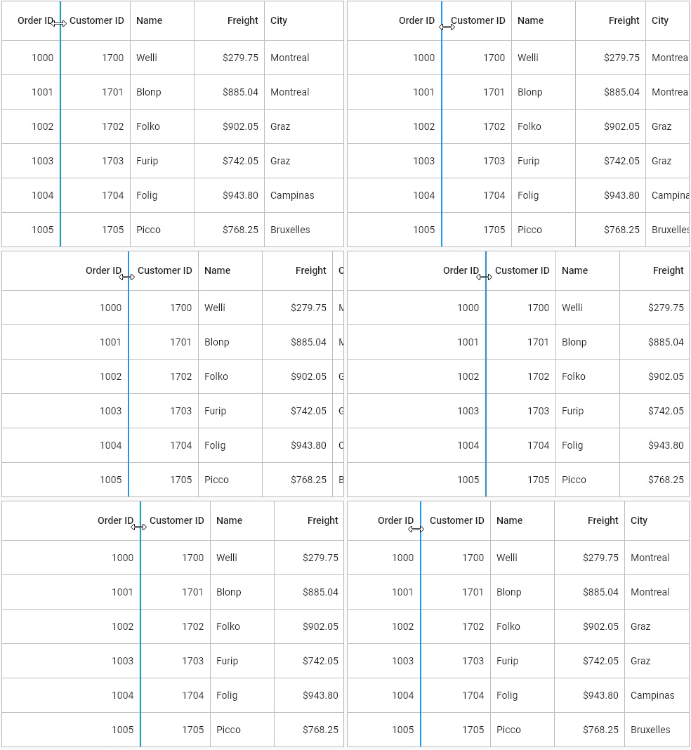
Now, users can easily resize columns dynamically in the Flutter DataGrid by just tapping and dragging the right end of the column header in web and desktop platforms. In mobile platforms, you can resize a column by dragging the indicator line, which will be shown when you long-press the column header.
Note: For more details, refer to the Column resizing in Flutter DataGrid documentation.
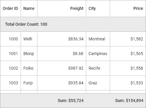
This feature enables users to show an additional unbound row to display a summary or total value. Users can display minimum, maximum, average, and count values of a column and decide whether the summary row should be displayed at the top or bottom.

Note: Refer to Summaries in Flutter DataGrid documentation to know how to show a table summary row in the DataGrid.
You can use the new built-in checkbox column support to show a checkbox in each row. The row can be selected or deselected when users select the checkbox. There is an additional option to show checkbox in the header cell. This will help users select or deselect all the rows in a data grid.
Note: Refer to the Checkbox column in Flutter DataGrid documentation to know how to add a checkbox column in the DataGrid.
Now, users can export the following DataGrid elements to Excel and PDF documents.
Also, the Flutter DataGrid provides these custom exporting options:
Note: Refer to the Export To Excel and Export To PDF documentation to learn how to export a DataGrid to Excel and PDF documents.
The 2021 Volume 3 release delivers these couple of enhancements in the Flutter DataGrid’s paging feature.
By default, sorting was applied only to the rows available on the current page. Now, the Flutter DataGrid supports sorting all the rows available in a DataGrid. To achieve this, you should not override the handlePagechange method because the DataGrid itself automatically applies paging with built-in support.
Splitting a page is done by dividing the total number of rows and the rows required for each page using the SfDataPager.pageCount property. You can also specify your required row count on a page through the rowsPerPage property.
Note: Refer to the paging documentation to learn how to sort all the rows available in a DataGrid when paging is applied.
You can change the size of the page buttons and apply padding between them. Also, you can change the visibility of the navigation items in the SfDataPager widget (i.e. the First, Last, Previous and Next buttons).
Use these properties to change the size and padding of the buttons:
Use these properties to change the visibility of the buttons:
The following screenshot shows the customized SfDataPager widget.
Thanks for reading! In this blog, we have seen the new features and enhancements for our Flutter DataGrid in the 2021 Volume 3 release. These features are also available in our Release Notes and What’s New pages. Try out these features and leave your feedback in the comments section of this blog post.
Also, browse our Flutter Widgets documentation and examples in this GitHub repository to explore other available features. Don’t miss our demo app in Google Play and the App Store.
If you aren’t a customer yet, you can try our 30-day free trial to check out these features.
You can also contact us through our support forum, feedback portal, or Direct-Trac support system. We are always happy to assist you!