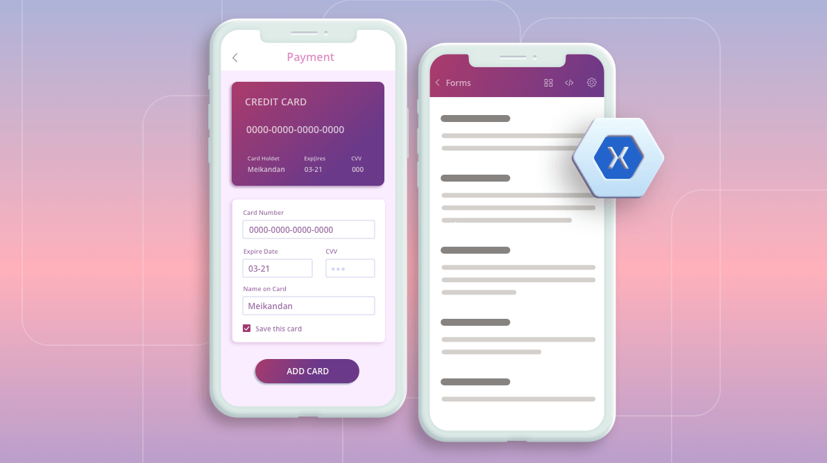

When it comes to design and production, the Essential UI Kit for Xamarin saves a lot of time and money. In our latest update, we have crafted a new page and added many interactions and appearance changes to the existing pages. Now, there are 102 screens in your favorite Essential UI Kit for Xamarin.
The complete set of screens can be downloaded from the Essential UI Kit for Xamarin GitHub location. These updates are available in our Visual Studio for Windows and Visual Studio for MAC extensions, too.
Let’s now see the new updates in our Essential UI Kit for Xamarin:
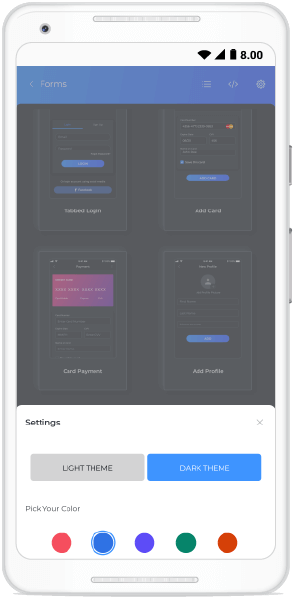
Now, you can enjoy the dark theme support in all the XAML pages. In the Xamarin UI Kit application, you can choose the required theme from the settings page as shown in the following screenshot. Also, you can update the app’s theme based on the device’s theme in the UI Kit app.


Switch to dark or light themes in Essential UI Kit for Xamarin
Please find the following XAML Pages with dark theme support in the Essential UI Kit for Xamarin.
We have added a new XAML page to the Kit to request credit card details from a user.
XAML page in the Essential UI Kit for Xamarin getting credit card details
We have included ripple effect support to our XAML pages. The following GIF image shows the ripple effect added to the e-commerce category page. We have used the Syncfusion Xamarin Effects View control for this amazingly easy-to-use ripple effect.
Ripple effect for touch interactions in Essential UI Kit for Xamarin
Previously, we had styles for each category of XAML page, such as forms, articles, and catalogues. But now, we have added screens by control that are more efficient at sharing styles among XAML pages.
As the Xamarin.Forms 4.5 version provides support to embedded fonts, we have now extended embedded fonts support to our Xamarin Essential UI Kit project. We have removed the fonts from platform-specific projects and added them to the Xamarin.Forms project.
In addition to the updates in XAML pages, the demo project that helps you view the XAML pages has been improved in this update.
This feature enables you to easily switch themes (light or dark) in your application based on the device’s theme settings.
Previously, we only had the grid view, which contained the description of each page. Now, we have added a new view that will show a thumbnail image for each of our XAML pages. This will allow a user to select pages from its miniature view. You have either the grid with page descriptions or the thumbnail image view for choosing XAML pages in the Essential UI Kit project.
Thumbnail view of the XAML pages in Essential UI Kit for Xamarin
Thanks for reading! In this blog post, we have seen the various new vivid updates in our Syncfusion Essential UI Kit for Xamarin. So, try out these features and build charming applications!
If the screen you need isn’t in the kit, don’t worry, it will be added soon. Just tell us what you want via our feedback portal. Stay tuned to our official Twitter, Facebook and LinkedIn pages for updates. If you found this post useful or have questions, please let us know in the comments.
My colleagues and I invite you to see all our Syncfusion Xamarin.Forms controls in action by downloading a free trial. You can also explore our Android, iOS and UWP demo apps. You can learn about the controls’ advanced features in our documentation.