TL;DR: Let’s explore the new updates in Syncfusion’s Blazor Diagram component, including rulers, symbol search, and more. These updates enhance diagram creation and editing, making it more interactive and precise.
Syncfusion Blazor Diagram component has made significant strides in its development, providing an advanced toolkit for visualizing, creating, and editing interactive diagrams. Whether you’re working on flowcharts, organizational charts, mind maps, floor plans, or BPMN charts, this comprehensive library equips you with the tools to programmatically and interactively bring your ideas to life.
This blog will explore the latest enhancements and features introduced in the 2024 Volume 2 release for the Blazor Diagram component. Discover how these new capabilities can elevate your diagramming experience and streamline your workflow.
Let’s get started!
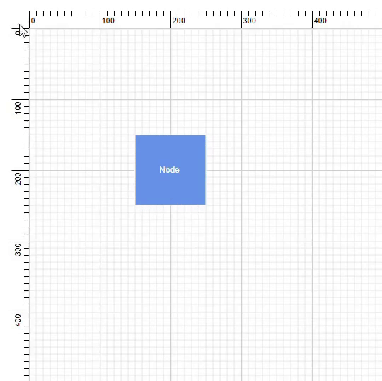
The new ruler feature in the Blazor Diagram component provides horizontal and vertical guides for precise measurement, ensuring accuracy when placing, sizing, and aligning shapes and objects within a diagram.
The RulerSettings property of the SfDiagramComponent controls the ruler’s visibility and appearance in the diagram. The HorizontalRuler and VerticalRuler properties define and customize the horizontal and vertical rulers, respectively, in the diagram canvas.
The following code demonstrates how to add a ruler to the diagram.
@using Syncfusion.Blazor.Diagram

<SfDiagramComponent Height="600px">
 <RulerSettings>
  <HorizontalRuler />
  <VerticalRuler />
 </RulerSettings>
</SfDiagramComponent>
The HorizontalRuler and VerticalRuler properties of the RulerSettings class are used to modify the appearance of the rulers in the diagram. The following properties are used to customize the appearance of both the horizontal and vertical rulers.
The following code example illustrates how to customize the ruler in the Blazor Diagram component.
@using Syncfusion.Blazor.Diagram;

<SfDiagramComponent Height="600px" Nodes="@nodes">
 <RulerSettings>
  <HorizontalRuler IsVisible="true" Interval="10"    TickAlignment="TickAlignment.LeftAndTop" MarkerColor="green" />
  <VerticalRuler IsVisible="true" Interval="10" TickAlignment="TickAlignment.RightAndBottom" MarkerColor="red" />
 </RulerSettings>
</SfDiagramComponent>

@code{
    public DiagramObjectCollection<Node> nodes = new DiagramObjectCollection<Node>();
    protected override void OnInitialized()
    {
        Node node = new Node()
        {
            OffsetX = 200,
            OffsetY = 200,
            Width = 100,
            Height = 100,
            Annotations = new DiagramObjectCollection<ShapeAnnotation>()
            {
                new ShapeAnnotation()
                {
                    Content = "Node",
                    Style = new TextStyle()
                    {
                        Color = "white",
                    }
                }
            },
            Style = new ShapeStyle() { Fill = "#6495ED", StrokeColor = "white" }
        };
        nodes. Add(node);
    }
}
Refer to the following image.
Note: For more details, refer to the ruler in Blazor Diagram component web demos, GitHub demos, and documentation.
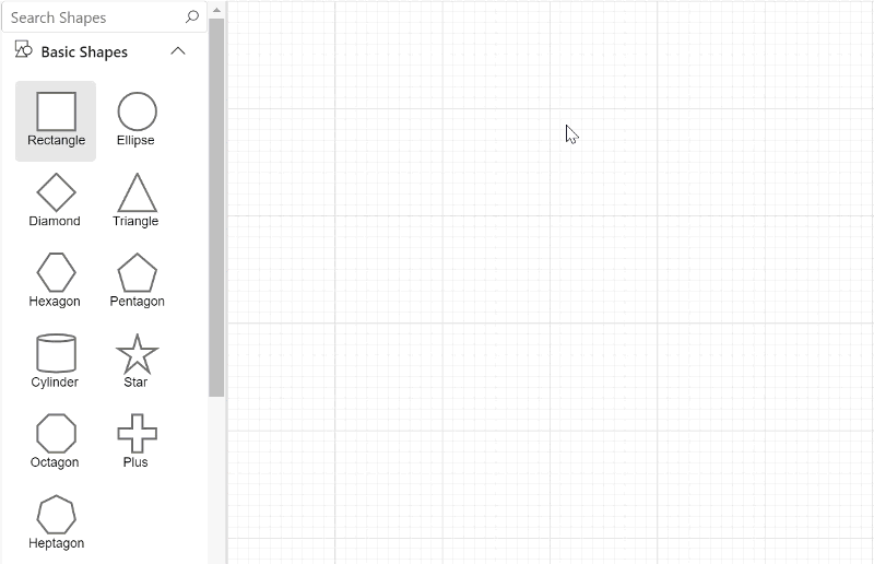
The symbol palette now allows users to search for and retrieve symbols. Users can find matching symbols by entering a symbol’s ID or search keywords into a text box clicking the Search button, or pressing the Enter key. The search results are based on matching the ID or SearchTags property with the entered search string. The ShowSearchTextBox property of the palette controls the visibility of the search text box.
Refer to the following image.
Note: For more details, refer to the symbols search feature in the Blazor Diagram component’s web demos, GitHub demos, and documentation.
In the Blazor Diagram component, it’s essential to calculate the bounds of paths, text, images, and SVG data on the JavaScript side using JsInterop calls. Connection failure issues can arise when processing large data sets (exceeding 32KB for a single incoming hub message) in a single JS call.
To resolve this, we have introduced the EnableChunkMessages property in the Diagram and symbol palette. This property allows large data to be sent in smaller chunks, thereby preventing connection failure issues. Chunk messages facilitate the measurement of paths, images, text, and SVG data without exceeding the maximum size limit for a single incoming hub message (MaximumReceiveMessageSize of 32KB). By default, the EnableChunkMessages property is set to false.
Note: For more details, refer to the chunk message support in the Blazor Diagram documentation.
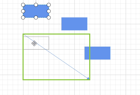
When a new node is dropped onto an existing connector, the user can split the connector between two nodes. This action creates new connections between the dropped node and the existing nodes. To enable this feature, set the EnableConnectorSplitting property of the SfDiagramComponent to true. The AllowDrop constraints must also be enabled on the connector to allow node dropping.
The following code example illustrates how to enable the connector splitting feature in the Blazor Diagram component.
@using Syncfusion.Blazor.Diagram

<SfDiagramComponent @ref="Diagram" Width="1000px" Height="500px" Nodes="@nodes" Connectors="@connectors" EnableConnectorSplitting="true" />

@code {
    //Reference the diagram.
    SfDiagramComponent Diagram;
    // Initialize the diagram's connector collection.
    DiagramObjectCollection<Connector> connectors = new DiagramObjectCollection<Connector>();
    // Initialize the diagram's node collection.
    DiagramObjectCollection<Node> nodes = new DiagramObjectCollection<Node>();
    protected override void OnInitialized()
    {
        nodes = new DiagramObjectCollection<Node>()
        {
          new Node()
          {
              OffsetX = 100, OffsetY = 100,
              Height = 50, Width = 100,
              Style = new ShapeStyle(){ Fill = "#6495ED", StrokeColor = "#6495ED",},
              Shape = new BasicShape() { Type = NodeShapes.Basic, Shape = NodeBasicShapes.Rectangle }
          },
          new Node()
          {
              OffsetX = 300, OffsetY = 300,
              Height = 50, Width = 100,
              Style = new ShapeStyle(){ Fill = "#6495ED", StrokeColor = "#6495ED",},
              Shape = new BasicShape() { Type = NodeShapes.Basic, Shape = NodeBasicShapes.Rectangle }
          },
          new Node()
          {
              OffsetX = 300, OffsetY = 100,
              Height = 50, Width = 100,
              Style = new ShapeStyle(){ Fill = "#6495ED", StrokeColor = "#6495ED",},
              Shape = new BasicShape() { Type = NodeShapes.Basic, Shape = NodeBasicShapes.Rectangle }
          }
        };
        Connector Connector = new Connector()
        {
                ID = "connector1",
                //Source node  ID of the connector.
                SourceID = "node1",
                TargetDecorator = new DecoratorSettings()
                {
                    Style = new ShapeStyle()
                    {
                        Fill = "#6495ED",
                        StrokeColor = "#6495ED",
                    }
                },
                //Target node  ID of the connector.
                TargetID = "node2",
                Style = new ShapeStyle()
                {
                    Fill = "#6495ED",
                    StrokeColor = "#6495ED",
                },
                // Type of the connector.
                Type = ConnectorSegmentType.Straight,
                Constraints = ConnectorConstraints.Default | ConnectorConstraints.AllowDrop,
        };
        connectors.Add(Connector);
    }
}
Refer to the following image.
Note: For more details, refer to the connector splitting in the Blazor Diagram component GitHub demos and documentation.
Thanks for reading! In this blog, we’ve seen the exciting new features added to the Syncfusion Blazor Diagram component for the 2024 Volume 2 release. Use them to create and visualize interactive diagrams, and leave your feedback in the comments section below!
Check out our Release Notes and What’s New pages for other 2024 Volume 2 release updates.
The new version of Essential Studio® is available for existing customers on the License and Downloads page. If you are not a Syncfusion customer, try our 30-day free trial to check out our available features.
You can also contact us through our support forum, support portal, or feedback portal. We are always happy to assist you!