
Welcome to our blog series, Chart of the Week!
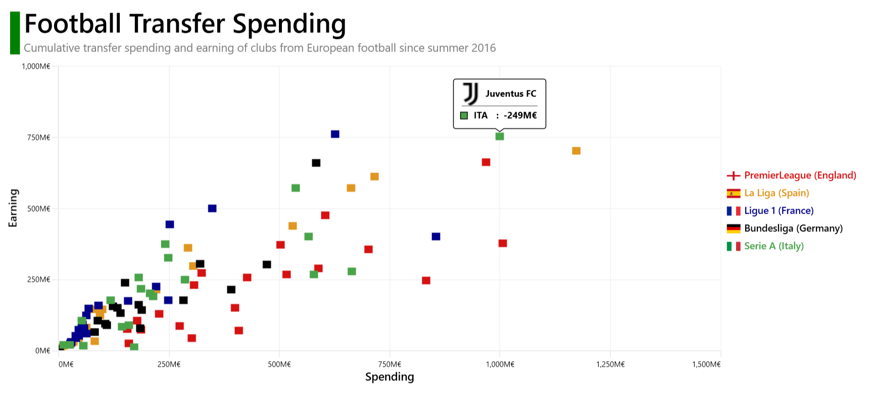
Today, we will visualize the amount of money spent and earned on transfers by the five big European football league clubs since the summer of 2016. For this demonstration, we will use Syncfusion’s WPF scatter chart control.
The team with the highest positive balance in France was LOSC Lille (+€191M), having spent €252M and earned €443M. In England, Manchester City had the most negative balance (-€631M), having spent €1006M and earned €375M.
Refer to the following image.


Let’s start constructing a football (soccer) transfer earning and spending chart using the Syncfusion WPF scatter chart control.
Before creating a chart, let’s gather the data from the CIES Football Observatory site. We’re going to obtain the transfer spending and earning details for the big five football league clubs since the summer of 2016. You can also download the data as a separate JSON file.
Create the FootballMarket class to hold the transfer spent and earned amounts, net amount in millions of euros, club names, and league code information.
Refer to the following code example for assistance.
public class FootballMarket
{
    public double Club_tm { get; set; }
    public double Spent { get; set; }
    public string LeagueCode { get; set; }
    public string Club { get; set; }
    public double Earned { get; set; }
    public double Net { get; set; }
}
Next, generate a collection of net transfer spent and earned amounts using the FootballRevenue class and PremierLeague, Liga, Ligue1, Bundesliga, and SerieA properties.
public class FootballRevenue
{
   private List<FootballMarket> premierLeague;
   public List<FootballMarket> PremierLeague
   {
       get { return premierLeague; }
       set
       {
           premierLeague = value;
       }
   }

   public List<FootballMarket> FlagCollection { get; set; }

   private List<FootballMarket> liga;
   public List<FootballMarket> Liga
   {
      get { return liga; }
      set
      {
         liga = value;
      }
   }

   private List<FootballMarket> ligue1;
   public List<FootballMarket> Ligue1
   {
       get { return ligue1; }
       set
       {
           ligue1 = value;
       }
   }

   private List<FootballMarket> bundesliga;
   public List<FootballMarket> Bundesliga
   {
       get { return bundesliga; }
       set
       {
           bundesliga = value;
       }
   }

   private List<FootballMarket> serieA;
   public List<FootballMarket> SerieA
   {
      get { return serieA; }
      set
      {
         serieA = value;
      }
    }
}
To convert the JSON data to a collection, use the StreamReader and JsonConvert.DeserializeObject methods and the NewtonSoft.Json package. Then, store the converted data in the appropriate properties.
public class FootballRevenue
{
  public FootballRevenue()
  {
      Assembly executingAssembly = typeof(App).GetTypeInfo().Assembly;
      using (var stream = executingAssembly.GetManifestResourceStream("FootballSpentEarned.Resources.data.json"))
      using (TextReader textStream = new StreamReader(stream))
      {
          var data = textStream.ReadToEnd();
          data = data.Trim();
          Data = JsonConvert.DeserializeObject<List<FootballMarket>>(data);
          PremierLeague = Data.Where(d => d.LeagueCode == "ENG").ToList();
          Bundesliga = Data.Where(d => d.LeagueCode == "GER").ToList();
          Liga = Data.Where(d => d.LeagueCode == "ESP").ToList();
          Ligue1 = Data.Where(d => d.LeagueCode == "FRA").ToList();
          SerieA = Data.Where(d => d.LeagueCode == "ITA").ToList();
      }
  }
} Now, let’s configure the Syncfusion WPF Charts control using this documentation.
Refer to the following code example.
<chart:SfChart >
 <chart:SfChart.PrimaryAxis>
  <chart:NumericalAxis>
  </chart:NumericalAxis>
 </chart:SfChart.PrimaryAxis>
 <chart:SfChart.SecondaryAxis>
  <chart:NumericalAxis>
  </chart:NumericalAxis>
 </chart:SfChart.SecondaryAxis>
</chart:SfChart>
Bind the football league clubs’ spending and earning data using the FastScatterBitmapSeries class. This class will allow you to render a collection with a large number of data points.
<chart:SfChart.Series>
 <chart:FastScatterBitmapSeries XBindingPath="Spent" YBindingPath="Earned" ItemsSource="{Binding PremierLeague}" />
 <chart:FastScatterBitmapSeries XBindingPath="Spent" YBindingPath="Earned" ItemsSource="{Binding Liga}" />
 <chart:FastScatterBitmapSeries XBindingPath="Spent" YBindingPath="Earned" ItemsSource="{Binding Ligue1}"  />
 <chart:FastScatterBitmapSeries XBindingPath="Spent" YBindingPath="Earned" ItemsSource="{Binding Bundesliga}" />
 <chart:FastScatterBitmapSeries XBindingPath="Spent" YBindingPath="Earned" ItemsSource="{Binding SerieA}" />
</chart:SfChart.Series>
In this example, we’ve bound the scatter chart with the PremierLeague, Liga, Ligue1, Bundesliga, and SerieA properties, which contain the information of the football league clubs. Additionally, we’ve specified the XBindingPath and YBindingPath with the Spent and Earned properties, which inform the chart about the data points for the x- and y-axes.
The WPF scatter chart allows us to customize its appearance based on our requirements.
Let’s see how to add a title to the chart using the Header property. Also, we’ll align the header using the HorizontalHeaderAlignment and VerticalHeaderAlignment properties.
<chart:SfChart x:Name="chart" Margin="10" HorizontalHeaderAlignment="Left">
 <chart:SfChart.Header>
  <Grid HorizontalAlignment="Left" Margin="5,0,0,10" VerticalAlignment="Center" >
   <Grid.ColumnDefinitions>
    <ColumnDefinition Width="13"/>
    <ColumnDefinition Width="*"/>
   </Grid.ColumnDefinitions>
   <StackPanel  Orientation="Vertical" Background="Green" Margin="0,10,0,0"  Grid.RowSpan="2"/>
   <StackPanel Margin="5,0,0,0" HorizontalAlignment="Left"  Orientation="Vertical" Grid.Column="1" >
    <TextBlock  Text="Football Transfer Spending" HorizontalAlignment="Left" TextWrapping="Wrap" FontSize="35" FontWeight="SemiBold" Foreground="Black"/>
    <TextBlock Text="Cumulative transfer spending and earning of clubs from European football since summer 2016" HorizontalAlignment="Left" FontSize="15" Foreground="Gray"/>
   </StackPanel>
  </Grid>
 </chart:SfChart.Header>
</chart:SfChart> We can customize the chart axis’s header using the Header property. Refer to the following code example.
<chart:SfChart.PrimaryAxis>
 <chart:NumericalAxis >
  <chart:NumericalAxis.Header>
    <TextBlock Text="Spending" HorizontalAlignment="Center" VerticalAlignment="Center" FontFamily="Helvetica" FontSize="15" FontWeight="SemiBold" Foreground="Black"/>
  </chart:NumericalAxis.Header>
 </chart:NumericalAxis>
</chart:SfChart.PrimaryAxis>

<chart:SfChart.SecondaryAxis>
 <chart:NumericalAxis >
  <chart:NumericalAxis.Header>
   <TextBlock Text="Earning" FontWeight="SemiBold" HorizontalAlignment="Center" VerticalAlignment="Center" FontSize="15" Foreground="Black" FontFamily="Helvetica"/>
  </chart:NumericalAxis.Header>
 </chart:NumericalAxis>
</chart:SfChart.SecondaryAxis>
Then, let’s customize the axis line style, major tick line style, and axis label format and set the interval for the numerical axis using the AxisLineStyle, MajorTickLineStyle, LabelFormat, and Interval properties, respectively.
We can also configure the position of the edge labels using the EdgeLabelDrawingMode property and add padding to the y-axis by setting the Normal value to the RangePadding property.
<chart:SfChart.PrimaryAxis>
 <chart:NumericalAxis Interval="250" AxisLineStyle="{StaticResource lineStyle}" MajorTickLineStyle="{StaticResource lineStyle}" RangePadding="Normal" Foreground="Black" FontWeight="Normal" EdgeLabelsDrawingMode="Shift" LabelFormat="#,0'M€" >
 </chart:NumericalAxis>
</chart:SfChart.PrimaryAxis>

<chart:SfChart.SecondaryAxis>
 <chart:NumericalAxis Interval="250" AxisLineStyle="{StaticResource lineStyle}" MajorTickLineStyle="{StaticResource lineStyle}" FontWeight="Normal" Foreground="Black" LabelFormat="#,0'M€">
 </chart:NumericalAxis>
</chart:SfChart.SecondaryAxis> Refer to the following code example to customize the chart’s scatter points using the ShapeType, Interior, ScatterHeight, ScatterWidth, and Label properties.
<chart:SfChart.Series>
 <chart:FastScatterBitmapSeries  XBindingPath="Spent" Interior="#d61111" Label="PremierLeague (England)"  ScatterWidth="10" ShapeType="Square" YBindingPath="Earned" ItemsSource="{Binding PremierLeague}"  ScatterHeight="10"/>
 <chart:FastScatterBitmapSeries Interior="#e19620" Label="La Liga (Spain)" XBindingPath="Spent" ScatterHeight="10" ScatterWidth="10"  ShapeType="Square" YBindingPath="Earned" ItemsSource="{Binding Liga}" />
 <chart:FastScatterBitmapSeries Interior="#00008B" Label="Ligue 1 (France) XBindingPath="Spent" ScatterHeight="10" ScatterWidth="10" ShapeType="Square" YBindingPath="Earned" ItemsSource="{Binding Ligue1}" />
 <chart:FastScatterBitmapSeries Interior="#000000 Label="Bundesliga (Germany)" XBindingPath="Spent" ScatterHeight="10" ShapeType="Square" YBindingPath="Earned" ItemsSource="{Binding Bundesliga}"  ScatterWidth="10"/>
 <chart:FastScatterBitmapSeries Interior="#49a349" Label="Serie A (Italy)" ScatterHeight="10" ScatterWidth="10" XBindingPath="Spent" ShapeType="Square" YBindingPath="Earned" ItemsSource="{Binding SerieA}" />
</chart:SfChart.Series>
Legends help us easily understand the different categories in the data set. You can customize the legend in the WPF scatter chart using the ItemTemplate property in the ChartLegend.
<Grid.Resources>
 <DataTemplate x:Key="legend">
  <StackPanel Orientation="Horizontal">
   <Image Source="{Binding Converter={StaticResource imageConverter}}" Margin="3,3,0,0" Height="12" VerticalAlignment="Center" Width="20" HorizontalAlignment="Left" />
   <TextBlock Text="{Binding Label}" Foreground="{Binding Interior}" FontSize="13" Margin="3" FontWeight="SemiBold"/>
  </StackPanel>
 </DataTemplate>
</Grid.Resources>
<chart:SfChart.Legend>
 <chart:ChartLegend ItemTemplate="{StaticResource legend}" ItemMargin="50,50,0,0" DockPosition="Right" />
</chart:SfChart.Legend>
Refer to the following code example to enable and customize the default appearance of the tooltip in the WPF scatter chart.
<Grid.Resources>
 <local:Converter x:Key="imageConverter" />
 <local:ImageConverter x:Key="toolTipConverter" />
 <local:ColorConverter x:Key="color" />
 <DataTemplate x:Key="toolTip1">
  <StackPanel>
   <StackPanel Orientation="Horizontal">
    <Image Source="{Binding Item.Club,Converter={StaticResource toolTipConverter}}" Height="30" Width="30" />
    <Label Content="{Binding Item.Club}" HorizontalAlignment="Center" VerticalAlignment="Center" Foreground="Black" FontWeight="Bold" FontFamily="Helvetica" Margin="0,2,0,2" FontSize="12" Grid.Row="0"/>
   </StackPanel>
   <Rectangle Fill="Gray" Height="1" Width="100" />
   <StackPanel HorizontalAlignment="Center" VerticalAlignment="Center" Orientation="Horizontal" >
    <Rectangle  Stroke="Black" StrokeThickness="1" Height="10" Width="10" Fill="{Binding Item,Converter={StaticResource color}}" />
    <Label Content="{Binding Item.LeagueCode}"  HorizontalAlignment="Center"  HorizontalContentAlignment="Left" Foreground="Black" FontWeight="Bold" FontFamily="Helvetica" FontSize="12" Margin="3,0,3,0" />
    <TextBlock Text=" : " FontWeight="Bold" VerticalAlignment="Center" Foreground="Black" FontFamily="Helvetica" Margin="0,0,3,0" FontSize="12" />
    <TextBlock Text="{Binding Item.Net, StringFormat='{}{0}M€'}" FontWeight="Bold" VerticalAlignment="Center" Foreground="Black" FontFamily="Helvetica" Margin="0,0,3,0" FontSize="12" />
   </StackPanel>
  </StackPanel>
 </DataTemplate>
</Grid.Resources>
Finally, configure the tooltip behavior using the following code example.
<Grid.Resources>
 <Style TargetType="Path" x:Key="style">
  <Setter Property="Stroke" Value="Black"/>
  <Setter Property="Fill" Value="White"/>
  <Setter Property="StrokeThickness" Value="1"/>
 </Style>
</Grid.Resources>

<chart:SfChart.Behaviors>
 <chart:ChartTooltipBehavior ShowDuration="2500" Style="{StaticResource style}"/>
</chart:SfChart.Behaviors>

<chart:SfChart.Series>
 <chart:FastScatterBitmapSeries ShowTooltip="True" TooltipTemplate="{StaticResource toolTip1}" />
 <chart:FastScatterBitmapSeries TooltipTemplate="{StaticResource toolTip1}" ShowTooltip="True" />
 <chart:FastScatterBitmapSeries TooltipTemplate="{StaticResource toolTip1}" ShowTooltip="True" />
 <chart:FastScatterBitmapSeries TooltipTemplate="{StaticResource toolTip1}" ShowTooltip="True" />
 <chart:FastScatterBitmapSeries TooltipTemplate="{StaticResource toolTip1}" ShowTooltip="True" />
</chart:SfChart.Series>
After executing these code examples, we will get output like in the following image.
For more details, refer to the project on GitHub.
Thanks for reading! In this blog, we have seen how to visualize football league clubs’ transfer spending and earning data using the Syncfusion WPF scatter chart. We encourage you to try these steps and share your thoughts in the comments below.
You can also explore our WPF Charts examples to learn more about the supported chart types and how easy it is to configure them for stunning visual effects.
The latest version of the WPF Charts control is available for current customers from the License and Downloads page. If you are not a Syncfusion customer, try our 30-day free trial to check it out.
For questions, you can contact us through our support forums, support portal, or feedback portal. We are always happy to assist you!